一、Toast
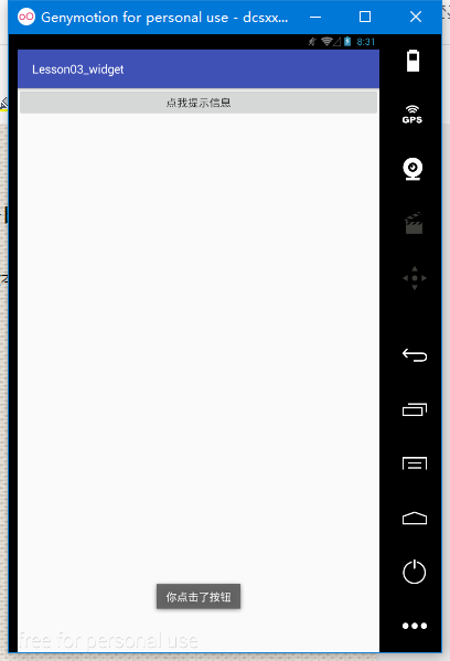
Toast是一种轻量级的提示工具,可显示一行文本对用户的操作进行提示响应
用法:Toast.makeText(context,text,time).show();
context:上下文 、text:显示文本内容、time:显示时长
Toast.LENGTH_SHORT(短时间显示)
Toast.LENGTH_LONG(长时间显示)
例:
button=(Button)findViewById(R.id.button);
button.setOnClickListener(new View.OnClickListener() {
@Override
public void onClick(View v) {
Toast.makeText(ceshi.this, "你点击了按钮", Toast.LENGTH_SHORT).show();
}
});
二、TextView——文本显示控件
常用属性
text 显示的文本内容 textColor 文本颜色
textSize 字体大小 singleLine 单行显示true|false
gravity 内容的重心位置 drawableLeft 文字左边显示的图片
drawableRight 文字右边显示的图片
drawableTop 文字上边显示的图片
drawableBottom 文字下边显示的图片
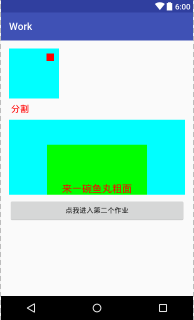
例:
<TextView
android:layout_width="200dp"
android:layout_height="100dp"
android:background="#00ff00"
android:id="@+id/textView2"
android:layout_alignBottom="@id/f1"
android:layout_centerInParent="true"
android:text="来一碗鱼丸粗面"
android:textColor="#f00"
android:textSize="20sp"
android:gravity="bottom|center"/>
常用方法
nsetText() 设置显示文字
nsetTextColor() 设置文字颜色,参数为颜色值
nsetTextSize() 设置文字尺寸,参数1为尺寸单位,2为尺寸大小
ngetText() 获取显示的文字
三、Button——按钮
常用属性
TextView的属性
还有一个onClick,但是这个一般用不到,
Button的方法见上面的Toast的用法
四、EditText——文本输入控件,继承自TextView
常用属性
inputType 限制能够输入文本类型
hint 显示的提示 值为 string
maxLength 能够输入的最大长度 值为 int
focusable 能否获取焦点 值为 boolean
lines 显示的行数 值为 int
maxLines 最大显示行数 值为 int
enable 是否可用 值为 boolean
例:
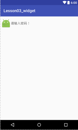
<EditText
android:id="@+id/edittext_2"
android:layout_width="match_parent"
android:layout_height="wrap_content"
android:hint="请输入密码!"
android:textSize="16sp"
android:textColor="#f00"
android:textColorHighlight="#a00000ff"
android:drawableLeft="@mipmap/ic_launcher"
android:inputType="textPassword" />
常用方法
setHint() 设置提示文本
setInputType() 设置输入限制类型
setFocusable() 设置能否获取焦点
setEnable() 设置是否可用
isEnable() 是否可用
具体代码:
edittext1.getText().toString();//获取EditView的文本值
edittext1.addTextChangedListener(watcher);//文本监听
private TextWatcher watcher = new TextWatcher() {
/*文本改变之前*/
@Override
public void beforeTextChanged(CharSequence s, int start, int count, int after) {
}
/*当文本改变的时候*/
@Override
public void onTextChanged(CharSequence s, int start, int before, int count) {
}
/*文本改变之后*/
@Override
public void afterTextChanged(Editable s) {
//获取已经输入的的文字总数
int currentCount = s.length();
//计算还能输入多少个字符,记住,数字不能直接写
textview1.setText(String.valueOf(max - currentCount));
}
};
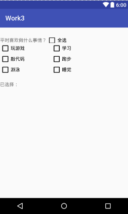
五、CheckBox——复选框,继承自TextView
常用属性
TextView的属性
button 复选指示按钮
checked 是否选中
例:
<CheckBox
android:id="@+id/checkbox3"
android:layout_width="wrap_content"
android:layout_height="wrap_content"
android:layout_below="@id/checkbox1"
android:text="敲代码" />
常用方法
TextView的方法
setChecked() 设置是否选中
isChecked() 是否选中的
setOnCheckedChangeListener() 设置选中改变监听
具体代码
checkboxall.setOnCheckedChangeListener(changeListener);
checkboxall.setChecked(false);
<!--布局-->
<?xml version="1.0" encoding="utf-8"?>
<RelativeLayout xmlns:android="http://schemas.android.com/apk/res/android"
    android:layout_width="match_parent"
    android:layout_height="match_parent"
    xmlns:app="http://schemas.android.com/apk/res-auto">

    <TextView
        android:id="@+id/textviewtitle"
        android:layout_width="wrap_content"
        android:layout_height="wrap_content"
        android:layout_marginTop="30dp"
        android:text="平时喜欢做什么事情?" />

    <CheckBox
        android:id="@+id/checkboxall"
        android:layout_width="wrap_content"
        android:layout_height="wrap_content"
        android:layout_alignBottom="@id/textviewtitle"
        android:layout_alignTop="@id/textviewtitle"
        android:layout_toRightOf="@id/textviewtitle"
        android:text="全选" />
    <!--内容的CheckBox-->
    <CheckBox
        android:id="@+id/checkbox1"
        android:layout_width="wrap_content"
        android:layout_height="wrap_content"
        android:layout_below="@id/textviewtitle"
        android:layout_marginRight="80dp"
        android:text="玩游戏" />

    <CheckBox
        android:id="@+id/checkbox2"
        android:layout_width="wrap_content"
        android:layout_height="wrap_content"
        android:layout_below="@id/textviewtitle"
        android:layout_toRightOf="@+id/checkbox1"
        android:text="学习" />

    <CheckBox
        android:id="@+id/checkbox3"
        android:layout_width="wrap_content"
        android:layout_height="wrap_content"
        android:layout_below="@id/checkbox1"
        android:text="敲代码" />

    <CheckBox
        android:id="@+id/checkbox4"
        android:layout_width="wrap_content"
        android:layout_height="wrap_content"
        android:layout_below="@id/checkbox2"
        android:layout_toRightOf="@+id/checkbox1"
        android:text="跑步" />

    <CheckBox
        android:id="@+id/checkbox5"
        android:layout_width="wrap_content"
        android:layout_height="wrap_content"
        android:layout_below="@id/checkbox3"
        android:text="游泳" />

    <CheckBox
        android:id="@+id/checkbox6"
        android:layout_width="wrap_content"
        android:layout_height="wrap_content"
        android:layout_below="@id/checkbox4"
        android:layout_toRightOf="@+id/checkbox1"
        android:text="睡觉" />


    <TextView
        android:id="@+id/textviewinfo"
        android:layout_width="match_parent"
        android:layout_height="wrap_content"
        android:layout_below="@id/checkbox5"
        android:layout_marginTop="20dp"
        android:text="已选择:"/>
</RelativeLayout>


<!--java代码-->
package com.dc.work3;

import android.os.Bundle;
import android.support.v7.app.AppCompatActivity;
import android.util.Log;
import android.widget.CheckBox;
import android.widget.CompoundButton;
import android.widget.TextView;
import android.widget.Toast;

import java.util.LinkedList;
import java.util.List;

/**
 * Created by 怪蜀黍 on 2016/11/4.
 */

public class MainActivity2s extends AppCompatActivity {
    private CheckBox checkboxall;
    private CheckBox checkBox1;
    private CheckBox checkBox2;
    private CheckBox checkBox3;
    private CheckBox checkBox4;
    private CheckBox checkBox5;
    private CheckBox checkBox6;


    private TextView textviewinfo;
    private List<String> checkedStr;


    //操作取消一个时,全选取消,这个变量是是否是用户点击
    private boolean checkFoUser=true;

    protected void onCreate(Bundle savedInstanceState) {
        super.onCreate(savedInstanceState);
        setContentView(R.layout.activity_main_2);

        checkboxall = (CheckBox) findViewById(R.id.checkboxall);
        checkBox1 = (CheckBox) findViewById(R.id.checkbox1);
        checkBox2 = (CheckBox) findViewById(R.id.checkbox2);
        checkBox3 = (CheckBox) findViewById(R.id.checkbox3);
        checkBox4 = (CheckBox) findViewById(R.id.checkbox4);
        checkBox5 = (CheckBox) findViewById(R.id.checkbox5);
        checkBox6 = (CheckBox) findViewById(R.id.checkbox6);
        textviewinfo = (TextView) findViewById(R.id.textviewinfo);

        checkBox1.setOnCheckedChangeListener(changeListener);
        checkBox2.setOnCheckedChangeListener(changeListener);
        checkBox3.setOnCheckedChangeListener(changeListener);
        checkBox4.setOnCheckedChangeListener(changeListener);
        checkBox5.setOnCheckedChangeListener(changeListener);
        checkBox6.setOnCheckedChangeListener(changeListener);
        checkboxall.setOnCheckedChangeListener(changeListener);

        checkedStr=new LinkedList<>();

    }
    public CompoundButton.OnCheckedChangeListener changeListener = new CompoundButton.OnCheckedChangeListener() {
        @Override
        public void onCheckedChanged(CompoundButton buttonView, boolean isChecked) {
            switch (buttonView.getId()){
                case R.id.checkbox1:
                case R.id.checkbox2:
                case R.id.checkbox3:
                case R.id.checkbox4:
                case R.id.checkbox5:
                case R.id.checkbox6:
                    String str=buttonView.getText().toString();
                    if(isChecked){
                        checkedStr.add(str);
                    }else {
                        checkedStr.remove(str);
                    }
                     checkboxall.setOnCheckedChangeListener(null);
                    if(checkBox1.isChecked()&&checkBox2.isChecked()&&checkBox3.isChecked()&&checkBox4.isChecked()&&checkBox5.isChecked()&&checkBox6.isChecked()){
                        //表示如果都选中时,把全选按钮也选中
                        checkboxall.setChecked(true);
                    }else {
                        //否则就全选按钮去不选中,但是这样会触发checkboxall的监听,会把所有的都取消掉
                        checkboxall.setChecked(false);
                    }
                     checkboxall.setOnCheckedChangeListener(changeListener);
                    break;
                case R.id.checkboxall:
                    if(checkFoUser) {
                        checkBox1.setChecked(isChecked);
                        checkBox2.setChecked(isChecked);
                        checkBox3.setChecked(isChecked);
                        checkBox4.setChecked(isChecked);
                        checkBox5.setChecked(isChecked);
                        checkBox6.setChecked(isChecked);
                        break;
                    }
            }
            StringBuffer sb=new StringBuffer();
            for(String str:checkedStr){
                sb.append(str+",");
            }
            if(sb.length()>0){
                //设置长度为长度-1,去除最后的“,”
                sb.setLength(sb.length()-1);
            }
            textviewinfo.setText("已选择:"+sb.toString());
        }
    };

}
六、RadioButtonRadioGroup——单选按钮、单选组

RadioButton——单选按钮,继承自TextView
单独使用和CheckBox一样,经常和RadioGroup一起使用,形
成单选效果
RadioGroup——单选组,继承自LinearLayout
常用属性:LinearLayout的属性
常用方法
setOnCheckedChangeLinsener() 内部单选按钮选中改变监听
check() 选中指定id的子项
getCheckedRadioButtonId() 获取选中的RadioButton的id
clearCheck() 清除选中
七、ImageView——图片控件
常用属性
src 指定要显示的图片
adjustViewBounds 控件的大小仅仅显示到图片的范围大小
maxHeight 最大高度
maxWidth 最大宽度
scaleType 缩放类型
nfitStart(等比例自适应大小在开头的显示) fitEnd(等比例自适应大小在末尾显示)
nfitXY(自适应控件xy大小) fitCenter(等比例自适应大小在中间显示)
ncenter(按原图片大小在中心显示) centerCrop(等比例缩放至充满控件)
ncenterInside(图片小于控件宽高时,缩放显示在中间,否则等比例缩放后显示在中间)
nmatrix(图片不缩放,显示在左上角,此时可以通过setImageMatrix()方法对图片进行操作)
例:
<!--默认缩放:自适应
android:scaleType="fitCenter"-->
<!--center不缩放,显示在中心-->
<!--如果是小图片,不进行缩放,会在中心显示
,如果是大的图片,会进行缩放android:scaleType="centerInside"-->
<!--按照左上角对齐,android:scaleType="matrix"-->
<!--如果要想不管图片多大,都不让其显示边框
android:adjustViewBounds="true"-->
ImageView
android:id="@+id/iv"
android:layout_width="200dp"
android:layout_height="wrap_content"
android:src="@mipmap/ic_launcher"
android:adjustViewBounds="true"
android:background="#ddd"
常用方法
常用方法
setImageResource() 设置显示的图片资源
setImageBitmap() 设置显示的图片位图
setImageDrawable() 设置显示的图片Drawable
setScaleType() 设置缩放类型
具体代码:
iv// 设置图片
ic_launcher//设置缩放类型
CENTER
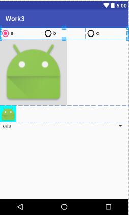
八、Spinner——下拉列表控件
常用属性
spinnerMode 下拉列表模式
entries 数据实体
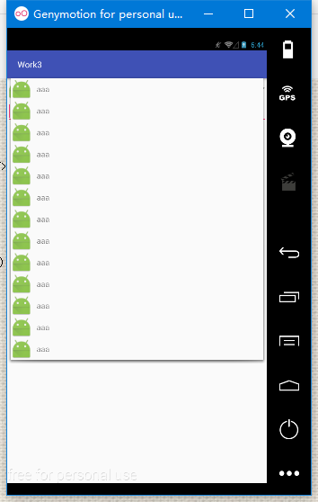
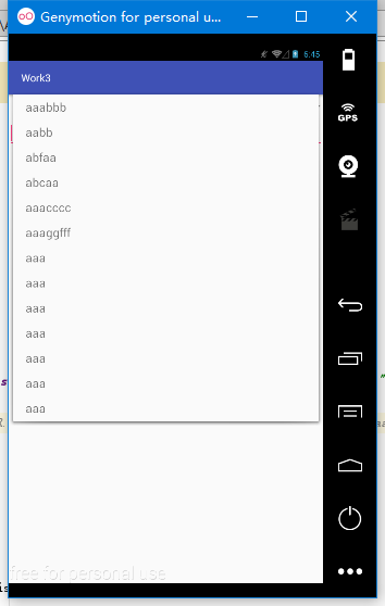
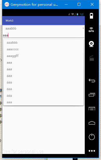
如右图,这个是自定义的布局,具体方法:
1.在layout文件夹下创建一个新的文件layout_list_item.xml
该文件中的内容:
<LinearLayout
xmlns:android="http://schemas.android.com/apk/res/android"
android:layout_width="match_parent"
android:layout_height="wrap_content"
android:orientation="horizontal">
<ImageView
android:layout_width="50dp"
android:layout_height="50dp"
android:src="@mipmap/ic_launcher"/>
<TextView
android:id="@+id/textview"
android:layout_marginLeft="10dp"
android:layout_width="wrap_content"
android:layout_height="wrap_content"
android:layout_gravity="center_vertical"/>
</LinearLayout>
该段代码实现的具体布局,如右图:
常用方法:
setAdapter() 设置数据适配器
setOnItemSelectedListener() 设置当子项选中的监听
getSelectedItem() 获取选中项
getSelectedItemId() 获取选中项id
getSelectedItemPosition() 获取选中项的下标
getSelectedView() 获取选中项视图
接下来是ActivityArrayadapter.class中的文件代码:
protected void onCreate(@Nullable Bundle savedInstanceState) {
super.onCreate(savedInstanceState);
setContentView(R.layout.activity_main_arrayadapter);
spinner = (Spinner) findViewById(R.id.spinner);
auto=(AutoCompleteTextView)findViewById(R.id.auto);
//调用android的布局
//如果不使用系统的布局,可以自定义布局
//系统布局
// ArrayAdapter<String> adapter =
new ArrayAdapter<String>(this,
android.R.layout.simple_list_item_1, 自定义布局
android.R.id.text1, new String[]{"aaabbb", "aabb",
"abfaa", "abcaa", "aaacccc"});
//使用自己的布局,这个布局中,选项的前边会有图片显示
ArrayAdapter<String> adapter =
new ArrayAdapter<String>(this,
R.layout.layout_list_item,R.id.textview,
new String[]{"aaa", "aaa", "aaa", "aaa"});
spinner.setAdapter(adapter);
auto.setAdapter(adapter);
//这些是解决如果下边提示没有时,上边的会没有显示
spinner.setOnItemSelectedListener(itemSelectedLis);
系统布局
}
九、ArrayAdapter——数据适配器
在进行数据显示的时候,经常有大量重复的格式的数据要显示,此时若是一个一个的设置数据会非常麻烦,适配器就是将这样重复的格式的数据自动进行数据的设置的工具
上面的ActivityArrayadapter.class中的文件代码就用到了适配器,请参考:
用法:
ArrayAdapter<String> adapter = new
ArrayAdapter<String>context,layoutRes,textviewId,data);
context:上下文 layoutRes:布局资源
textviewId:textview控件的id data:数据
在需要适配数据的控件调用其setAdapter()方法设置数据
十、 AutoCompleteTextView——建议提示输入框
常用属性:
completionHint 设置出现在下拉菜单中的提示标题
completionThreshold 设置用户至少输入多少个字符才会显示提示
dropDownHeight 下拉菜单的高度
dropDownWidth 下拉菜单的宽度
<!--建议提示输入框-->
<AutoCompleteTextView
android:id="@+id/auto"
android:layout_width="match_parent"
android:layout_height="wrap_content" />
常用方法:
EditText的方法
setAdapter() 设置数据适配器
auto=(AutoCompleteTextView)findViewById(R.id.auto);
auto.setAdapter(adapter);
十一、滚动条的基本使用
Ⅰ:ScrollView——竖向滚动条
Ⅱ:HorizontalScrollView——横向滚动条
常用属性:
scrollbars 滚动条
Horizontal:横向滚动条 vertical:竖向滚动条 none :无滚动条
注意:滚动条里有且只能有一个子控件
<!--注意,ScrolView只能有一个子控件,要想有多个空间,使用Linear Layout包裹-->
例:
<!--虽然高度是充满,但是他是包裹的-->
<!--android:scrollbars="none"无滚动条-->
<!--android:overScrollMode="never" 滚动条到头的提示模式-->
<ScrollView xmlns:android="http://schemas.android.com/apk/res/android"
android:layout_width="match_parent"
android:layout_height="match_parent"
android:scrollbars="none"
android:overScrollMode="never">
十二、ProgressBar——进度条
常用属性:
style 设置进度条样式
max 设置进度条最大值
progress 设置进度条进度值
secondaryProgress 第二进度条
maxHeight/maxWidth 最大宽高
minHeight/minWidth 最小宽高
progressDrawable 设置进度条图片
<!--android:indeterminate="true" 设置进度条不确定值的进度条-->
<!--android:progressDrawable="@drawable/progress_bar_drawable"
我们自定义的进度条-->
<!--高度最大最小android:maxHeight="2dp"
android:minHeight="2dp"-->
<ProgressBar
android:id="@+id/progress_bar"
style="?android:attr/progressBarStyleHorizontal"
android:layout_width="match_parent"
android:layout_height="wrap_content"
android:max="10"
android:progress="4"
android:secondaryProgress="6"
android:progressDrawable="@drawable/progress_bar_drawable"
/>
<!--自定义布局-->
<layer-list xmlns:android="http://schemas.android.com/apk/res/android">
<!--注意顺序不能改变,先写的在最下边显示-->
<!--这一项我们修改背景-->
<item android:id="@android:id/background" android:drawable="@mipmap/a"/>
<!--这一项我们修改第二进度-->
<item android:id="@android:id/secondaryProgress" android:drawable="@mipmap/b"/>
<!--这一项我们修改进度-->
<item android:id="@android:id/progress" android:drawable="@mipmap/c"/>
</layer-list>
常用方法:
setMax() 设置最大值
setProgress() 设置进度值
getProgress() 获取进度值
setSecondaryProgress() 设置第二进度值
getSecondaryProgress() 获取第二进度值
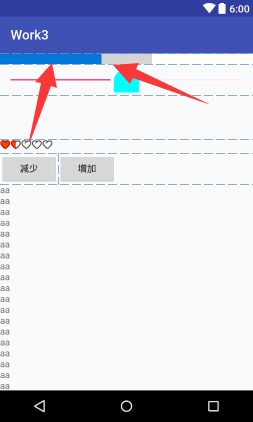
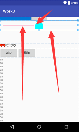
可以实现点击按钮,增加进度和减少进度,包括下边有些内容
都在这代码中:
<!--布局-->

<?xml version="1.0" encoding="utf-8"?>
<!--虽然高度是充满,但是他是包裹的-->
<!--android:scrollbars="none"无滚动条-->
<!--android:overScrollMode="never" 滚动条到头的提示模式-->
<ScrollView xmlns:android="http://schemas.android.com/apk/res/android"
    android:layout_width="match_parent"
    android:layout_height="match_parent"
    android:scrollbars="none"
    android:overScrollMode="never">


    <!--注意,ScrolView只能有一个子控件,要想有多个空间,使用Linear Layout包裹-->
    <LinearLayout
        android:layout_width="match_parent"
        android:layout_height="match_parent"
        android:orientation="vertical">
        <!--横向滚动条-->
        <!--因为是横向滚动条,所以不管你宽度设置多少,他始终是充满的-->
        <HorizontalScrollView
            android:layout_width="match_parent"
            android:layout_height="wrap_content"></HorizontalScrollView>

        <!--进度条-->
        <!--android:indeterminate="true" 设置进度条不确定值的进度条-->
        <!--android:progressDrawable="@drawable/progress_bar_drawable"我们自定义的进度条-->
        <!--高度
        android:maxHeight="2dp"
            android:minHeight="2dp"-->
        <ProgressBar
            android:id="@+id/progress_bar"
            style="?android:attr/progressBarStyleHorizontal"
            android:layout_width="match_parent"
            android:layout_height="wrap_content"
            android:max="10"
            android:progress="4"
            android:secondaryProgress="6"
            android:progressDrawable="@drawable/progress_bar_drawable"
            />

        <!--可以拖拽的进度条-->
        <!-- android:thumb="@mipmap/ic_launcher"自定义图片-->
        <!-- android:thumbOffset="100dp" 偏移量,一般不会用到-->
        <!--android:thumbTint="#0ff"  着色,不管什么图片还是默认,颜色都改变-->
        <!--鼠标悬浮上边这句话时,他的意思是,21版本才可以使用,当前版本是16-->
        <SeekBar
            android:id="@+id/seek_bar"
            android:layout_width="match_parent"
            android:layout_height="wrap_content"
            android:thumb="@mipmap/ic_launcher"
            android:thumbTint="#0ff"
            android:progress="50"/>

        <!-- android:visibility="invisible" 默认隐藏-->
        <!--调整文本框的大小尽量使用边来改变-->
        <TextView
            android:id="@+id/progress"
            android:layout_width="wrap_content"
            android:layout_height="wrap_content"
            android:paddingLeft="50dp"
            android:paddingRight="50dp"
            android:paddingTop="20dp"
            android:paddingBottom="20dp"
            android:background="#cdcdcd"
            android:text="0%"
            android:textSize="22sp"
            android:visibility="invisible"
            android:layout_gravity="center_horizontal"/>

        <!--注意使用时,宽度和高度都使用包裹-->
        <!--android:stepSize="1"每次增长1-->
        <!--android:isIndicator="true" 是否作为指示器,比如QQ等级-->
        <!--style="?android:attr/ratingBarStyleSmall"-->
        <!--hdpi是mdpi的1.5倍,xmdpi是m的2倍-->
        <RatingBar

            android:layout_width="wrap_content"
            android:layout_height="wrap_content"
            android:numStars="5"
            android:rating="1.5"
            android:stepSize="0.5"
            android:progressDrawable="@drawable/rating_bar_drawable"
            android:minHeight="21dp"
            android:maxHeight="21dp"/>


        <LinearLayout
            android:layout_width="match_parent"
            android:layout_height="wrap_content">
            <Button
                android:id="@+id/bt1"
                android:layout_width="wrap_content"
                android:layout_height="wrap_content"

                android:text="减少"/>

            <Button
                android:id="@+id/bt2"
                android:layout_width="wrap_content"
                android:layout_height="wrap_content"
                android:text="增加"/>
        </LinearLayout>

        <!--为了看清楚效果,这里我们把高度设为20dp,text设置多点字符,这样就超出了屏幕-->
        <TextView
            android:layout_width="20dp"
            android:layout_height="wrap_content"
            android:text="aaaaaaaaaaaaaaaaaaaaaaaaaaaaaaaaaaaaaaaaaaaaaaaaaaaaaaaaaaaaaaaaaaaaaaaaaaaaaaaaaaaaaaaaaaaaaaaaaaaaaaaaaaaaaaaaaaaaaaaaaaaaaaaaaaaaaaa"/>
        <Button
            android:layout_width="wrap_content"
            android:layout_height="wrap_content" />
    </LinearLayout>
</ScrollView>
具体功能实现的java代码

package com.dc.work3;

import android.os.Bundle;
import android.support.annotation.Nullable;
import android.support.v7.app.AppCompatActivity;
import android.util.Log;
import android.view.View;
import android.widget.AdapterView;
import android.widget.ImageView;
import android.widget.RadioGroup;
import android.widget.Spinner;

/**
 * Created by 怪蜀黍 on 2016/11/4.
 */

public class MainActivity_radiobutton extends AppCompatActivity {
    private RadioGroup rg;

    private Spinner spinner;

    //重写一个参数的处事方法
    @Override
    protected void onCreate(Bundle savedInstanceState) {
        super.onCreate(savedInstanceState);
        setContentView(R.layout.activity_main_radiobutton);

        rg= (RadioGroup) findViewById(R.id.rg1);
        rg.setOnCheckedChangeListener(changeLis);
        //如果没有任何选中项,返回-1
      //  rg.getCheckedRadioButtonId();
        //选中指定项
       // rg.check(R.id.rb1);
        //清除选中项
       // rg.clearCheck();


        ImageView img=(ImageView) findViewById(R.id.iv);
//        设置图片
        img.setImageResource(R.mipmap.ic_launcher);
        //设置缩放类型
        img.setScaleType(ImageView.ScaleType.CENTER);

        spinner=(Spinner)findViewById(R.id.spinner);
        spinner.setOnItemSelectedListener(itemSelectedListener);

    }
    private AdapterView.OnItemSelectedListener itemSelectedListener =new AdapterView.OnItemSelectedListener() {
        @Override//当项选中时  参数1:触发事件的控件 2:选中的视图 3:选中视图的id
        public void onItemSelected(AdapterView<?> parent, View view, int position, long id) {

        }
        @Override//当没有项选中时
        public void onNothingSelected(AdapterView<?> parent) {

        }
    };

    private RadioGroup.OnCheckedChangeListener changeLis=new RadioGroup.OnCheckedChangeListener() {
        @Override //参数2:选中者的id
        public void onCheckedChanged(RadioGroup group, int checkedId) {
            //获取选中项的数据
            String str=spinner.getSelectedItem().toString();
            //获取选中项的下标
            int position=spinner.getSelectedItemPosition();
            //获取选中项的id
            long id= spinner.getSelectedItemId();
            Log.e("aaaa",str+"========="+position+"========="+id);
        }
    };
}
十三、SeekBar——拖动条
常用属性:
max 最大值
progress 进度值
secondaryProgress 第二进度条
progressDrawable 进度图片
thumb 拖拽按钮
thumbOffset 拖拽按钮位置补偿
maxHeight/maxWidth 最大宽高
minHeight/minWidth 最小宽高
例:
<!--可以拖拽的进度条-->
<!-- android:thumb="@mipmap/ic_launcher"自定义图片-->
<!-- android:thumbOffset="100dp" 偏移量,一般不会用到-->
<!--android:thumbTint="#0ff" 着色,不管什么图片还是默认,颜色都改变-->
<!--鼠标悬浮上边这句话时,他的意思是,21版本才可以使用,当前版本是16-->
<SeekBar
android:id="@+id/seek_bar"
android:layout_width="match_parent"
android:layout_height="wrap_content"
android:thumb="@mipmap/ic_launcher"
android:thumbTint="#0ff"
android:progress="50"/>
常用方法:
setProgress() 设置进度值
getProgress() 获取进度值
setSecondaryProgress() 设置第二进度值
getSecondaryProgress() 获取第二进度值
setSeekBarChangeListener() 设置seekbar拖动改变监听
具体代码:在上一个代码中
十四、RatingBar——等级条
常用方法:
numStars 最大值
rating 等级值
stepSize 最小步进值
progressDrawable 进度图片
isIndicator 是否是指示器
例:
<!--注意使用时,宽度和高度都使用包裹-->
<!--android:stepSize="1"每次增长1-->
<!--android:isIndicator="true" 是否作为指示器,比如QQ等级-->
<!--style="?android:attr/ratingBarStyleSmall"-->
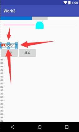
<!--hdpi是mdpi的1.5倍,xmdpi是m的2倍-->
<RatingBar
android:layout_width="wrap_content"
android:layout_height="wrap_content"
android:numStars="5"
android:rating="1.5"
android:stepSize="0.5"
android:progressDrawable="@drawable/rating_bar_drawable"
android:minHeight="21dp"
android:maxHeight="21dp"/>
自定义的布局
<!--注意:顺序不可以改变,先写的在最下一层-->
<!--背景-->
<!--第二进度-->
<!--进度-->
<item
android:id="@android:id/background"
android:drawable="@mipmap/favour_icon"/>
<item
android:id="@android:id/secondaryProgress"
android:drawable="@mipmap/favour_icon"/>
<item
android:id="@android:id/progress"
android:drawable="@mipmap/favoured_icon"/>