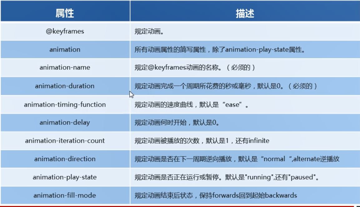
动画是CSS3中具有颠覆性的特征之一,可以通过设置多个节点来精确控制一个或者一组动画,常常用来实现复杂的动画效果。相比较过度,动画可以实现更多变化,更多控制,连续自动(不需要鼠标经过和鼠标离开来控制)播放等效果。
5.1动画的基本使用
- 先定义动画
- 再使用(调用)动画
5.1.1用keyframes定义动画(类似定义类选择器)
@keyframes 动画名称 {
	0% {
		 100px;
	}
	100% {
		 200px;
	}
}
动画序列
- 0%是动画的开始,100%是动画的结尾。这样的规则就是动画序列。
- 在@keyframes中规定某项CSS样式,就能创建以当前样式逐渐转化为新样式的动画效果。
- 动画是使元素从一种样式逐渐变化为另一种样式的效果。我们可以改变任意多的样式任意多的次数。
- 请用百分比来规定变化发生的时间,或者用关键词from和to,等同于0%和100%
5.1.2元素使用动画
/*调用动画*/
animation-name: 动画名称;
/*持续时间*/
animation-duration: 持续时间;
举例:
<body>
	<div></div>
</body>
<style type="text/css">
	/*1. 定义动画*/
	@keyframes move {
		0% {
			transform: translateX(0px);
		}
		100% {
			transform: translateX(1000px);
		}
	}
		div {
			 200px;
			height: 200px;
			background-color: pink;
			/*2. 调用动画*/
			animation-name: move;
			/*3. 持续时间*/
			animation-duration: 2s;

		}
</style>
5.2动画序列
动画序列
- 0%是动画的开始,100%是动画的结尾。这样的规则就是动画序列。
- 在@keyframes中规定某项CSS样式,就能创建以当前样式逐渐转化为新样式的动画效果。
- 动画是使元素从一种样式逐渐变化为另一种样式的效果。我们可以改变任意多的样式任意多的次数。
- 请用百分比来规定变化发生的时间,或者用关键词from和to,等同于0%和100%
<body>
	<div></div>
</body>
<style type="text/css">
	/*动画序列*/
	/*1.可以做多个状态的变化keyframe关键帧*/
	/*2. 里面的百分比要是整数*/
	/*3. 里面的百分比是总时间(这个案例是10s)的划分 25% * 10 = 2.5s*/
	@keyframes move {
		0% {
			transform: translate(0,0);//这里可以空着,甚至不写
		}
		25% {
			transform: translate(1000px,0);
		}
		50% {
			transform: translate(1000px,500px);
		}
		75% {
			transform: translate(0,500px);
		}
		100% {
			transform: translate(0,0);
		}
	}
	div {
		 100px;
		height: 100px;
		background-color: pink;
		animation-name: move;
		animation-duration: 10s;
	}
</style>
5.3动画属性
5.3.1动画的常用属性
<body>
	<div></div>
</body>
<style type="text/css">
	@keyframes move {
		from {
			transform: translate(0,0);//这里可以空着,甚至不写
		}
		50% {
			transform: translate(1000px,0);
		}
		to {
			transform: translate(1000px,500px);
		}

	}
	div {
		 100px;
		height: 100px;
		background-color: pink;
		/*动画名称*/
		animation-name: move;
		/*持续时间*/
		animation-duration: 5s;
		/*运动曲线*/
		animation-timing-function: ease;
		/*何时开始*/
		animation-delay: 1s;
		/*重复次数*/
		animation-iteration-count: 2;
		/*是否反方向*/
		animation-direction: normal;
		/*动画结束后的状态 默认是backwards回到起始状态,我们可以让它停留在结束状态forwards*/
		animation-fill-mode: forwards;
	}
	div:hover {
		/*鼠标经过div 让这个div停止动画,鼠标离开就继续动画*/
		animation-play-state: paused;
	}
</style>
5.3.2 速度曲线细节
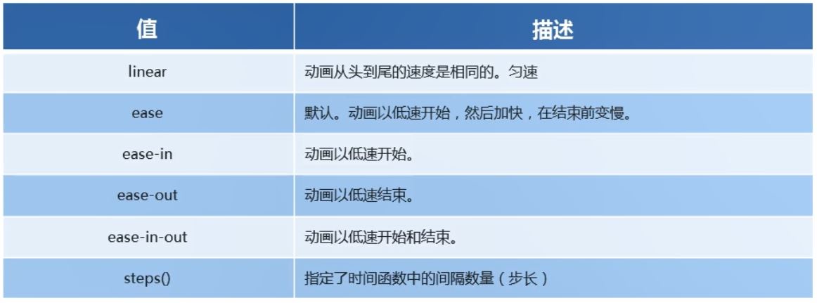
对于steps()举例
<body>
	<div></div>
</body>
<style type="text/css">
	div {
		 0;
		height: 30px;
		background-color: pink;
		animation: w 4s steps(10) forwards;/*steps(10)一步一步地走,走10步到达200px*/
	}
	@keyframes w {
		0% {
			 0;
		}
		100% {
			 200px;
		}
	}
</style>
利用steps()实现打字机效果
<body>
	<div>我可以实现打字机效果</div>
</body>
<style type="text/css">
	div {
		overflow: hidden;
		font-size: 20px;/*字号是按照字符的高度和宽度来规定的,一个汉字字符在显示器上他的高度是有几行点来表示就是几号字,20号字就是从上到下20*20个点来表示*/
		 0;
		height: 30px;
		background-color: pink;
		white-space: nowrap;/*让文字强制一行内显示*/
		animation: w 4s steps(10) forwards;/*steps(10)一步一步地走,走10步到达200px*/
	}
	@keyframes w {
		0% {
			 0;
		}
		100% {
			 200px;/*一共10个字,每个字20px,这10个子一共宽度为200px*/
		}
	}
</style>
steps()强化练习案例:奔跑的熊
<body>
	<div></div>
</body>
<style type="text/css">
	body {
		background-color: #ccc;
	}
	div {
		position: absolute;
		 200px;
		height: 100px;
		background: url(media/bear.png) no-repeat;
		/*元素可以添加多个动画,用逗号隔开*/
		animation: bear 3s steps(8) infinite, move 1s;
	}
	@keyframes bear {
		0% {
			background-position: 0 0;
		}
		100% {
			background-position: -1600px 0;
		}
	}
	@keyframes move {
		0% {
			left: 0;
		}
		100% {
			left: 50%;
			transform: translateX(-50%);
		}
	}
</style>
5.3.3 属性简写:
animation: 动画名称 持续时间 运动曲线 何时开始 播放次数 是否反方向 动画起始或者结束状态
eg
animation: myfirst 5s linear 2s infinite alternative
- 前两个属性-name和-duration一定要写
- 简写属性里面不包括animation-play-state
- 暂停动画:animation-play-state: paused;经常和鼠标经过等其他配合使用。
- 想要动画走回来,而不是直接跳回来:animation-direction:alternate
- 盒子动画结束后,停在结束位置:animation-fill-mode:forwards
<body>
	<div></div>
</body>
<style type="text/css">
	@keyframes move {
		from {
			transform: translate(0,0);//这里可以空着,甚至不写
		}
		50% {
			transform: translate(1000px,0);
		}
		to {
			transform: translate(1000px,500px);
		}

	}
	div {
		 100px;
		height: 100px;
		background-color: pink;
		/*简写*/
		animation: move 5s linear 2s infinite alternate forwards;
	}
	div:hover {
		/*鼠标经过div 让这个div停止动画,鼠标离开就继续动画*/
		animation-play-state: paused;
	}
</style>
5.4热点图案例 波纹效果
<body>
	<div class="map">
		<div class="city">
			<div class="dotted"></div>
			<div class="pulse1"></div>
			<div class="pulse2"></div>
			<div class="pulse3"></div>
		</div>
		<div class="city tb">
			<div class="dotted"></div>
			<div class="pulse1"></div>
			<div class="pulse2"></div>
			<div class="pulse3"></div>
		</div>
	</div>
</body>
<style type="text/css">
	.map {
		position: relative;
		 747px;
		height: 616px;
		background: url(media/map.jpg) no-repeat;
		margin: 0 auto;
	}
	.city {
		position: absolute;
		top: 70px;
		right: 100px;
		color: #fff;
	}
	.tb {
		top: 170px;/*不可以用left和bottom,为的就是将上面.city中的值给铺盖掉,而且如果同时有top和bottom,优先满足top*/
		right: 200px;
	}
	.dotted {
		 8px;
		height: 8px;
		background-color: #09f;
		border-radius: 50%;
	}
	.city div[class^="pulse"] {/*以pulse开头的div盒子   权重: 10+1+10=21*/
		position: absolute;
		top: 50%;
		left: 50%;
		transform: translate(-50%, -50%);
		 8px;
		height: 8px;
		box-shadow: 0 0 12px #009dfd;
		border-radius: 50%;
		animation: pulse 1.2s linear infinite;
	}
	.city div.pulse2 {/*10+1+10=21*/
		animation-delay: 0.3s;
	}
	.city div.pulse3 {/*10+1+10=21*/
		animation-delay: 0.6s;
	}
	@keyframes pulse {/*这里的放大是通过改变width和height,而没有用scale,这是因为用scale放大时会把阴影也一起放大了,结果并不好看*/
		0% {}
		70% {
			 40px;
			height: 40px;
			opacity: 1;/*透明的不变*/
		}
		100% {
			 70px;
			height: 70px;
			opacity: 0;
		}
	}
</style>