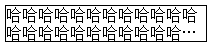
1.text-overflow:ellipsis实现
overflow: hidden;
text-overflow: ellipsis;//clip|ellipsis
white-space: nowrap;
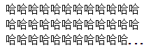
2.-webkit-line-clamp
 200px;
overflow : hidden;
text-overflow: ellipsis;
display: -webkit-box;
-webkit-line-clamp: 2;
-webkit-box-orient: vertical;
border:solid 1px black;
3.用包含省略号(…)的元素模拟实现
.demo {
    height: 200px;
     200px;
    position:relative;
    line-height:1.4em;
    height:4.2em;
    overflow:hidden;
}
.demo::after {
    content:"...";
    font-weight:bold;
    position:absolute;
    bottom:0;
    right:0;
    padding:0 -20px 1px 45px;
    background-color:white;
}
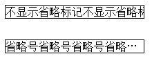
这里用一个包含了省略号,且背景色为白色的伪元素遮盖了部分内容。高度 height 是行高 line-height 的三倍。需要显示几行文字就设置为几倍。
这种思路实现较为简单,兼容性也比较好