
通过导入相应的sql文件得到数据库文件。之后通过数据库的查找得到相应的数据。通过list进行保存传输。
之后展示一下数据库的信息。
对于助兴图标的生成主要是因为对于插件的不理解当误了时间。最后了解了插件,就比较简单了。
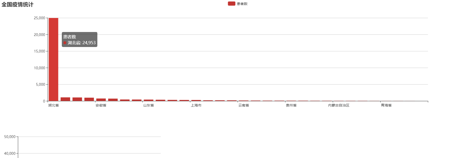
传递相应的名称以及对应的数值,直接就会生成柱状图。
具体的代码如下:
主要的jsp的页面(包含图表和信息列表。通过div来分析上下):
<%@ page language="java" contentType="text/html; charset=UTF-8"
    pageEncoding="UTF-8"%>
    <%@ taglib prefix="c" uri="http://java.sun.com/jsp/jstl/core" %>
    <%@page import="com.yiqing.users.*"%>
<%@page import="java.util.ArrayList"%>

<%@ taglib prefix="c" uri="http://java.sun.com/jsp/jstl/core" %>
<!DOCTYPE html>
<html>
<head>
<meta name="viewport" content="width=device-width, initial-scale=1">
 <link rel="stylesheet" href="https://cdn.staticfile.org/twitter-bootstrap/4.3.1/css/bootstrap.min.css">
 <script src="https://cdn.staticfile.org/jquery/3.2.1/jquery.min.js"></script>
 <script src="https://cdn.staticfile.org/popper.js/1.15.0/umd/popper.min.js"></script>
 <script src="https://cdn.staticfile.org/twitter-bootstrap/4.3.1/js/bootstrap.min.js"></script>
    <meta charset="utf-8">
    <title>ECharts</title>
    <!-- 引入 echarts.js -->
    <script src="js/echarts.min.js"></script>
</head>
<body>
    <div id="main" style="height:400px"></div>
    <div>
        <table class="table table-hover table-striped table-bordered table-sm" id="resultshow">
            <tr>

                <th>日期</th>
                <th>城市</th>
                <th>新增病例</th>
                <th>原有病例</th>
                <th>死亡人数</th>
                <th>总人数</th>
                <th>治愈人数</th>

            </tr>
            <%ArrayList<heibeicity> list=(ArrayList<heibeicity>)request.getAttribute("list1");%>
            <c:forEach var="l" items="<%=list %>" varStatus="i">
                <tr>

                    <td>${l.getDate()}</td>
                    <td>${l.getCity()}</td>
                    <td>${l.getNew_confirmed_num()}</td>
                    <td>${l.getConfirmed_num()}</td>
                    <td>${l.getDead_num()}</td>
                    <td>${l.getZhong_num()}</td>
                    <td>${l.getCured_num()}</td>


                </tr>
            </c:forEach>
        </table>
    </div>
    <script type="text/javascript">
    // 基于准备好的dom,初始化echarts实例
    var myChart = echarts.init(document.getElementById('main'));

    var arr = new Array();
    var index = 0;
    <c:forEach items="${pres}" var="goods">
        arr[index++] = ${goods.getConfirmed_num()};
    </c:forEach>

    // 指定图表的配置项和数据
    var option = {
        title: {
            text: '全国疫情统计'
        },
        tooltip: {
            show: true
        },
        legend: {
            data:['患者数']
        },
        xAxis : [
            {
                type : 'category',
                data : [
                    <c:forEach items="${pres}" var="g">
                    ["${g.getProvince()}"],
                    </c:forEach>
                ]
            }
        ],
        yAxis : [
            {
                type : 'value'
            }
        ],
        series : [
            {
                name:'患者数',
                type:'bar',
                data: arr
            }
        ]
    };

    // 使用刚指定的配置项和数据显示图表。
    myChart.setOption(option);
</script>
</body>
</html>
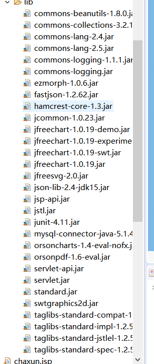
其余的都是普通的相关数据库的操作。然后总要的就是自己导入的jar包
包括页面样式和图表的所有的jar包如下:
柱形图折线图的同同时出现:
<%@ page language="java" contentType="text/html; charset=UTF-8"
    pageEncoding="UTF-8"%>
    <%@ taglib prefix="c" uri="http://java.sun.com/jsp/jstl/core" %>
    <%@page import="com.yiqing.users.*"%>
<%@page import="java.util.ArrayList"%>

<%@ taglib prefix="c" uri="http://java.sun.com/jsp/jstl/core" %>
<!DOCTYPE html>
<html>
<head>
<meta name="viewport" content="width=device-width, initial-scale=1">
 <link rel="stylesheet" href="https://cdn.staticfile.org/twitter-bootstrap/4.3.1/css/bootstrap.min.css">
 <script src="https://cdn.staticfile.org/jquery/3.2.1/jquery.min.js"></script>
 <script src="https://cdn.staticfile.org/popper.js/1.15.0/umd/popper.min.js"></script>
 <script src="https://cdn.staticfile.org/twitter-bootstrap/4.3.1/js/bootstrap.min.js"></script>
    <meta charset="utf-8">
    <title>ECharts</title>
    <!-- 引入 echarts.js -->
    <script src="js/echarts.min.js"></script>
     <script src="${pageContext.request.contextPath}/resource/echarts.js"></script>
</head>
<body>
    <div id="main" style="height:400px"></div>
    <div id="main1" style=" 600px;height:400px;"></div>
    <div>
        <table class="table table-hover table-striped table-bordered table-sm" id="resultshow">
            <tr>

                <th>日期</th>
                <th>城市</th>
                <th>新增病例</th>
                <th>原有病例</th>
                <th>死亡人数</th>
                <th>总人数</th>
                <th>治愈人数</th>

            </tr>
            <%ArrayList<heibeicity> list=(ArrayList<heibeicity>)request.getAttribute("list1");%>
            <c:forEach var="l" items="<%=list %>" varStatus="i">
                <tr>

                    <td>${l.getDate()}</td>
                    <td>${l.getCity()}</td>
                    <td>${l.getNew_confirmed_num()}</td>
                    <td>${l.getConfirmed_num()}</td>
                    <td>${l.getDead_num()}</td>
                    <td>${l.getZhong_num()}</td>
                    <td>${l.getCured_num()}</td>


                </tr>
            </c:forEach>
        </table>
    </div>
    <script type="text/javascript">
    // 基于准备好的dom,初始化echarts实例
    var myChart = echarts.init(document.getElementById('main'));

    var arr = new Array();
    var index = 0;
    <c:forEach items="${pres}" var="goods">
        arr[index++] = ${goods.getConfirmed_num()};
    </c:forEach>

    // 指定图表的配置项和数据
    var option = {
        title: {
            text: '全国疫情统计'
        },
        tooltip: {
            show: true
        },
        legend: {
            data:['患者数']
        },
        xAxis : [
            {
                type : 'category',
                data : [
                    <c:forEach items="${pres}" var="g">
                    ["${g.getProvince()}"],
                    </c:forEach>
                ]
            }
        ],
        yAxis : [
            {
                type : 'value'
            }
        ],
        series : [
            {
                name:'患者数',
                type:'bar',
                data: arr
            }
        ]
    };

    // 使用刚指定的配置项和数据显示图表。
    myChart.setOption(option);
</script>
<script type="text/javascript">
    // 基于准备好的dom,初始化echarts实例
    var myChart = echarts.init(document.getElementById('main1'));

    var sale = new Array;
    var index = 0;
    <c:forEach items="${pres}" var="goods">
        sale[index++] = ${goods.getConfirmed_num()};
    </c:forEach>

    option = {
        tooltip: {
            trigger: 'axis',
            position: function (pt) {
                return [pt[0], '10%'];
            }
        },
        title: {
            left: 'center',
            text: '超市商品销量图',
        },
        toolbox: {
            feature: {
                dataZoom: {
                    yAxisIndex: 'none'
                },
                restore: {},
                saveAsImage: {}
            }
        },
        xAxis: {
            type: 'category',
            boundaryGap: false,
            data: [
                <c:forEach items="${pres}" var="g">
                    ["${g.getProvince()}"],
                </c:forEach>
            ]
        },
        yAxis: {
            type: 'value',
            boundaryGap: [0, '100%']
        },
        dataZoom: [{
            type: 'inside',
            start: 0,
            end: 10
        }, {
            start: 0,
            end: 10,
            handleIcon: 'M10.7,11.9v-1.3H9.3v1.3c-4.9,0.3-8.8,4.4-8.8,9.4c0,5,3.9,9.1,8.8,9.4v1.3h1.3v-1.3c4.9-0.3,8.8-4.4,8.8-9.4C19.5,16.3,15.6,12.2,10.7,11.9z M13.3,24.4H6.7V23h6.6V24.4z M13.3,19.6H6.7v-1.4h6.6V19.6z',
            handleSize: '80%',
            handleStyle: {
                color: '#fff',
                shadowBlur: 3,
                shadowColor: 'rgba(0, 0, 0, 0.6)',
                shadowOffsetX: 2,
                shadowOffsetY: 2
            }
        }],
        series: [
            {
                name:'商品销量',
                type:'line',
                smooth:true,
                symbol: 'none',
                sampling: 'average',
                itemStyle: {
                    normal: {
                        color: 'rgb(255, 70, 131)'
                    }
                },
                areaStyle: {
                    normal: {
                        color: new echarts.graphic.LinearGradient(0, 0, 0, 1, [{
                            offset: 0,
                            color: 'rgb(255, 158, 68)'
                        }, {
                            offset: 1,
                            color: 'rgb(255, 70, 131)'
                        }])
                    }
                },
                data: sale
            }
        ]
    };

    // 使用刚指定的配置项和数据显示图表。
    myChart.setOption(option);
</script>
</body>
</html>
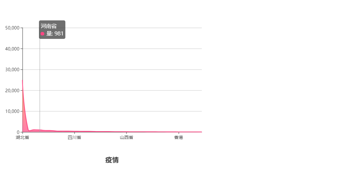

都是在同一个界面显示的(表格和图表使用的不是一个数据库。所以对应的数值不是相对应的)