sticky简介
- sticky的本意是粘的,粘性的,使用其进行的布局被称为粘性布局。
- sticky是position属性新推出的值,属于CSS3的新特性,常用与实现吸附效果。
- 设置了sticky布局的元素,在视图窗口时,与静态布局的表现一致。
- 但当该元素的位置移出设置的视图范围时,其定位效果将变成fixed,并根据设置的left、top等作为其定位参数。
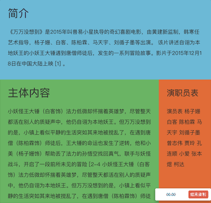
- 具体效果如下,当页面滚动至下方,原本静态布局的「演职员表」将变为fixed布局,固定在页面顶部。
sticky兼容性
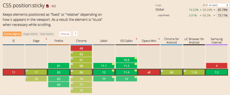
下图可见,除了IE以外,目前绝大部分浏览器都是支持sticky布局。
需求背景
- 但是实际情况并不如上图展示的那么美好,在360安全浏览器上,并不支持sticky布局,即使使用极速模式(使用chrome内核运行)也不支持。
- 另外,笔者在网上找过相关的vue-sticky组件。但是使用起来并不是那么顺手,而且看其源码也是一头雾水,用着不踏实。
- 所以自己写了一个,希望通过本文能将组件分享出去,也希望将本组件的原理讲清楚。让其他同学在使用的时候能更踏实一些。遇到坑也知道该怎么去填。希望能帮到大家。
面向人群
- 急于使用vue-sticky组件的同学。直接下载文件,拷贝代码即可运行。
- 喜欢看源码,希望了解组件背后原理的同学。
其实本sticky组件原理很简单,看完本文,相信你一定能把背后原理看懂。
刚接触前端的同学也可以通过本文章养成看源码的习惯。打破对源码的恐惧,相信自己,其实看源码并没有想象中的那么困难
组件完整源码如下
<!--sticky组件-->
<template>
  <!--盒子容器-->
  <section ref="$box" class="c-sticky-box" :style="boxStyle">
    <!--内容容器-->
    <div ref="$content" class="content" :style="contentStyle">
      <slot></slot>
    </div>
  </section>
</template>

<script>

export default {
  props: {
    top: {
      type: [String],
      default: 'unset',
    },
    left: {
      type: [String],
      default: 'unset',
    },
  },

  data() {
    return {
      boxStyle: {
        position: 'static',
        top: 0,
        left: 0,
         'auto', // 占位,为了形成数据绑定
        height: 'auto',
      },
      contentStyle: {
        position: 'static',
        top: 0,
        left: 0,
         'auto',
        height: 'auto',
      },
      isFixedX: false, // 是否已经设置为fixed布局,用于优化性能,防止多次设置
      isFixedY: false, // 是否已经设置为fixed布局,用于优化性能,防止多次设置
      isSupport: this.cssSupport('position', 'sticky'),
      // isSupport: false,
    }
  },

  mounted() {
    if (!this.isSupport) { // 不支持sticky
      this.getContentSize() // 获取内容宽高
      this.scrollHandler() // 主动触发一次位置设置操作
      window.addEventListener('resize', this.onResize)
      window.addEventListener('scroll', this.scrollHandler, true)
    } else {
      this.boxStyle = {
        position: 'sticky',
        top: this.top,
        left: this.left,
      }
    }
  },

  beforeDestroy() {
    if (!this.isSupport) {
      window.removeEventListener('resize', this.onResize)
      window.removeEventListener('scroll', this.scrollHandler, true)
    }
  },

  methods: {
    // 判断是否支持某样式的函数
    cssSupport(attr, value) {
      let element = document.createElement('div')
      if (attr in element.style) {
        element.style[attr] = value
        return element.style[attr] === value
      } else {
        return false
      }
    },

    // 获取dom数据
    getContentSize() {
      // 获取内容容器宽高信息
      const style = window.getComputedStyle(this.$refs.$content)

      // 设置盒子容器的宽高,为了后续占位
      this.boxStyle.width = style.width
      this.boxStyle.height = style.height
    },

    // 页面缩放重置大小时,重新计算其位置
    onResize() {
      const { $box } = this.$refs
      const { contentStyle } = this
      const boxTop = $box.getBoundingClientRect().top
      const boxLeft = $box.getBoundingClientRect().left

      if (contentStyle.position === 'fixed') {
        contentStyle.top = this.top === 'unset' ? `${boxTop}px` : this.top
        contentStyle.left = this.left === 'unset' ? `${boxLeft}px` : this.left
      }
    },

    scrollHandler() {
      const { $content, $box } = this.$refs
      const { contentStyle } = this
      const boxTop = $box.getBoundingClientRect().top
      const boxLeft = $box.getBoundingClientRect().left
      const contentTop = $content.getBoundingClientRect().top
      const contentLeft = $content.getBoundingClientRect().left

      if (this.top !== 'unset') {
        if (boxTop > parseInt(this.top) && this.isFixedY) {
          this.isFixedY = false
          contentStyle.position = 'static'
        } else if (boxTop < parseInt(this.top) && !this.isFixedY) {
          this.isFixedY = true
          contentStyle.position = 'fixed'
          this.onResize()
        }

        // 当位置距左位置不对时,重新设置fixed对象left的值,防止左右滚动位置不对问题
        if (contentLeft !== boxLeft && this.left === 'unset') {
          this.onResize()
        }
      }

      if (this.left !== 'unset') {
        if (boxLeft > parseInt(this.left) && this.isFixedX) {
          this.isFixedX = false
          contentStyle.position = 'static'
        } else if (boxLeft < parseInt(this.left) && !this.isFixedX) {
          this.isFixedX = true
          contentStyle.position = 'fixed'
          this.onResize()
        }

        // 当位置距左位置不对时,重新设置fixed对象left的值,防止左右滚动位置不对问题
        if (contentTop !== boxTop && this.top === 'unset') {
          this.onResize()
        }
      }
    },
  },

}
</script>
技术难点
sticky效果需要解决这么几个问题
- 占位问题,sticky实现原理,无非是在特定超出视图时,将内容的布局设为fixed。但将内容设置为fixed布局时,内容将脱离文档流,原本占据的空间将被释放掉,这将导致页面空了一块后其他内容发生位移。
- 页面resize后位置问题。当使用fixed定位时,其定位将根据页面进行。若页面大小发现变化,原显示的位置可能与页面变化后的不一致。这时需要重新设置。
- 横向滚动条问题。本质上和resize是同一个问题,需要监听scroll事件,当页面发送无相关方向的位移时,需要重新计算其位置,例如前面的sticky效果示例中设置了「演职员表」的top值,当其fixed后,滚动X轴,需要重新设置fixed的left参数。让元素始终位于页面相同位置
实现思路
-
组件有两层容器
- 一个是内容slot的容器$content
- 一个是内容容器$content的sticky盒子容器$box
- 即包围关系为$sticky-box($content(slot))
<section ref="$box" class="c-sticky-box" :style="boxStyle"> <div ref="$content" class="content" :style="contentStyle"> <slot></slot> </div> </section> -
监听vue的mounted事件
- 这时内容slot已经被渲染出来
- 获取slot容器$content的宽高,设置到$box容器上
- 设置$box容器宽高是为了当后续$content容器Fixed后,$box容器仍在页面中占据空间。
const style = window.getComputedStyle(this.$refs.$content) this.boxStyle.width = style.width this.boxStyle.height = style.height -
监听scroll事件
- 在事件中获取容器$content在页面中的位置,并将其与预设值进行大小比较,判断$content是否应该fixed
- 怎么便捷地获取$content在页面中的位置呢?直接使用Element.getBoundingClientRect()函数,该函数将返回{left,top}分别表示dom元素距离窗口的距离。详细可参看MDN文档
const { $content, $box } = this.$refs const { contentStyle } = this const boxTop = $box.getBoundingClientRect().top const boxLeft = $box.getBoundingClientRect().left const contentTop = $content.getBoundingClientRect().top const contentLeft = $content.getBoundingClientRect().left- 比较boxTop与预设值top的大小,当boxTop比预设值值要小时,即内容即将移出规定的视图范围。这时将内容容器$content设置为fixed。并设置其top值(即预设的top值,吸顶距离),left值与盒子位置相同,故设置为盒子距离的left值
- 当boxTop比预设值值要大时,即内容重新返回的视图范围。则将内容容器$content重新设置会静态布局,让其重新回到盒子布局内部。由于静态布局不受left和top的影响,所以不需要设置left和top
if (boxTop > parseInt(this.top) && this.isFixedY) { contentStyle.position = 'static' } else if (boxTop < parseInt(this.topI) && !this.isFixedY) { contentStyle.position = 'fixed' contentStyle.top = this.top contentStyle.left = `${boxLeft}px` }- 在scroll事件中,除了Y轴方向上的滚动,还可能发生X轴方向的滚动。这些需要重新设置fixed元素的left值,让其与盒子容器的left值一致
// 当位置距左位置不对时,重新设置fixed对象left的值,防止左右滚动位置不对问题 if (contentLeft !== boxLeft && this.left === 'unset') { const { $box } = this.$refs const { contentStyle } = this const boxTop = $box.getBoundingClientRect().top const boxLeft = $box.getBoundingClientRect().left if (contentStyle.position === 'fixed') { contentStyle.top = this.top contentStyle.left = `${boxLeft}px` } } -
最后,是监听页面的resize事件,防止页面大小变化时,fixed相对页面的变化。同样的,重新设置left值
// 当位置距左位置不对时,重新设置fixed对象left的值,防止左右滚动位置不对问题
const { $box } = this.$refs
const { contentStyle } = this
const boxTop = $box.getBoundingClientRect().top
const boxLeft = $box.getBoundingClientRect().left

if (contentStyle.position === 'fixed') {
  contentStyle.top = this.top === 'unset' ? `${boxTop}px` : this.top
  contentStyle.left = this.left === 'unset' ? `${boxLeft}px` : this.left
}
需要注意的地方
- 目前仅支持top与left值的单独使用,暂不支持同时设置
- 目前仅支持px单位,暂不支持rem及百分比单位
-
设置内容样式时需要注意,设置定位相关属性需要设置在box容器上,例如设置'displCy: inline-block;','verticCl-Clign: top;','margin'
- 设置外观样式,如背景,边框等,则设置在slot内容中
- 即内容content-box以外的设置在box容器中,content-box以内的样式,则设置在slot内容中
- 盒子容器不需要设置position属性,即使有也会被冲刷掉。因为程序将内部重新设置position的值
- 同样的,在样式中设置盒子容器的left和top值也是无效的,会被程序内部重新设置。只能通过dom属性值传递到组件中进行设置
后续优化
目前本组件仅实现了基本功能,后续还将继续优化以下功能
-
slot内容中,如果有图片,如果获取设置宽高,(监听所有图片的load事件,重新设置容器的高宽)
- 目前仅在mounted中获取slot的宽高,这仅仅是dom元素被渲染,但是dom内容是否加载完毕并不知道的,如img标签,后续在slot中,监听所有img标签的load事件,load中,重新设置组件容器的大小
-
slot内容有变化时,设置容器
- 同样的,当slot内容变化后,重新设置$content的宽高
- 具体如何实现,暂时还没有头绪
-
移动端适配
- 目前只测试了在PC中的效果,暂未在移动端做测试。不排除移动端使用存在坑
-
单位适配
- 目前只支持PX单位,未支持rem,百分百等单位
- left和top值的混合使用,目前只支持单个属性的使用,暂不支持同时设置