这两天真的被这个问题抓狂,找了好多都没有效果,百试无用。
不过有句话说的很对:方法总比问题多。遇到问题总会有解决方法,只要你愿意试。
下面说下我的方法,其实很简单
没改前时这样的,canvas超出父级div的宽度

改之后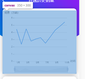
话不多说,上代码
// 图表
var myChart = echarts.init(document.getElementById('sale-chart'));
var legend="";
// 指定图表的配置项和数据
var option = {
        //图表配置标题
        title: {
            text: '销量(万辆)',
            textStyle: {
                fontSize: 12,
                fontWeight: 400,
                color: '#000000'
            },
            left: 5
        },
        color:'#0E76E4',
        //配置提示信息
        tooltip: {
            trigger: 'axis',
            axisPointer: {
                type: 'shadow'
            }
        },
        legend: {
            show: true,
            right: '10%',
            top: 2,
            itemWidth: 10,
            itemHeight: 4,
            textStyle: {
                color: '#1a1a1a',
                fontSize: 12,
                icon: 'rect',
            },
            data:legend
        },
//设置中间内容距离div的距离,也就是内边距
        grid: {
            top: 35,
            left: 55,
            right: 45,
            'auto',
            height:'auto'
        },
        dataZoom: [{
            type: 'inside'
        }, {
            type: 'slider'
        }],


        // ],
        //x轴
        xAxis: {
            name: '时间', // 给X轴加单位
            nameLocation: 'end',
            type: 'category',
            //x轴文字配置
            axisLabel: {
                show: true,
                inside: false,
                align: 'left',
                margin: 2,
                textStyle: {
                    color: '#1a1a1a',
                    fontSize: '10'
                }
            },
            axisTick: {
                show: false
            }, //去掉x轴刻度线
            // data: ["1月", "2月", "3月", "4月", "5月", "6月", "7月", "8月"],
            data: [],
            axisLine: {
                show: false,
                length: 3,
            }
        },
        //y轴
        yAxis: {
            axisLabel: {
                show: true,
                textStyle: {
                    color: '#1a1a1a',
                    fontSize: '10'
                }
            },
            axisLine: {
                show: false //y轴刻度线不显示
            }

        },
        series: [{
            // name: "",
            type: 'line', //图表类型
            // data: [266, 200, 306, 100, 100, 280, 500, 500],
            data: [],
            symbol: 'none',

        }]


};
// 使用刚指定的配置项和数据显示图表。 -->
myChart.setOption(option);
//请求图表数据
function chartData(){
    $.ajax({
        type: "get",
        url: "”,
        dataType: "jsonp",
        success: function (json) {
            console.log(json);

            // 需要倒序数组
            myChart.setOption({
                xAxis: {
                    data: monthData.reverse()
                },
                series: {
                    data: saleData.reverse()
                },
                legend: {
                    data: legend
                },
            });
        //最关键,自动调整canvas的
            myChart.resize();


        },
        error: function () {
            console.log("请求失败");
        }
    })
}
放了这么多代码,其他配置好就两句话
  调用时加上 myChart.resize();
  设置内边距   grid
还有就是给父级的div宽度设置100%;

问题就解决了