最近项目有多处是用echarts的,有环形图,折线图,饼图,总结了一下。
本次主要讲环形图,折线图在下期。
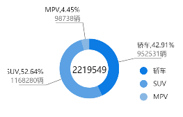
这个是最终的效果图。下面附上代码
//三种占比
var myChartType = echarts.init(document.getElementById('type_chart'));
var gailanTotal="";
option = {
    legend: {
        icon: "circle",
        orient: 'vertical',
        right: 50,
        bottom: 20,
        selectedMode: false, //取消图例上的点击事件
        data: ['轿车', 'SUV', 'MPV']
    },
    //点击提示文字
    tooltip: {
        trigger: 'item',
        formatter: "{a} <br/>{b}: {c} ({d}%)",


    },
    //环形颜色
    color: ['#0C7BE3', '#5BA1E3', '#88B7E3'],
    // 设置环形中间的数据
    graphic: [{
        type: 'text',
        left: '34%',
        top: '55%',
        z: 10,
        style: {
            fill: '#1a1a1a',
            text: gailanTotal,
            font: '16px Microsoft YaHei'
        }
    }],
    series: [{
        name: '访问来源',
        type: 'pie',
        radius: ['35%', '55%'], //两个表示环:内半径,外半径
        center: ['43%', '58%'],//左右,上下
        avoidLabelOverlap: false,
        label: {
            normal: {
                show: true,
                position: 'outer',
                // formatter: '{d}%, {c}

',
                //模板变量有 {a}, {b},{c},{d},{e},分别表示系列名,数据名,数据值等。
                formatter: "{a_set|{b},{d}%}
{c_set|{c}辆}


",
                borderWidth: 20,
                borderRadius: 4,
                padding: [90, -50],
                rich: {
                    a_set: {
                        color: "#1a1a1a",
                        lineHeight: 20,
                        align: "center"
                    },
                    c_set:{
                        color: "#808080",
                    }

                }
            },
            emphasis: {
                show: true,
                textStyle: {
                    fontSize: '30',
                    fontWeight: 'bold',
                }
            }
        },
        //牵引线条颜色
        labelLine: {
            normal: {
                show: true,
                length: 30,
                length2: 50,
                lineStyle: {
                    color: '#808080'
                },
            }
        },
        data: [],
    }]
};
myChartType.setOption(option);
因为是动态获取的,索引中间的总数,还有环形的数据都在接口中获取的
$.ajax({
    type: "get",
    url: "http:///salesSearch/?Stype="+stype+"&date="+date,
    dataType: "jsonp",
    success: function (json) {
        console.log(json);
        var item=json;
         var gailan=json.gailan;
        //总数
         gailanTotal=json.gailan[0].value+json.gailan[1].value+json.gailan[2].value;
         console.log(gailanTotal);// 行业概览
        myChartType.setOption({
            series: {
                data:gailanData
            },
            // //环形心总数
            graphic:{
                style:{
                    text:gailanTotal
                }
            }
        })

    },
    error: function () {
        console.log("请求失败");
    }
有时候数据多了,牵引线的会重叠
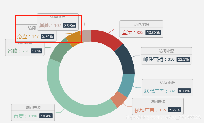
饼图中的series有个avoidLabelOverlap属性,改为true之后就不会重叠
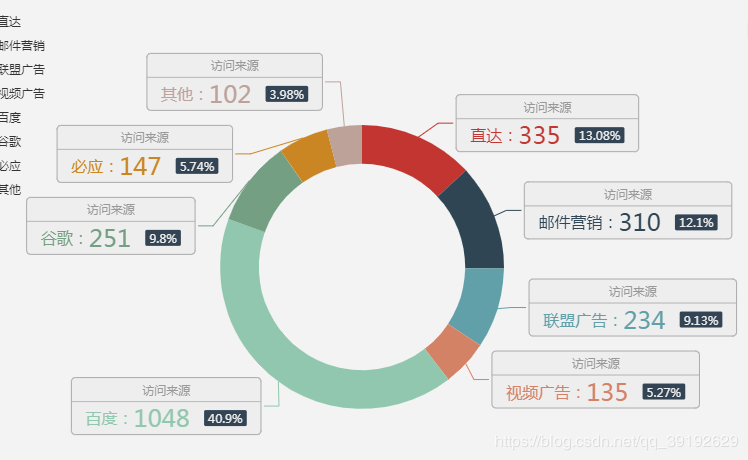
avoidLabelOverlap:是否启用防止标签重叠策略,默认开启,在标签拥挤重叠的情况下会挪动各个标签的位置,防止标签间的重叠。
原文链接https://blog.csdn.net/qq_37899792/article/details/90747057?depth_1-utm_source=distribute.pc_relevant.none-task&utm_source=distribute.pc_relevant.none-task
Echarts 解决饼图文字过长重叠的问题 以下是解决方法
https://blog.csdn.net/weixin_41384423/article/details/88049983?depth_1-utm_source=distribute.pc_relevant.none-task&utm_source=distribute.pc_relevant.none-task