示例一:
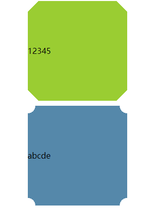
代码:
<style type="text/css">
.one {
height: 200px;
200px;
margin: 10px auto;
line-height: 200px;
background: yellowgreen;
background:
linear-gradient(-45deg, transparent 15px, yellowgreen 0)bottom right,
linear-gradient(-135deg, transparent 15px, yellowgreen 0)top right,
linear-gradient(135deg, transparent 15px, yellowgreen 0)top left,
linear-gradient(45deg, transparent 15px, yellowgreen 0)bottom left;
background-size: 50% 50%;
background-repeat: no-repeat;
}
.two {
height: 200px;
200px;
margin: 10px auto;
background: #58a;
line-height: 200px;
background:
radial-gradient(circle at bottom right, transparent 15px, #58a 0)bottom right,
radial-gradient(circle at top right, transparent 15px, #58a 0)top right,
radial-gradient(circle at top left, transparent 15px, #58a 0)top left,
radial-gradient(circle at bottom left, transparent 15px, #58a 0)bottom left;
background-size: 50% 50%;
background-repeat: no-repeat;
}
</style>
<body>
<div class="one">12345</div>
<div class="two">abcde</div>
</body>
示例二:
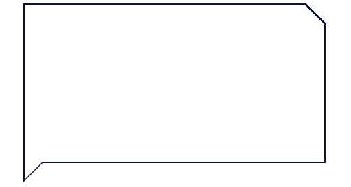
代码:
<style type="text/css">
.top-box {
position: relative;
display: block;
90%;
min-height: 230px;
margin: 0 auto 40px;
padding: 0 10px 80px;
background: #fff;
background: linear-gradient(-135deg, transparent 20px, #FFF 0);
box-sizing: border-box;
}
/* 左下角小三角 */
.top-box:before,
.top-box:after {
position: absolute;
left: -2px;
bottom: -30px;
display: inline-block;
content: '';
height: 0;
border-left: 15px solid #0B113C;
border-top: 15px solid #0B113C;
border-right: 15px solid transparent;
border-bottom: 15px solid transparent;
}
.top-box:after {
left: 0;
bottom: -26px;
border-left: 15px solid #fff;
border-top: 15px solid #fff;
}
/* 切角矩形描边 */
.top-box-border {
position: absolute;
top: -2px;
bottom: -2px;
left: -2px;
right: -2px;
content: '';
background: #000;
background: linear-gradient(-135deg, transparent 20px, #0B113C 0);
z-index: -1;
}
</style>
<body>
<div class="top-box">
<div class="top-box-border"></div>
</div>
</body>
示例三:
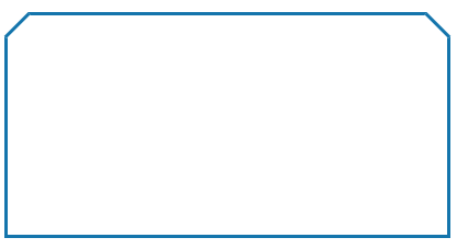
代码:
<style type="text/css">
.div1 {
400px;
height: 200px;
border: 3px solid #1475AC;
position: relative;
}
.div2 {
30px;
height: 30px;
border-top: 3px solid #1475AC;
transform: rotate(135deg);
position: absolute;
top: -18px;
left: -17px;
background-color: #fff;
}
.div3 {
30px;
height: 30px;
border-bottom: 3px solid #1475AC;
transform: rotate(45deg);
position: absolute;
top: -18px;
right: -17px;
background-color: #fff;
}
</style>
<body>
<div class="div1">
<div class="div2"></div>
<div class="div3"></div>
</div>
</body>