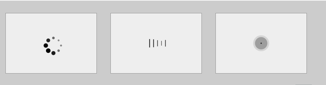
效果图:
代码:
<!DOCTYPE html>
<html lang="en">
<head>
    <meta charset="UTF-8">
    <title>loading</title>
</head>
<style type="text/css">
    .box{
         100%;
        margin: 50px auto;
        padding: 3%;
        overflow: hidden;
        box-sizing: border-box;
        background-color: #cccccc;
    }
    .load{
         300px;
        height: 200px;
        border: 1px gray solid;
        display: flex;
        align-items: center;
        justify-content: center;
        box-sizing: border-box;
        float: left;
        background-color: #eeeeee;
        margin-left: 45px;
    }
    .loading{
        position: relative;
    }
    .loading i{
        15px;
        height: 15px;
        background-color: black;
        border-radius: 50%;
        display: block;
        position: absolute;
    }
    .loading2 >i{
         3px;
        height: 30px;
        background-color: #333333;
        border-radius: 2px;
        display: inline-block;
        float: left;
        margin-left: 10px;
    }
    .loading2 i:nth-child(1){
        -webkit-animation: shrink 1s linear 0s infinite;
    }
    .loading2 i:nth-child(2){
        -webkit-animation: shrink 1s linear 0.2s infinite;
    }
    .loading2 i:nth-child(3){
        -webkit-animation: shrink 1s linear 0.4s infinite;
     }
    .loading2 i:nth-child(4){
        -webkit-animation: shrink 1s linear 0.6s infinite;
    }
    .loading2 i:nth-child(5){
        -webkit-animation: shrink 1s linear 0.8s infinite;
    }


    @keyframes shrink {
        50%{transform: scale(.5)}
        100%{transform: scale(1)}
    }

    .loading i:nth-child(1){
        top: 25px;
        left: 0;
        -webkit-animation: loading 1s ease 0s infinite;
    }
    .loading i:nth-child(2){
        top: 17px;
        left: 17px;
        -webkit-animation: loading 1s ease 0.84s infinite;
    }
    .loading i:nth-child(3){
        top: 0px;
        left: 25px;
        -webkit-animation: loading 1s ease 0.72s infinite;
    }
    .loading i:nth-child(4){
        top: -17px;
        left: 17px;
        -webkit-animation: loading 1s ease 0.60s infinite;
    }
    .loading i:nth-child(5){
        top: -25px;
        left: 0px;
        -webkit-animation: loading 1s ease 0.48s infinite;
    }
    .loading i:nth-child(6){
        top: -17px;
        left: -17px;
        -webkit-animation: loading 1s ease 0.36s infinite;
    }
    .loading i:nth-child(7){
        top: 0px;
        left: -25px;
        -webkit-animation: loading 1s ease 0.24s infinite;
    }
    .loading i:nth-child(8){
        top: 17px;
        left: -17px;
        -webkit-animation: loading 1s ease 0.12s infinite;
    }
    @keyframes loading {
        50%{transform: scale(0.4);opacity: 0.4}
        100%{transform: scale(1);opacity: 1}
    }
    .loading3{
        position: relative;
         60px;
        height: 60px;
    }
    .loading3 > i{
        display: block;
         60px;
        height: 60px;
        border-radius: 50%;
        background-color: #333333;
        position: absolute;
        left: 0px;
        top: 0px;
        opacity: 0;
    }
    @keyframes dot {
        0%{
            transform: scale(0);
            opacity: 0;
        }
        5%{
            opacity: 1;
        }
        100%{
            transform: scale(1);
            opacity: 0;
        }
    }
    .loading3 i:nth-child(1){
        -webkit-animation: dot 1s linear 0s infinite;
    }
    .loading3 i:nth-child(2){
        -webkit-animation: dot 1s linear 0.2s infinite;
    }
    .loading3 i:nth-child(3){
        -webkit-animation: dot 1s linear 0.4s infinite;
    }
</style>
<body>
    <div class="box">
        <div class="load">
            <div class="loading">
                <i></i>
                <i></i>
                <i></i>
                <i></i>
                <i></i>
                <i></i>
                <i></i>
                <i></i>
            </div>
        </div>
        <div class="load">
            <div class="loading2">
                <i></i>
                <i></i>
                <i></i>
                <i></i>
                <i></i>
            </div>
        </div>
        <div class="load">
            <div class="loading3">
                <i></i>
                <i></i>
                <i></i>
            </div>
        </div>
    </div>
</body>
</html>