RGBA
The first three values are RGB color values and the last value is the level of the transparency (0 = transparent and 1 = opaque).
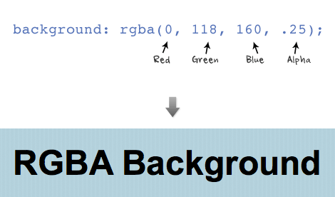
RBGA can be applied to any properties associated with color such as font color, border color, background color, shadow color, etc.

Text Shadow
Text shadow is structured in the following order: x-offset, y-offset, blur, and color;
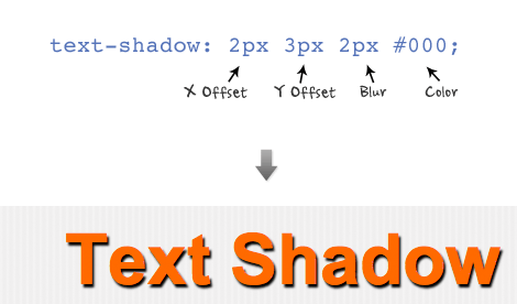
Set a negative value for x-offset to shift the shadow to the left. Set a negative value for y-offset to shift the shadow to the top. Don't forget you can use RGBA values for the shadow color.

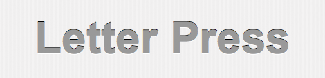
You can also specify a list of text-shadow (separated by a comma). The following example uses two text-shadow declarations to make a letter press effect (1px top and 1px bottom).
text-shadow: 0 1px 0 #fff, 0 -1px 0 #000;
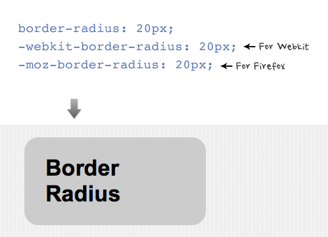
Border Radius
The shorthand for border radius is similar to the padding and margin property (eg.border-radius: 20px). In order for the browsers to render the border radius, add "-webkit-" in font of the property name for webkit browsers and "-moz-" for Firefox.
You can specify each corner with a different value. Note Firefox and Webkit has different property names for the corners.

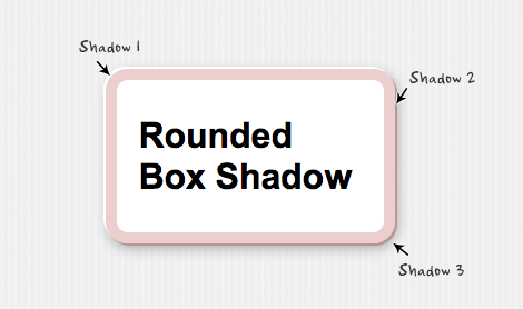
Box Shadow
The structure for box shadow is same as the text-shadow property: x-offset, y-offset, blur, and color.

Again, you can apply more than one box shadow. The following example is a list of three box shadow declarations.
-moz-box-shadow:
-2px -2px 0 #fff,
2px 2px 0 #bb9595,
2px 4px 15px rgba(0, 0, 0, .3);