CSS3中的动画包括两种:
- Transition(过渡)
- Animation(动画)
这两种方法都可以让元素动起来,功能类似,但是稍有区别:
- Transition只定义某一个元素的开始状态和结束状态
- Animation除了开始和结束状态之外,还可以定义中间任意时间点关键帧的状态
剩下的内容就是CSS3完成任意两个时间区间内进行补间动画,达到平滑过渡的效果。
Transition
transition的语法为:
transition:transition-property, transition-duration,  transition-timing-function, transition-delay

翻译成中文就是:
transition: 变换属性, 持续时间, 速率变化, 变换延迟
- transition-property:指定元素哪些属性改变时进行过渡。当它为all时,所有可过渡的属性变化时都会触发元素过渡效果,当它为none时,停止所有的过渡。
所谓可过渡属性,是指在动画过程中,能够转化为某些类型的属性,这些类型包括color,length,percentage,number等等。比如某一个元素的margin,height,border-width这三个属性,在动画过程中都是以length的类型进行改变的,它们都是可过渡属性,且动画时的类型为length
元素属性和过渡类型的对应关系在:http://www.w3.org/TR/css3-transitions/#properties-from-css- - transition-duration:持续时间,可以为秒(s)或者毫秒(ms),默认为0,没有过渡效果
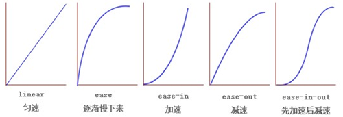
- transition-timing-function:过渡时间函数,预设的值有:
- ease: 逐渐变慢,等同于贝塞尔曲线(0.25, 0.1, 0.25, 1.0).
- linear: 匀速,等同于贝塞尔曲线(0.0, 0.0, 1.0, 1.0).
- ease-in: 加速,等同于贝塞尔曲线(0.42, 0, 1.0, 1.0).
- ease-out: 减速,等同于贝塞尔曲线(0, 0, 0.58, 1.0).
- ease-in-out: 加速然后减速,等同于贝塞尔曲线(0.42, 0, 0.58, 1.0)
- cubic-bezier:贝塞尔曲线控制四个点:起始点、终止点和两个相互分离的中间点。在我们这里,起始点为(0,0),终止点为(1.0,1.0),我们可以改变的就是两个锚点,用来控制曲线的弯曲程度。可以在http://cubic-bezier.com 网站上进行演示,右边是标准的几个过渡函数,通过更改url的hash值,可以准确改变贝塞尔函数
- transition-delay:等待多少时间之后进行转换,默认为0
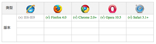
transition的浏览器兼容性为:
由于浏览器有些不支持标准的W3C写法,因此最好加上各自的前缀,将标准写法放到最后。
p {
  -webkit-transition: all .5s ease-in-out 1s;
  -o-transition: all .5s ease-in-out 1s;
  -moz-transition: all .5s ease-in-out 1s;
  transition: all .5s ease-in-out 1s;
}
总之,诸如focus、hover、鼠标点击事件或其他js控制等会改变元素的属性,如果该元素在css中定义了transition,且被改变的属性是可过渡的属性,那么就会触发过渡效果。
Animation
如前所述,animation动画可以在不同的时间段设置关键帧。关键帧可以使用@keyframes进行定义:
 @keyframes IDENT {
     from {
       Properties:Properties value;
     }
     Percentage {
       Properties:Properties value;
     }
     to {
       Properties:Properties value;
     }
   }

或者写成百分比:
  @keyframes IDENT {
      0% {
         Properties:Properties value;
      }
      Percentage {
         Properties:Properties value;
      }
      100% {
         Properties:Properties value;
      }
    }
如定义了一个名字叫做wobble的关键帧:
@-webkit-keyframes 'wobble' {
     0% {
        margin-left: 100px;
        background: green;
     }
     40% {
        margin-left: 150px;
        background: orange;
     }
     60% {
        margin-left: 75px;
        background: blue;
     }
     100% {
        margin-left: 100px;
        background: red;
     }
  }
该关键帧分别定义了0%,40%,60%和100%这四个点的元素状态,主要改变的是margin-left和背景色这两个属性。
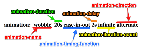
接下来就在animation属性中使用该关键帧,animation涉及到的属性有:
- animation-name: 动画名字,可以是我们之前定义的keyframe
- animation-duration: 动画播放时长
- animation-timing-function: 动画变换速率
- animation-delay: 开始动画延时
- animation-iteratoration-count: 动画播放循环次数(1还是infinite等)
- animation-direction: 播放方向(向前还是向后)
animation属性也可以简写,如下图,不过属性太多,不太好记住顺序,我反正还是用分开写的方式。
一些animation的例子可以看:http://www.justinaguilar.com/animations/