<!DOCTYPE html>
<html>
<head>
<meta charset="utf-8">
<meta http-equiv="X-UA-Compatible" content="IE=edge,chrome=1">
<title>漫天表情飘</title>
<meta name="description" content="">
<meta content="无聊,写个无聊的东西都自己乐乐。部分代码是从360里面抄过来的。" name="keywords" />
<style>
*{ list-style: none; padding: 0; margin: 0;}
#main{ width:100%; position:relative;min-height:100%;_height:100%}
#main div{
    background: url(http://sandbox.runjs.cn/uploads/rs/290/zgpr2hqt/all.png) no-repeat;
    position: absolute;
    overflow: hidden;
    width: 21px;height: 21px;
    -webkit-animation: rotate 2s linear infinite;
    -moz-animation: rotate 2s linear infinite;
    -o-animation: rotate 2s linear infinite;
    animation: rotate 2s linear infinite
}

#main .c1 {background-position: 0 0;}
#main .c2 {background-position: -21px 0;}
#main .c3 {background-position: -42px 0;}
#main .c4 {background-position: -63px 0;}
#main .c5 {background-position: -84px 0;}
#main .c6 {background-position: -105px 0;}
#main .c7 {background-position: -126px 0;}
#main .c8 {background-position: -147px 0;}
#main .c9 {background-position: -168px 0;}
#main .c10 {background-position: -189px 0;}
#main .c11 {background-position: -210px 0;}
#main .c12 {background-position: 0px -21px;}
#main .c13 {background-position: -21px -21px;}
#main .c14 { width:22px;height:22px;background-position: -42px -21px;}
#main .c15 { width:22px;height:22px;background-position: -64px -21px;}
#main .c16 {background-position: -86px -21px;}
#main .c17 {background-position: -107px -21px;}
#main .c18 { width:11px;height:21px;background-position: -128px -21px;}
#main .c19 {width:22px;height:13px;background-position: -139px -21px;}
#main .c20 {background-position: -162px -21px;}
#main .c21 {background-position: -183px -21px;}

@-webkit-keyframes rotate {
    from {
        -webkit-transform: rotate(0deg)
    }

    to {
        -webkit-transform: rotate(360deg)
    }
}

@-moz-keyframes rotate {
    from {
        -moz-transform: rotate(0deg)
    }

    to {
        -moz-transform: rotate(360deg)
    }
}

@-o-keyframes rotate {
    from {
        -o-transform: rotate(0deg)
    }

    to {
        -o-transform: rotate(360deg)
    }
}

@keyframes rotate {
    from {
        transform: rotate(0deg)
    }

    to {
        transform: rotate(360deg)
    }
}

@-webkit-keyframes rotate2 {
    0% {
        -webkit-transform: rotate(-6deg)
    }

    50% {
        -webkit-transform: rotate(10deg)
    }

    100% {
        -webkit-transform: rotate(-6deg)
    }
}

@-moz-keyframes rotate2 {
    0% {
        -moz-transform: rotate(-6deg)
    }

    50% {
        -moz-transform: rotate(10deg)
    }

    100% {
        -moz-transform: rotate(-6deg)
    }
}

@-o-keyframes rotate2 {
    0% {
        -o-transform: rotate(-6deg)
    }

    50% {
        -o-transform: rotate(10deg)
    }

    100% {
        -o-transform: rotate(-6deg)
    }
}

@keyframes rotate2 {
    0% {
        transform: rotate(-6deg)
    }

    50% {
        transform: rotate(10deg)
    }

    100% {
        transform: rotate(6deg)
    }
}
body{ background:url(http://sandbox.runjs.cn/uploads/rs/290/zgpr2hqt/3.jpg) center top no-repeat;}
</style>

</head>

<body class="Snow">
<div id="main"></div>

<!--引入JQ库文件-->
<script type="text/javascript" src="http://sandbox.runjs.cn/uploads/rs/290/zgpr2hqt/jquery.min.js"></script>

<script type="text/javascript">
if($.browser.msie && $.browser.version <= 8){
    alert('亲,您的浏览器太out了,赶紧升级到IE9吧或者用谷歌浏览器或者火狐浏览器打开看吧!');
}

var width=$(window).width();
var height=$(window).height();
var Snow = function(e, t, n, r, i, s) {
        var o = this;
        o.el = e, o.x1 = t, o.y1 = n, o.x2 = r, o.y2 = i, o.speed = s, o.space = Math.floor(Math.random() * 40 + 40), o.init()
    };
Snow.prototype = {
    init: function() {
        var e = this;
        e.el.css({
            left: e.x1,
            top: e.y1
        }), e.el.fadeIn("fast"), e.move()
    },
    move: function() {
        var e = this;
        $.browser.msie && $.browser.version <= 6 ? e.el.animate({
            left: e.x2 + "px",
            top: e.y2 + "px"
        }, e.speed, "linear", function() {
            e.init()
        }) : e.el.animate({
            left: e.x2 + "px",
            top: e.y2 - e.space + "px"
        }, e.speed, "linear", function() {
            e.el.fadeOut("slow", function() {
                e.init()
            })
        })
    }
};
var SnowFly = {
    init: function() {
        for (var e = 0; e < 20; e++) {
            var t = Math.floor(Math.random() * 21 + 1),
                n = Math.floor(Math.random() * 10000 + 10000),
                r = Math.floor(Math.random()*(width-100)+100),
                i = Math.floor(Math.random() * 155 - 155),
                s = r + Math.floor(Math.random() * 100 - Math.random() * 150);
            y2 = height, el = $("<div/>").addClass("c" + t).appendTo($("#main")).css({
                left: r,
                top: i
            }), new Snow(el, r, i, s, y2, n)
        }
    }
};
$.browser.msie && $.browser.version <= 6 || SnowFly.init()
</script>

</body>
</html>
用到一些css3的属性,表情会旋转,所以想看最好的效果就不要用IE6、7、8打开了。
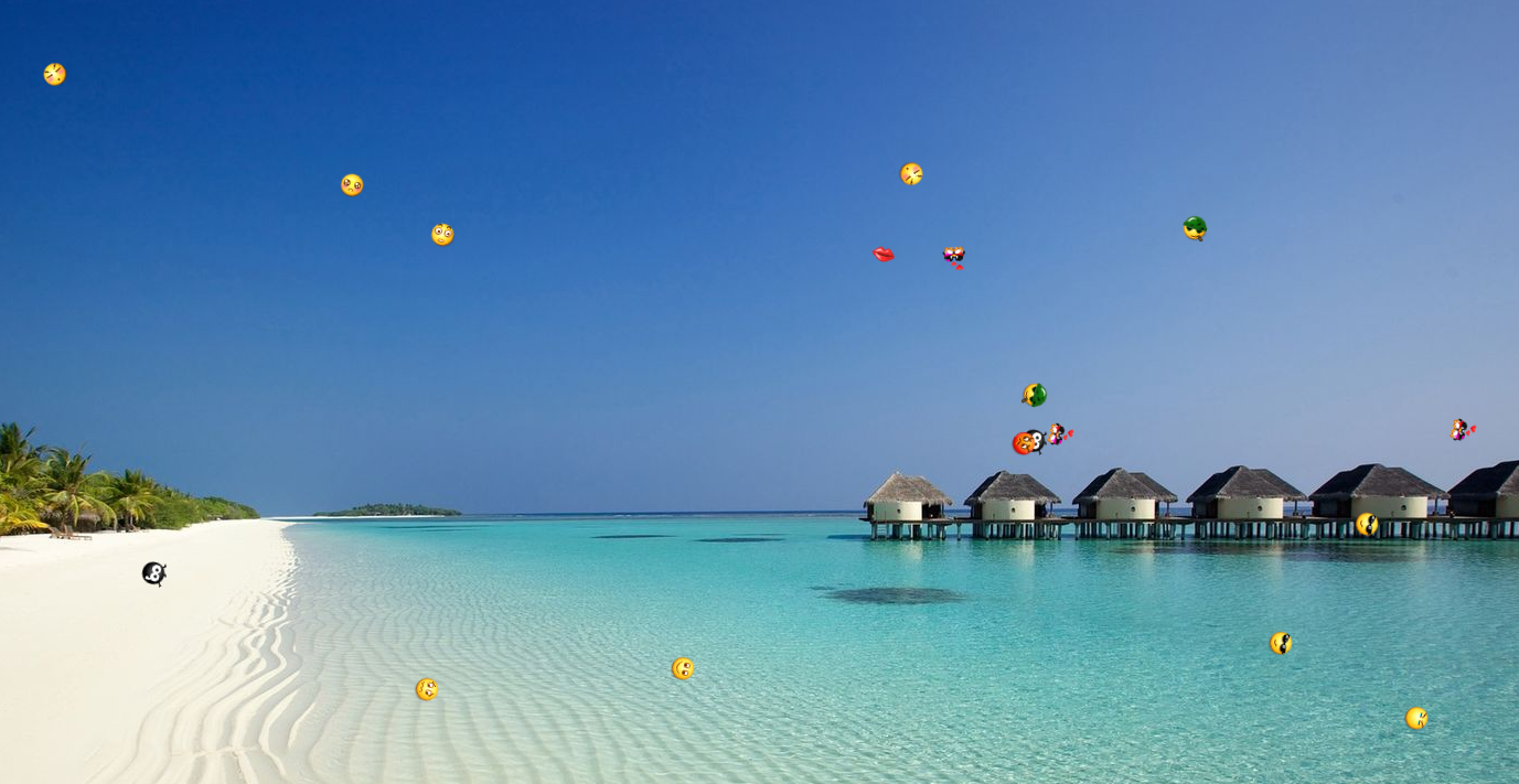
大概效果是这样: