设页面中有<div class=” wrap”></div>,若定义.wrap的样式规则为:
.wrap
{
200px;
height: 100px;
top:100px;
left:100px;
position: absolute;
background-color:#ff0;
border:4px solid #f00;
transform-origin: 50% 100%;
animation: spin 2s cubic-bezier(.175, .885, .32, 1.275) infinite;
}
定义关键帧spin,使矩形绕底部中点旋转起来
@keyframes spin
{
0%,15% { transform: rotate(0); }
100% { transform: rotate(360deg); }
}
可在页面中呈现如图1所示的动画。
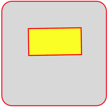
图1 矩形绕底部中点旋转
在页面中放置5个<div class=” wrap”></div>,使这5个矩形各自按给定的延迟进行旋转。编写如下的HTML文件。
<!DOCTYPE html>
<html>
<title>旋转的矩形</title>
<head>
<style>
.container
{
position: relative;
margin: 50px auto;
400px;
height:400px;
background:#d8d8d8;
overflow:hidden;
border: 4px solid rgba(255, 0, 0, 0.9);
border-radius: 10%;
}
.wrap
{
200px;
height: 100px;
top:100px;
left:100px;
position: absolute;
background-color:#ff0;
border:4px solid #f00;
transform-origin: 50% 100%;
animation: spin 2s cubic-bezier(.175, .885, .32, 1.275) infinite;
}
.wrap:nth-child(1)
{
animation-delay: -0.05s;
}
.wrap:nth-child(2)
{
animation-delay: -0.1s;
}
.wrap:nth-child(3)
{
animation-delay: -0.15s;
}
.wrap:nth-child(4)
{
animation-delay: -0.2s;
}
.wrap:nth-child(5)
{
animation-delay: -0.25s;
}
@keyframes spin
{
0%,15% { transform: rotate(0); }
100% { transform: rotate(360deg); }
}
</style>
</head>
<body>
<div class="container">
<div class="wrap"></div>
<div class="wrap"></div>
<div class="wrap"></div>
<div class="wrap"></div>
<div class="wrap"></div>
</div>
</body>
</html>
在浏览器中打开包含这段HTML代码的html文件,可以呈现出如图2所示的动画效果。

图2 旋转的5个矩形
在图2的5个矩形中依次放置5个圆,每个矩形中放置一个圆,每个圆的大小依次递减,使得5个圆同圆心,小圆完全嵌套在大圆内。取消原来矩形的边框和背景色设置。
编写如下的HTML文件。
<!DOCTYPE html>
<html>
<title>旋转的同心圆</title>
<head>
<style>
.container
{
position: relative;
margin: 50px auto;
400px;
height:400px;
background:#d8d8d8;
overflow:hidden;
border: 4px solid rgba(255, 0, 0, 0.9);
border-radius: 10%;
}
.wrap
{
200px;
height: 105px;
top:100px;
left:100px;
position: absolute;
overflow: hidden;
transform-origin: 50% 100%;
animation: spin 2s cubic-bezier(.175, .885, .32, 1.275) infinite;
}
.wrap:nth-child(1)
{
animation-delay: -0.05s;
}
.wrap:nth-child(2)
{
animation-delay: -0.1s;
}
.wrap:nth-child(3)
{
animation-delay: -0.15s;
}
.wrap:nth-child(4)
{
animation-delay: -0.2s;
}
.wrap:nth-child(5)
{
animation-delay: -0.25s;
}
@keyframes spin
{
0%,15% { transform: rotate(0); }
100% { transform: rotate(360deg); }
}
.circle
{
border: 4px solid transparent;
border-radius: 100%;
height: 100px;
left: 0;
margin: 0 auto;
position: absolute;
right: 0;
top: 0;
100px;
}
.wrap:nth-child(1) .circle
{
border-color: hsl(0, 80%, 60%);
height: 90px;
90px;
top: 7px;
}
.wrap:nth-child(2) .circle
{
border-color: hsl(60, 80%, 60%);
height: 76px;
76px;
top: 14px;
}
.wrap:nth-child(3) .circle
{
border-color: hsl(120, 80%, 60%);
height: 62px;
62px;
top: 21px;
}
.wrap:nth-child(4) .circle
{
border-color: hsl(180, 80%, 60%);
height: 48px;
48px;
top: 28px;
}
.wrap:nth-child(5) .circle
{
border-color: hsl(240, 80%, 60%);
height: 34px;
34px;
top: 35px;
}
</style>
</head>
<body>
<div class="container">
<div class="wrap"><div class="circle"></div></div>
<div class="wrap"><div class="circle"></div></div>
<div class="wrap"><div class="circle"></div></div>
<div class="wrap"><div class="circle"></div></div>
<div class="wrap"><div class="circle"></div></div>
</div>
</body>
</html>
在浏览器中打开包含这段HTML代码的html文件,可以呈现出如图3所示的动画效果。
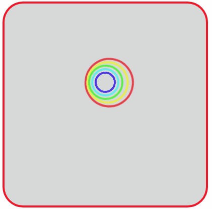
图3 旋转的同心圆
将呈现图3动画效果的HTML文件中,矩形的高度修改为50px(原来的一半),此时各个同心圆被裁掉了一大半(超出矩形的部分被隐藏),只剩下5条弧段。在浏览器中呈现出如图4所示的动画效果。这个动画效果可以作为一个Loading动画。
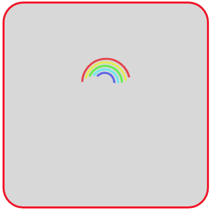
图4 旋转的5条弧段