为了在页面中利用CSS3绘制图形,在页面中定义
<div class="container">
<div class="shape"></div>
</div>
其中,container作为显示图形的画布(容器),shape描述所绘制的图形。
定义.container的样式规则如下:
.container
{
margin: 0 auto;
300px;
height:300px;
position: relative;
display:flex;
justify-content:center;
align-items:center;
background:#d8d8d8;
border: 4px solid rgba(255, 0, 0, 0.9);
border-radius: 10%;
}
对shape设置不同的样式规则,可以绘制不同的图形。
1.利用边框属性border绘制基本图形
在CSS中,可以用width和height属性设置一个元素的宽度和高度,background属性设置元素的背景色。例如,设置.shape的样式规则如下:
.shape
{
position: absolute;
height:200px;
200px;
background:#ff8c00;
}
则可以在页面中绘制如图1所示的用深橙色填充的边长为200px的正方形。
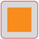
图1 用深橙色填充的正方形
图1中,外面的红色圆角方框由.container样式决定,里面的用深橙色填充的边长为200px的正方形由.shape样式决定。完整的HTML文件内容如下。
<!DOCTYPE html>
<html>
<head>
<title>CSS图形绘制</title>
<style>
.container
{
margin: 0 auto;
300px;
height:300px;
position: relative;
display:flex;
justify-content:center;
align-items:center;
background:#d8d8d8;
border: 4px solid rgba(255, 0, 0, 0.9);
border-radius: 10%;
}
.shape
{
position: absolute;
height:200px;
200px;
background:#ff8c00;
}
</style>
</head>
<body>
<div class="container">
<div class="shape"></div>
</div>
</body>
</html>
下面各图形绘制时,除了特别说明,我们只给出图形所对应.shape样式的定义,其余部分保持不变。这样修改.shape样式,可以绘制不同的图形。
例如,要绘制一个边长为200px的正方形(只有外框线,没有内部填充),可以修改.shape如下:
.shape
{
position: absolute;
height:200px;
200px;
border:4px solid #ff8c00;
}
此时页面显示如图2所示,“画布”中显示的图形为一个边长为200px的正方形。其中,用到了border属性进行边框样式的设置。
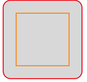
图2 正方形
border属性是一个缩写的边框属性,用于设置元素所有的边框属性。可以设置的属性分别(按顺序)为:border-width(边框宽度)、border-style(边框样式)和border-color(边框颜色)。
本文中会用到包括border在内的许多CSS属性,这些属性的格式和功能我们不一一介绍,只是拿过来应用。需要了解这些属性功能和使用方法的读者可以参看《CSS参考手册》(https://www.w3cschool.cn/cssref/3ps212do.html)。
(1)三角形。
修改.shape如下:
.shape
{
position: absolute;
height:50px;
50px;
border-top: 100px solid orange;
border-left: 100px solid blue;
border-right: 100px solid green;
border-bottom: 100px solid red;
}
可在页面中看到如图3所示的图形。
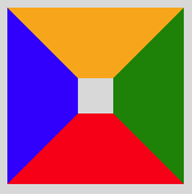
图3 四个梯形围成正方形
在图3中,橙色梯形块代表是上边框宽度,蓝色梯形块代表左边框宽度,红色梯形块代表下边框宽度,绿色梯形块代表右边框宽度,对几个边距的宽度而言,它们之间的分界恰好是这个正方形的对角线所在的直线,如果里面的小正方形宽高无穷小(将shape样式定义中width和height的属性值均设为0),那么这个图形将是一个由四块不同颜色三角形拼接而成的图形,如图4所示。

图4 四个三角形拼成正方形
修改.shape如下:
.shape
{
position: absolute;
height:0px;
0px;
border-left: 100px solid blue;
border-right: 100px solid green;
border-bottom: 200px solid red;
}
可在页面中看到如图5所示的图形。
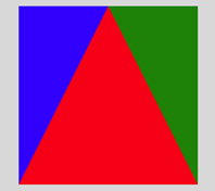
图5 三个三角形拼成一个正方形
修改上面样式中左、右或下边框的填充色为背景色或transparent,相当于切掉了该边框,这样可以组合为不同的三角形。
例如,修改.shape样式定义为:
.shape
{
position: absolute;
height:0px;
0px;
border-left: 100px solid transparent;
border-right: 100px solid transparent;
border-bottom: 200px solid red;
}
可在页面中看到如图6所示的等腰三角形。
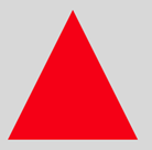
图6 等腰三角形
又如,修改.shape样式定义为:
.shape
{
position: absolute;
height:0px;
0px;
border-left: 100px solid blue;
border-bottom: 200px solid transparent;
}
可在页面中看到如图7所示的直角三角形。
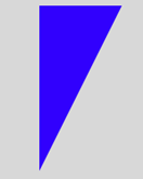
图7 直角三角形
再如,修改.shape样式定义为:
.shape
{
position: absolute;
height:0px;
0px;
border-right: 100px solid green;
border-bottom: 100px solid transparent;
}
可在页面中看到如图8所示的等腰直角三角形。
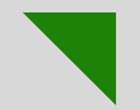
图8 等腰直角三角形
(2)平行四边形和梯形。
将一个矩形框进行倾斜,可以得到平行四边形。修改.shape样式定义为:
.shape
{
position: absolute;
height:100px;
200px;
background:#ff8c00;
transform: skew(20deg);
}
可在页面中看到如图9所示的平行四边形。

图9 平行四边形
修改.shape样式定义为:
.shape
{
0;
height: 0;
border: 50px solid transparent;
border-bottom: 70px solid #ff8c00;
position: relative;
top:-50px;
}
.shape:after
{
content: '';
position: absolute;
top: 70px;
left:-50px;
0;
height: 0;
border: 50px solid transparent;
border-top: 70px solid #ff8c00;
}
可在页面中看到如图10所示的菱形。
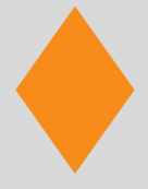
图10 菱形
修改.shape样式定义为:
.shape
{
position: absolute;
100px;
border-bottom: 150px solid red;
border-left: 50px solid transparent;
border-right: 50px solid transparent;
}
可在页面中看到如图11所示的梯形。

图11 梯形
(3)圆、圆环和椭圆。
利用border-radius属性可以为元素设置圆角边框,这样可以绘制各种圆形。
修改.shape样式定义为:
.shape
{
position: absolute;
150px;
height:150px;
background:#8A2BE2;
border-radius:50%;
}
可在页面中看到如图12所示的圆形。

图12 圆
将上面绘制圆的样式中的“height:150px;”改成“height:50px;”,其余保持不变,则得到如图13所示的椭圆。
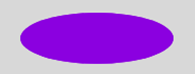
图13 椭圆
将两个椭圆旋转后交叉在一起,可以构成一个红叉叉。修改.shape样式定义为:
.shape
{
position: relative;
160px;
height: 24px;
background-color: #f00;
transform: rotate(45deg);
border-radius: 50%;
}
.shape:after
{
content: "";
position: absolute;
160px;
height: 24px;
background-color: #f00;
transform: rotate(90deg);
border-radius: 50%;
}
可在页面中看到如图14所示的红叉叉。
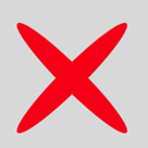
图14 红叉叉
修改.shape样式定义为:
.shape
{
100px;
height: 50px;
background: #8A2BE2;
border-radius: 100px 100px 0 0;
}
可在页面中看到如图15所示的半圆。
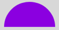
图15 半圆
修改.shape样式定义为:
.shape
{
100px;
height: 100px;
background: #8A2BE2;
border-radius: 100px 0 0 0;
}
可在页面中看到如图16所示的四分之一圆(扇形)。
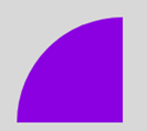
图16 扇形
修改.shape样式定义为:
.shape
{
0px;
height: 0px;
border-right: 60px solid transparent;
border-top: 60px solid red;
border-left: 60px solid red;
border-bottom: 60px solid red;
border-radius: 50%;
}
可在页面中看到如图17所示的图形,这个图形是游戏中的“食人豆”。
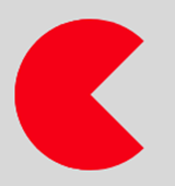
图17 “食人豆”
修改.shape样式定义为:
.shape
{
126px;
height: 180px;
background-color:#FFEFD5;
border-radius: 50% 50% 50% 50% / 60% 60% 40% 40%;
}
可在页面中看到如图18所示的鸡蛋。
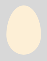
图18 鸡蛋
修改.shape样式定义为:
.shape
{
100px;
height: 100px;
border: 15px solid red;
position: relative;
border-radius: 50%;
}
可在页面中看到如图19所示的圆环。
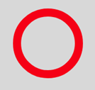
图19 圆环
为一个圆环加上一个倾斜的手柄,可以绘制出一个放大镜。修改.shape样式定义为:
.shape
{
64px;
height: 64px;
border: 10px solid black;
position: relative;
border-radius: 50%;
}
.shape:before
{
content: "";
position: absolute;
right: -40px;
bottom: -16px;
border- 0;
background: black;
56px;
height: 10px;
transform: rotate(45deg);
}
可在页面中看到如图20所示的放大镜。
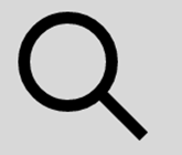
图20 放大镜
修改.shape样式定义为:
.shape
{
100px;
height: 100px;
border: 15px solid white;
position: relative;
border-radius: 50%;
border-top: 15px solid red;
border-left: 15px solid orange;
border-bottom: 15px solid green;
border-right: 15px solid blue;
}
可在页面中看到如图21四色圆环。
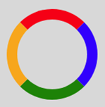
图21 四色圆环
修改.shape样式定义为:
.shape
{
120px;
height: 120px;
border-left: 60px solid green;
border-right: 60px solid blue;
border-top: 60px solid red;
border-radius: 50%;
}
可在页面中看到如图22所示的不规则圆环。
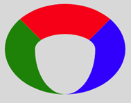
图22 不规则圆环
若保留图22中的红色,将另外两种颜色设为transparent,可在页面中看到如图23所示的扇面。若只保留蓝色,则可在页面中看到如图24所示的牛角。

图23 扇面

图24 牛角
修改.shape样式定义为:
.shape
{
0px;
height: 0px;
border-left: 60px solid transparent;
border-right: 60px solid transparent;
border-top: 120px solid red;
border-radius: 50%;
}
可在页面中看到如图25所示的圆锥形。
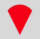
图 25 圆锥形
(4)多边形。
修改.shape样式定义为:
.shape
{
position: relative;
54px;
border-top: 50px solid red;
border-left: 18px solid transparent;
border-right: 18px solid transparent;
}
.shape:before
{
content: "";
position: absolute;
height: 0;
0;
top: -85px;
left: -18px;
border-bottom: 35px solid red;
border-left: 45px solid transparent;
border-right: 45px solid transparent;
}
可在页面中看到如图26所示的五边形。这个五边形由两个基本图形拼合而成:一个是下面部分使用.shape定义的梯形,另一个是上面部分使用.shape:before定义的上三角形。三角形和梯形层叠到一起,从而形成五边形。
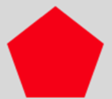
图26 五边形
修改.shape样式定义为:
.shape
{
138.5px;
height: 80px;
background: red;
position: relative;
}
.shape:before
{
content: "";
position: absolute;
top: -40px;
left: 0;
0;
height: 0;
border-left: 69.25px solid transparent;
border-right: 69.25px solid transparent;
border-bottom: 40px solid red;
}
.shape:after
{
content: "";
position: absolute;
bottom: -40px;
left: 0;
0;
height: 0;
border-left: 69.25px solid transparent;
border-right: 69.25px solid transparent;
border-top: 40px solid red;
}
可在页面中看到如图27所示的六边形。这个六边形由三个基本图形拼合而成:一个是中间部分使用.shape定义的矩形,另一个是上面部分使用.shape:before定义的上三角形,还有一个是下面部分使用.shape:after定义的下三角形。三个基本图形层叠到一起,从而形成六边形。并且图中的六边形还是一个正六边形。
图27 六边形
修改.shape样式定义为:
.shape
{
120px;
height: 50px;
background: red;
position: relative;
}
.shape:before
{
content: "";
position: absolute;
top: -35px;
left: 0;
border-bottom: 35px solid red;
border-left: 35px solid transparent;
border-right: 35px solid transparent;
50px;
height: 0;
}
.shape:after
{
content: "";
position: absolute;
top: 50px;
left: 0;
border-top: 35px solid red;
border-left: 35px solid transparent;
border-right: 35px solid transparent;
50px;
height: 0;
}
可在页面中看到如图28所示的八边形。这个八边形由三个基本图形拼合而成:一个是中间部分使用.shape定义的矩形,另一个是上面部分使用.shape:before定义的底边大于顶边的梯形,还有一个是下面部分使用.shape:after定义的底边小于顶边的梯形。三个基本图形层叠到一起,从而形成八边形。并且图中的八边形还是一个近似正八边形。
图28 八边形
(5)多角星。
修改.shape样式定义为:
.shape
{
position: relative;
display: block;
0px;
height:0px;
border-left: 100px solid transparent;
border-right: 100px solid transparent;
border-bottom:70px solid red;
transform:rotate(35deg);
}
.shape:before
{
content: '';
position: absolute;
0px;
height: 0px;
top: -45px;
left: -62.5px;
border-left: 30px solid transparent;
border-right: 30px solid transparent;
border-bottom: 80px solid green;
transform: rotate(-35deg);
}
.shape:after
{
content: '';
position: absolute;
0px;
height: 0px;
top: 3px;
left: -105px;
border-left: 100px solid transparent;
border-right: 100px solid transparent;
border-bottom: 70px solid blue;
transform:rotate(-70deg);
}
可在页面中显示如图29所示的五角星。这个五角星是由三个三角形拼成的,由于文字描述不能精确,为了方便理解,将三个三角形设置成不同的颜色。
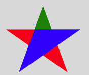
图29 五角星
修改.shape样式定义为:
.shape
{
0;
height: 0;
border-left: 50px solid transparent;
border-right: 50px solid transparent;
border-bottom: 100px solid red;
position: relative;
}
.shape:after
{
content: "";
0;
height: 0;
border-left: 50px solid transparent;
border-right: 50px solid transparent;
border-top: 100px solid red;
position: absolute;
top: 30px;
left: -50px;
}
可在页面中看到如图30所示的六角星。这个六角星是由两个三角形拼合而成的,一个三角形是使用.shape定义的上三角形,另一个是使用.shape:after定义的下三角形。它们层叠到一起,从而形成六角星。
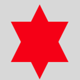
图30 六角星
修改.shape样式定义为:
.shape
{
background: red;
150px;
height: 150px;
position: relative;
}
.shape:after
{
content: "";
position: absolute;
top: 0;
left: 0;
height: 150px;
150px;
background: red;
transform: rotate(45deg);
}
可在页面中看到如图31所示的八角星。这个八角星由两个正方形拼合而成:一个正方形是使用.shape定义的,另一个是使用.shape:after定义的,它旋转了45°。两个正方形层叠到一起,从而形成八角星。
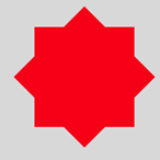
图31 八角星
修改.shape样式定义为:
.shape
{
background: red;
150px;
height: 150px;
position: relative;
}
.shape:before, .shape:after
{
content: "";
position: absolute;
top: 0;
left: 0;
height: 150px;
150px;
background: red;
}
.shape:before
{
transform: rotate(30deg);
}
.shape:after
{
transform: rotate(60deg);
}
可在页面中看到如图32所示的十二角星。这个十二角星由三个正方形拼合而成:一个正方形是使用.shape定义的,另一个是使用.shape:before定义的,它旋转了30°,还有一个是使用.shape:after定义的,它 旋转了60°。三个正方形层叠到一起,从而形成十二角星。
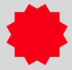
图32 十二角星
(6)其他组合图形。
修改.shape样式定义为:
.shape
{
position: relative;
20px;
height: 100px;
background: red;
}
.shape:after
{
content: "";
position: absolute;
left: -40px;
top: 40px;
100px;
height: 20px;
background: red;
}
可在页面中看到如图33所示的红十字。
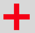
图33 红十字
修改.shape样式定义为:
.shape
{
position: relative;
100px;
height: 90px;
}
.shape:before, .shape:after
{
position: absolute;
content: "";
left: 50px;
top: 0;
50px;
height: 80px;
background: red;
border-radius: 50px 50px 0 0;
transform: rotate(-45deg);
transform-origin: 0 100%;
}
.shape:after
{
left: 0;
transform: rotate(45deg);
transform-origin :100% 100%;
}
可在页面中看到如图34所示的心形。
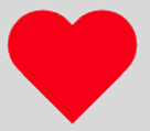
图34 心形
修改.shape样式定义为:
.shape
{
border-style: solid;
border-color: transparent transparent #FFFAFA transparent;
border- 0 25px 25px 25px;
height: 0;
50px;
position: relative;
}
.shape:after
{
content: "";
position: absolute;
top: 25px;
left: -25px;
0;
height: 0;
border-style: solid;
border-color: #FFFAFA transparent transparent transparent;
border- 70px 50px 0 50px;
}
可在页面中看到如图35所示的钻石。

图35 钻石
修改.shape样式定义为:
.shape
{
position: relative;
212px;
height: 100px;
}
.shape:before, .shape:after
{
content: "";
position: absolute;
top: 0;
left: 0;
60px;
height: 60px;
border: 20px solid red;
border-radius: 50px 50px 0 50px;
transform: rotate(-45deg);
}
.shape:after
{
left: auto;
right: 0;
border-radius: 50px 50px 50px 0;
transform: rotate(45deg);
}
可在页面中看到如图36所示的无穷大符号。
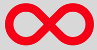
图36 无穷大
修改.shape样式定义为:
.shape
{
position: relative;
80px;
height:80px;
border: 15px solid transparent;
border-top-color: red;
border-bottom-color: red;
border-radius: 50%;
}
.shape:before, .shape:after
{
content: '';
display: block;
0;
height: 0;
position: absolute;
border: 15px solid transparent;
border-bottom-color: red;
}
.shape:before
{
transform: rotate(135deg);
right: -15px;
top: -2.5px;
}
.shape:after
{
transform: rotate(-45deg);
left: -15px;
bottom: -2.5px;
}
可在页面中看到如图37所示的圆弧箭头。
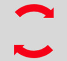
图37 圆弧箭头
2.利用box-shadow绘制图形
在CSS中,属性box-shadow用于给对象实现图层阴影效果。利用box-shadow属性也可以绘制图形。
box-shadow的基本格式为:
box-shadow: h-shadow v-shadow blur spread color inset;
各参数的含义说明如下:
h-shadow必须设置,它表示阴影的水平偏移量,其值可以取正负值,如果值为正值,则阴影在对象的右边;若值为负值时,阴影在对象的左边。
v-shadow也必须设置,它表示阴影的垂直偏移量,其值也可以是正负值,如果为正值,阴影在对象的底部;其值为负值时,阴影在对象的顶部。
blur可选,表示阴影模糊半径,其值只能是为正值,如果值为0时,表示阴影不具有模糊效果,其值越大阴影的边缘就越模糊。
Spread可选,表示阴影扩展半径,其值可以是正负值,如果值为正,则整个阴影都延展扩大;若值为负值时,则缩小。
Color可选,表示阴影颜色。
Inset可选,表示阴影类型。其默认的投影方式是外阴影;如果取其唯一值“inset”,就是将外阴影变成内阴影。
另外,box-shadow可以使用一个或多个投影,如果使用多个投影时,必须用逗号“,”分开。
例如,若定义.shape样式规则如下:
.shape
{
80px;
height: 60px;
background: #ff008c;
border: 6px solid blue;
box-shadow: 40px 30px green;
}
则在页面中显示如图38所示的图形。
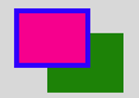
图38 绿色投影(outset)
若在box-shadow定义中加上inset,则显示的图形如图39所示。

图39 绿色投影(inset)
由此可知,对象阴影同box模型的层次一样,外阴影会在对象背景之下,内阴影会在边框之下背景之上。所以整个层级就是:边框>内阴影>背景图片>背景颜色>外阴影。
利用box-shadow属性,我们可以在页面中绘制图形。
例如,修改.shape样式定义为:
.shape
{
0;
color: #f00;
border: 15px solid transparent;
border-top: 25px solid;
box-shadow: 0 -32px 0 -6px;
}
可在页面中显示如图40所示的下载箭头。

图40 下载箭头
一般而言,一个div之类的元素通过设置border属性可以绘制一个基本图形,加上:before和:after两个伪类,最多可进行三个基本图形组合。若需要更多图形组合,border属性就有点无能为力了,增加div的定义个数是一种办法。有时,通过box-shadow属性设置多个投影来解决,可能更方便。这也是box-shadow属性的一大优势。
例如,修改.shape样式定义为:
.shape
{
40px;
height: 0;
color: red;
box-shadow: 20px 20px 0 4px ,20px 0 0 4px ,20px 40px 0 4px;
}
可在页面中显示如图41所示的图形。
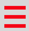
图41 三道杠
再修改.shape样式定义为:
.shape
{
40px;
height: 0;
color: red;
box-shadow: 20px 20px 0 3px ,20px 0 0 3px ,20px 40px 0 3px,
20px 10px 0 3px ,20px 30px 0 3px;
}
可在页面中显示如图42所示的五道杠。
图42 五道杠
修改.shape样式定义为:
.shape
{
position: relative;
80px;
height:80px;
box-shadow:-30px 0px 0px red,0px -30px 0px yellow,
30px 0px 0px green,0px 30px 0px blue;
}
可在页面中显示如图43所示的图形。

图43 四色方框
修改.shape样式定义为:
.shape
{
position: relative;
40px;
height: 40px;
background-color: black;
border-radius: 50%;
box-shadow: 0 0 0 15px #fff,0 0 0 25px #000;
}
可在页面中显示如图44所示的单选按钮。
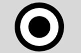
图44 单选按钮
修改.shape样式定义为:
.shape
{
80px;
height: 80px;
border-radius: 50%;
box-shadow: 15px 15px 0 0 white;
}
可在页面中看到如图45所示的弯月。

图45 弯弯的月亮
修改.shape样式定义为:
.shape
{
40px;
height: 40px;
background: #fff;
border-radius: 50%;
box-shadow: #fff 22px -15px 0 6px, #fff 57px -6px 0 2px, #fff 87px 4px 0 -4px,
#fff 33px 6px 0 6px, #fff 61px 6px 0 2px, #ccc 29px -23px 0 6px,
#ccc 64px -14px 0 2px, #ccc 94px -4px 0 -4px;
}
可在页面中看到如图46所示的云朵。

图46 云朵
修改.shape样式定义为:
.shape
{
160px;
height:160px;
border-radius: 50%;
box-shadow: inset 0 0 0 16px #fff,
-80px -80px 0 -64px #f00,
0 -112px 0 -64px #f0f,
80px -80px 0 -64px #ff0,
-80px 80px 0 -64px #0f0,
0 112px 0 -64px #0ff,
80px 80px 0 -64px #00f,
-112px 0 0 -64px #808,
112px 0 0 -64px #000;
}
可在页面中看到如图47所示的图形,在一个圆环的周围围了8个小圆。

图47 圆环周围的小圆