容器使用display:flex;
-webkit-display:flex;
-moz-display:flex;
行内元素使用display:inline-flex;
-webkit-display:inline-flex;
-moz-display:inline-flex;
注意,设为 Flex 布局以后,子元素的float、clear和vertical-align属性将失效。
容器有水平的主轴(main axis)和垂直的交叉轴(cross axis)
主轴起始点为main start,结束点为main end
交叉轴起始点为cross start,结束点为cross end
项目默认沿主轴排列
单个项目占据的主轴空间为main size,占据的交叉轴空间为cross size
容器的属性
- flex-direction:row(默认值,水平方向,起点在左)/
row-reverse(水平方向,起点在右)/
column(垂直方向,起点在上)/
column-reverse(垂直方向,起点在下)
- flex-wrap:nowrap(默认,不换行)/
wrap(换行,第一行在上)/
wrap-reverse(换行,第一行在下)
- flex-flow:flex-direction,flex-wrap;(默认值为row,nowrap)
- justify-content:flex-start(水平主轴上左对齐)/
flex-end(水平主轴上右对齐)/
center(水平主轴上居中对齐)/
space-between(水平主轴上两端对齐)/
space-around(水平主轴上每个项目两侧的间隔相等)
- align-items:flex-start(垂直交叉轴上顶点对齐)/
flex-end(垂直交叉轴上底点对齐)/
center(垂直交叉轴上居中对齐)/
baseline(垂直交叉轴上以项目第一行文字的基线对齐)/
stretch(默认值,如果项目未设置高度或设为auto,将占满整个容器的高度)
- 多轴线对齐方式(如果项目只有一根轴线,该属性不起作用)
align-content:flex-start(垂直交叉轴上顶点对齐)/
flex-end(垂直交叉轴上底点对齐)/
center(垂直交叉轴上居中对齐)/
space-between(垂直交叉轴上两端对齐)/
space-around(垂直交叉轴上每个项目两侧的间隔相等)/
stretch(默认值,轴线占满整个交叉轴)
项目的属性
- order:<整数值>;(定义项目的排列顺序,默认值为0,数值越小排列越靠前)
- flex-grow:<整数值>;(定义项目的放大比例,默认值为0)
- flex-shrink:<整数值>;(定义了项目的缩小比例,默认值为1)
- flex-basis:auto(默认值)/<数值>;(定义项目占据的主轴空间)
- flex:flex-grow,flex-shrink,flex-basis;(默认值为0,1,auto)
优先使用flex:auto/none;
- align-self:auto/fix-start/fix-end/center/baseline/stretch;

默认值为auto,设置单个项目有与其他项目不一样的对齐方式
实践:骰子效果
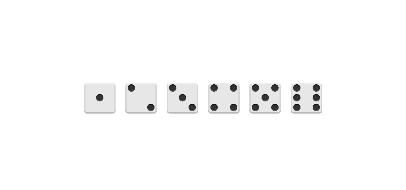
<!DOCTYPE html>
<html lang="en">
<head>
    <meta charset="UTF-8">
    <title>Title</title>
    <link rel="stylesheet" href="flex.css">
</head>
<body>
<div class="first-face">
    <span class="pip"></span>
</div>
<div class="second-face">
    <span class="pip"></span>
    <span class="pip"></span>
</div>
<div class="third-face">
    <span class="pip"></span>
    <span class="pip"></span>
    <span class="pip"></span>
</div>
<div class="fourth-face">
    <div class="column">
        <span class="pip"></span>
        <span class="pip"></span>
    </div>
    <div class="column">
        <span class="pip"></span>
        <span class="pip"></span>
    </div>
</div>
<div class="fifth-face">
    <div class="column">
        <span class="pip"></span>
        <span class="pip"></span>
    </div>
    <div class="column">
        <span class="pip"></span>
    </div>
    <div class="column">
        <span class="pip"></span>
        <span class="pip"></span>
    </div>
</div>
<div class="sixth-face">
    <div class="column">
        <span class="pip"></span>
        <span class="pip"></span>
        <span class="pip"></span>
    </div>
    <div class="column">
        <span class="pip"></span>
        <span class="pip"></span>
        <span class="pip"></span>
    </div>
</div>
</body>
</html>
.first-face {
    display: flex;
    justify-content: center;
    align-items: center;
}

.second-face {
    display: flex;
    justify-content: space-between;
}

.second-face .pip:nth-of-type(2) {
    align-self: flex-end;
}

.third-face {
    display: flex;
    justify-content: space-between;
}

.third-face .pip:nth-of-type(2) {
    align-self: center;
}

.third-face .pip:nth-of-type(3) {
    align-self: flex-end;
}

.fourth-face, .sixth-face {
    display: flex;
    justify-content: space-between;
}

.fourth-face .column, .sixth-face .column {
    display: flex;
    flex-direction: column;
    justify-content: space-between;
}

.fifth-face {
    display: flex;
    justify-content: space-between;
}

.fifth-face .column {
    display: flex;
    flex-direction: column;
    justify-content: space-between;
}

.fifth-face .column:nth-of-type(2) {
    justify-content: center;
}

/* OTHER STYLES */

* {
    box-sizing: border-box;
}

html, body {
    height: 100%;
}

body {
    display: flex;
    align-items: center;
    justify-content: center;
    vertical-align: center;
    flex-wrap: wrap;
    align-content: center;
    font-family: 'Open Sans', sans-serif;

    background: linear-gradient(top, #222, #333);
}

[class$="face"] {
    margin: 16px;
    padding: 4px;

    background-color: #e7e7e7;
    width: 104px;
    height: 104px;
    object-fit: contain;

    box-shadow:
            inset 0 5px white,
            inset 0 -5px #bbb,
            inset 5px 0 #d7d7d7,
            inset -5px 0 #d7d7d7;

    border-radius: 10%;
}

.pip {
    display: block;
    width: 24px;
    height: 24px;
    border-radius: 50%;
    margin: 4px;

    background-color: #333;
    box-shadow: inset 0 3px #111, inset 0 -3px #555;
}