1.Splash.vue
<!-- splash页面 -->
<template>
<div class="wrap" @focus="rotate" @load="rotate">
<!-- logo图标 -->
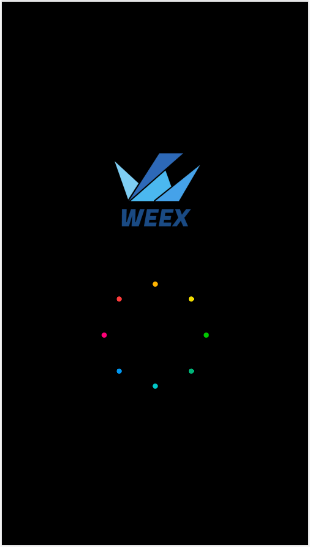
<div class="logo_wrap">
<image class="img_logo" :src="splash_logo" @click="rotate" />
</div>
<!-- 旋转动画 -->
<div id="animation" style="transform-origin:center center" ref="anim">
<image class="img_circle" @focus="rotate" :src="splash_circle" @click="rotate" />
</div>
</div>
</template>
<style scoped>
.wrap{
align-items: center;
justify-content: center;
background-color: #000;
}
/*logo图标*/
.logo_wrap {
300px;
height:300px;
}
.img_logo {
300px;
height:300px;
}
/*旋转图标*/
.img_circle {
400px;
height:400px;
align-items: center;
justify-content: center;
}
</style>
<script>
// 动画模块
const animation = weex.requireModule('animation');
// 弹窗
const modal = weex.requireModule('modal');
export default {
data() {
return {
splash_circle:'//duqian291902259.github.io/dusan/oair/splash_circle.png',
splash_logo:'//gw.alicdn.com/tps/i2/TB1DpsmMpXXXXabaXXX20ySQVXX-512-512.png_400x400.jpg',
current_rotate: 0,
current_scale: 1
}
},
mounted() {
this.rotate();
},
methods: {
goSite() {
// 页面跳转
this.$router.push({path:'/login'});
},
// 动画
anim(styles, timingFunction, duration, callback) {
var anim = this.$refs.anim;
// 动画效果
animation.transition(anim, {
styles: styles,
duration: duration, //ms
timingFunction: timingFunction,
needLayout:false,
delay: 0 //ms
}, callback);
},
// 旋转
rotate() {
var self = this;
self.current_rotate += 30;
self.anim({
transform: 'rotate(' + self.current_rotate + 'deg)'
}, 'ease-in-out', 100, function() {
if (self.current_rotate === 360) {
self.current_rotate = 0;
// 页面跳转
self.goSite();
}else if (self.current_rotate === 180){
self.scale();
}else{
self.rotate();
}
});
},
// 缩放
scale() {
var self = this;
self.current_scale = 0.3;
self.anim({
transform: 'scale(' + self.current_scale + ')'
}, 'linear', 500, function() {
self.current_scale =1;
// 调用旋转
self.rotate();
});
}
}
};
</script>
2.效果图