npm install --save react-navigation
1.测试TabNavigator、StackNavigator和DrawerNavigator
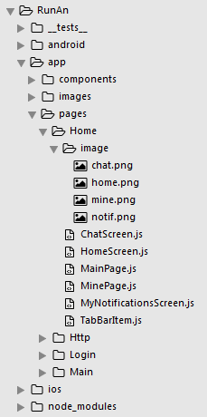
(1)新建HomeScreen.js
/**
 * 主页面
 */
import React, { Component } from 'react';
import {
    StyleSheet,
    View,
    Text,
    Button,
    Image,
} from 'react-native';

// 引入 导航组件
import {
    StackNavigator,
    TabNavigator,
    TabBarBottom,
} from 'react-navigation';

// TabBar 子组件
import TabBarItem from './TabBarItem';

// 引入 其他组件
import MainScreen from './MainPage';
import MineScreen from './MinePage';
import ChatScreen from './ChatScreen';

export default class HomeScreen extends Component {
    // 渲染页面
    render() {
        return (
            <Navigator />
        )
    }
}

/**
 * TabNavigator Tab选项卡
 * TabNavigator(RouteConfigs, TabNavigatorConfig)
 * 参数1:表示各个页面路由配置
 * 参数2:tab属性配置
 */
// 注册tabs (底部选项卡)
const Tab = TabNavigator(
    {
        Main:{
            screen:MainScreen, // 对应界面名称,可以在其他页面通过这个screen传值和跳转。
            navigationOptions:({navigation}) => ({ // 配置TabNavigator的一些属性
                tabBarLabel:'首页', // 设置标签栏的title
                tabBarIcon:({focused,tintColor}) => ( // 设置标签栏的图标。需要给每个都设置
                    <TabBarItem
                        tintColor={tintColor}
                        focused={focused}
                        normalImage={require('./image/home.png')}
                        selectedImage={require('./image/home.png')}
                    />
                )
            }),
        },

        Mine:{
            screen:MineScreen,
            navigationOptions:({navigation}) => ({
                tabBarLabel:'我的',
                tabBarIcon:({focused,tintColor}) => (
                    <TabBarItem
                        tintColor={tintColor}
                        focused={focused}
                        normalImage={require('./image/mine.png')}
                        selectedImage={require('./image/mine.png')}
                    />
                )
            }),
        },
    },
    {
        tabBarComponent:TabBarBottom, // 导航器 组件
        tabBarPosition:'bottom', // 显示在底端,android 默认是显示在页面顶端的
        swipeEnabled:false, // 禁止左右滑动
        animationEnabled:false, // 切换页面时不显示动画
        lazy:true, // 懒加载
        tabBarOptions:{
            activeTintColor:'#06c1ae', // 文字和图片选中颜色
            inactiveTintColor:'#979797', // 文字和图片默认颜色
            indicatorStyle: {height: 0}, // android 中TabBar下面会显示一条线,高度设为 0 后就不显示线了
            style:{
                backgroundColor:'#ffffff', // TabBar 背景色
            },
            labelStyle: {
                fontSize: 12, // 文字大小
            },
        }
    }
);

/**
 * 注册导航
 */
const Navigator = StackNavigator(
    {
        Tab:{screen:Tab},
        Chat:{screen:ChatScreen},
    },
    {
        initialRouteName:'Tab', // 默认显示页面
        navigationOptions:{
            // header:null, // 可以设置一些导航的属性,如果隐藏顶部导航栏只要将这个属性设置为null
            headerBackTitle: null, // 设置跳转页面左侧返回箭头后面的文字,默认是上一个页面的标题。
            headerTitleStyle: {fontSize:18, color:'#666666',alignSelf:'center'}, // 设置alignSelf:'center' 文字居中
            headerStyle: {height:48, backgroundColor:'#00BFFF'},
        },
        mode:'card', // 使用iOS和安卓默认的风格
    }
);
(2)新建MainPage.js
/**
* 首页
*/
import React, { Component } from 'react';
import {
Button,
Image,
View,
Text,
StyleSheet,
} from 'react-native';
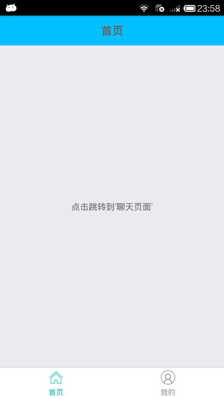
export default class MainPage extends Component {
static navigationOptions = {
title:'首页', // 顶部标题
};
render() {
const {navigate} = this.props.navigation;
return(
<View style={styles.container}>
<Text onPress={() =>{
navigate('Chat',{user:'Sybil'})
}}>点击跳转到'聊天页面'</Text>
</View>
);
}
_skip() {
/**
* 页面跳转并传值
* 参数1:页面名称
* 参数2:传的值
* <Text onPress={this._skip.bind(this)}>点击跳转到'我的页面'</Text>
*/
// this.props.navigation.navigate('Chat',{user:'Sybil'});
}
}
// 层叠样式表
const styles = StyleSheet.create({
container: {
flex: 1,
alignItems: 'center',
justifyContent: 'center',
},
});
(3)新建MinePage.js
/**
* 我的
*/
import React, {Component} from 'react';
import {
Button,
Image,
View,
Text,
StyleSheet,
} from 'react-native';
import {
DrawerNavigator
} from 'react-navigation';
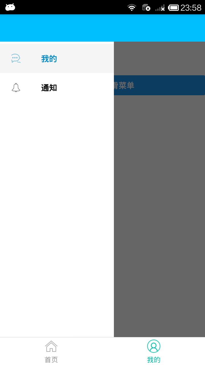
// 引入 侧滑菜单组件 (通知页)
import MyNotificationsScreen from './MyNotificationsScreen';
// 定义 我的组件
class MinePage extends Component{
// 定义抽屉子组件样式
static navigationOptions = {
title:'我的',
drawerLabel: '我的',
drawerIcon: ({ tintColor }) => (
<Image
source={require('./image/chat.png')}
style={[styles.tabIcon, {tintColor: tintColor}]}
/>
),
};
// 组件加载完成
componentDidMount() {
// 获取传值 {this.props.navigation.state.params.info}
// const {params} = this.props.navigation.state;
// const user = params.user;
// alert(user);
}
render(){;
return(
<View style={styles.container}>
<Text style={{padding:20}}>Sybil</Text>
<Button
style={{padding:20}}
onPress={() => this.props.navigation.navigate('DrawerOpen')}
title="点击打开侧滑菜单"
/>
</View>
);
}
}
const styles = StyleSheet.create({
container:{
flex:1,
backgroundColor:'#fff',
},
tabIcon: {
16,
height: 16,
},
});
/**
* 注册抽屉 (侧滑菜单)
* DrawerNavigator(RouteConfigs, DrawerNavigatorConfig)
* 参数1:抽屉包含的子组件
* 参数2:抽屉的样式
*/
const MyDrawerNavigator = DrawerNavigator(
{
Mine: {
screen: MinePage,
},
Notifications: {
screen: MyNotificationsScreen,
},
},
{
drawerWidth: 200, // 抽屉宽
drawerPosition: 'left', // 抽屉在左边还是右边
// contentComponent: CustomDrawerContentComponent, // 自定义抽屉组件
contentOptions: {
initialRouteName: MinePage, // 默认页面组件
activeTintColor: '#008AC9', // 选中文字颜色
activeBackgroundColor: '#f5f5f5', // 选中背景颜色
inactiveTintColor: '#000', // 未选中文字颜色
inactiveBackgroundColor: '#fff', // 未选中背景颜色
style: { // 样式
}
}
}
);
// 默认向外暴露 '我的抽屉' 组件
export default MyDrawerNavigator;
(4)编写TabBarItem.js
/**
 * TabBarItem 组件
 */
import React,{Component} from 'react';
import {Image} from 'react-native';

export default class TabBarItem extends Component {
    render() {
        return(
            <Image
                source={this.props.focused ? this.props.selectedImage : this.props.normalImage}
                style={{tintColor:this.props.tintColor,25,height:25 }}
            />
        )
    }
}
(5)编写ChatScreen.js
/**
 * 聊天页
 */
import React, { Component } from 'react';
import {
    Button,
    Image,
    View,
    Text
} from 'react-native';

export default class ChatScreen extends Component {
    static navigationOptions = {
        title:'聊天',
    };

    render() {
        const {params} = this.props.navigation.state;
        return (
        <View style={{backgroundColor:'#fff',flex:1}}>
            <Text style={{padding:20}}>Chat with {params.user}</Text>

        </View>

        );
    }
}
(6)编写MyNotificationsScreen.js
/**
* 侧滑菜单
* 通知页
*/
import React, { Component } from 'react';
import {
StyleSheet,
View,
Text,
Button,
Image
} from 'react-native';
// 定义 通知组件
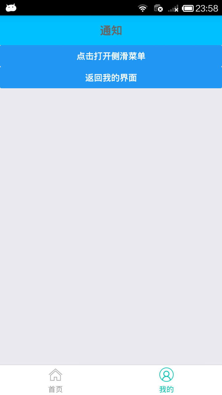
export default class MyNotificationsScreen extends Component {
// 定义抽屉子组件样式
static navigationOptions = {
title:'通知',
drawerLabel: '通知',
drawerIcon: ({ tintColor }) => (
<Image
source={require('./image/notif.png')}
style={[styles.tabIcon, {tintColor: tintColor}]}
/>
),
};
render() {
return (
<View style={styles.container}>
<Button
style={{padding:20}}
onPress={() => this.props.navigation.navigate('DrawerOpen')}
title="点击打开侧滑菜单"
/>
<Button
onPress={() => this.props.navigation.goBack()}
title="返回我的界面"
/>
</View>
);
}
}
const styles = StyleSheet.create({
container: {
backgroundColor:'#fff',
},
tabIcon: {
16,
height: 16,
},
});
效果图