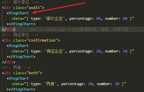
使用方法
可以通过传递props数据动态渲染环形图,只需导入单独的组件即可
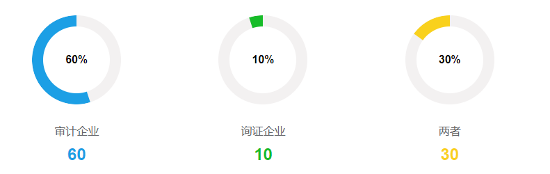
效果展示
vue组件代码
数据判断渲染逻辑请自行查看
需要看原版环形图CSS的请查看参考文献。
<template>
  <div class="ring-data">
    <div class="loading">
      <div class="left" ref="left" :style="style"></div>
      <div class="right" ref="right" :style="style"></div>
      <div class="progress">{{ data.percentage }}%</div>
    </div>
    <div class="unit">{{ data.type }}</div>
    <div class="number" :style="textColor">{{ data.number }}</div>
  </div>
</template>

<script>
export default {
  name: 'RingData',
  data() {
    return {
      style: {
        '--bgColor': '#1c9fe5',
        '--left': `rotateZ(180deg)`,
        '--right': `rotateZ(180deg)`
      }
    }
  },
  props: {
    data: {
      type: Object,
      default() {
        return {}
      },
      require: true
    }
  },
  created: function() {
    this.changeStyle()
  },
  methods: {
    changeStyle() {
      // 改变环形比例
      if (this.data.percentage < 50) {
        this.style['--left'] = `rotateZ(${180 -
          (this.data.percentage / 100) * 180}deg)`
      } else if (this.data.percentage === 50) {
        this.style['--left'] = `rotateZ(0deg)`
      } else if (this.data.percentage < 100) {
        this.style['--left'] = `rotateZ(0deg)`
        this.style['--right'] = `rotateZ(${180 -
          ((this.data.percentage - 50) / 100) * 180}deg)`
      } else if (this.data.percentage === 100) {
        this.style['--left'] = `rotateZ(0deg)`
        this.style['--right'] = `rotateZ(0deg)`
      }
      // 改变环形颜色
      if (this.data.type === '审计企业') {
        this.style['--bgColor'] = '#1c9fe5'
      } else if (this.data.type === '询证企业') {
        this.style['--bgColor'] = '#17bc29'
      } else if (this.data.type === '两者') {
        this.style['--bgColor'] = '#f9d11d'
      }
    }
  },
  computed: {
    textColor() {
      if (this.data.type === '审计企业') {
        return { color: '#1c9fe5' }
      } else if (this.data.type === '询证企业') {
        return { color: '#17bc29' }
      } else if (this.data.type === '两者') {
        return { color: '#f9d11d' }
      }
    }
  }
}
</script>

<style scoped lang="scss">
.ring-data {
  display: flex;
  flex-direction: column;
  align-items: center;
  .loading {
    margin-top: 20px;
  }
  .unit {
    margin-top: 30px;
    color: #606266;
    text-align: center;
  }
  .number {
    margin-top: 10px;
    font-size: 24px;
    font-weight: bold;
    color: #1c9fe5;
    text-align: center;
  }
}
.loading {
  // margin: 100px auto;
   8em;
  height: 8em;
  position: relative;
}

.loading .progress {
  position: absolute;
   6em;
  height: 6em;
  font-weight: bold;
  background-color: white;
  border-radius: 50%;
  left: 1em;
  top: 1em;
  line-height: 6em;
  text-align: center;
}

.left,
.right {
   4em;
  height: 8em;
  overflow: hidden;
  position: relative;
  float: left;
  background-color: rgb(243, 241, 241);
}

.left {
  border-radius: 8em 0 0 8em;
}

.right {
  border-radius: 0 8em 8em 0;
}

.left:after,
.right:after {
  content: '';
  position: absolute;
  display: block;
   4em;
  height: 8em;
  background-color: white;
  border-radius: 8em 0 0 8em;
  background-color: var(--bgColor);
}

.right:after {
  content: '';
  position: absolute;
  display: block;
  border-radius: 0 8em 8em 0;
}
.left:after {
  transform-origin: right center;
  // 0%-50%左侧
  transform: var(--left);
}

.right:after {
  transform-origin: left center;
  // 50%-100%右侧
  transform: var(--right);
}
</style>