1.头部导航栏下拉弹框

单纯的下拉弹框,我们在很多组件中都可以找到,但是放在头部导航的位置组件不常见,期初我也借用很多组件的方式展示,均已失败告终,索性自己动手写了一个。
HTML部分
<view class="selectBox">
            <view class="select" @tap="showPicker('selector')">
                <view class="sel-text">
                    <label>{{value}}</label>
                    <u-icon name="arrow-down-fill"></u-icon>
                </view>
            </view>
            <view class="map">
                <i class="iconfont icondituzhanshi"></i>
                <!-- <label>地图展示</label> -->
            </view>
            <view class="fanHui" @tap="navigateBack">
                <i class="iconfont iconfanhui"></i>
            </view>
            <w-picker mode="selector" default-type="value" :default-props="defaultProps" themeColor="#2152BA" @confirm="onConfirm($event,'selector')"
             @cancel="onCancel" ref="selector" :value="value" :options="array"></w-picker>
        </view>
【注】引入uniapp封装下拉弹框

JS部分
<script>
    import wPicker from '@/components/w-picker/w-picker.vue';
    export default {
        components: {
            wPicker
        },
        data() {
            return {
                value: '雨花街道',
                array: [{
                    name: '雨花街道'
                }, {
                    name: '软件大道'
                }, {
                    name: '宏运大道'
                }],
                defaultProps: {
                    label: "name",
                    value: "index",
                },
            }
        },
        methods: {
            showPicker(type) {
                this.$refs[type].show();
            },
            onConfirm(res, type) {
                this.value = res.result;
                console.log(res)
            },
            navigateBack() {
                uni.navigateBack();
            }
        }
    }
</script>
CSS部分
【注】工作中用的是scss预处理,会出现一些变量,将变量改成自己项目中的颜色即可,例:background: $bg-color-fff; 改为:background: #fff;即可
.selectBox{
    width: 100%;
    height: 128upx;
    background: $bg-color-fff;
    padding: 40upx 28upx 0 28upx;
    display: flex;
    justify-content: center;
    position: fixed;
    top: 0upx;
    z-index: 9999;
}
.select{
    display: flex;
    padding: 16upx 28upx;
}
.sel-tit{
    font-size: $fonts-16;
}
.sel-text{
    height: 60upx;
    line-height: 60upx;
    padding: 0 30upx;
    border-radius: 60upx;
    background: $bg-color-2152BA;
    margin-left: 20upx;
    color: $bg-color-fff;
}
.sel-text .u-icon{
    color: $bg-color-fff;
    margin-left: 16upx;
    font-size: $fonts-12;
}
重点来了!!!
这种方式对安卓、H5都没问题,但是iOS头部刘海屏会遮挡!
如何解决安卓和iOS兼容性问题?话不多说,直接上代码
@media only screen and (min-height: 812px){
    .selectBox{
        position: fixed;
        top: 40upx;
    }
    .xmCont{
        margin-top: 188upx;
    }
}
媒体查询,根据高度做兼容性处理

min-height: 812px是由iPhoneX的高度决定的,当最小高度时812时将进入媒体查询。
【注】媒体查询需要放在css文件的最后,不然会被之前的css样式覆盖。

2.数字弹框验证
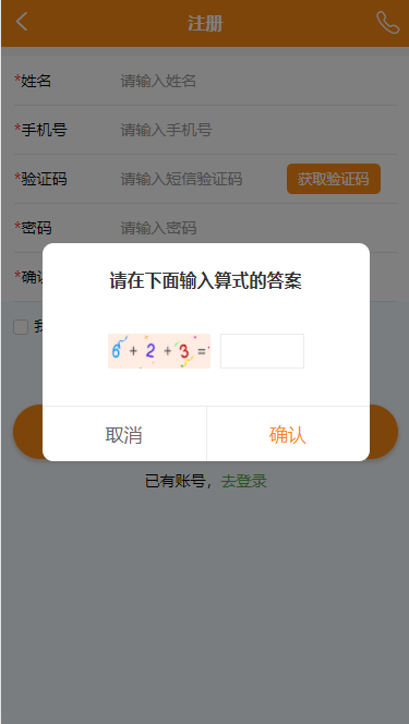
思路:盒子最外层用背景图片,里面用数字和符号用相同大小的图片展示
HTML:
<!-- 验证框 -->
            <view class="uni-mask" v-if="showYZ"></view>
            <view class="yzView" v-if="showYZ">
                <view class="tips">请在下面输入算式的答案</view>
                <view class="numView">
                    <view class="num">
                        <image src="../static/img/icon/num-icon6.png"></image>
                        <image src="../static/img/icon/num-icon10.png"></image>
                        <image src="../static/img/icon/num-icon2.png"></image>
                        <image src="../static/img/icon/num-icon10.png"></image>
                        <image src="../static/img/icon/num-icon3.png"></image>
                        <image src="../static/img/icon/num-icon11.png"></image>
                    </view>
                    <view class="inputView">
                        <input type="text" value="" v-model="calResult"/>
                    </view>
                </view>
                <view class="confirmView">
                    <view class="cancel" @tap='hideYzView()'>取消</view>
                    <view class="confirm" @tap='GetCode()'>确认</view>
                </view>
            </view>
            <!-- 验证框 end -->
CSS:
/* 验证框 */
.yzView{
    width: 80%;
    height: 400upx;
    background-color: #fff;
    z-index: 1000;
    border-radius: 20upx;
    position: absolute;
    top: 360upx;
    left: 50%;
    margin-left: -40%;
}
.tips{
    padding-top: 40upx;
    text-align: center;
    font-size: 16px;
    font-weight: bold;
    color: #333;
}
.confirmView{
    width: 100%;
    display: flex;
    border-top: 1px solid #EBEBEB;
    position: absolute;
    bottom: 0;
}
.confirmView view{
    width: 50%;
    text-align: center;
    height: 100upx;
    line-height: 100upx;
    font-size: 17px;
}
.cancel{
    color: #666;
}
.confirm{
    color: #fa8b15;
}
.confirm{
    border-left: 1px solid #EBEBEB;
}
.numView{
    display: flex;
    justify-content: center;
    padding: 70upx 0;
}
.num{
    width: 188upx;
    height: 64upx;
    line-height: 64upx;
    display: flex;
    align-items: center;
    background: url(~@/static/img/icon/numBg.png) no-repeat center center;
    background-size: 188upx 64upx;
}
.num image {
    width: 40upx;
    height: 40upx;
    vertical-align: middle;
}
.inputView{
    width: 154upx;
    height: 64upx;
    margin-left: 18upx;
    border: 1px solid #EBEBEB;
}
/* 验证框 end */