使用场景
sticky:粘性。粘性布局。
在屏幕范围内时,元素不受定位影响(即top、left等设置无效);
当元素的位置将要移出偏移范围时,定位又会变成fixed,根据设置的left、top等属性成固定位置的效果。
说明:元素并没有脱离文档流。
1.示例一:
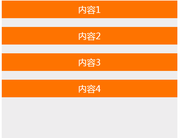
<div class="container">
      <div class="sticky-box">内容1</div>
      <div class="sticky-box">内容2</div>
      <div class="sticky-box">内容3</div>
      <div class="sticky-box">内容4</div>
</div>
.container {
                width: 600px;
                height: 10000px;
                margin: 0 auto;
                border: solid 1px red;
            }

            .sticky-box {
                position: -webkit-sticky;
                position: sticky;
                height: 60px;
                margin-bottom: 30px;
                background: #ff7300;
                top: 0px;
                font-size: 30px;
                text-align: center;
                color: #fff;
                line-height: 60px;
            }
2.示例二:
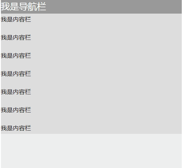
<div class="container">
            <nav>我是导航栏</nav>
            <div class="content">
                <p>我是内容栏</p>
                <p>我是内容栏</p>
                <p>我是内容栏</p>
                <p>我是内容栏</p>
                <p>我是内容栏</p>
                <p>我是内容栏</p>
                <p>我是内容栏</p>
                <p>我是内容栏</p>
            </div>
        </div>
.container {
                width: 600px;
                height: 10000px;
                margin: 0 auto;
                border: solid 1px red;
            }
            nav {
                position: -webkit-sticky;
                position: sticky;
                top: 0;
            }
            nav {
                height: 50px;
                background: #999;
                color: #fff;
                font-size: 30px;
                line-height: 50px;
            }
            .content {
                margin-top: 30px;
                background: #ddd;
            }
            p {
                line-height: 40px;
                font-size: 20px;
            }