在做一个移动端排班的时候需要某一行的字超出的部分用省略号代替 然后写着发现后面排版乱了
HTML结构如下 我想让第二个span的内容加省略号
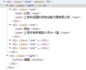
css正确的代码如下
 1 .list {
 2         width: 100%;
 3         .item {
 4             width: 100%;
 5             height: 4rem;
 6             display: flex;
 7             background-color: #eee;
 8             margin: 0.1rem 0;
 9             .left {
10                 flex: 8;
11                 display: flex;
12                 flex-direction: column;
13                 padding: 0.15rem;
14                 box-sizing: border-box;
15                 min-width: 0;  //就是这行改变了
16                 .one {
17                     flex: 1;
18                     font-size: 0.36rem;
19                     @extend %juzhong;
20
21                     span {
22                         height: 100%;
23
24                         &:nth-child(1) {
25                             flex: 3;
26                         }
27                         &:nth-child(2) {
28                             flex: 7;
29                             overflow: hidden;
30                             text-overflow: ellipsis;
31                             white-space: nowrap;
32                         }
33                     }
34                 }
35             }
如果去掉了15行就会出现下图这种效果
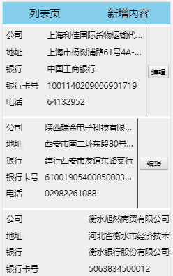
加上排版就好了
至于为什么我也不知道 痛苦~~~~~
望哪位大神知道原因告知一下 跪求