本来想把实例也写到上篇博客里,最后发现太长了,拆成两篇博客了。
实例来源于官方文档:http://www.jqplot.com/tests/
这篇博客主要是翻译了官方文档关于经典实例的解说,并在相应代码中添加注释。
写到后面的时候,感觉有点心不在焉,如果有错误,或者看不懂的,欢迎留言。
Line charts, scatter plots and series options(线图,散点图和系列选项)
该类型图表可能依赖于以下插件
<script type="text/javascript" src="../src/plugins/jqplot.canvasTextRenderer.min.js"></script>
<script type="text/javascript" src="../src/plugins/jqplot.canvasAxisLabelRenderer.min.js"></script>
大部分基本的jqPlot图表是根据一系列数据绘制出一条线。没有选项需要提供。数据是一系列数组,它可以是y值组成的数组,也可以是[x,y]组成的数组。如果只有y值,x值将被自动赋值,1,2,3,4...
下面这个图表不需要任何插件
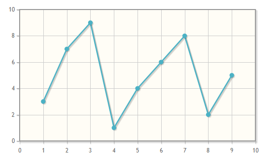
$(document).ready(function(){
    var plot1 = $.jqplot ('chart1', [[3,7,9,1,4,6,8,2,5]]);
});
下面这个图表使用了一些选项来设置标题,添加轴标签,并展示了如何使用canvasAxisLabelRenderer插件来提供旋转轴标签。
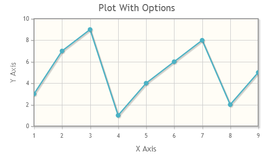

$(document).ready(function(){
  var plot2 = $.jqplot ('chart1', [[3,7,9,1,4,6,8,2,5]], {
      // Give the plot a title.
      // 设置标题
      title: 'Plot With Options',
      // You can specify options for all axes on the plot at once with
      // the axesDefaults object.  Here, we're using a canvas renderer
      // to draw the axis label which allows rotated text.
      // 设置默认坐标轴属性
      axesDefaults: {
        // 设置x轴y轴label的渲染器
        labelRenderer: $.jqplot.CanvasAxisLabelRenderer
      },
      // An axes object holds options for all axes.
      // Allowable axes are xaxis, x2axis, yaxis, y2axis, y3axis, ...
      // Up to 9 y axes are supported.
      axes: {
        // options for each axis are specified in seperate option objects.
        xaxis: {
          label: "X Axis",
          // Turn off "padding".  This will allow data point to lie on the
          // edges of the grid.  Default padding is 1.2 and will keep all
          // points inside the bounds of the grid.
          pad: 0
        },
        yaxis: {
          label: "Y Axis"
        }
      }
    });
});
下面的例子使用了许多线条样式选项来控制线条和标记显示
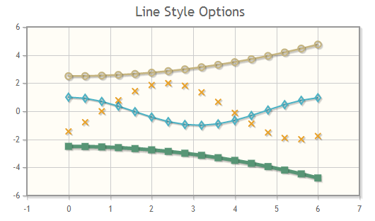
$(document).ready(function(){
  // Some simple loops to build up data arrays.
  var cosPoints = [];
  // 获取cos(i)的值,i的间隔为0.4
  for (var i=0; i<2*Math.PI; i+=0.4){
    cosPoints.push([i, Math.cos(i)]);
  }

  var sinPoints = [];
  // 获取sin(i)的值,i的间隔为0.4
  for (var i=0; i<2*Math.PI; i+=0.4){
     sinPoints.push([i, 2*Math.sin(i-.8)]);
  }

  var powPoints1 = [];
  // 获取2.5+(i/4)^2的值,i的间隔为0.4
  for (var i=0; i<2*Math.PI; i+=0.4) {
      powPoints1.push([i, 2.5 + Math.pow(i/4, 2)]);
  }

  var powPoints2 = [];
  // 获取-2.5-(i/4)^2的值,i的间隔为0.4
  for (var i=0; i<2*Math.PI; i+=0.4) {
      powPoints2.push([i, -2.5 - Math.pow(i/4, 2)]);
  }

  var plot3 = $.jqplot('chart1', [cosPoints, sinPoints, powPoints1, powPoints2],
    {
      title:'Line Style Options',
      // Series options are specified as an array of objects, one object
      // for each series.
      // 配置要绘制的线的参数
      series:[
          {
            // Change our line width and use a diamond shaped marker.
            // 设置线宽为2px
            lineWidth:2,
            // 设置点的标记为空心菱形
            markerOptions: { style:'dimaond' }
          },
          {
            // Don't show a line, just show markers.
            // Make the markers 7 pixels with an 'x' style
            // 设置不显示线
            showLine:false,
            // 设置点用符号x表示,大小为7px
            markerOptions: { size: 7, style:"x" }
          },
          {
            // Use (open) circlular markers.
            // 设置点的标记为空心圆
            markerOptions: { style:"circle" }
          },
          {
            // Use a thicker, 5 pixel line and 10 pixel
            // filled square markers.
            // 设置线宽为5px
            lineWidth:5,
            // 设置点的标记为实心正方形
            markerOptions: { style:"filledSquare", size:10 }
          }
      ]
    }
  );
});
Axis Labels and label options(坐标轴标签和标签选项)
该类型图表可能依赖于以下插件
<script type="text/javascript" src="../src/plugins/jqplot.canvasTextRenderer.min.js"></script>
<script type="text/javascript" src="../src/plugins/jqplot.canvasAxisLabelRenderer.min.js"></script>
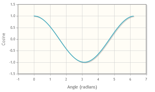
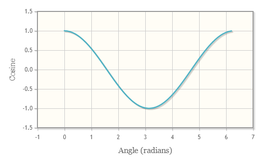
jqPlot通过每个坐标轴的label选项配置坐标轴的标签。默认的label渲染器在div标签中创建labels。这使得在每一个label完全受CSS控制。labels被赋的css类名是""jqplot-axis_name-label",其中"axis_name"是xaxis, yaxis等。

$(document).ready(function(){
  var cosPoints = [];
  for (var i=0; i<2*Math.PI; i+=0.1){
     cosPoints.push([i, Math.cos(i)]);
  }
  var plot1 = $.jqplot('chart1', [cosPoints], {
      // 设置不显示点的标记
      series:[{showMarker:false}],
      axes:{
        xaxis:{
          label:'Angle (radians)'
        },
        yaxis:{
          label:'Cosine'
        }
      }
  });
});
通过包含"jqplot.canvasTextRenderer.min.js"和"jqplot.canvasAxisLabelRenderer.min.js"插件,可以直接将label文本渲染到canvas元素上。这也允许文本旋转,而且y轴上的标签会默认旋转90度。默认情况下,标签将使用Hershey字体。最新的浏览器(包括IE 9)都支持在画布元素原生文本渲染。
$(document).ready(function(){
  var cosPoints = [];
  for (var i=0; i<2*Math.PI; i+=0.1){
     cosPoints.push([i, Math.cos(i)]);
  }
  var plot2 = $.jqplot('chart1', [cosPoints], {
      series:[{showMarker:false}],
      axes:{
        xaxis:{
          label:'Angle (radians)',
          // 设置渲染器为CanvasAxisLabelRenderer
          labelRenderer: $.jqplot.CanvasAxisLabelRenderer
        },
        yaxis:{
          label:'Cosine',
          labelRenderer: $.jqplot.CanvasAxisLabelRenderer
        }
      }
  });
});
如果访问者使用浏览器支持本地canvas字体,他们会看到下面图表中的label被渲染为12px的Georgia字体(或他们的系统的默认字体,当Georgia字体不可用时)。如果他们的浏览器不支持,他们将看到默认的Hershey字体。
$(document).ready(function(){
  var cosPoints = [];
  for (var i=0; i<2*Math.PI; i+=0.1){
     cosPoints.push([i, Math.cos(i)]);
  }
  var plot3 = $.jqplot('chart3', [cosPoints], {
      series:[{showMarker:false}],
      axes:{
        xaxis:{
          label:'Angle (radians)',
          labelRenderer: $.jqplot.CanvasAxisLabelRenderer,
          labelOptions: {
            fontFamily: 'Georgia, Serif',
            fontSize: '12pt'
          }
        },
        yaxis:{
          label:'Cosine',
          labelRenderer: $.jqplot.CanvasAxisLabelRenderer,
          labelOptions: {
            fontFamily: 'Georgia, Serif',
            fontSize: '12pt'
          }
        }
      }
  });
});
Axis Tick Labels and rotated text(坐标轴刻度标签和旋转文本)
该类型图表可能依赖于以下插件
<script type="text/javascript" src="../src/plugins/jqplot.dateAxisRenderer.min.js"></script>
<script type="text/javascript" src="../src/plugins/jqplot.canvasTextRenderer.min.js"></script>
<script type="text/javascript" src="../src/plugins/jqplot.canvasAxisTickRenderer.min.js"></script>
<script type="text/javascript" src="../src/plugins/jqplot.categoryAxisRenderer.min.js"></script>
<script type="text/javascript" src="../src/plugins/jqplot.barRenderer.min.js"></script>
坐标轴旋转刻度标签是可以通过"jqplot.canvasTextRenderer.min.js"和"jqplot.canvasAxisTickRenderer.min.js"插件实现。本地canvas字体渲染能力被用在支持的浏览器。这包括大多数最新的浏览器(包括IE 9)。在不支持原生的画布字体文本浏览器,文本使用Hershey的字体。
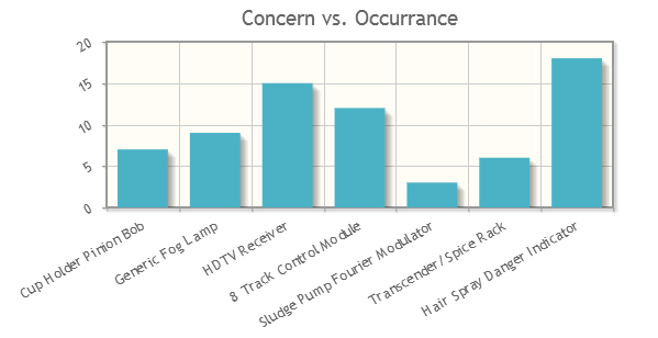
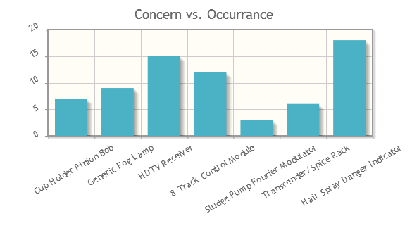
$(document).ready(function(){
  var line1 = [['Cup Holder Pinion Bob', 7], ['Generic Fog Lamp', 9], ['HDTV Receiver', 15],
  ['8 Track Control Module', 12], [' Sludge Pump Fourier Modulator', 3],
  ['Transcender/Spice Rack', 6], ['Hair Spray Danger Indicator', 18]];

  var plot1 = $.jqplot('chart1', [line1], {
    title: 'Concern vs. Occurrance',
    // 选择使用柱状图渲染器
    series:[{renderer:$.jqplot.BarRenderer}],
    axesDefaults: {
        // 设置tick的渲染器为CanvasAxisTickRenderer
        tickRenderer: $.jqplot.CanvasAxisTickRenderer ,
        tickOptions: {
          // 字体旋转-30度
          angle: -30,
          fontSize: '10pt'
        }
    },
    axes: {
      xaxis: {
        renderer: $.jqplot.CategoryAxisRenderer
      }
    }
  });
});
为了便于比较,这里是相同的图形,不同的"fontFamily"。如果你的浏览器支持,你能看到标签字体的差异。
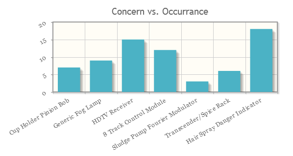
$(document).ready(function(){
  var line1 = [['Cup Holder Pinion Bob', 7], ['Generic Fog Lamp', 9], ['HDTV Receiver', 15],
  ['8 Track Control Module', 12], [' Sludge Pump Fourier Modulator', 3],
  ['Transcender/Spice Rack', 6], ['Hair Spray Danger Indicator', 18]];
  var plot1b = $.jqplot('chart1b', [line1], {
    title: 'Concern vs. Occurrance',
    series:[{renderer:$.jqplot.BarRenderer}],
    axesDefaults: {
        tickRenderer: $.jqplot.CanvasAxisTickRenderer ,
        tickOptions: {
          fontFamily: 'Georgia',
          fontSize: '10pt',
          angle: -30
        }
    },
    axes: {
      xaxis: {
        renderer: $.jqplot.CategoryAxisRenderer
      }
    }
  });
});
默认的定位于主坐标轴或次坐标轴以及旋转标签用以确保标签指向适当的柱状或刻度位置。
这里还要注意在Y轴的"autoscale"选项的使用。
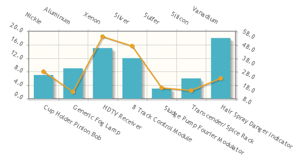
$(document).ready(function(){
  var line1 = [['Cup Holder Pinion Bob', 7], ['Generic Fog Lamp', 9], ['HDTV Receiver', 15],
  ['8 Track Control Module', 12], [' Sludge Pump Fourier Modulator', 3],
  ['Transcender/Spice Rack', 6], ['Hair Spray Danger Indicator', 18]];
  var line2 = [['Nickle', 28], ['Aluminum', 13], ['Xenon', 54], ['Silver', 47],
  ['Sulfer', 16], ['Silicon', 14], ['Vanadium', 23]];

  var plot2 = $.jqplot('chart2', [line1, line2], {
    series:[{renderer:$.jqplot.BarRenderer}, {xaxis:'x2axis', yaxis:'y2axis'}],
    axesDefaults: {
        tickRenderer: $.jqplot.CanvasAxisTickRenderer ,
        tickOptions: {
          angle: 30
        }
    },
    axes: {
      xaxis: {
        renderer: $.jqplot.CategoryAxisRenderer
      },
      x2axis: {
        renderer: $.jqplot.CategoryAxisRenderer
      },
      yaxis: {
        autoscale:true
      },
      y2axis: {
        autoscale:true
      }
    }
  });
});
可以通过指定的LabelPosition的'start', 'middle'或'end'覆盖默认的位置。默认为"auto"设置。
$(document).ready(function(){
  var line1 = [['Cup Holder Pinion Bob', 7], ['Generic Fog Lamp', 9], ['HDTV Receiver', 15],
  ['8 Track Control Module', 12], [' Sludge Pump Fourier Modulator', 3],
  ['Transcender/Spice Rack', 6], ['Hair Spray Danger Indicator', 18]];
  var plot3 = $.jqplot('chart1', [line1], {
    title: 'Concern vs. Occurrance',
    series:[{renderer:$.jqplot.BarRenderer}],
    axesDefaults: {
        tickRenderer: $.jqplot.CanvasAxisTickRenderer,
        tickOptions: {
          angle: -30
        }
    },
    axes: {
      xaxis: {
        renderer: $.jqplot.CategoryAxisRenderer,
        tickOptions: {
          // 设置tick的label位置在中间
          labelPosition: 'middle'
        }
      },
      yaxis: {
        autoscale:true,
        tickRenderer: $.jqplot.CanvasAxisTickRenderer,
        tickOptions: {
          // 设置tick的label位置在前边
          labelPosition: 'start'
        }
      }
    }
  });
});
AJAX, JSON data loading and external plot data functions(Ajax,JSON数据加载和外部数据绘图功能)
该类型图表可能依赖于以下插件
<script type="text/javascript" src="../src/plugins/jqplot.json2.min.js"></script>
数据渲染器允许jqPlot从外部源(例如执行一个AJAX调用一个函数)中提取数据。外部源简单的将图表选项分配给"dataRenderer"。数据渲染的唯一要求是,它必须返回一个有效jqPlot数据数组。

$(document).ready(function(){
  // Our data renderer function, returns an array of the form:
  // [[[x1, sin(x1)], [x2, sin(x2)], ...]]
  // 自定义dataRenderer,返回一个有效数组
  var sineRenderer = function() {
    var data = [[]];
    for (var i=0; i<13; i+=0.5) {
      data[0].push([i, Math.sin(i)]);
    }
    return data;
  };

  // we have an empty data array here, but use the "dataRenderer"
  // option to tell the plot to get data from our renderer.
  // 使用dataRenderer生成数据,再绘制图表
  var plot1 = $.jqplot('chart1',[],{
      title: 'Sine Data Renderer',
      dataRenderer: sineRenderer
  });
});
下面的例子展示了一个更复杂的例子,它使用AJAX从外部JSON数据源中提取数据。
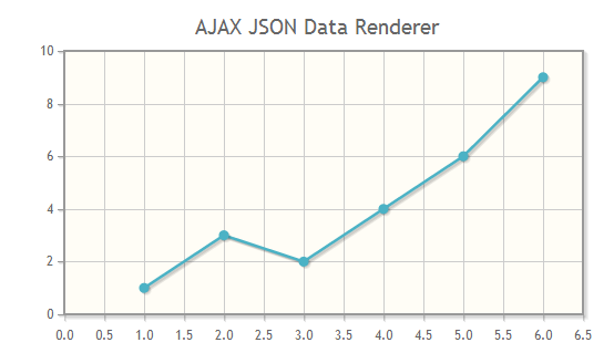
$(document).ready(function(){
  // Our ajax data renderer which here retrieves a text file.
  // it could contact any source and pull data, however.
  // The options argument isn't used in this renderer.
  var ajaxDataRenderer = function(url, plot, options) {
    var ret = null;
    $.ajax({
      // have to use synchronous here, else the function
      // will return before the data is fetched
      // 使用异步
      async: false,
      url: url,
      // 数据类型是json
      dataType:"json",
      // AJAX成功后调用
      success: function(data) {
        ret = data;
      }
    });
    return ret;
  };

  // The url for our json data
  var jsonurl = "./jsondata.txt";

  // passing in the url string as the jqPlot data argument is a handy
  // shortcut for our renderer.  You could also have used the
  // "dataRendererOptions" option to pass in the url.
  var plot2 = $.jqplot('chart1', jsonurl,{
    title: "AJAX JSON Data Renderer",
    dataRenderer: ajaxDataRenderer,
    dataRendererOptions: {
      // 传递url参数到dataRenderer中
      unusedOptionalUrl: jsonurl
    }
  });
});
jsondata.txt
[[1, 3, 2, 4, 6, 9]]
Data point highlighting and mouse cursor tracking(数据点的高亮显示和鼠标光标跟踪)
该类型图表可能依赖于以下插件
<script type="text/javascript" src="../src/plugins/jqplot.highlighter.min.js"></script>
<script type="text/javascript" src="../src/plugins/jqplot.cursor.min.js"></script>
<script type="text/javascript" src="../src/plugins/jqplot.dateAxisRenderer.min.js"></script>
高亮插件将突出鼠标附近的数据点和显示一个可选有数据值的提示。默认情况下,提示的数据值将与坐标轴刻度值格式化为相同的格式。文本格式可以自定义格式字符串。
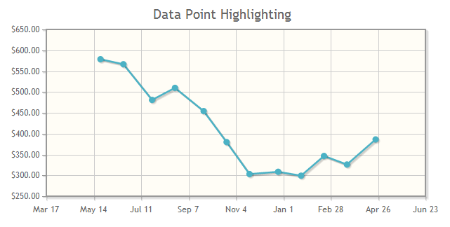
$(document).ready(function(){
  var line1=[['23-May-08', 578.55], ['20-Jun-08', 566.5], ['25-Jul-08', 480.88], ['22-Aug-08', 509.84],
      ['26-Sep-08', 454.13], ['24-Oct-08', 379.75], ['21-Nov-08', 303], ['26-Dec-08', 308.56],
      ['23-Jan-09', 299.14], ['20-Feb-09', 346.51], ['20-Mar-09', 325.99], ['24-Apr-09', 386.15]];
  var plot1 = $.jqplot('chart1', [line1], {
      title:'Data Point Highlighting',
      axes:{
        xaxis:{
          renderer:$.jqplot.DateAxisRenderer,
          tickOptions:{
            // x轴刻度标签格式化为月日,如: May 1
            formatString:'%b %#d'
          }
        },
        yaxis:{
          tickOptions:{
            // y轴刻度标签格式化为带两位小数的美元数,如: $500.00
            formatString:'$%.2f'
            }
        }
      },
      highlighter: {
        // 是否高亮显示
        show: true,
        // 当鼠标移动到数据点上时,数据点扩大的增量增量
        sizeAdjust: 7.5
      },
      cursor: {
        // 是否显示光标,若为true,光标默认为十字
        show: false
      }
  });
});
光标插件改变鼠标光标,当它进入图形区域,将显示一个鼠标位置的提示。提示可以是在一个固定的位置,或者它可以跟随鼠标移动。该指针的样式,默认设置为十字,也可以自定义指针样式。提示值的格式类似高亮插件。默认情况下,他们所使用轴的格式化方式,但可以定制。

$(document).ready(function(){
  var line1=[['23-May-08', 578.55], ['20-Jun-08', 566.5], ['25-Jul-08', 480.88], ['22-Aug-08', 509.84],
      ['26-Sep-08', 454.13], ['24-Oct-08', 379.75], ['21-Nov-08', 303], ['26-Dec-08', 308.56],
      ['23-Jan-09', 299.14], ['20-Feb-09', 346.51], ['20-Mar-09', 325.99], ['24-Apr-09', 386.15]];
  var plot2 = $.jqplot('chart1', [line1], {
    title:'Mouse Cursor Tracking',
    axes:{
      xaxis:{
        renderer:$.jqplot.DateAxisRenderer,
          tickOptions:{
            formatString:'%b %#d'
          }
      },
      yaxis:{
        tickOptions:{
          formatString:'$%.2f'
        }
      }
    },
    highlighter: {
      show: false
    },
    cursor: {
      // 显示光标,光标默认为十字
      show: true,
      // 提示的位置在左下角
      tooltipLocation:'sw'
    }
  });
});
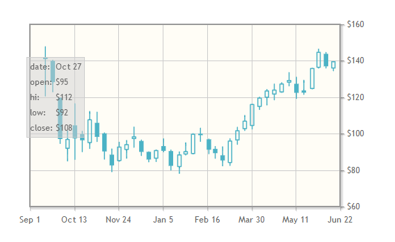
Candlestick and Open Hi Low Close charts(蜡杆图表和美国线即OHLC图表)
该类型图表可能依赖于以下插件
<script type="text/javascript" src="../src/plugins/jqplot.dateAxisRenderer.min.js"></script>
<script type="text/javascript" src="../src/plugins/jqplot.ohlcRenderer.min.js"></script>
<script type="text/javascript" src="../src/plugins/jqplot.highlighter.min.js"></script>
OHLC,HLC和K线图是使用$.jqplot.OHLCRenderer插件创建的。下面的图表利用高亮插件,当鼠标移过一个数据点,它会显示一个定制的提示。
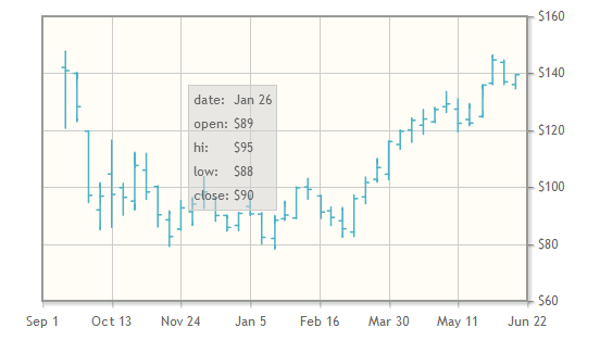
$(document).ready(function(){
  // Note, the ohlc data is specified below
  // 其中的ohlc数据会在下面展示
  var plot1 = $.jqplot('chart1',[ohlc],{
    // use the y2 axis on the right of the plot
    //rather than the y axis on the left.
    // 选择y轴为y2axis,位于图表右侧
    seriesDefaults:{yaxis:'y2axis'},
    axes: {
      xaxis: {
        renderer:$.jqplot.DateAxisRenderer,
        tickOptions:{formatString:'%b %e'},
        // For date axes, we can specify ticks options as human
        // readable dates.  You should be as specific as possible,
        // however, and include a date and time since some
        // browser treat dates without a time as UTC and some
        // treat dates without time as local time.
        // Generally, if  a time is specified without a time zone,
        // the browser assumes the time zone of the client.
        // 用时间做x轴,min代表开始时间,max代表结束时间
        min: "09-01-2008 16:00",
        max: "06-22-2009 16:00",
        // 每两个刻度之间的时间长度是6个周
        tickInterval: "6 weeks",
      },
      y2axis: {
        tickOptions:{formatString:'$%d'}
      }
    },
    // 使用OHLCRenderer渲染器
    series: [{renderer:$.jqplot.OHLCRenderer}],
    highlighter: {
      show: true,
      // 不显示数据点的标记
      showMarker:false,
      showTooltip: true,
      // 提示信息框显示数据点那个坐标轴上的值,目前有横/纵/横纵三种方式,值分别为 x, y, xy or both
      tooltipAxes: 'both',
      yvalues: 4,
      // You can customize the tooltip format string of the highlighter
      // to include any arbitrary text or html and use format string
      // placeholders (%s here) to represent x and y values.
      // 提示的样式定义
      formatString:'<table class="jqplot-highlighter">
      <tr><td>date:</td><td>%s</td></tr>
      <tr><td>open:</td><td>%s</td></tr>
      <tr><td>hi:</td><td>%s</td></tr>
      <tr><td>low:</td><td>%s</td></tr>
      <tr><td>close:</td><td>%s</td></tr></table>'
    }
  });
});
$(document).ready(function(){
  var plot2 = $.jqplot('chart2',[ohlc],{
    seriesDefaults:{yaxis:'y2axis'},
    axes: {
      xaxis: {
        renderer:$.jqplot.DateAxisRenderer,
        tickOptions:{formatString:'%b %e'},
        min: "09-01-2008",
        max: "06-22-2009",
        tickInterval: "6 weeks",
      },
      y2axis: {
        tickOptions:{formatString:'$%d'}
      }
    },
    // To make a candle stick chart, set the "candleStick" option to true.
    // 添加参数,设置为candleStick
    series: [
      {
        renderer:$.jqplot.OHLCRenderer,
        rendererOptions:{ candleStick:true }
      }
    ],
    highlighter: {
      show: true,
      showMarker:false,
      tooltipAxes: 'xy',
      yvalues: 4,
      formatString:'<table class="jqplot-highlighter">
      <tr><td>date:</td><td>%s</td></tr>
      <tr><td>open:</td><td>%s</td></tr>
      <tr><td>hi:</td><td>%s</td></tr>
      <tr><td>low:</td><td>%s</td></tr>
      <tr><td>close:</td><td>%s</td></tr></table>'
    }
  });
});
前面的图表使用下面的数据集。 jqPlot将解析最易读的日期格式。它始终是最安全的,但是,通过一个日期作为JavaScript时间戳要比用jqPlot解析一个任意的日期字符串更合理。
var ohlc = [
  ['06/15/2009 16:00:00', 136.01, 139.5, 134.53, 139.48],
  ['06/08/2009 16:00:00', 143.82, 144.56, 136.04, 136.97],
  ['06/01/2009 16:00:00', 136.47, 146.4, 136, 144.67],
  ['05/26/2009 16:00:00', 124.76, 135.9, 124.55, 135.81],
  ['05/18/2009 16:00:00', 123.73, 129.31, 121.57, 122.5],
  ['05/11/2009 16:00:00', 127.37, 130.96, 119.38, 122.42],
  ['05/04/2009 16:00:00', 128.24, 133.5, 126.26, 129.19],
  ['04/27/2009 16:00:00', 122.9, 127.95, 122.66, 127.24],
  ['04/20/2009 16:00:00', 121.73, 127.2, 118.6, 123.9],
  ['04/13/2009 16:00:00', 120.01, 124.25, 115.76, 123.42],
  ['04/06/2009 16:00:00', 114.94, 120, 113.28, 119.57],
  ['03/30/2009 16:00:00', 104.51, 116.13, 102.61, 115.99],
  ['03/23/2009 16:00:00', 102.71, 109.98, 101.75, 106.85],
  ['03/16/2009 16:00:00', 96.53, 103.48, 94.18, 101.59],
  ['03/09/2009 16:00:00', 84.18, 97.2, 82.57, 95.93],
  ['03/02/2009 16:00:00', 88.12, 92.77, 82.33, 85.3],
  ['02/23/2009 16:00:00', 91.65, 92.92, 86.51, 89.31],
  ['02/17/2009 16:00:00', 96.87, 97.04, 89, 91.2],
  ['02/09/2009 16:00:00', 100, 103, 95.77, 99.16],
  ['02/02/2009 16:00:00', 89.1, 100, 88.9, 99.72],
  ['01/26/2009 16:00:00', 88.86, 95, 88.3, 90.13],
  ['01/20/2009 16:00:00', 81.93, 90, 78.2, 88.36],
  ['01/12/2009 16:00:00', 90.46, 90.99, 80.05, 82.33],
  ['01/05/2009 16:00:00', 93.17, 97.17, 90.04, 90.58],
  ['12/29/2008 16:00:00', 86.52, 91.04, 84.72, 90.75],
  ['12/22/2008 16:00:00', 90.02, 90.03, 84.55, 85.81],
  ['12/15/2008 16:00:00', 95.99, 96.48, 88.02, 90],
  ['12/08/2008 16:00:00', 97.28, 103.6, 92.53, 98.27],
  ['12/01/2008 16:00:00', 91.3, 96.23, 86.5, 94],
  ['11/24/2008 16:00:00', 85.21, 95.25, 84.84, 92.67],
  ['11/17/2008 16:00:00', 88.48, 91.58, 79.14, 82.58],
  ['11/10/2008 16:00:00', 100.17, 100.4, 86.02, 90.24],
  ['11/03/2008 16:00:00', 105.93, 111.79, 95.72, 98.24],
  ['10/27/2008 16:00:00', 95.07, 112.19, 91.86, 107.59],
  ['10/20/2008 16:00:00', 99.78, 101.25, 90.11, 96.38],
  ['10/13/2008 16:00:00', 104.55, 116.4, 85.89, 97.4],
  ['10/06/2008 16:00:00', 91.96, 101.5, 85, 96.8],
  ['09/29/2008 16:00:00', 119.62, 119.68, 94.65, 97.07],
  ['09/22/2008 16:00:00', 139.94, 140.25, 123, 128.24],
  ['09/15/2008 16:00:00', 142.03, 147.69, 120.68, 140.91]
];
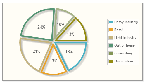
Pie and Donut Charts(饼状图和环形图)
该类型图表可能依赖于以下插件
<script type="text/javascript" src="../src/plugins/jqplot.pieRenderer.min.js"></script>
<script type="text/javascript" src="../src/plugins/jqplot.donutRenderer.min.js"></script>

$(document).ready(function(){
  var data = [
    ['Heavy Industry', 12],['Retail', 9], ['Light Industry', 14],
    ['Out of home', 16],['Commuting', 7], ['Orientation', 9]
  ];
  var plot1 = jQuery.jqplot ('chart1', [data],
    {
      seriesDefaults: {
        // Make this a pie chart.
        // 设置绘制一个饼状图
        renderer: jQuery.jqplot.PieRenderer,
        rendererOptions: {
          // Put data labels on the pie slices.
          // By default, labels show the percentage of the slice.
          // 展示饼块的数据
          showDataLabels: true
        }
      },
      // 展示图标,在图标的右侧
      legend: { show:true, location: 'e' }
    }
  );
});
$(document).ready(function(){
  var data = [
    ['Heavy Industry', 12],['Retail', 9], ['Light Industry', 14],
    ['Out of home', 16],['Commuting', 7], ['Orientation', 9]
  ];
  var plot2 = jQuery.jqplot ('chart2', [data],
    {
      seriesDefaults: {
        renderer: jQuery.jqplot.PieRenderer,
        rendererOptions: {
          // Turn off filling of slices.
          // 设置不填充饼块
          fill: false,
          showDataLabels: true,
          // Add a margin to seperate the slices.
          // 饼块之间的距离为4px
          sliceMargin: 4,
          // stroke the slices with a little thicker line.
          // 饼块的线宽为5px
          lineWidth: 5
        }
      },
      legend: { show:true, location: 'e' }
    }
  );
});
环形图和饼状图的配置项几乎相同。
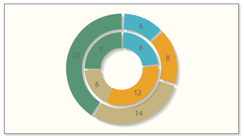
$(document).ready(function(){
  var s1 = [['a',6], ['b',8], ['c',14], ['d',20]];
  var s2 = [['a', 8], ['b', 12], ['c', 6], ['d', 9]];

  var plot3 = $.jqplot('chart3', [s1, s2], {
    seriesDefaults: {
      // make this a donut chart.
      // 设置绘制一个环形图
      renderer:$.jqplot.DonutRenderer,
      rendererOptions:{
        // Donut's can be cut into slices like pies.
        // 环块之间的距离为3px
        sliceMargin: 3,
        // Pies and donuts can start at any arbitrary angle.
        // 起始位置为-90度,x轴正方向为0度
        startAngle: -90,
        showDataLabels: true,
        // By default, data labels show the percentage of the donut/pie.
        // You can show the data 'value' or data 'label' instead.
        // 可以设置在环块上显示的是数值还是标签
        dataLabels: 'value'
      }
    }
  });
});
Bar charts(柱状图)
该类型图表可能依赖于以下插件
<script type="text/javascript" src="../src/plugins/jqplot.barRenderer.min.js"></script>
<script type="text/javascript" src="../src/plugins/jqplot.categoryAxisRenderer.min.js"></script>
<script type="text/javascript" src="../src/plugins/jqplot.pointLabels.min.js"></script>
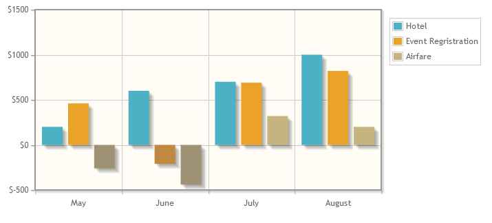
$(document).ready(function(){
    var s1 = [200, 600, 700, 1000];
    var s2 = [460, -210, 690, 820];
    var s3 = [-260, -440, 320, 200];
    // Can specify a custom tick Array.
    // Ticks should match up one for each y value (category) in the series.
    // 定义x轴的刻度数组,需与数据相对应
    var ticks = ['May', 'June', 'July', 'August'];

    var plot1 = $.jqplot('chart1', [s1, s2, s3], {
        // The "seriesDefaults" option is an options object that will
        // be applied to all series in the chart.
        seriesDefaults:{
            renderer:$.jqplot.BarRenderer,
            // 强制填充到0值
            rendererOptions: {fillToZero: true}
            // 若使用fillToValue,则可设置填充到的数值
        },
        // Custom labels for the series are specified with the "label"
        // option on the series option.  Here a series option object
        // is specified for each series.
        // 设置三条数据的标识label,依次对应
        series:[
            {label:'Hotel'},
            {label:'Event Regristration'},
            {label:'Airfare'}
        ],
        // Show the legend and put it outside the grid, but inside the
        // plot container, shrinking the grid to accomodate the legend.
        // A value of "outside" would not shrink the grid and allow
        // the legend to overflow the container.
        legend: {
            show: true,
            // 设置标识在图表外,元素内(在canvas内)
            placement: 'outsideGrid'
        },
        axes: {
            // Use a category axis on the x axis and use our custom ticks.
            // x轴使用CategoryAxisRenderer渲染器
            xaxis: {
                renderer: $.jqplot.CategoryAxisRenderer,
                ticks: ticks
            },
            // Pad the y axis just a little so bars can get close to, but
            // not touch, the grid boundaries.  1.2 is the default padding.
            yaxis: {
                pad: 1.05,
                tickOptions: {formatString: '$%d'}
            }
        }
    });
});
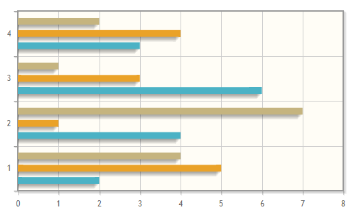
$(document).ready(function(){
    // For horizontal bar charts, x an y values must will be "flipped"
    // from their vertical bar counterpart.
    var plot2 = $.jqplot('chart2', [
        [[2,1], [4,2], [6,3], [3,4]],
        [[5,1], [1,2], [3,3], [4,4]],
        [[4,1], [7,2], [1,3], [2,4]]], {
        seriesDefaults: {
            renderer:$.jqplot.BarRenderer,
            // Show point labels to the right ('e'ast) of each bar.
            // edgeTolerance of -15 allows labels flow outside the grid
            // up to 15 pixels.  If they flow out more than that, they
            // will be hidden.
            pointLabels: { show: true, location: 'e', edgeTolerance: -15 },
            // Rotate the bar shadow as if bar is lit from top right.
            // 柱块的阴影角度为135度
            shadowAngle: 135,
            // Here's where we tell the chart it is oriented horizontally.
            // 设置为水平柱状图
            rendererOptions: {
                barDirection: 'horizontal'
            }
        },
        axes: {
            yaxis: {
                renderer: $.jqplot.CategoryAxisRenderer
            }
        }
    });
});
点击图表更新文本
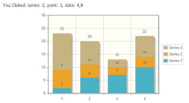
$(document).ready(function(){
  var s1 = [2, 6, 7, 10];
  var s2 = [7, 5, 3, 4];
  var s3 = [14, 9, 3, 8];
  plot3 = $.jqplot('chart3', [s1, s2, s3], {
    // Tell the plot to stack the bars.
    stackSeries: true,
    captureRightClick: true,
    seriesDefaults:{
      renderer:$.jqplot.BarRenderer,
      rendererOptions: {
          // Put a 30 pixel margin between bars.
          // 柱之间间距为30px
          barMargin: 30,
          // Highlight bars when mouse button pressed.
          // Disables default highlighting on mouse over.
          // 当鼠标按下时,高亮
          highlightMouseDown: true
      },
      pointLabels: {show: true}
    },
    axes: {
      xaxis: {
          renderer: $.jqplot.CategoryAxisRenderer
      },
      yaxis: {
        // Don't pad out the bottom of the data range.  By default,
        // axes scaled as if data extended 10% above and below the
        // actual range to prevent data points right on grid boundaries.
        // Don't want to do that here.
        // 填充,以延长数据界限以下的范围内。
        // 该数据范围的底部被乘以该因子,以确定最小轴界限。
        // 0值将被解释为无填充,并将padmin设置为1.0 。
        padMin: 1
      }
    },
    legend: {
      show: true,
      location: 'e',
      placement: 'outside'
    }
  });
  // Bind a listener to the "jqplotDataClick" event.  Here, simply change
  // the text of the info3 element to show what series and ponit were
  // clicked along with the data for that point.
  // 绑定到"jqplotDataClick"时间
  $('#chart3').bind('jqplotDataClick',
    function (ev, seriesIndex, pointIndex, data) {
      $('#info3').html('series: '+seriesIndex+', point: '+pointIndex+', data: '+data);
    }
  );
});
Bubble plots(气泡图)
该类型图表可能依赖于以下插件
<script type="text/javascript" src="../src/plugins/jqplot.bubbleRenderer.min.js"></script>
气泡图表示3维数据。首先,一个基本的气泡图用"bubbleGradients:true"选项来指定渐变填充。径向渐变不支持IE浏览器9之前的IE版本,将自动禁用。
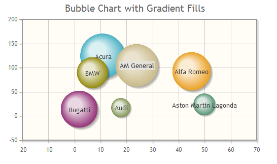
$(document).ready(function(){

    var arr = [[11, 123, 1236, "Acura"], [45, 92, 1067, "Alfa Romeo"],
    [24, 104, 1176, "AM General"], [50, 23, 610, "Aston Martin Lagonda"],
    [18, 17, 539, "Audi"], [7, 89, 864, "BMW"], [2, 13, 1026, "Bugatti"]];

    var plot1 = $.jqplot('chart1',[arr],{
        title: 'Bubble Chart with Gradient Fills',
        seriesDefaults:{
            renderer: $.jqplot.BubbleRenderer,
            rendererOptions: {
                bubbleGradients: true
            },
            shadow: true
        }
    });
});
数据传递到一个气泡图是一系列的[x, y, radius, <label or object>]。的数据点的可选的第四个元素可以是任一个标签字符串或具有'label'和/或'color'属性指定到气泡中的对象。
默认情况下,所有的泡沫都根据绘图区的大小进行缩放。在数据点的半径值将被调整,以适应图表中的气泡。如果"autoscaleBubbles"选项被设置为假,在数据中的半径的值将被当作点的半径值。
下一步是气泡采用了"bubbleAlpha"和"highlightAlpha"选项实现了一些基本的自定义。
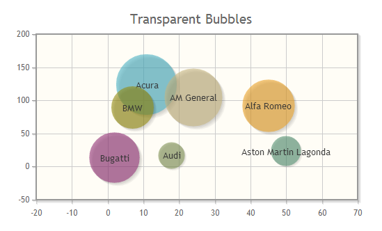
$(document).ready(function(){

    var arr = [[11, 123, 1236, "Acura"], [45, 92, 1067, "Alfa Romeo"],
    [24, 104, 1176, "AM General"], [50, 23, 610, "Aston Martin Lagonda"],
    [18, 17, 539, "Audi"], [7, 89, 864, "BMW"], [2, 13, 1026, "Bugatti"]];

    var plot2 = $.jqplot('chart2',[arr],{
        title: 'Transparent Bubbles',
        seriesDefaults:{
            renderer: $.jqplot.BubbleRenderer,
            rendererOptions: {
                // 气泡透明度为0.6
                bubbleAlpha: 0.6,
                // 高亮显示的透明度为0.8
                highlightAlpha: 0.8
            },
            shadow: true,
            // 阴影透明度为0.05
            shadowAlpha: 0.05
        }
    });
});
在下面的示例中,自定义tooltip和一个自定义表传奇高亮显示被绑定到"jqplotDataHighlight"和"jqplotDataUnhighlight"事件的执行。自定义图例表这里是动态基于jQuery创建。
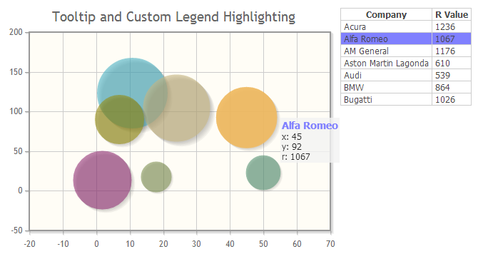
$(document).ready(function(){

  var arr = [[11, 123, 1236, "Acura"], [45, 92, 1067, "Alfa Romeo"],
  [24, 104, 1176, "AM General"], [50, 23, 610, "Aston Martin Lagonda"],
  [18, 17, 539, "Audi"], [7, 89, 864, "BMW"], [2, 13, 1026, "Bugatti"]];

  var plot1b = $.jqplot('chart1b',[arr],{
    title: 'Tooltip and Custom Legend Highlighting',
    seriesDefaults:{
      renderer: $.jqplot.BubbleRenderer,
      rendererOptions: {
        bubbleAlpha: 0.6,
        highlightAlpha: 0.8,
        showLabels: false
      },
      shadow: true,
      shadowAlpha: 0.05
    }
  });

  // Legend is a simple table in the html.
  // Dynamically populate it with the labels from each data value.
  $.each(arr, function(index, val) {
    $('#legend1b').append('<tr><td>'+val[3]+'</td><td>'+val[2]+'</td></tr>');
  });

  // Now bind function to the highlight event to show the tooltip
  // and highlight the row in the legend.
  $('#chart1b').bind('jqplotDataHighlight',
    function (ev, seriesIndex, pointIndex, data, radius) {
      var chart_left = $('#chart1b').offset().left,
        chart_top = $('#chart1b').offset().top,
        x = plot1b.axes.xaxis.u2p(data[0]),  // convert x axis unita to pixels
        y = plot1b.axes.yaxis.u2p(data[1]);  // convert y axis units to pixels
      var color = 'rgb(50%,50%,100%)';
      $('#tooltip1b').css({left:chart_left+x+radius+5, top:chart_top+y});
      $('#tooltip1b').html('<span style="font-size:14px;font-weight:bold;color:' +
      color + ';">' + data[3] + '</span><br />' + 'x: ' + data[0] +
      '<br />' + 'y: ' + data[1] + '<br />' + 'r: ' + data[2]);
      $('#tooltip1b').show();
      $('#legend1b tr').css('background-color', '#ffffff');
      $('#legend1b tr').eq(pointIndex+1).css('background-color', color);
    });

  // Bind a function to the unhighlight event to clean up after highlighting.
  $('#chart1b').bind('jqplotDataUnhighlight',
      function (ev, seriesIndex, pointIndex, data) {
          $('#tooltip1b').empty();
          $('#tooltip1b').hide();
          $('#legend1b tr').css('background-color', '#ffffff');
      });
});
Date Axes(时间轴)
该类型图表可能依赖于以下插件
<script type="text/javascript" src="../src/plugins/jqplot.dateAxisRenderer.min.js"></script>
时间轴的支持是通过dateAxisRenderer插件提供。时间轴扩展于JavaScript原生的时间处理。这允许日期以任何明确的形式输入,而不只是以毫秒为单位!
注意,虽然jqPlot将解析几乎所有的人类可读的日期,它是最安全的还是使用JavaScript的时间戳。还有,最好是指定日期和时间,而不只是一个单独的日期。这是由于浏览器处理本地时间与UTC不一致导致的。
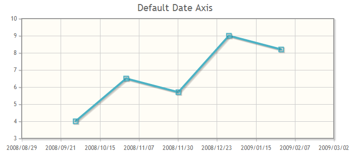
$(document).ready(function(){
  var line1=[['2008-09-30 4:00PM',4], ['2008-10-30 4:00PM',6.5], ['2008-11-30 4:00PM',5.7], ['2008-12-30 4:00PM',9], ['2009-01-30 4:00PM',8.2]];
  var plot1 = $.jqplot('chart1', [line1], {
    title:'Default Date Axis',
    axes:{xaxis:{renderer:$.jqplot.DateAxisRenderer}},
    series:[{lineWidth:4, markerOptions:{style:'square'}}]
  });
});
时间轴还提供了强大的格式化功能。可以使用自定义格式化字符串格式化坐标轴刻度标签。
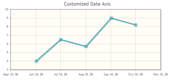
$(document).ready(function(){
  var line1=[['2008-06-30 8:00AM',4], ['2008-7-30 8:00AM',6.5], ['2008-8-30 8:00AM',5.7], ['2008-9-30 8:00AM',9], ['2008-10-30 8:00AM',8.2]];
  var plot2 = $.jqplot('chart2', [line1], {
      title:'Customized Date Axis',
      gridPadding:{right:35},
      axes:{
        xaxis:{
          renderer:$.jqplot.DateAxisRenderer,
          tickOptions:{formatString:'%b %#d, %y'},
          min:'May 30, 2008',
          tickInterval:'1 month'
        }
      },
      series:[{lineWidth:4, markerOptions:{style:'square'}}]
  });
});
Data Point Labels(数据点标签)
该类型图表可能依赖于以下插件
<script type="text/javascript" src="../src/plugins/jqplot.barRenderer.min.js"></script>
<script type="text/javascript" src="../src/plugins/jqplot.categoryAxisRenderer.min.js"></script>
<script type="text/javascript" src="../src/plugins/jqplot.pointLabels.min.js"></script>
pointLabels插件放置在图上标记的数据点的位置。 标签可以使用一系列的数据数组或一个单独的标签数组。如果使用的序列数据,该数据点中的最后一个值是默认用作标签。
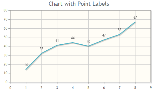
$(document).ready(function(){
  var line1 = [14, 32, 41, 44, 40, 47, 53, 67];
  var plot1 = $.jqplot('chart1', [line1], {
      title: 'Chart with Point Labels',
      seriesDefaults: {
        showMarker:false,
        pointLabels: { show:true }
      }
  });
});
附加数据可以被添加到该系列,它将被用于标签。如果需要额外的数据被提供,每个数据点必须都有该标签的值,即使它是null。
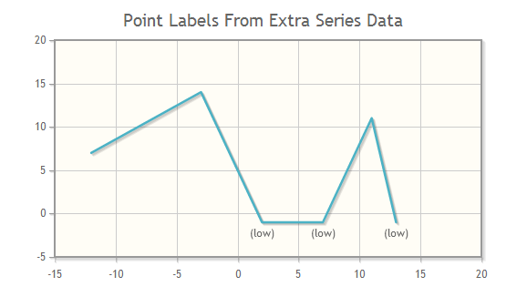
$(document).ready(function(){
  var line1 = [[-12, 7, null], [-3, 14, null], [2, -1, '(low)'],
      [7, -1, '(low)'], [11, 11, null], [13, -1, '(low)']];
  var plot2 = $.jqplot('chart2', [line1], {
    title: 'Point Labels From Extra Series Data',
    seriesDefaults: {
      showMarker:false,
      pointLabels:{ show:true, location:'s', ypadding:3 }
    },
    axes:{ yaxis:{ pad: 1.3 } }
  });
});
标签与柱状图配合起来使用很好。在这里,标签配置了"pointLabels"选项,该选项中的"labels"数组提供了标签。此外,额外的CSS样式已经提供给标签。
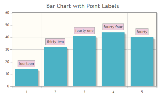
<style type="text/css">
#chart3 .jqplot-point-label {
  border: 1.5px solid #aaaaaa;
  padding: 1px 3px;
  background-color: #eeccdd;
}
</style>
$(document).ready(function(){
  var line1 = [14, 32, 41, 44, 40];
  var plot3 = $.jqplot('chart3', [line1], {
    title: 'Bar Chart with Point Labels',
    seriesDefaults: {renderer: $.jqplot.BarRenderer},
    series:[
     {pointLabels:{
        show: true,
        labels:['fourteen', 'thirty two', 'fourty one', 'fourty four', 'fourty']
      }}],
    axes: {
      xaxis:{renderer:$.jqplot.CategoryAxisRenderer},
      yaxis:{padMax:1.3}}
  });
});
点标签可以用在堆积柱状图。如果没有指定标签的数组,它们将使用图表数据。值可以分别为每个系列显示(stackedValue选项设置为false,默认值),或者可以显示所有系列的累积值( stackedValue选项为true )。
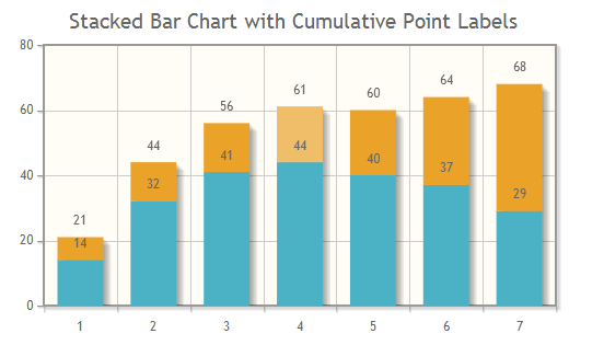
$(document).ready(function(){
  var line1 = [14, 32, 41, 44, 40, 37, 29];
  var line2 = [7, 12, 15, 17, 20, 27, 39];
  var plot4 = $.jqplot('chart4', [line1, line2], {
      title: 'Stacked Bar Chart with Cumulative Point Labels',
      stackSeries: true,
      seriesDefaults: {
          renderer: $.jqplot.BarRenderer,
          rendererOptions:{barMargin: 25},
          pointLabels:{show:true, stackedValue: true}
      },
      axes: {
          xaxis:{renderer:$.jqplot.CategoryAxisRenderer}
      }
  });
});
数据点标签有一个"edgeTolerance"选项。此选项控制如何关闭数据点标签,它可以是一个轴边缘,但仍然可以得出。0的默认允许的标签碰到坐标轴。正值将增加轴和标签之间所需的距离,负值将使标签重叠轴。
$(document).ready(function(){
  var line1 = [14, 32, 41, 44, 40, 47, 53, 67];
  var plot5 = $.jqplot('chart5', [line1], {
      title: 'Chart with Point Labels',
      seriesDefaults: {
        showMarker:false,
        pointLabels: {
          show: true,
          edgeTolerance: 5
        }},
      axes:{
        xaxis:{min:3}
      }
  });
})
Plot Zooming(图表缩放)
该类型图表可能依赖于以下插件
<script type="text/javascript" src="../src/plugins/jqplot.cursor.min.js"></script>
<script type="text/javascript" src="../src/plugins/jqplot.dateAxisRenderer.min.js"></script>
光标的插件也能使图表缩放。单击并拖动的图表范围被放大。双击复位。
您可以禁用双击缩放复位。光标插件也扩展了plot对象与resetZoom()方法,它可以从用户代码或其它HTML元素(如按钮)触发。
放大前
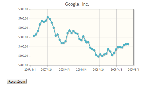
放大后
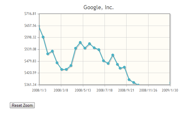
$(document).ready(function(){
  var plot1 = $.jqplot('chart1', [goog], {
      title: 'Google, Inc.',
      series: [{
          label: 'Google, Inc.',
          neighborThreshold: -1
      }],
      axes: {
          xaxis: {
              renderer: $.jqplot.DateAxisRenderer,
              min:'August 1, 2007 16:00:00',
              tickInterval: '4 months',
              tickOptions:{formatString:'%Y/%#m/%#d'}
          },
          yaxis: {
              tickOptions:{formatString:'$%.2f'}
          }
      },
      cursor:{
        show: true,
        zoom:true,
        showTooltip:false
      }
  });

  $('.button-reset').click(function() { plot1.resetZoom() });
});
图表的缩放也适用将多个轴。
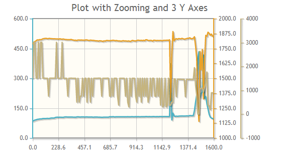
$(document).ready(function(){
  var plot2 = $.jqplot('chart2', [InPr, OutPr, ERPM], {
      title:'Plot with Zooming and 3 Y Axes',
      seriesDefaults: {showMarker:false},
      series:[
          {},
          {yaxis:'y2axis'},
          {yaxis:'y3axis'}
      ],
      cursor: {
        show: true,
        tooltipLocation:'sw',
        zoom:true
      },
      axesDefaults:{useSeriesColor: true},
      axes:{
          xaxis:{min:0, max:1600},
          yaxis:{min:0, max:600},
          y2axis:{
              min:1000,
              max:2000,
              numberTicks:9,
              tickOptions:{showGridline:false}
          },
          y3axis:{}
      }
  });
});