css3--animation实现钟表效果
<!DOCTYPE html>
<html lang="en">
<head>
    <meta charset="UTF-8">
    <meta name="viewport" content="width=device-width, initial-scale=1.0">
    <meta http-equiv="X-UA-Compatible" content="ie=edge">
    <title>Document</title>
    <style>
        *{
            padding: 0px;
            margin: 0px;
        }
        @keyframes secondrun{
            0%{
                transform: rotate(180deg);
            }
            100%{
                transform: rotate(540deg);
            }
        }
        @keyframes minuterun{
            0%{
                transform: rotate(180deg);
            }
            100%{
                transform: rotate(540deg);
            }
        }
        .clock{
            position: relative;
            width: 512px;
            height: 512px;
            background-image: url(clock.png);
            background-size: cover;
            background-repeat: no-repeat;
        }
        .second{
            position: absolute;
            top:181px;
            left:246px;
            width: 16px;
            height: 278px;
            background-image: url(second.png);
            background-size: cover;
            background-repeat: no-repeat;
            transform: rotate(180deg);
            transform-origin:center 76px;
            z-index: 3;
            animation: secondrun 60s steps(60,end) infinite;
        }
        .minute{
            position: absolute;
            left:238px;
            top:240px;
            width:32px;
            height:218px;
            background-image: url(minute.png);
            background-size: cover;
            background-repeat:no-repeat;
            z-index: 2;
            transform:rotate(180deg);
            transform-origin:center 16px;
            animation:minuterun 3600s steps(60,end);
        }
        .hour{
            position: absolute;
            left:238px;
            top:240px;
            width:32px;
            height:148px;
            background-image: url(hour.png);
            background-size: cover;
            background-repeat:no-repeat;
            z-index:1;
            transform-origin: inherit center 16px;

        }
!
    </style>
</head>
<body>
    <div class="clock">
        <div class="second"></div>
        <div class="minute"></div>
        <div class="hour"></div>
    </div>
</body>
</html>


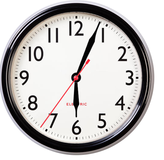
效果图: