一 、浮动布局
★元素浮动之后不占据原来的位置,脱离标准流
★浮动的盒子在一行上显示
★行内元素浮动之后转换为行内块元素。(不推荐使用,会脱离标准流,转行内元素最好使用display: inline-block;这样就还是在标准流中)
1.1 浮动的作用
◆文本绕图 浮动图片,使得文字会在图片的 右边显示,在此中浮动文字是不会覆盖住图片的。

◆制作导航
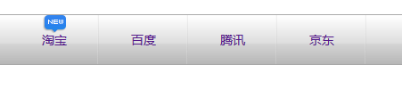
制作类似的导航;
1.首先各链接之间使用ul li来实现,用浮动在一行显示。大框架清楚内外边距
2.外面是一个大的DIV,里面要使用一个小的DIV,用这样的方式对小DIV实现让链接居中,使用margine 0 auto;
3.针对链接,设置为链接居中 text-align:center 垂直居中: line-height设置为何DIV高度一致 必须设置为内联元素才能设置宽高 display: inline-block;
◆网页布局
清除浮动
问题:父盒子高度为0,子盒子不占位置,子盒子不会撑开父盒子。
(下面的标准流盒子,会跑到父盒子中的子盒子下面。)
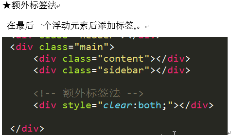
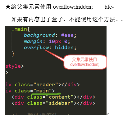
处理办法:清除浮动。(清除子盒子因为浮动,对父子造成的影响)
使用方法:谁出问题给谁加一个clearfix类名。
三种方法:
1.
2.
3.
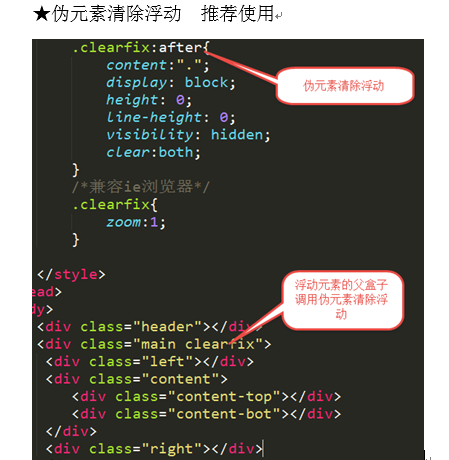
1.1.1 单伪元素标签法
.clearfix:after {
content: “”;
height: 0;
visibility: hidden;
overflow: hidden;
dispaly: block;
clear: both;
}
.clearfix {
zoom: 1;/*IE678*/
}
1.1.2 双伪元素标签法
.clearfix:before, .clearfix:after {
content: “”;
display: table;
}
.clearfix:after {
clear: both;
}
.clearfix {
zoom: 1;/*IE678*/
}
二、CSS初始化
腾讯:
body,ol,ul,h1,h2,h3,h4,h5,h6,p,th,td,dl,dd,form,fieldset,legend,input,textarea,select{margin:0;padding:0}
body{font:12px"宋体","Arial Narrow",HELVETICA;background:#fff;-webkit-text-size-adjust:100%;}
a{color:#2d374b;text-decoration:none}
a:hover{color:#cd0200;text-decoration:underline}
em{font-style:normal}
li{list-style:none}
img{border:0;vertical-align:middle}
table{border-collapse:collapse;border-spacing:0}
p{word-wrap:break-word}
新浪:
body,ul,ol,li,p,h1,h2,h3,h4,h5,h6,form,fieldset,table,td,img,div{margin:0;padding:0;border:0;}
body{background:#fff;color:#333;font-size:12px; margin-top:5px;font-family:"SimSun","宋体","Arial Narrow";}
ul,ol{list-style-type:none;}
select,input,img,select{vertical-align:middle;}
a{text-decoration:none;}
a:link{color:#009;}
a:visited{color:#800080;}
a:hover,a:active,a:focus{color:#c00;text-decoration:underline;}
淘宝:
body, h1, h2, h3, h4, h5, h6, hr, p, blockquote, dl, dt, dd, ul, ol, li, pre, form, fieldset, legend, button, input, textarea, th, td { margin:0; padding:0; }
body, button, input, select, textarea { font:12px/1.5tahoma, arial, 5b8b4f53; }
h1, h2, h3, h4, h5, h6{ font-size:100%; }
address, cite, dfn, em, var { font-style:normal; }
code, kbd, pre, samp { font-family:couriernew, courier, monospace; }
small{ font-size:12px; }
ul, ol { list-style:none; }
a { text-decoration:none; }
a:hover { text-decoration:underline; }
sup { vertical-align:text-top; }
sub{ vertical-align:text-bottom; }
legend { color:#000; }
fieldset, img { border:0; }
button, input, select, textarea { font-size:100%; }
table { border-collapse:collapse; border-spacing:0; }
三、定位
定位方向: left | right | top | bottom
◆position:static; 静态定位。默认值,就是文档流。
◆绝对定位
Position:absolute;
特点:
★元素使用绝对定位之后不占据原来的位置(脱标)
★元素使用绝对定位,位置是从浏览器出发。
★嵌套的盒子,父盒子没有使用定位,子盒子绝对定位,子盒子位置是从浏览器出发。如果父盒子没有设置绝对定位但是爷爷盒子设置了绝对定位,那么就是相对于爷爷盒子的定位.。
★给行内元素使用绝对定位之后,转换为行内块。(不推荐使用,推荐使用display:inline-block;),如果是转换为块元素,则结果是各占一行,但是行内块元素,可以设置宽高,但是又在一行上面展示。
◆相对定位
Position: relative;
特点:
★使用相对定位,位置从自身出发。
★还占据原来的位置。
★子绝父相(父元素相对定位,子元素绝对定位),父元素不会脱标,页面不会乱
★行内元素使用相对定位不能转行内块
◆固定定位
Position:fixed;
特点:
★固定定位之后,不占据原来的位置(脱标)
★元素使用固定定位之后,位置从浏览器出发。
★元素使用固定定位之后,会转化为行内块(不推荐,推荐使用display:inline-block;)