问题:假设高度已知,写出三栏布局,其中左栏,右栏各为300px,中间自适应
三栏布局可以用浮动,绝对定位,flexbox布局,表格布局(table-cell),网格布局(grid)实现
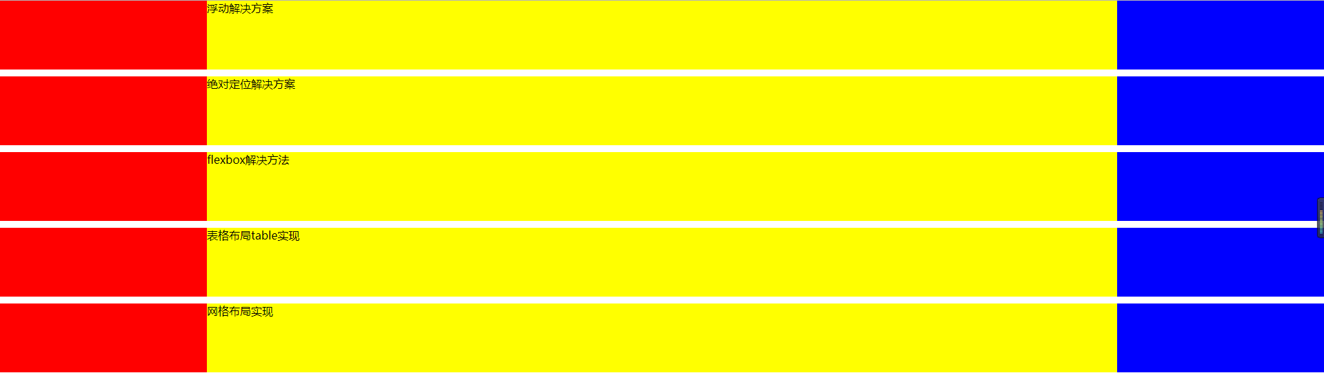
1.浮动布局
 1     <section class="layout float">
 2         <style>
 3             .layout article div {
 4                 height: 100px;
 5             }
 6             .layout.float .left {
 7                 float: left;
 8                 width: 300px;
 9                 background-color: red;
10             }
11             .layout.float .right {
12                 float: right;
13                 width: 300px;
14                 background-color: blue;
15             }
16             .layout.float .center {
17                 width: auto;
18                 background-color: yellow;
19             }
20         </style>
21         <article class="left-right-center">
22             <div class="left"></div>
23             <div class="right"></div>
24             <div class="center">
25                 浮动解决方案
26             </div>
27         </article>
28     </section>
2.绝对定位
 1     <section class="layout absolute">
 2         <style>
 3             .layout article div {
 4                 height: 100px;
 5             }
 6             .layout.absolute .left-right-center>div {
 7                 position: absolute;
 8             }
 9             .layout.absolute .left {
10                 left: 0;
11                 width: 300px;
12                 background-color: red;
13             }
14             .layout.absolute .center {
15                 left: 300px;
16                 right: 300px;
17                 background-color: yellow;
18             }
19             .layout.absolute .right {
20                 right: 0;
21                 width: 300px;
22                 background-color: blue;
23             }
24         </style>
25         <article class="left-right-center">
26             <div class="left"></div>
27             <div class="right"></div>
28             <div class="center">
29                 绝对定位解决方案
30             </div>
31         </article>
32     </section>
3.flexbox布局实现
 1     <section class="layout flexbox">
 2         <style>
 3             .layout article div {
 4                 height: 100px;
 5             }
 6             .layout.flexbox {
 7                 margin-top: 120px;
 8             }
 9             .layout.flexbox .left-center-right {
10                 display: flex;
11             }
12             .layout.flexbox .left {
13                 width: 300px;
14                 background-color: red;
15             }
16             .layout.flexbox .center {
17                 flex: 1;
18                 background-color: yellow;
19             }
20             .layout.flexbox .right {
21                 width: 300px;
22                 background-color: blue;
23                 ;
24             }
25         </style>
26         <article class="left-center-right">
27             <div class="left"></div>
28             <div class="center">flexbox解决方法</div>
29             <div class="right"></div>
30         </article>
31     </section>
4.表格布局(table-cell)
 1     <section class="layout table">
 2         <style>
 3             .layout article div {
 4                 height: 100px;
 5             }
 6             .layout.table .left-center-right {
 7                 width: 100%;
 8                 display: table;
 9                 height: 100px;
10             }
11             .layout.table .left-center-right>div {
12                 display: table-cell;
13             }
14             .layout.table .left {
15                 width: 300px;
16                 background-color: red;
17             }
18             .layout.table .center {
19                 background-color: yellow;
20             }
21             .layout.table .right {
22                 background-color: blue;
23                 width: 300px;
24             }
25         </style>
26         <article class="left-center-right">
27             <div class="left"></div>
28             <div class="center">表格布局table实现</div>
29             <div class="right"></div>
30         </article>
31     </section>
5.网格布局
 1     <section class="layout grid">
 2         <style>
 3             .layout article div {
 4                 height: 100px;
 5             }
 6             .layout.grid .left-center-right {
 7                 display: grid;
 8                 width: 100%;
 9                 grid-template-rows: 100px;
10                 grid-template-columns: 300px auto 300px;
11             }
12             .layout.grid .left {
13                 background-color: red;
14             }
15             .layout.grid .center {
16                 background-color: yellow;
17             }
18             .layout.grid .right {
19                 background-color: blue;
20             }
21         </style>
22         <article class="left-center-right">
23             <div class="left"></div>
24             <div class="center">网格布局实现</div>
25             <div class="right"></div>
26         </article>
27     </section>
效果是