文本与字体
1)阴影:text-shadow
格式:text-shadow:5px 5px 3px #FFFFFF分别对应 水平方向 垂直方向 模糊程度 颜色值
代码:


 1 <!DOCTYPE html>
 2 <html>
 3 <head lang="en">
 4     <meta charset="UTF-8">
 5     <title>文字阴影</title>
 6     <style type="text/css">
 7         p {
 8             /*文字的宽度,大小设定*/
 9             font-family: Times, Verdanna, Geneva, sans-serif;
10             font-weight: bold;
11             font-size: 30px;
12             /*背景颜色设定*/
13             background-color: #C0C0C0;
14             /*文字颜色设定*/
15             color: #40E0D0;
16             /*阴影效果*/
17             /*text-shadow:-5px -5px 3px #00C957,*/
18                         /*5px 5px 3px #7FFFD4;*/
19             /*用阴影实现描边*/
20             text-shadow: -1px 0 #D2691E,
21                          0 -1px #D2691E,
22                          1px 0 #D2691E,
23                          0 1px #D2691E;
24         }
25     </style>
26 </head>
27 <body>
28 <p>阴影属性<br />晨落梦公子</p>
29 <!--<br />换行符-->
30 </body>
31 </html>
妙点领悟:可以利用阴影实现发光效果,如设置为text-shadow : 0 0 3px #FFFFFF即可
2)溢出文本处理:text-overflow
格式:text-overflow : clip | ellipsis | ellipsis-word
clip:直接裁剪溢出的文本
ellipsis:省略溢出,结尾是...(常用)
ellipsis-word:省略溢出,结尾是 最后一个字
代码:
 1 <!DOCTYPE html>
 2 <html>
 3 <head lang="en">
 4     <meta charset="UTF-8">
 5     <title>处理溢出</title>
 6     <style type="text/css">
 7         li {
 8              /*设置链表属性*/
 9             list-style: none;
10             line-height: 22px;
11             font-size: 12px;
12             border-bottom: 1px solid #D2691E;
13             width: 220px;
14             /*溢出内容为隐藏*/
15             overflow: hidden;
16             /*强制文本单行显示 */
17             white-space: nowrap;
18             /*设置文本的溢出处理方法 */
19             text-overflow: ellipsis;
20         }
21     </style>
22 </head>
23 <body>
24 <ul>
25     <li>·春节前夕赴江西看望干部群众</li>
26     <li>·向宁夏人民"云拜年"|神曲《四个全面》</li>
27     <li>·马家军兴奋剂独家内幕曝光 王春霞等10人联名举报</li>
28     <li>·朝鲜通报将发射卫星 外媒猜测准备发射远程导弹</li>
29 </ul>
30 </body>
31 </html>
常用方法
1             /*溢出内容为隐藏*/
2             overflow: hidden;
3             /*强制文本单行显示 */
4             white-space: nowrap;
5             /*设置文本的溢出处理方法 */
6             text-overflow: ellipsis;
3)对齐文本 word-wrap和word-break
格式:边界换行:word-wrap : nomal | break-word
nomal: break-word:

有必要说明一下:nomal中溢出的是一个连续的词(如:特别长网址)
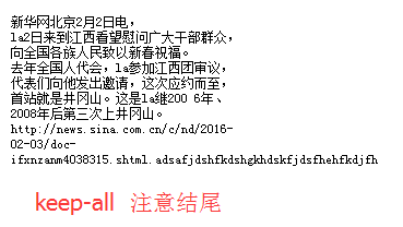
字内换行:word-break normal | break-all | keep-all
normal:同上
break-all: keep-all:

代码:
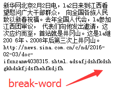
 1 <!DOCTYPE html>
 2 <html>
 3 <head lang="en">
 4     <meta charset="UTF-8">
 5     <title>边界换行</title>
 6     <style type="text/css">
 7         p {
 8             font-family: Verdanna,Geneva,sans-serif;
 9             border 1px solid #40E0D0;
10             padding: 10px;
11             width: 220px;
12             font-size: 12px;
13             /*连续字换行 */
14             /*word-wrap:break-word;*/
15             word-wrap: normal;
16             /*字内换行 */
17             /*word-break: break-all;*/
18             /*word-break: normal;*/
19             /*word-break: keep-all;*/
20         }
21     </style>
22 </head>
23 <body>
24 <p>新华网北京2月2日电,la2日来到江西看望慰问广大干部群众,
25     向全国各族人民致以新春祝福。去年全国人代会,la参加江西团审议,
26     代表们向他发出邀请,这次应约而至,首站就是井冈山。这是la继200
27     6年、2008年后第三次上井冈山。
28     http://news.sina.com.cn/c/nd/2016-02-03/doc-ifxnzanm4038315.shtml.adsafjdshfkdshgkhdskfjdsfhehfkdjfh</p>
29 </body>
30 </html>
4)使用服务器端字体 @font-face 规则
格式:见代码
 1 <!DOCTYPE html>
 2 <html>
 3 <head lang="en">
 4     <meta charset="UTF-8">
 5     <title>字体调用</title>
 6     <style type="text/css">
 7         @font-face {
 8             font-family: myfont;
 9             src: url(字体/雪.ttf) format("truetype");
10         }
11     p {
12         font-family: myfont;
13         font-size: 36px;
14         color: #FF3321;
15     }
16     </style>
17 </head>
18 <body>
19 <p>abc<br />晨落梦公子</p>
20 </body>
21 </html>
考虑到字体兼容问题,设立format来约束
.ttf 对应 truetype
.otf 对应 opentype
.eot 对应 eot
关于字体有:
font-family:设置文本的字体名称。 就是为字体规定个名字。
font-style:设置文本样式。 数值有normal(正常),italic(斜体),oblique(倾斜),inherit(从父元素继承字体样式)。
font-variant :设置文本是否为小型大写字母大小写。 即小写字母均被转换为大写。数值有normal,samll-caps(显示小型的大写字母),inherit。
font-weight:设置文本的粗细。 不再赘述,以前讲过。
font-stretch:设置文本是否横向的拉伸变形。 不多言了,貌似所有浏览器都不支持。
font-size:设置文本字号的大小。 常用百分比表示(这里的百分比是基于父类的)。
5)配色 HSL色彩模式
格式:hsl length | percentage | percentage
length:色调。可取任意值。其值除以360的余数为0表示红色,为240表示蓝色等等。
percentage :饱和度。范围为0%~100% 数值越大越鲜艳。
percentage :明亮度。范围同上。数值越大越亮。
代码:
 1 <!DOCTYPE html>
 2 <html>
 3 <head lang="en">
 4     <meta charset="UTF-8">
 5     <title>配色方案</title>
 6     <style type="text/css">
 7         .hsl {
 8             height: 20px;
 9             border: 1px solid #f00;
10             padding: 10px;
11             height: 170px;
12             background-color: hsl(0,0%,50%);
13             color: hsl(0,100%,50%);
14             font-size: 12px;
15             text-align: center;
16             line-height: 25px;
17             width: 320px;
18         }
19         ul {
20             width: 320px;
21             margin: 0;
22             padding: 10px 0;
23             border-top: 1px solid #ccc;
24         }
25         li{
26             float: left;
27             margin: 1px 0 0 1px;
28             width: 50px;
29             height: 15px;
30             list-style: none;
31             font-size: 12px;
32             line-height: 15px;
33         }
34         /*可以对第八个li进行相关设置*/
35         li:nth-child(8){background-color: hsl(0,100%,100%);}
36         li:nth-child(9){background-color: hsl(0,75%,100%);}
37         li:nth-child(10){background-color: hsl(0,50%,100%);}
38         li:nth-child(11){background-color: hsl(0,25%,100%);}
39         li:nth-child(12){background-color: hsl(0,0%,100%);}
40
41         li:nth-child(14){background-color: hsl(0,100%,75%);}
42         li:nth-child(15){background-color: hsl(0,75%,75%);}
43         li:nth-child(16){background-color: hsl(0,50%,75%);}
44         li:nth-child(17){background-color: hsl(0,25%,75%);}
45         li:nth-child(18){background-color: hsl(0,0%,75%);}
46
47         li:nth-child(20){background-color: hsl(0,100%,50%);}
48         li:nth-child(21){background-color: hsl(0,75%,50%);}
49         li:nth-child(22){background-color: hsl(0,50%,50%);}
50         li:nth-child(23){background-color: hsl(0,25%,50%);}
51         li:nth-child(24){background-color: hsl(0,0%,50%);}
52
53         li:nth-child(26){background-color: hsl(0,100%,25%);}
54         li:nth-child(27){background-color: hsl(0,75%,25%);}
55         li:nth-child(28){background-color: hsl(0,50%,25%);}
56         li:nth-child(29){background-color: hsl(0,25%,25%);}
57         li:nth-child(30){background-color: hsl(0,0%,25%);}
58
59         li:nth-child(32){background-color: hsl(0,100%,0%);}
60         li:nth-child(33){background-color: hsl(0,75%,0%);}
61         li:nth-child(34){background-color: hsl(0,50%,0%);}
62         li:nth-child(35){background-color: hsl(0,25%,0%);}
63         li:nth-child(36){background-color: hsl(0,0%,0%);}
64     </style>
65 </head>
66 <body>
67 <div class="hsl">
68     <div>色调:0 红色</div>
69     <div>竖向:亮度:横向:饱和度</div>
70     <ul>
71         <li></li> <li>100%</li> <li>75%</li> <li>50%</li> <li>25%</li> <li>0%</li>
72         <li>100%</li> <li></li> <li></li> <li></li> <li></li> <li></li>
73         <li>75%</li> <li></li> <li></li> <li></li> <li></li> <li></li>
74         <li>50%</li> <li></li> <li></li> <li></li> <li></li> <li></li>
75         <li>25%</li> <li></li> <li></li> <li></li> <li></li> <li></li>
76         <li>0%</li> <li></li> <li></li> <li></li> <li></li> <li></li>
77     </ul>
78 </div>
79 </body>
80 </html>
新学到只是点:随意解释一句吧。li:nth-child(20){background-color: hsl(0,100%,50%);}:为设置 li 的第二十个 背景颜色为hsl色彩模式。
这里注意分号在中括号里面,ps:写多了Java总以为在外面(⊙﹏⊙)b。
另有HSLA RGB RGBA等就是添加了个透明度。
如果只是单纯的调节透明度可以用 opacity:0.5 。如li:nth-child(1){optacity : 0.5;}。
背景
多重背景 backgroud
可选数值有:
background-image:指定或检索对象的背景图像。
直接 url 连接即可。
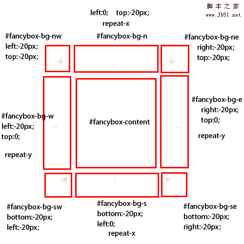
background-origin:指定背景的原点位置。
border-box:原点位置从边框开始
padding-box:原点位置从内边距开始
content-box:原点位置从内容开始
详情参考下图。
background-clip:指定背景的显示区域。
参数同上。
background-repeat:设置或检索对象的背景图像是否及如何重复铺排。
不再赘述。
background-size:指定背景图片的大小。
数值有:length percentage cover contain
这里只解释cover 和 contain
cover : 保证覆盖完背景区域,但可能会剪切掉部分图像。
contain: 保证背景图像完全显示出来,但可能会不完全覆盖背景区域。
background-position:设置或检索对象的背景图像位置。
代码:
 1 <!DOCTYPE html>
 2 <html>
 3 <head lang="en">
 4     <meta charset="UTF-8">
 5     <title>多重背景</title>
 6     <style type="text/css">
 7         /*这里注意逗号,用逗号隔开 */
 8         /*这里的px是用来定位置的 */
 9         /*第一种方法 */
10         /*body {*/
11             /*background: url("图片/狗3.jpg") 300px 185px no-repeat,*/
12                         /*url("图片/狗4.jpg") 500px 220px no-repeat,*/
13                         /*url("图片/狗1.jpg") 300px 220px no-repeat;*/
14         /*}*/
15         /*第二种方法 */
16         /*又有个问题╮(╯▽╰)╭,这里这样写会出现下划线,但也能执行,但总觉的怪怪的,*/
17         /*body {*/
18             /*background-image: url("图片/狗3.jpg"),url("图片/狗4.jpg"),url("图片/狗1.jpg");*/
19             /*background-position: 200px 185px,500px 220px,300px 220px;*/
20             /*background-repeat: no-repeat,no-repeat,no-repeat;*/
21         /*}*/
22         /*这样写就没事,貌似以前就见过这是只要格式为 方法-方法 就会出现下划线(╯﹏╰) */
23         body {
24             background: url("图片/狗3.jpg"),url("图片/狗4.jpg"),url("图片/狗1.jpg")
25                         200px 185px,500px 220px,300px 220px
26                         no-repeat,no-repeat,no-repeat;
27         }
28     </style>
29 </head>
30 <body>
31
32 </body>
33 </html>
 1 <!DOCTYPE html>
 2 <html>
 3 <head lang="en">
 4     <meta charset="UTF-8">
 5     <title>背景的原点位置</title>
 6     <style type="text/css">
 7         div {
 8             /*设置内边框大小 */
 9             padding: 50px;
10             /*设置边框颜色 */
11             border: 50px solid rgba(255,153,200,0.6);
12             height: 158px;
13             width: 185px;
14             color: #fff;
15             font-size: 24px;
16             font-weight: bold;
17             text-shadow: 2px 0 1px #f00,-2px 0 1px #f00,0 2px 1px #f00 0 -2px 1px #f00;
18             background: url("图片/狗3.jpg")  0 0 no-repeat;
19             /*原点为边框的开始 */
20             -webkit-background-origin: border-box;
21             -moz-background-origin: border-box;
22             background-origin: border-box;
23             /*原点从内边距开始 */
24         /*    -webkit-background-origin: padding-box;
25             -moz-background-origin: padding-box;
26             background-origin: padding-box;*/
27             /*原点从内容开始 */
28             /*-webkit-background-origin: content-box;*/
29             /*-moz-background-origin: content-box;*/
30             /*background-origin: content-box;*/
31             /*指定背景的显示区域*/
32             /*-webkit-background-clip: content-box;*/
33             /*-moz-background-clip: content-box;*/
34             /*-background-clip: content-box;*/
35             /*百分比确定大小 */
36             /*background-size: 50% 50%;*/
37             /*cover和contain确定大小 */
38             /*cover保证覆盖完整个背景区域 contain保证背景图片完全显示 */
39             /*background-size: cover;*/
40             /*background-size: contain;*/
41         }
42     </style>
43 </head>
44 <body>
45 <div>内容从这里开始</div>
46 </body>
47 </html>
 摘自脚本之家
边框
方法为:border-radius
只写一个数值表示每个圆角都是该数值 可以间接为 “口”
写两个数值表示:前一个为 左上和右下 后一个数值为 左下和右上 可以简记为 “X”
写三个数值表示:第一个为 左上 第二个为 右上和左下 第三个为 右下 可以简记为 "斜着的舒心旁"
四个数值表示:是个数值的顺序为:左上 右上 右下 左下。 可以简记为 "]"
记得设置 border 。 要不然就没有了╮(╯▽╰)╭,想想没边框何谈设置边框属性呢O(∩_∩)O哈!。
代码:
 1 <!DOCTYPE html>
 2 <html>
 3 <head lang="en">
 4     <meta charset="UTF-8">
 5     <title>边框圆角属性</title>
 6     <style type="text/css">
 7         div {
 8             width: 200px;
 9             height: 80px;
10             background-color: #ff0000;
11             /*border: 10px solid #FF3321;*/
12             /*下面四个数值可以简单记为到]顺序 */
13             /*border-radius:10px 20px 30px 40px;*/
14             /*另有斜线方法,第一个水平半径,第二个垂直半径*/
15             border-radius: 10px/100px;
16         }
17     </style>
18 </head>
19 <body>
20 <div></div>
21 </body>
22 </html>
另外有
border-image:设置边框图像
border-color:设置边框颜色
贴一个多色边框实例
 1 <!DOCTYPE html>
 2 <html>
 3 <head lang="en">
 4     <meta charset="UTF-8">
 5     <title>多色边框</title>
 6     <style type="text/css">
 7         div {
 8             height: 160px;
 9             border-style: solid;
10             border-width: 20px;
11
12             border-color: #40E0D0 #FF3321 #0000FF #FF9912;
13         }
14     </style>
15 </head>
16 <body>
17 <div></div>
18 </body>
19 </html>

吐槽:好丑!!!好丑!!!好丑!!! 重要的事情要说三遍!
引用以前学英语时觉得比较吊的一句话 last but not last least,学任何都是循序渐进的的过程,我从未想过一步登天,一蹴而就。看到特别炫的样式,就盲目的去模仿,显然只是生搬硬套,当然这也不是绝对的,你仔细分析代码,并能利用其中一二就挺好的,这就要基于即扎实的基础。基础才是重要的。地基打好,才能擎天。就如上图,边框实在太丑了!当然你也可以加一些特效进去,如阴影。而这就需要你扎实的基本功。曾看到一篇文章,说写程序就好像练功,功法是必要的,但也要举一反三。张无忌练乾坤大挪移快的原因是张无忌早已精通九阳神功,这就如写程序,你把c学好了,学起Java来一定很快,毕竟一些语法是互通的,如for语句就是都有的。
不多说了,道理大家都懂,最后希望我的博文能帮到大家n(*≧▽≦*)n。(博主吃饭去了。。。886)