定位是设置元素相对于其正常出现的位置、或者相对于父级应该出现的位置、甚至是浏览器窗口本身的位置。
1.定位的属性
position: fixed/relative/absolute;
left: px/%;
right:px/%;
top:px/%;
bottom:px/%;
2.固定定位:position: fixed;
固定定位类似浮动,是脱离文档流的,且固定定位是相对于窗口本身定位的,不随页面滚动而移动。
固定定位常用于页面的导航栏部分,有利于提高用户的体验度,或者做侧边栏广告。
3.相对定位position: relative;
相对定位没有脱离文档流,是相对于其正常出现的位置定位的,其正常位置不会被其他内容占用,会随着页面滚动而移动。
由于其原来的位置被保留下来,所以一般不用相对定位来定位,只是当做父级定位元素来用。
4.绝对定位position: absolute;
绝对定位是相对于最近的父级定位元素定位(包括三种定位:fixed、relative、absolute),如果直到body也没有找到定位元素,那么就会相对于body元素定位。
绝对定位是脱离文档流的。
示例:
 1 <!doctype html>
 2 <html lang="en">
 3  <head>
 4   <meta charset="UTF-8">
 9   <title>Document</title>
10   <style>
11     #container{
12         width: 1000px;
13         height: 800px;
14         margin: 50px;
15         border: 1px solid #ccc;
16     }
17     .box1{
18         /* position: relative; */
19         width: 300px;
20         height: 300px;
21         border: 5px solid #0000ff;
22     }
23     .box2{
24         position: absolute;
25         left: 50px;
26         top: 50px;
27         width: 200px;
28         height: 200px;
29         border: 5px solid #ff0000;
30     }
31     .box3{
32         width: 50px;
33         height: 50px;
34         border: 5px solid #009900;
35     }
36   </style>
37  </head>
38  <body>
39   <div id="container">
40     <div class="box1">
41         box1
42         <div class="box2">
43             box2
44             <div class="box3">
45                 box3
46             </div>
47         </div>
48     </div>
49   </div>
50  </body>
51 </html>
结果:
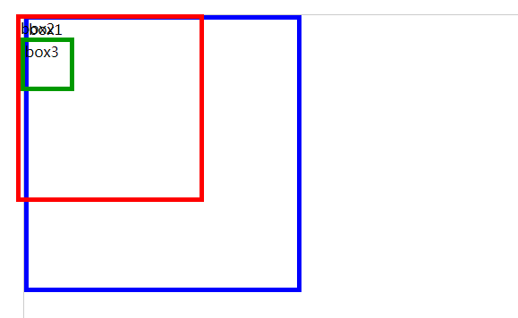
可以看到绝对定位是脱离文档流的。如果要让其不脱离文档流,则要让父级元素用相对定位,只是父级元素不用给偏移量。
结果如下:

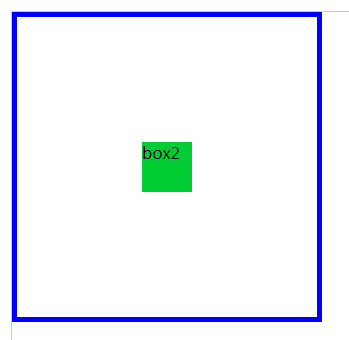
5.定位特性
无论是什么类型的标签,除了relative以外,其他定位都支持宽高,因为他们脱离了文档流,且不支持margin: auto。
由于定位不支持margin居中,下面来讨论一下定位的居中方法。
1)用margin方法,使其折回一半距离
示例:
 1 <!doctype html>
 2 <html lang="en">
 3  <head>
 4   <meta charset="UTF-8">
 5   <title>Document</title>
 6   <style>
 7     #container{
 8         width: 1000px;
 9         height: 800px;
10         margin: 50px;
11         border: 1px solid #ccc;
12     }
13     .box1{
14         position: relative;
15         width: 300px;
16         height: 300px;
17         border: 5px solid #0000ff;
18     }
19     .box2{
20         position: absolute;
21         /* 垂直居中 */
22         top: 150px;
23         margin-top: -25px;
24         /* 水平居中 */
25         left: 150px;
26         margin-left: -25px;
27         width: 50px;
28         height: 50px;
29         background: #00cc33;
30     }
31   </style>
32  </head>
33  <body>
34   <div id="container">
35     <div class="box1">
37         <div class="box2">
38             box2
39         </div>
40     </div>
41   </div>
42  </body>
43 </html>
结果:
2)用calc代替margin
示例:
 1 <!doctype html>
 2 <html lang="en">
 3  <head>
 4   <meta charset="UTF-8">
 5   <title>Document</title>
 6   <style>
 7     #container{
 8         width: 1000px;
 9         height: 800px;
10         margin: 50px;
11         border: 1px solid #ccc;
12     }
13     .box1{
14         position: relative;
15         width: 300px;
16         height: 300px;
17         border: 5px solid #0000ff;
18     }
19     .box2{
20         position: absolute;
21         /* 垂直居中 */
22         top: calc(50% - 25px); /* 50%是父级盒子的一半,减号两边一定要有空格,减去的是要居中的盒子宽高的一半。 */
23         /* 水平居中 */
24         left: calc(50% - 25px);
25         width: 50px;
26         height: 50px;
27         background: #00cc33;
28     }
29   </style>
30  </head>
31  <body>
32   <div id="container">
33     <div class="box1">
35         <div class="box2">
36             box2
37         </div>
38     </div>
39   </div>
40  </body>
41 </html>
3)margin:auto;也不是绝对的不支持,可以另其定位元素偏移量为0就可以居中。
示例:
 1 <!doctype html>
 2 <html lang="en">
 3  <head>
 4   <meta charset="UTF-8">
 5   <title>Document</title>
 6   <style>
 7     #container{
 8         width: 1000px;
 9         height: 800px;
10         margin: 50px;
11         border: 1px solid #ccc;
12     }
13     .box1{
14         position: relative;
15         width: 300px;
16         height: 300px;
17         border: 5px solid #0000ff;
18     }
19     .box2{
20         position: absolute;
21         /* 垂直居中 */
22         top: 0;
23         bottom: 0;
24         /* 水平居中 */
25         left: 0;
26         right: 0;
27         width: 50px;
28         height: 50px;
29         /* margin: auto必须有 */
30         margin: auto;
31         background: #00cc33;
32     }
33   </style>
34  </head>
35  <body>
36   <div id="container">
37     <div class="box1">
39         <div class="box2">
40             box2
41         </div>
42     </div>
43   </div>
44  </body>
45 </html>
6.层级
定位和浮动都提高一个半层,z-index属性也可以提高层级。
z-index值没有单位,值越大,层级越高,就会越在上面出现,且值没有上下限,只比较大小。
7.实战
1)一周热榜
示例:
<!doctype html>
<html lang="en">
 <head>
  <meta charset="UTF-8">
  <meta name="Generator" content="EditPlus®">
  <meta name="Author" content="XXX">
  <meta name="Keywords" content="01-周热榜">
  <meta name="Description" content="01-周热榜">
  <title>01-周热榜</title>
  <style>
    body,dl,dd,dt,p,h1,h2,h3,h4,h5,h6{margin: 0;}
    *{margin: 0; padding: 0;}
    ol,ul{list-style: none;}
    a{text-decoration: none; color: inherit;}
    html{background: #ccc;}
    #container{padding: 50px; background: #fff;}
    .con{
        width: 280px;
        margin: auto;
        border: 10px solid rgba(242, 242, 242, 0.8);
    }
    .con .title{
        position: relative;
        height: 60px;
    }
    .con .title div{
        margin: 0 15px;
        width: 50px;
    }
    .con .title .line1{
        position: absolute;
        top: 30px;
        left: 0px;
    }
    /* 相对title定位的,不是前一个定位元素定位,是嵌套定位 */
    .con .title span{
        position: absolute;
        top: calc(50% - 17px);
        left: calc(50% - 52px);
        /*  60px; */
        font-size: 26px;
        font-family: "微软雅黑";
        /* line-height: 60px; */
    }
    .con .title .line2{
        position: absolute;
        top: 30px;
        right: 0px;
    }
    .con ul{
        margin-left: 50px;
        font-size: 14px;
    }
    .con ul li{
        position: relative;
        height: 19px;
        margin: 15px 0;
    }
    .con ul li a:hover{
        position: absolute;
        top: 0px;
        left: 2px;
        color: red;
    }
  </style>
 </head>
 <body>
  <div id="container">
    <div class="con">
        <div class="title">
            <div class="line1"><hr /></div>
            <span>一周热榜</span>
            <div class="line2"><hr /></div>
        </div>
        <ul>
            <li><a href="#">按时间空格和假设大家看公开就定</a></li>
            <li><a href="#">按时间空格和假设大家看公开就定</a></li>
            <li><a href="#">按时间空格和假设大家看公开就定</a></li>
            <li><a href="#">按时间空格和假设大家看公开就定</a></li>
            <li><a href="#">按时间空格和假设大家看公开就定</a></li>
            <li><a href="#">按时间空格和假设大家看公开就定</a></li>
            <li><a href="#">按时间空格和假设大家看公开就定</a></li>
        </ul>
    </div>
  </div>
 </body>
</html>
结果:

2)轮播图布局
示例:
  1 <!doctype html>
  2 <html lang="en">
  3  <head>
  4   <meta charset="UTF-8">
  5   <meta name="Generator" content="EditPlus®">
  6   <meta name="Author" content="XXX">
  7   <meta name="Keywords" content="02-轮播图布局">
  8   <meta name="Description" content="02-轮播图布局">
  9   <title>02-轮播图布局</title>
 10   <style>
 11     body,dl,dd,dt,p,h1,h2,h3,h4,h5,h6{margin: 0;}
 12     *{margin: 0; padding: 0;}
 13     ol,ul{list-style: none;}
 14     a{text-decoration: none; color: inherit;}
 15     .con .title{
 16         position: relative;
 17         height: 150px;
 18         border: 1px solid #fff;
 19     }
 20     .con .title .line{
 21         position: absolute;
 22         top: 88px;
 23         width: 100%;
 24     }
 25     .con .title .tpic{
 26         position: absolute;
 27         left: calc(50% - 123px);
 28         width: 366px;
 29         margin: auto;
 30         background: #fff;
 31     }
 32     .con .title .tpic .pic{
 33         width: 305px;
 34         height: 87px;
 35         margin: 43px 30px 0;
 36         background: url("./images/1.jpg") -37px -521px;
 37     }
 38     /* 广告 */
 39     .con .adventure{
 40         position: relative;
 41         width: 1000px;
 42         margin: auto;
 43     }
 44     .con .adventure .pic ul{
 45         width: 1000px;
 46         height: 500px;
 47     }
 48     .con .adventure .pic ul li{
 49         position: absolute;
 50     }
 51     .con .adventure .ipic{
 52         position: absolute;
 53         top: 295px;
 54         width: 60px;
 55         height: 75px;
 56         background: url("./images/2.png");
 57     }
 58     .con .adventure .left{
 59         background-position: 0 -690px;
 60     }
 61     .con .adventure .right{
 62         right: 0;
 63         background-position: 0 -760px;
 64     }
 65     .con .adventure .center{
 66         position: absolute;
 67         top: 425px;
 68         left: calc(50% - 445px);
 69         width: 890px;
 70         color: #fff;
 71         background: rgba(0, 0, 0, 0.5);
 72     }
 73     .con .adventure .center .detail1{
 74         position: relative;
 75         float: left;
 76         width: 350px;
 77         height: 150px;
 78         font-size: 24px;
 79     }
 80     .con .adventure .center .detail1 span{
 81         position: absolute;
 82         top: calc(50% - 36px);
 83         left: calc(50% - 140px);
 84         width: 280px;
 85         line-height: 35px;
 86     }
 87     .con .adventure .center .detail2{
 88         position: relative;
 89         float: left;
 90         width: 530px;
 91         height: 90px;
 92         margin: 30px 0;
 93         border-left: 1px solid #fff;
 94     }
 95     .con .adventure .center .detail2 span{
 96         display: inline-block;
 97         font-size: 14px;
 98         margin: 15px 20px;
 99     }
100     .con .adventure .bottom ul{
101         position: absolute;
102         top: 605px;
103         left: calc(50% - 28px);
104     }
105     .con .adventure .bottom ul li{
106         float: left;
107         width: 10px;
108         height: 10px;
109         margin: 2px;
110         border: 1px solid #fff;
111         border-radius: 50%;
112         background: #ccc;
113     }
114     .con .adventure .bottom ul .li1{
115         background: red;
116     }
117   </style>
118  </head>
119  <body>
120   <div id="container">
121     <div class="con">
122         <div class="title">
123             <hr class="line" />
124             <div class="tpic">
125                 <div class="pic"></div>
126             </div>
127         </div>
128         <div class="adventure">
129             <div class="pic">
130                 <ul>
131                     <li><a href="#"><img src="./images/6.jpg" alt="" /></a></li>
132                     <li><a href="#"><img src="./images/5.jpg" alt="" /></a></li>
133                     <li><a href="#"><img src="./images/4.jpg" alt="" /></a></li>
134                     <li><a href="#"><img src="./images/3.jpg" alt="" /></a></li>
135                 </ul>
136             </div>
137             <div class="left ipic"></div>
138             <div class="right ipic"></div>
139             <div class="center">
140                 <div class="detail1"><span>爱神的箭海关法地方鬼地方个的算法各函 还是改</span></div>
141                 <div class="detail2"><span>按时间看到回复即可视化端口封禁还是打发四大皆空咖世家看到回复gas发V盎司的哈哈健康规划按即可各函数聊得好嘎嘎哈算法给红烧冬瓜放表数据很方便V卡是工号工号V和说过的话发光时代V操作更加开学才V社然后就眼未来会</span></div>
142             </div>
143             <div class="bottom">
144                 <ul>
145                     <li class="li1"><a href="#"></a></li>
146                     <li><a href="#"></a></li>
147                     <li><a href="#"></a></li>
148                     <li><a href="#"></a></li>
149                 </ul>
150             </div>
151         </div>
152     </div>
153   </div>
154  </body>
155 </html>
结果:
