1.使用npm添加package.json文件中的配置并下载相关npm包依赖
npm install echarts --save
2.然后在项目文件的入口js文件main.js中添加
import echarts from "echarts"
3在需要添加图标的组件中创建依赖的实例
var echarts = require('echarts');
main.js
		// The Vue build version to load with the `import` command
		// (runtime-only or standalone) has been set in webpack.base.conf with an alias.
		import Vue from 'vue'
		import App from './App'
		import router from './router'
		import $ from 'jquery'
		import './../static/css/global.css'
		import './../static/css/select.css'
		import './icons'
		import axios from 'axios';
		import './util/request'
		import commonDate from './util/commonDate';
		import common from './util/common';
		import Element from 'element-ui'
		import 'element-ui/lib/theme-chalk/index.css'
		import './../static/css/element-ui-ext.css'
		import echarts from 'echarts'
		require("./../static/js/rtsp_player.1.8.js");
		//地图js
		Vue.prototype.$commonDate = commonDate;
		Vue.prototype.$common = common;
		Vue.prototype.$axios = axios;
		// 引入echarts
		Vue.prototype.$echarts = echarts
		Vue.config.productionTip = false

		Vue.use(Element)

		/* eslint-disable no-new */
		new Vue({
		  el: '#app',
		  router,
		  components: {App},
		  template: '<App/>'
		})
4.上手使用
示例:
1.创建三个组件
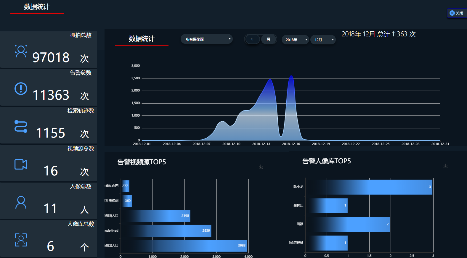
2.编写ChartsView.vue
<template>

  <div id="myChart" :style="{ '1400px', height: '400px'}"></div>

</template>

<script>
    export default {
      name: "ChartsView",
      components: {
      },
      data(){
        return{
          data:[],
          title:[],
          array:[]
        }
      },

      mounted(){
        this.init();
      },
      created(){

      },
      methods: {

        init(){
          /*分成两个集合*/
          this.data = [];
          this.title = [];
          for(var i =0;i<this.array.length; i++){
            this.data.push(this.array[i].count)
            this.title.push(this.array[i].title)
          }

          this.drawLine();
        },
        drawLine(){
          // 基于准备好的dom,初始化echarts实例
          let myChart = this.$echarts.init(document.getElementById('myChart'))
          // 绘制图表
          myChart.setOption({
            show:true,
            title:{
              shadowColor:'blue'
            },
            animation: true,
            xAxis: {
              type: 'category',
              boundaryGap: false,
              data: this.title
            },
            yAxis: {
              type: 'value'
            },
            textStyle:{
              color:"#FFF",
            },

            areaStyle:{
            },
            series: [{
              data: this.data,
              type: 'line',
              areaStyle: {},
              // itemStyle: {
              //   color:"#4480C4"
              // }
              symbol:'none',  //这句就是去掉点的
              smooth:true,  //这句就是让曲线变平滑的
            }],

            color: {
              type: 'linear',
              x: 0,
              y: 0,
              x2: 0,
              y2: 1,
              colorStops: [
                {
                  offset: 0, color: 'blue' // 0% 处的颜色
                },
                {
                  offset: 0.5, color: '#84C1FF' // 100% 处的颜色
                },
                {
                  offset: 0.6, color: '#D2E9FF' // 100% 处的颜色
                },
                {
                  offset: 1, color: '#84C1FF' // 100% 处的颜色
                },
              ],
              globalCoord: false // 缺省为 false
            }

          },true);
        },
      }
    }
</script>


<style scoped>
  #myChart{
    padding-top: 80px;
    color: white;
  }
</style>
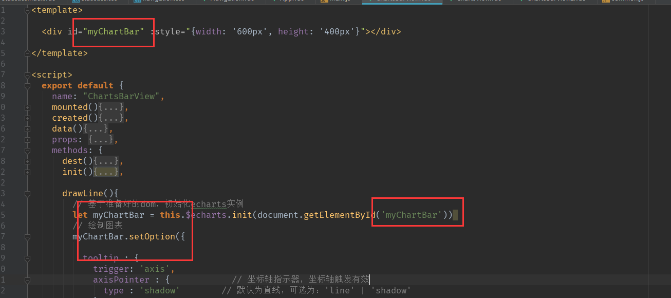
3.编写底下两个组件(没有做组件复用,写好一个直接复制另一个)
<template>

  <div id="myChartBar" :style="{ '600px', height: '400px'}"></div>

</template>

<script>
  export default {
    name: "ChartsBarView",
    mounted(){
      this.init();
    },
    created(){

    },
    data(){
      return{
        name:[],
        val:[],
      }
    },
    props: {
      dataList: {
        type: [Array],
      },
    },
    methods: {
      dest(){
        this.$destroy(true);
        console.log(1)
      },
      init(){
        /*循环取值*/
        this.name = [];
        this.val = [];
        for(var i =0;i<this.dataList.length; i++){
          this.name.push(this.dataList[i].name)
          this.val.push(this.dataList[i].value)
        }
        this.drawLine();
      },

      drawLine(){
        // 基于准备好的dom,初始化echarts实例
        let myChartBar = this.$echarts.init(document.getElementById('myChartBar'))
        // 绘制图表
        myChartBar.setOption({

          tooltip : {
            trigger: 'axis',
            axisPointer : {            // 坐标轴指示器,坐标轴触发有效
              type : 'shadow'        // 默认为直线,可选为:'line' | 'shadow'
            }
          },
          toolbox: {
            show : true,
            feature : {
              mark : {show: true},
              //dataView : {show: true, readOnly: false},
              //magicType : {show: true, type: ['line', 'bar', 'stack', 'tiled']},
              //restore : {show: true},
              saveAsImage : {show: true}
            }
          },
          calculable : true,
          xAxis : [
            {
              type : 'value'
            }
          ],
          yAxis : [
            {
              type : 'category',
              data : this.name
            }
          ],
          textStyle:{
            color:"#FFF",
          },
          series : [
            {
              name:'告警视频源TOP5',
              type:'bar',
              stack: '次数',
              itemStyle : { normal: {label : {show: true, position: 'insideRight'}}},
              data:this.val
            },

          ],
          color: {
            type: 'line',
            x: 0,
            y: 0,
            x2: 1,
            y2: 0,
            colorStops: [
              {
                offset: 0, color: 'transparent' // 0% 处的颜色
              },
              {
                offset: 0.3, color: '#265080' // 50% 处的颜色
              },
              {
                offset: 0.7, color: '#4ca0ff' // 70% 处的颜色
              },
              {
                offset: 1, color: '#448CDF' // 100% 处的颜色
              },
            ],
            globalCoord: false // 缺省为 false
          }
        });
      }
    }
  }
</script>


<style scoped>
#myChartBar{
  padding-top: 40px;
}
</style>
需要注意,两个相同的组件,这两个地方不一样
使用组件
 import ChartsView from '../chartsView/ChartsView'
 import ChartsBarView from '../chartsView/ChartsBarView'
 import ChartsBarView2 from '../chartsView/ChartsBarView2'

	 <div>
            <ChartsView ref="sjtj" :dataList="figureData"></ChartsView>
     </div>
	 <div>
            <ChartsBarView ref="gjsp" :dataList="gaoJinSPTop5"></ChartsBarView>
     </div>
	  <div>
            <ChartsBarView2 ref="gjrx" :dataList="gaoJinRXTop5"></ChartsBarView2>
     </div>
效果就出来了!