以下代码来源网络……
 var colors=["red","blue","green","black","orange","purple"]

            option = {
                title: {
                    text: '测试',
                },
                tooltip: {
                    trigger: 'axis',
                    axisPointer: { // 坐标轴指示器,坐标轴触发有效
                        type: 'shadow' // 默认为直线,可选为:'line' | 'shadow'
                    },
                    formatter: function(params) {
                        return params[0].name + '<br/>' +
                            params[0].seriesName + ' : ' + params[0].value + '<br/>' +
                            params[1].seriesName + ' : ' + (params[1].value + params[0].value);
                    }
                },
                legend: {
                    selectedMode: false,
                    data: ['Acutal', 'Forecast']
                },
                toolbox: {
                    show: true,
                    feature: {
                        mark: { show: true },
                        dataView: { show: true, readOnly: false },
                        restore: { show: true },
                        saveAsImage: { show: true }
                    }
                },
                calculable: true,
                xAxis: [{
                    type: 'category',
                    data: ['top1', 'top2', 'top3', 'top4', 'top5', 'top6'],
                    splitLine:false
                    //data:[]
                },{
                    type: 'category',
                    show:false,
                    boundaryGap : false,
                    data: ['Cosco', 'CMA', 'APL', 'OOCL', 'Wanhai', 'Zim',"333"],
                    splitLine:true
                }],
                yAxis: [{
                        type: 'value',
                        boundaryGap: [0, 0.1],
                        splitLine:false
                    },
                    {
                        type: 'value',
                        name: '温度',
                        axisLabel: {
                            formatter: '{value} %'
                        },
                        splitLine:false
                    }
                ],
                series: [{
                        name: 'Acutal',
                        type: 'bar',
                        //barGap:'10%',
                        barCategoryGap: '0%',
                        itemStyle: {
                            normal: {
                                color: function(obj){
                                    if(obj.dataIndex>=0){
                                        return colors[obj.dataIndex];
                                    }
                                },
                                barBorderColor: 'tomato',
                                barBorderWidth:1,
                                barBorderRadius: 2,
                                label: {
                                    show: true,
                                    position: 'insideTop'
                                }
                            }
                        },
                        data: [300, 200, 180, 150, 120, 50]
                    },
                    {
                        name: 'Forecast',
                        type: 'line',
                        xAxisIndex: 1,
                        yAxisIndex: 1,
                        data: [0, 30,50, 68, 83, 95,100 ]
                    }

                ]
            };
其实这两效果是一样的,仅边框有点儿区别而已。
app.title = '折柱混合';

var colors = ['#C33531','#EFE42A','#64BD3D','#EE9201','#29AAE3', '#B74AE5','#0AAF9F','#E89589']

option = {
    title : {
        text : '测试'
    },
    tooltip : {
        trigger : 'axis',
        axisPointer : { // 坐标轴指示器,坐标轴触发有效
            type : 'shadow' // 默认为直线,可选为:'line' | 'shadow'
        },
        formatter : function(params) {
            return params[0].name + '<br/>' + params[0].seriesName + ' : '
                    + params[0].value + '<br/>' + params[1].seriesName + ' : '
                    + (params[1].value + params[0].value);
        }
    },
    legend : {
        selectedMode : false,
        data : ['Acutal', 'Forecast']
    },
    toolbox : {
        show : true,
        feature : {
            mark : {
                show : true
            },
            dataView : {
                show : true,
                readOnly : false
            },
            restore : {
                show : true
            },
            saveAsImage : {
                show : true
            }
        }
    },
    xAxis : [{
        type : 'category',
        data : ['top1', 'top2', 'top3', 'top4', 'top5', 'top6']
        }, {
        type : 'category',
        show : false,
        boundaryGap : false,
        data : ['Cosco', 'CMA', 'APL', 'OOCL', 'Wanhai', 'Zim', "333"]
    }],
    yAxis : [{
                type : 'value',
                boundaryGap : [0, 0.1],
                splitLine : false
            }, {
                type : 'value',
                name : '温度',
                axisLabel : {
                    formatter : '{value} %'
                },
                splitLine : false
            }],
    series : [{
                name : 'Acutal',
                type : 'bar',
                barCategoryGap : '0%',
                itemStyle : {
                    normal : {
                        color : function(obj) {
                            if (obj.dataIndex >= 0) {
                                return colors[obj.dataIndex];
                            }
                        },
                        barBorderWidth : 1,
                        barBorderRadius : 2,
                        label : {
                            show : true,
                            position : 'insideTop'
                        }
                    }
                },
                data : [300, 200, 180, 150, 120, 50]
            }, {
                name : 'Forecast',
                type : 'line',
                xAxisIndex : 1,
                yAxisIndex : 1,
                data : [0, 30, 50, 68, 83, 95, 100]
            }

    ]
};
可在此处测试之:https://echarts.apache.org/examples/zh/editor.html?c=mix-line-bar
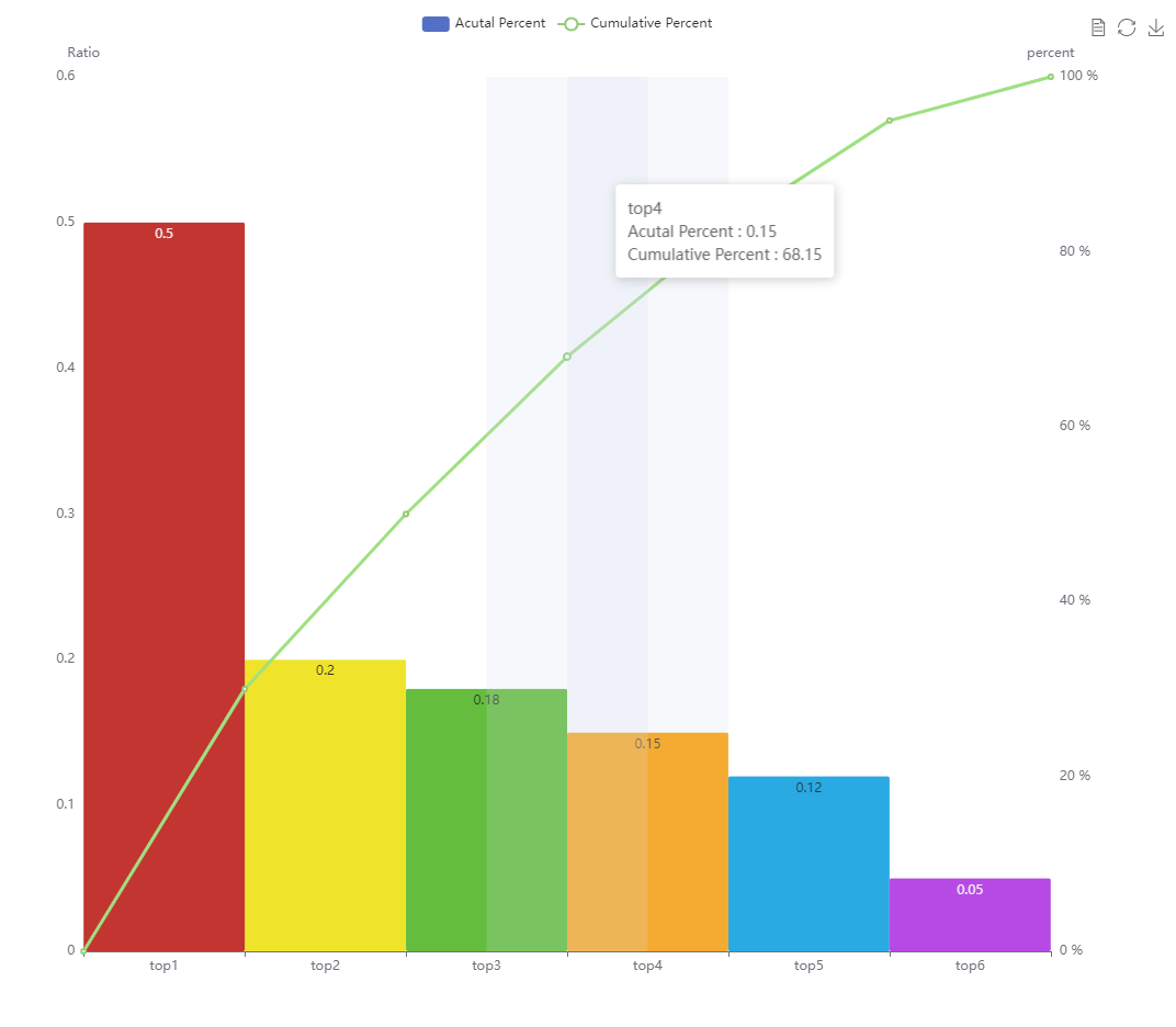
简单优化后及效果图如下:
var colors = ['#C33531','#EFE42A','#64BD3D','#EE9201','#29AAE3', '#B74AE5','#0AAF9F','#E89589']

option = {
    /*title : {
        text : '测试'
    },*/
    tooltip : {
        trigger : 'axis',
        axisPointer : { // 坐标轴指示器,坐标轴触发有效
            type : 'shadow' // 默认为直线,可选为:'line' | 'shadow'
        },
        formatter : function(params) {
            return params[0].name + '<br/>' + params[0].seriesName + ' : '
                    + params[0].value + '<br/>' + params[1].seriesName + ' : '
                    + (params[1].value + params[0].value);
        }
    },
    legend : {
        selectedMode : false,
        data : ['Acutal Percent', 'Cumulative Percent']
    },
    toolbox : {
        show : true,
        feature : {
            mark : {
                show : true
            },
            dataView : {
                show : true,
                readOnly : false
            },
            restore : {
                show : true
            },
            saveAsImage : {
                show : true
            }
        }
    },
    xAxis : [{
        type : 'category',
        data : ['top1', 'top2', 'top3', 'top4', 'top5', 'top6']
        }, {
        type : 'category',
        show : false,
        boundaryGap : false,
    //    data : ['Cosco', 'CMA', 'APL', 'OOCL', 'Wanhai', 'Zim', "333"]
    }],
    yAxis : [{
                type : 'value',
                name:'Ratio',
                boundaryGap : [0, 0.1],
                splitLine : false
            }, {
                type : 'value',
                name : 'percent',
                axisLabel : {
                    formatter : '{value} %'
                },
                splitLine : false
            }],
    series : [{
                name : 'Acutal Percent',
                type : 'bar',
                barCategoryGap : '0%',
                itemStyle : {
                    normal : {
                        color : function(obj) {
                            if (obj.dataIndex >= 0) {
                                return colors[obj.dataIndex];
                            }
                        },
                        barBorderWidth : 1,
                        barBorderRadius : 2,
                        label : {
                            show : true,
                            position : 'insideTop'
                        }
                    }
                },
                data : [0.5, 0.2, 0.18, 0.15, 0.12, 0.05]
            }, {
                name : 'Cumulative Percent',
                type : 'line',
                xAxisIndex : 1,
                yAxisIndex : 1,
                data : [0, 30, 50, 68, 83, 95, 100]
            }

    ]
};
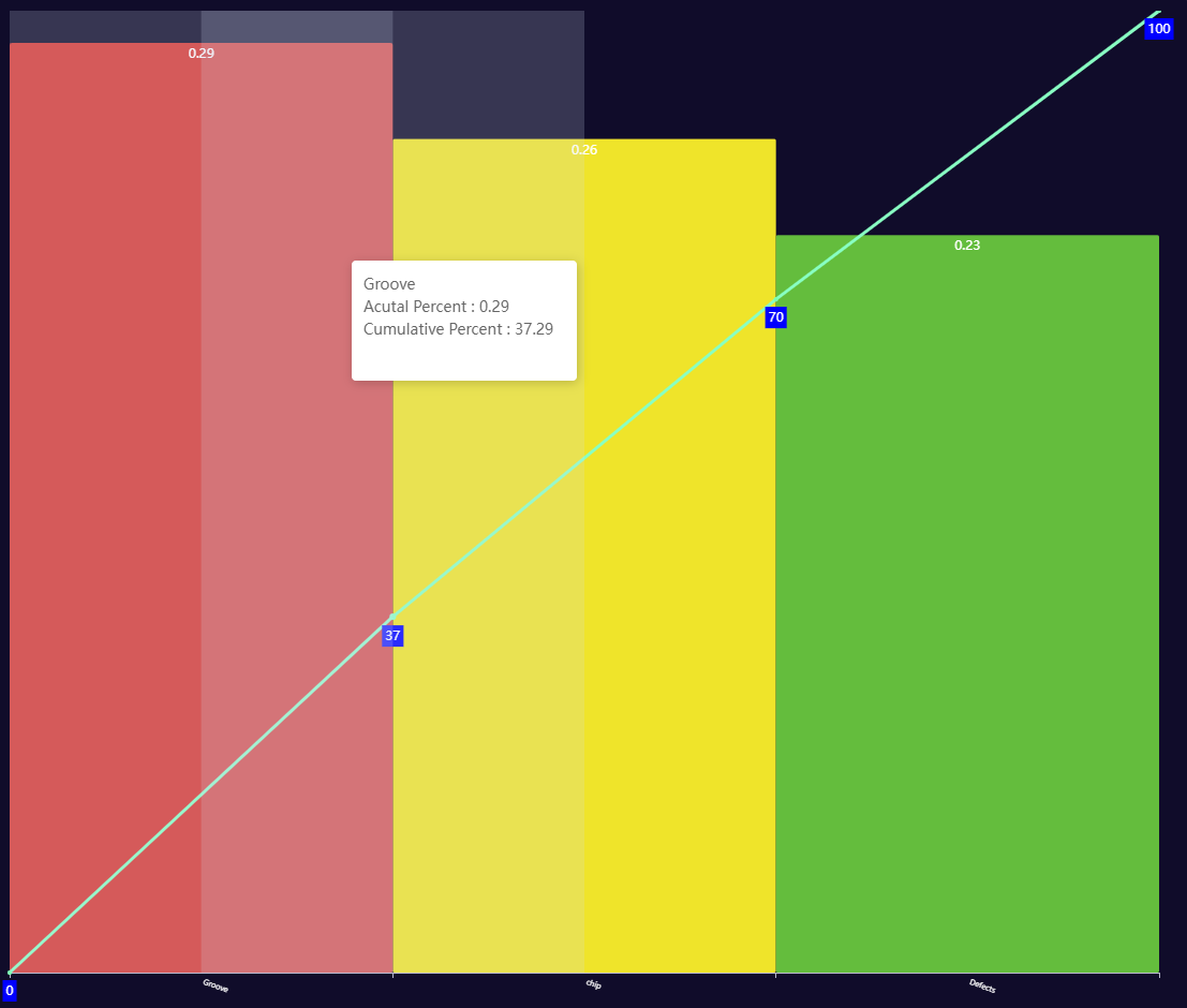
调整工作区域优化相关配置后
 var colors = ['#C33531', '#EFE42A', '#64BD3D', '#EE9201', '#29AAE3', '#B74AE5', '#0AAF9F', '#E89589']

   var   $Categorly="['Groove','chip','Defects']";
     //$Categorly= $Categorly.replace(/'/g,"'");

    var Categorly = eval($Categorly);//eval转化为实体或数组

    option = {
        /*title : {
            text : '测试'
        },*/
        grid: {//调整工作区域,以符合需求(更多时候是为了取消图形周围过多的空白)
                //height: 800,//高度
                left: 10,//左边距
                top: 0,
                right:20,
                bottom:30,
            },
        textStyle:{
          color:"#FFF"
        },
        tooltip: {
            trigger: 'axis',
            axisPointer: { // 坐标轴指示器,坐标轴触发有效
                type: 'shadow' // 默认为直线,可选为:'line' | 'shadow'
            },
            formatter: function (params) {
                return params[0].name + '<br/>' + params[0].seriesName + ' : '
                    + params[0].value + '<br/>' + params[1].seriesName + ' : '
                    + (params[1].value + params[0].value);
            },
            extraCssText:'15em;height:8em;',//添加css设置tooltip宽高
             position:function(p){ //其中p为当前鼠标的位置
                return [p[0] + 10, p[1] - 10];
            },//设置tooltip显示位置
        },

        toolbox: {
            show: false,
            feature: {
                mark: {
                    show: true
                },
                dataView: {
                    show: true,
                    readOnly: false
                },
                restore: {
                    show: true
                },
                saveAsImage: {
                    show: true
                }
            }
        },
        xAxis: [{
            type: 'category',
           // data: ['top1', 'top2', 'top3']//xAxis 名称   $Data
            data: Categorly,
            //将x轴标签旋转20度,长label时方便读取
            axisLabel: {
                       interval:0,
                       rotate:-20,
                       fontSize:"0.5em"
                    }

        }, {
            type: 'category',
            show: false,
            boundaryGap: false,
          //  data: ['Cosco', 'CMA', 'APL', 'OOCL', 'Wanhai', 'Zim', "333"]//副轴类别,某些版本可以不要,
          //但低版本可能需要,另外做Plato时此类别在低版本时需要比主轴多一个值用来存储0值——Plato的起始点
        }],
        yAxis: [{
            type: 'value',
            name: 'Ratio',
            boundaryGap: [0, 0.1],
            splitLine: false,
            show:false
        }, {
            type: 'value',
            name: 'percent',
            axisLabel: {
                formatter: '{value} %'
            },
            splitLine: false,
             show:false
        }],
        series: [{
            name: 'Acutal Percent',
            type: 'bar',
            barCategoryGap: '0%',
            itemStyle: {
                normal: {
                    color: function (obj) {
                        if (obj.dataIndex >= 0) {
                            return colors[obj.dataIndex];
                        }
                    },
                    barBorderWidth: 1,
                    barBorderRadius: 2,
                    label: {
                        show: true,
                        position: 'insideTop',
                        color:"#FFF"
                    }
                }
            },
            data: [0.29, 0.26, 0.23],//主轴数据 ——data
        }, {
            name: 'Cumulative Percent',
            type: 'line',
            xAxisIndex: 1,
            yAxisIndex: 1,
            data: [0,37, 70, 100],//副轴数据——percent
            itemStyle: {
                normal: {
                    label: {
                        show: true,
                        position: 'bottom',
                        color:"#FFF",
                        backgroundColor:"blue",
                        padding:[5,3,3,3]
                    }
                }
            },
        }

        ]
    };
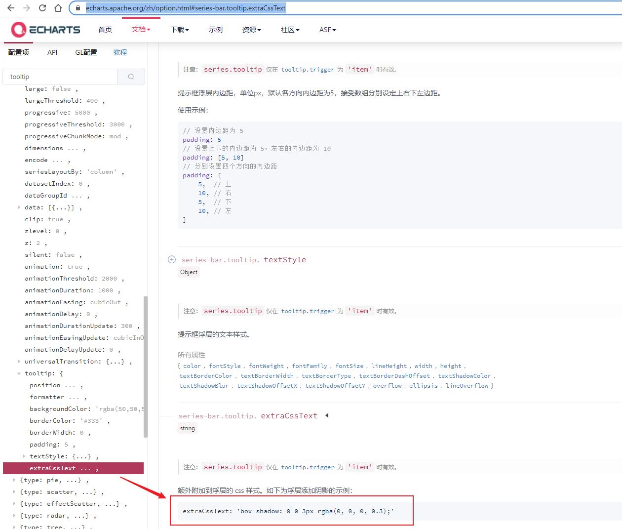
对于echart其更多新功能,搜索也许能解决,但不要忘记其官网最详尽的文档。其是解决找不到的终极武器。
比如tooltip的边框大小是可通过CSS定制的,基官方指导为:https://echarts.apache.org/zh/option.html#series-bar.tooltip.extraCssText