1.小程序的布局就多了一个flex布局,其他和之前html没太大区别 ,先看代码;
(1)wxml
<view class='container'>
  <view class='selection'>
    <swiper indicator-dots="true" autoplay="true" interval="5000" vertical="{{false}}" class='swiper'>
      <block wx:for="{{imgUrls}}">
        <swiper-item>
          <image src="{{item}}" class="slide-image" style='100%;height:100%' />
        </swiper-item>
      </block>
    </swiper>
  </view>

  <view class='selection'>
    <view class='head'>
      <text>精品推荐</text>
      <text class='text_all'>全部精品</text>
    </view>

    <view class='content'>
      <view class='content_item' wx:for="{{contontitems}}">
        <image src='{{item.url}}' mode='aspectFit'></image>
        <view class='content_item_tex'>
          <text>{{item.title}}</text>
        </view>
      </view>
    </view>
  </view>
  <view class='selection'>
    <view class='head'>
      <text>热门评测</text>
      <text class='text_all'>全部评测</text>
    </view>
    <view class='list_item'wx:for="{{listitem}}">
      <view class='list_item_images'>
        <image src='{{item.url}}'style='100%;height:100%'></image>
        <view class='list_item_text'>
        {{item.text}}
        </view>
      </view>
    </view>
  </view>
  <view class='bottom_tap'>
 <button type=''>我们与你同在</button>
  </view>
</view>
这是页面结构
(2)wxss
.container{
  padding: 5px;
  box-sizing: border-box;

}

.head{
  border-left: 2px solid green;
  font-size: 15px;
  display: flex;
  justify-content: space-between;/*主轴(这里是水平方向)方向两边对齐平均分*/
  align-content: center;/*交叉轴方向居中(这里是垂直方向)*/
  margin: 3px;
  padding: 5px;

}
.text_all{
  color: green;
  font-size: 10px;
  /* background-color: red; */
}
.content{
display: flex;
direction: row;
flex-wrap: wrap;/*装不下换行*/
justify-content: center;


}
.content_item{
height: 250rpx;
 45%;
background:rgba(0, 0,0, 0.1);
border:1px solid gray;
margin: 2px;
position: relative;
}
.content_item image{
  100%;
  height: 100%;

}
.content_item_tex{
  position: absolute;
  bottom:3px;
  right: 2px;
   20px;
  line-height: 20px;
  font-size: 18px;
  /* background-color:greenyellow; */
  color: deepskyblue;
  background:-webkit-linear-gradient(bottom,rgba(0, 0,0, 0.8),rgba(0, 0,0,0));
}
.list_item{
   height: 500rpx;
    100%;
}
.list_item_images{
  height: 300rpx;
    100%;
}
.list_item_text{
   height: 200rpx;
     100%;
    background-color:black;
    opacity:0.5;
    color: white;
}
.bottom_tap{
   100%;
  height: 100rpx;
  margin-top:12px;
  margin-bottom: 10px;

}
这是样式文件
(3)js
Page({

  /**
   * 页面的初始数据
   */
  data: {
    //轮播图片路径
    imgUrls: ['../../img/1.jpg',
      '../../img/2.jpg',
      '../../img/3.jpg'],
    contontitems: [{ title: '奇异博士', url: '../../img/4.jpg' },
    { title: '钢铁侠', url: '../../img/5.jpg' },
    { title: '浩克', url: '../../img/6.jpg' },
    { title: '美国队长', url: '../../img/7.jpg' }],
    listitem: [{
      url: '../../img/8.jpg', text: 'Failure is the fog through which we glimpse triumph 失败是迷雾,穿过它,我们就可以瞥见光明' },
      { url: '../../img/9.jpg', text: '.I have to protect the one thing I can’t live without我希望保护好我所不能失去的东西' },
      {
        url: '../../img/10.jpg', text: 'If I see the situation pointed south, I cant ignore it. Sometimes I wish I could.如果我发觉事情在向糟糕的方向发展,我就没法无视他,有时候我也希望我可以' }],
  }
})
这里没有特别的逻辑主要是设置了一下数据;
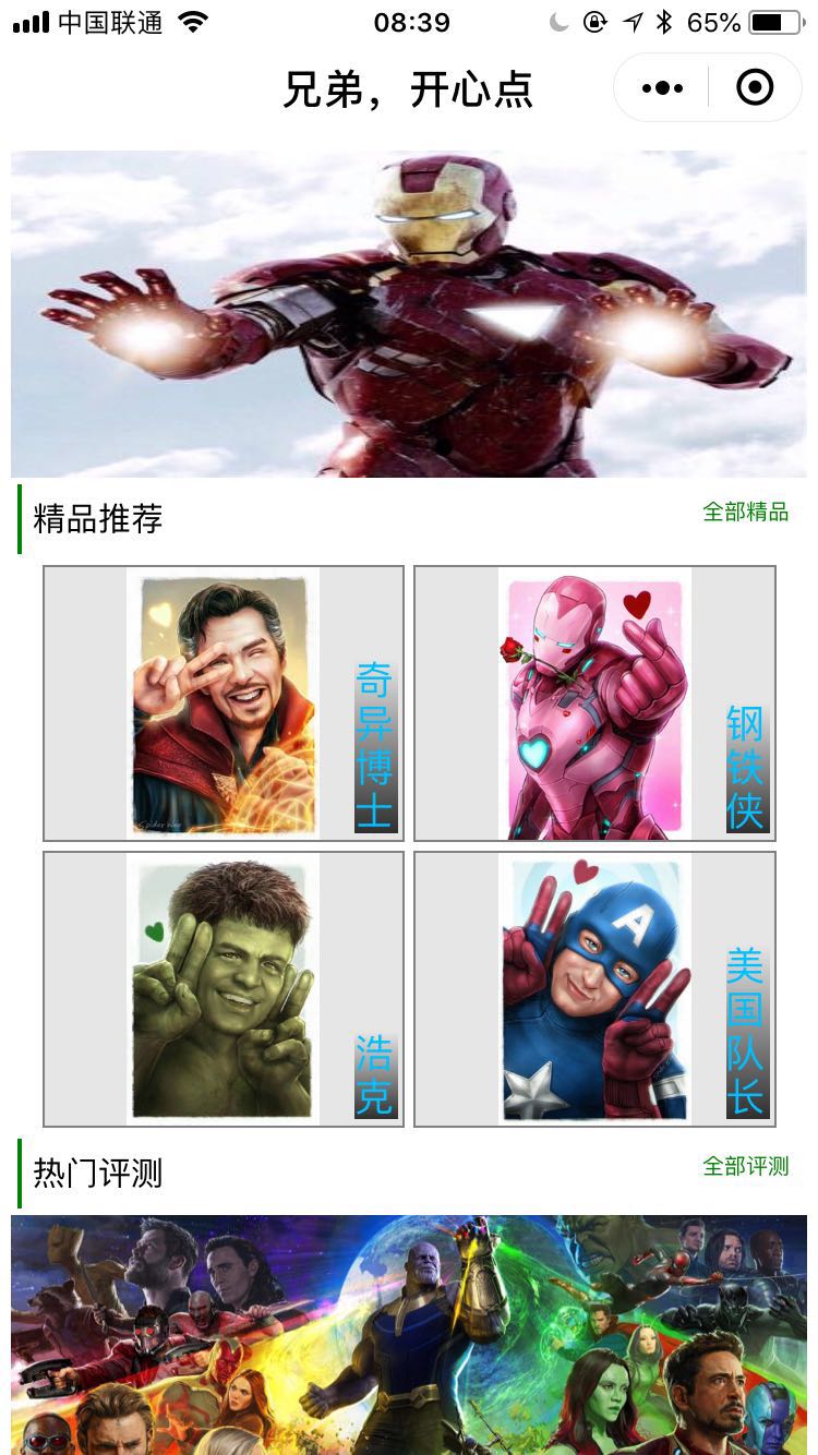
效果图:

差不多就这样;
总结一下:.学习到的新知识
wx:for的使用:1.这是用来循环组件用的;(循环绑定数据很向.net中的reapter)
2.控制属性绑定一个数组,即可使用数组中各项的数据重复渲染该组件;
3.默认数组的当前项的下标变量名默认为 index,数组当前项的变量名默认为 item
4.
使用 wx:for-item 可以指定数组当前元素的变量名,
使用 wx:for-index 可以指定数组当前下标的变量名:
flex布局
简单记一下
1.首先在父级容器添加display:flex;属性此时容器内的元素就可以使用flex布局了;
2.他把页面分为主轴和交叉轴;默认一般也不去改主轴一般是水平方向;交叉轴一般是处置方向;
这个就不整理了直接转一篇博客(http://www.cnblogs.com/7z7chn/p/5782273.html )
主要还布局的时候多用就熟悉了