 hover:
在前端开发中经常会遇到项目展示,往往会采用卡片方式来描述。众多网站中,普遍采用CSS3的scale()方法来实现交互。
本文即是利用纯CSS实现图片居中缩放,此类方法各大网站均有应用,以此可以延伸出更多方式,比如遮罩亦可以使用圆形,不规则矩形等。
本文采用矩形实例,文末链接采用圆形头像实例。
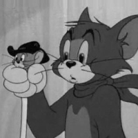
 1 <!DOCTYPE html>
 2 <html>
 3 <head lang="en">
 4     <meta charset="UTF-8">
 5     <title>CSS3实现图片居中,hover缩放遮罩的效果</title>
 6     <style type="text/css">
 7     /*遮罩层*/
 8     .wrap{
 9         height:200px;
10         width:200px;
11         margin: 300px auto;
12         justify-content:center;
13         align-items:center;
14         display:-webkit-flex;
15         overflow: hidden;
16     }
17     /*图片div*/
18     .tom{
19         height:200px;
20         width:200px;
21     }
22     /*图片初始效果*/
23     .tom img{
24         width: 100%;
25         height: 100%;
26         /*图片过渡效果*/
27         transition: all 0.8s ease;
28         /*图片初始添加黑白滤镜*/
29         filter:grayscale(100%);
30     }
31     /*图片hover效果*/
32      .tom img:hover{
33         /*图片缩放*/
34          transform: scale(1.5);
35         /*图片恢复全彩*/
36          filter:grayscale(0%);
37      }
38     </style>
39 </head>
40 <body>
41     <!-- 外遮罩 -->
42     <div class="wrap">
43         <!-- 图片 -->
44         <div class="tom">
45             <img src="http://www.cdtu6129.cn/img/tom.jpg">
46         </div>
47     </div>
48 </body>
49 </html>
如有疑问,欢迎指出。