df.plot()
针对每个变量画直方图,每组直方图的x轴一样,也就是说画多变量的直方图,如果x轴是某列,则需要先设置某列为index,因为这个默认index作为x轴
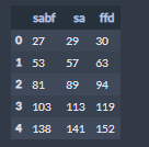
x=range(1,6)

sabf = (27,53,81,103,138)
sa = (29,57,89,113,141)
ffd = (30,63,94,119,152)

import pandas as pd
data = pd.DataFrame()

data['sabf'] = sabf
data['sa'] = sa
data['ffd'] = ffd

data.plot(kind='bar')

sns.factorplot
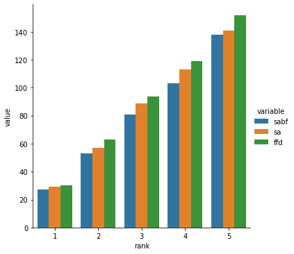
首先我们要处理一下,将需要画图的多变量弄成长格式的表格,且要生成一列循环的索引,作为x的值
data1 = pd.melt(data)
data1['rank'] = list(range(1,6))*3
sns.factorplot(data=data1,x='rank',y='value',hue='variable',kind='bar')
matplotlib画图
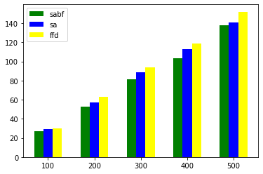
原理是针对x轴处理,也就是说使用index+1的方法
import numpy as np
sabf = (27,53,81,103,138)

sa = (29,57,89,113,141)

ffd = (30,63,94,119,152)
index = np.arange(5)
bar_width = 0.2
import matplotlib.pyplot as plt
plt.bar(index,sabf,color='green',width=bar_width)
plt.bar(index+bar_width,sa,color='blue',width=bar_width)
plt.bar(index+bar_width+bar_width,ffd,color='yellow',width=bar_width)
plt.legend(('sabf','sa','ffd'))
plt.xticks(index + 3 * bar_width / 3,('100', '200', '300', '400', '500'))