区分figure和axes
figure 是作图时给你的一个大画板,而 axes 是在这个画板上的很多幅画布(子图),绘制的所有图都在画布(axes)上。
*plt.figure
通常我们创建图形时,首先会用 fig = plt.figure() 创建一个 “画板”,并定义画板名称为 fig,此时画板是空白的,后面我们可以在画板上绘制一个或多个子图像。
通过 ax = fig.add_subplot() 向画板中添加新的画布,并为画布指定名字为 “ax”,然后就可以单独给这个画布设置各种属性啦。
plt.figure(num=None, figsize=None, dpi=None,
           facecolor=None, edgecolor=None, frameon=True,
           FigureClass=<class 'matplotlib.figure.Figure'>,
           clear=False, **kwargs)
num当给它一个数字时,就作为画板的编号,相当于 ID 号;当给它一个字符串时,就作为画板的名称figsize画板的宽、高,单位为英寸 (2.5cm)dpi指定在该画板上绘制的图像的分辨率,即每英寸多少个像素facecolor画板的背景颜色edgecolor画板的边框颜色frameon是否显示边框
plt.subplot(nrows, ncols, index, **kwargs)
import matplotlib.pyplot as plt
fig = plt.figure(num='panel', figsize=(8,4),facecolor='gray')
# 绘制两个不同大小的区域
plt.subplot(1,3,1) # 划分1行3列,第1个子区域
plt.subplot(1,2,2) # 划分1行2列,第2个子区域
plt.show()
# create data
A1 = np.arange(1, 6)  # x ∈ [1,5]
A2 = np.arange(1, 11) # x ∈ [1,10]
B = A1 ** 2
C = A1 ** 3
D = A2 ** 2

# create figure and axes
fig = plt.figure()
ax1 = fig.add_subplot(221)  #分成2x2,占用第一个,即第一行第一列的子图
ax2 = fig.add_subplot(222)  #分成2x2,占用第二个,即第一行第二列的子图
ax3 = fig.add_subplot(212)  #分成2x1,占用第二个,即第二行

# plot data
ax1.bar(A1, B)
ax2.scatter(A1, C)
ax3.plot(A2, D)

plt.show()
创建子图更简便的方法——引入axes
import matplotlib.pyplot as plt
import numpy as np

# create data
A = np.arange(1,5)
B = A**2
C = A**3

# create figure and axes
fig, axes = plt.subplots(1, 2, figsize=(6,3))

# plot data
axes[0].plot(A,B)    #可以用索引的方法获得
axes[1].scatter(A,C)
设置每一个 axes 的坐标轴信息:
# 设定标题
ax.set_title('Title',fontsize=18)
ax.set_xlabel('xlabel', fontsize=18,fontfamily = 'sans-serif',fontstyle='italic')
ax.set_ylabel('ylabel', fontsize='x-large',fontstyle='oblique')
ax.legend()

# 属性设定
ax.set_aspect('equal')
ax.minorticks_on()
ax.set_xlim(0,16)
ax.grid(which='minor', axis='both')

# 坐标轴细节
ax.xaxis.set_tick_params(rotation=45,labelsize=18,colors='w')
start, end = ax.get_xlim()
ax.xaxis.set_ticks(np.arange(start, end,1))
ax.yaxis.tick_right()

# 关闭坐标轴
plt.axis('off')  # 需要位于plt.imshow之后,plt.show之前
1. 折线图 line plot
1)plot()函数参数可包含多个x,y,可设置折线的对应属性:颜色、线宽度等
如:plot(x1,y1,x2,y2,x3,y3……)//在同一幅图中显示多条折线
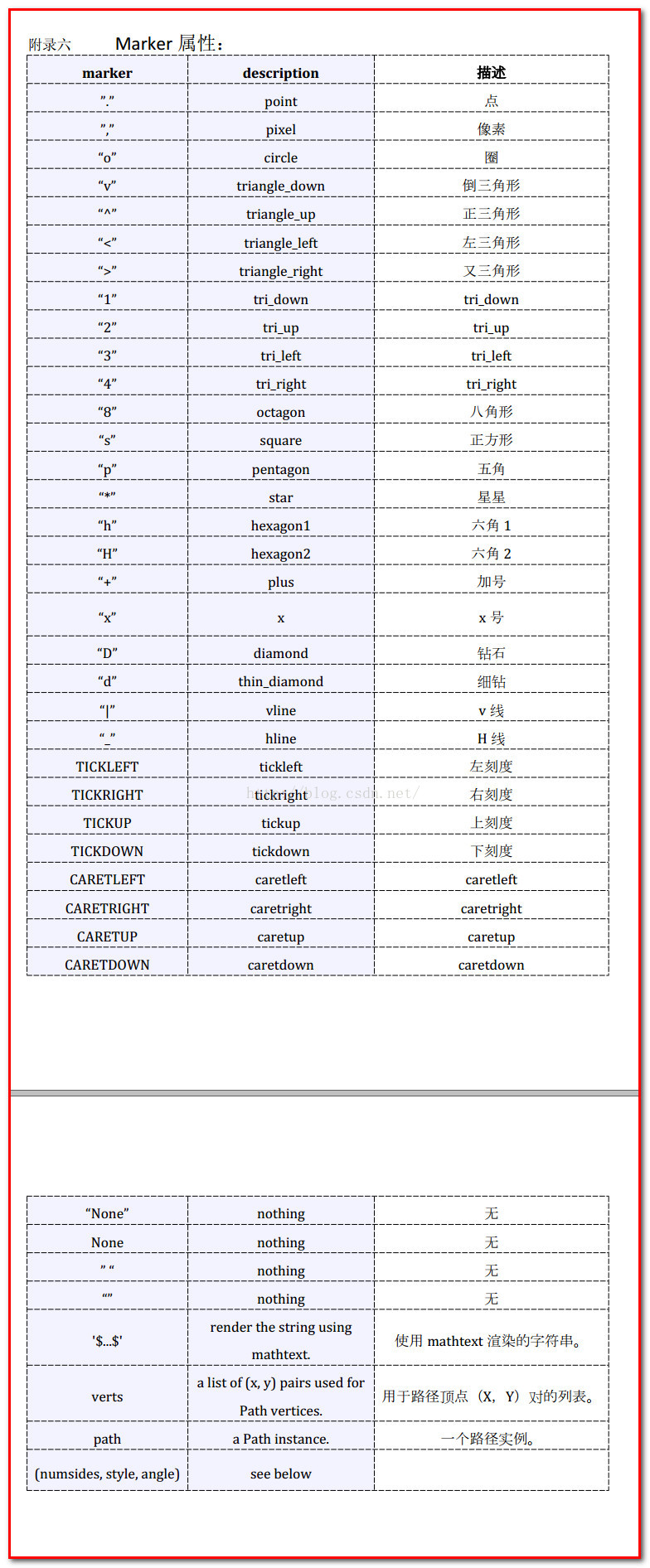
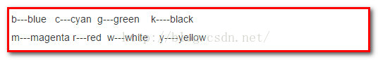
2)plt.plot(x,y,label=”red”,color=”r”,linestyle=”–”,linewidth=5,marker=”^”,markersize=20)
//设置折线颜色、标签、折线类型、关键点符号、marker大小
import matplotlib.pyplot as plt
import matplotlib as mlp
import numpy as np

x=10*np.random.randn(3)
x.sort()
y=10*np.random.rand(3)
y.sort()
plt.plot(x,y,x+1,y+1)
plt.show()
2. 直方图 Histogram
函数:pyplot.hist()
hist(x,bins=25)//x分布集合,bins要分布的条形数量
import matplotlib.pyplot as plt
import matplotlib as mlp
import numpy as np

x=np.random.randn(1000)//产生符合标准正太分布的1000个数
plt.hist(x,bins=25)//画出分布直方图
plt.savefig("1.png")
plt.show()
matplotlib.pyplot.hist(
    x, bins=10, range=None, normed=False,
    weights=None, cumulative=False, bottom=None,
    histtype=u'bar', align=u'mid', orientation=u'vertical',
    rwidth=None, log=False, color=None, label=None, stacked=False,
    hold=None, **kwargs)
x : (n,) array or sequence of (n,) arrays
这个参数是指定每个bin(箱子)分布的数据,对应x轴
bins : integer or array_like, optional
这个参数指定bin(箱子)的个数,也就是总共有几条条状图
normed : boolean, optional
If True, the first element of the return tuple will be the counts normalized to form a probability density, i.e.,n/(len(x)`dbin)
这个参数指定密度,也就是每个条状图的占比例比,默认为1
color : color or array_like of colors or None, optional
这个指定条状图的颜色
3. 条形图 Bar char
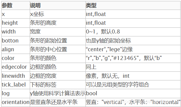
plt.bar(left=index, height=y, color='red', width=0.5)
plt.show()
4. 饼状图 pie chart
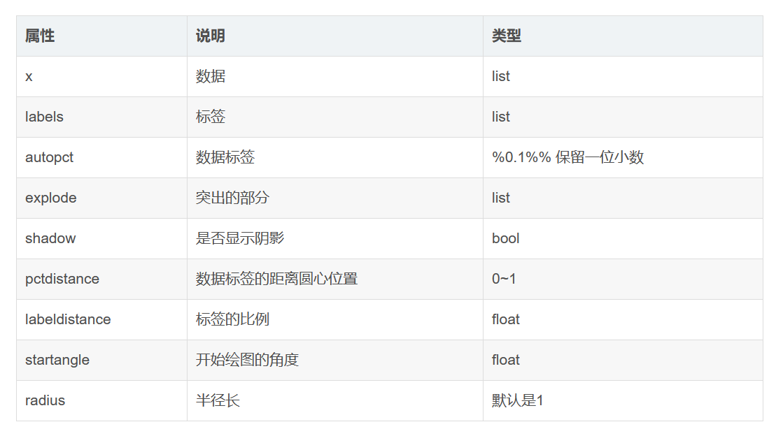
explode = (0, 0.1, 0, 0) # only "explode" the 2nd slice
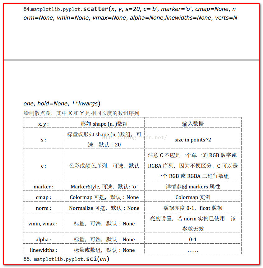
5. 描点图 Scatter plot