Echarts.init:
全局 echarts 对象,在 script 标签引入 echarts.js 文件后获得,或者在 AMD 环境中通过 require('echarts') 获得。
<script src="http://echarts.baidu.com/build/dist/echarts.js"></script>
或者
<script
type="text/javascript">
// 路径配置
require.config({
paths: {
echarts: 'http://echarts.baidu.com/build/dist'
}
});
// 使用
require(
[
'echarts',
'echarts/chart/bar', // 使用柱状图就加载bar模块,按需加载
'echarts/chart/line'
],

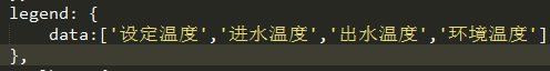
Legend:
组件长相:

相关代码:
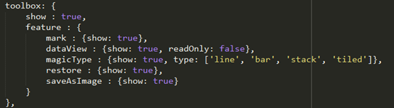
Toolbox:

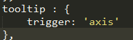
toolTip

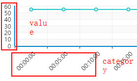
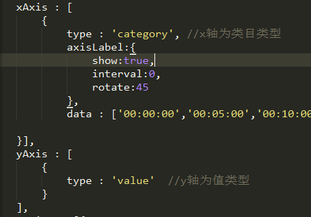
xAxis/yAxiis:
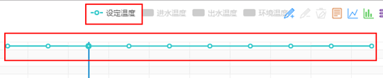
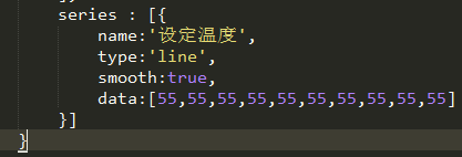
Series
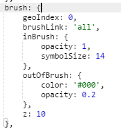
Brush
显示刷子选中区域的数据详情
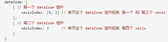
Datazoom
dataZoom 组件 用于区域缩放
Visualmap
连续性
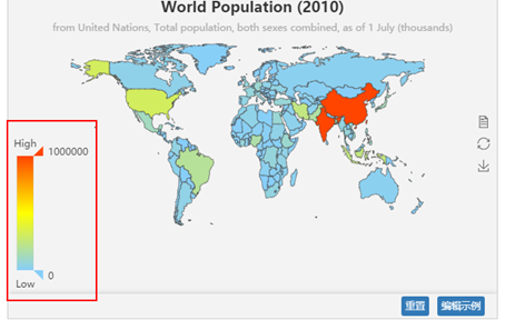
分段性:

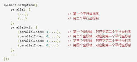
Parallel
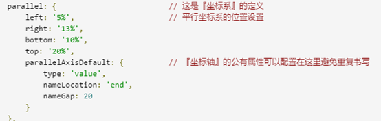
parallelIndex
Json:javascript object notation
JS中的变量声明:
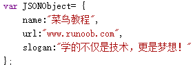
Json中的对象:属性名必须加双引号
{

   “name”:“abc”,

“age”:20,

“school”:{//可嵌套

“  ”:”  ”,//有逗号

“  ”:”  ”//无逗号

}

}
JS对象(-->JSON.stringify(var) JSON.parse(json) <--) json字符串
自适应布局:
使用百分比宽度来自适应屏幕大小。现在的移动设备大小都是960*640,40*‘800
如何解决html字体大小自适应?
<style>

@media screen and (max-980px)

 {

 body{

 font-size:20px;

 }

 }

 @media screen and (max-580px)

 {

 body{

 font-size:14px;

 }

 }

 @media screen and (max-380px)

 {

 body{

 font-size:8px;

 }

 }

 </style>
或者
把字体大小用百分比%做单位,例如:font-size:20%;
或者
最简单的方法给父元素(一般是body)设置一个px单位的字体,其他字体用em.