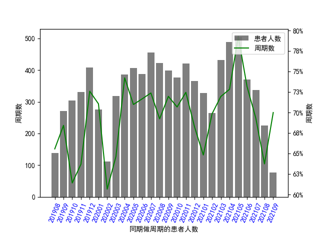
import matplotlib.pyplot as plt
import numpy as np
import pandas as pd  # data processing, CSV file I/O (e.g. pd.read_csv)
import pymssql  # 引入pymssql模块
import seaborn as sns  # Provides a high level interface for drawing attractive and informative statistical graphics
from matplotlib import ticker
from matplotlib.font_manager import FontProperties
from pylab import *
import matplotlib.pyplot as plt
import seaborn as sns
plt.rcParams['font.sans-serif']=['SimHei']#用来正常显示中文标签
plt.rcParams['axes.unicode_minus']=False#用来正常显示负号

if __name__ == '__main__':
 conn = pymssql.connect(host='localhost', user='wonderful', password='wonderful', database='ProcreateV93',
                        charset='GBK')
sql ="select replace(LEFT(CONVERT(varchar(100), op.RecordDate, 120),7),'-','')  AS months, "
"COUNT(DISTINCT OP.O_iD)   AS patientcount,sum(op.OPSTimes)   optime, "
"(COUNT(DISTINCT OP.O_iD) + 0.0) / (sum(op.OPSTimes) + 0.0) as pct FROM Oplan op "
"where op.GroupName is not null "
"and op.RecordDate is not null "
"group by replace(LEFT(CONVERT(varchar(100), op.RecordDate, 120),7),'-','') "
"order by months,patientcount,pct asc"
df0 = pd.read_sql(sql, conn)
print(df0)
df = pd.DataFrame(df0)
vm=df['months'].astype(str)
print(vm)
fig, ax1 = plt.subplots()
plt.xticks(fontsize='10',color='blue',rotation=67)

# 柱形图
ax1.bar(df.months.values,df.patientcount.values, color="black", alpha=0.5, label="患者人数")
ax1.set_xlabel("同期做周期的患者人数")
ax1.set_ylabel("周期数")
#  label下边界
plt.subplots_adjust(bottom=0.18)

ax2 = ax1.twinx()
# 折线图
ax2.plot(df.months.values, df.pct.values, color="green", label="周期数")
ax2.yaxis.set_major_formatter(ticker.PercentFormatter(xmax=1,decimals=0))
ax2.set_ylabel("周期数")
#参数x空值X轴的间隔,第二个参数控制每个间隔显示的文本,后面两个参数控制标签的颜色和旋转角度
# plt.xticks(rotation=45)
fig.legend(loc="upper right", bbox_to_anchor=(1, 1), bbox_transform=ax1.transAxes)

plt.show();