前言:就比如我们想给界面跳转的button在界面的边角处用个箭头来代替按钮,使得界面简洁;或者是给TextView加个边框时;
我们可以通过在drawable文件夹下创建自定义的xml文件,通过shape标签来绘制需要的图案,然后作为组件的背景呈现。
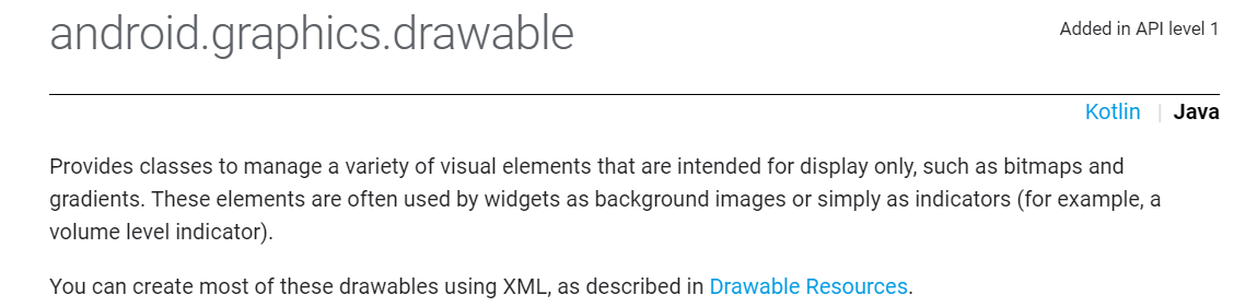
1、在介绍shape之前,先来对drawable粗糙了解一下。
如下所示,drawable文件夹主要是一系列用来显示的视觉元素,包括位图、背景渐变等;常用来作为组件的背景使用。
drawable文件夹下可以存放图片,然后直接作为背景调用;但更多的是在该文件夹下创建xml文件,然后作为背景调用;
1.1、而drawable夹下的xml文件的类型也有许多种,
比如selector标签,layer-list标签,shape标签、bitmap标签等;并且还可以在一种标签里嵌套另一种标签使用。
本文主要是对其中的shape标签进行总结。但是shape标签用着用着就搭配上其他标签了,但是本文还是只介绍shape标签。
2、如下所示是关于shape标签的知识导图。

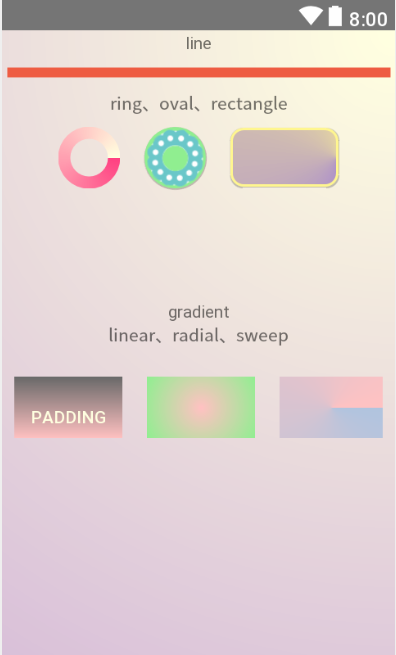
3、结合以上思维导图的知识点,附上使用代码。
四个<shape属性/>分别创建了一个xml文件。
其中<shape子标签corners、solid、stroke/>主要在rectangle.xml进行举例,<shape子标签gradient、size、padding/>主要在shape_gradient_linear.xml中进行举例。
然后<子标签gradient/>因为有三种常用渐变方式,所以又单独加了xml举例。
顺带着在oval.xml中使用到了layerlist和bitmap制作背景。
3.1、rectangle.xml:包含子标签corners、solid、stroke。
<?xml version="1.0" encoding="utf-8"?>
<selector xmlns:android="http://schemas.android.com/apk/res/android">
    <item android:state_pressed="false">
        <shape android:shape="rectangle">
            <corners android:radius="10dp" />
            <gradient
                android:type="sweep"
                android:centerX="1"
                android:centerY="0.5"
                android:startColor="@color/colorMediumPurple"
                android:endColor="@color/colorKhaki1"/>
            <stroke
                android:width="2dp"
                android:color="@color/colorMediumPurple"/>
        </shape>
    </item>

    <item android:state_pressed="true">
        <shape android:shape="rectangle">
            <corners android:radius="10dp" />
            <solid android:color="@color/colorThistle" />
            <stroke
            android:width="5dp"
            android:dashWidth="10dp"
            android:dashGap="10dp"
            android:color="@color/colorMediumPurple"/>
        </shape>
    </item>
</selector>
<!--使用selector状态选择器,可以设置button点击前后的不同shape-->
3.2、line.xml
<?xml version="1.0" encoding="utf-8"?>
<shape xmlns:android="http://schemas.android.com/apk/res/android"
    android:shape="line">
    <stroke
        android:width="8dp"
        android:color="@color/colorTomato2"/>
    <size
        android:height="10dp"
        android:width="300dp"/>
</shape>
<!-- stroke的width描述stroke的宽度,size的height描述shape的宽度;
     因为stroke属于shape内的标签,所以stroke的宽度要小于shape的高度 -->
<!--size和组件长宽不同时,显示数值大的-->
3.3、ring.xml
<?xml version="1.0" encoding="utf-8"?>
<shape xmlns:android="http://schemas.android.com/apk/res/android"
    android:shape="ring"
    android:innerRadius="15dp"
    android:thickness="10dp"
    android:useLevel="false">

    <gradient
        android:type="sweep"
        android:startColor="@color/colorAccent"
        android:endColor="@color/colorWhite" />
</shape>
<!--shape是环形的,所以子标签的属性描述的是环形,而不是环心的空心部分-->
<!--需要定义内环半径innerRadius和内环厚度thickness-->
<!--至于属性innerRadiusRatio和thicknessRatio的比例不知道怎么计算-->
<!--useLevel属性是必要属性,不然不显示,不知道为什么-->
3.4、oval.xml
<?xml version="1.0" encoding="utf-8"?>
<layer-list xmlns:android="http://schemas.android.com/apk/res/android">
    <item>
        <shape android:shape="oval">
            <solid android:color="@color/colorgreen"/>
        </shape>
    </item>
    <item>
        <bitmap
            android:src="@drawable/pic"/>
    </item>
</layer-list>

<!--layer-list是通过层叠来自定义按钮,最先写的是最底层。-->
4、主要是演示子标签gradient的三种渐变方式。
4.1、shape_gradient_linear.xml 。包含子标签gradient、size、padding。
<?xml version="1.0" encoding="utf-8"?>
<selector xmlns:android="http://schemas.android.com/apk/res/android">
    <item>
        <shape android:shape="rectangle">
            <gradient
                android:type="linear"
                android:angle="270"
                android:startColor="@color/darkGrey"
                android:endColor="@color/colorRosyBrown1" />
            <size
                android:width="50dp"
                android:height="50dp"/>
            <padding
                android:top="15dp"/>
        </shape>
    </item>
    <!--线性gradient,angle属性只有线性渐变能用-->
</selector>
    <!--总结:gradient标签使用的三步骤可以概括为先确定type,然后确定位置,最后确定颜色-->
    <!--总结:angle是linear的特有属性,gradientRadius是radial的必要属性-->
4.2、shape_gradient_raidial.xml
<?xml version="1.0" encoding="utf-8"?>
<shape xmlns:android="http://schemas.android.com/apk/res/android">
    <gradient
        android:type="radial"
        android:gradientRadius="50dp"
        android:centerX="0.5"
        android:centerY="0.5"
        android:startColor="@color/colorRosyBrown1"
        android:endColor="@color/colorgreen" />
    <size
        android:width="50dp"
        android:height="50dp"/>
    <!--gradientRadius属性是反射性渐变的半径,是必要属性-->
</shape>
4.3、shape_gradient_sweep.xml
<?xml version="1.0" encoding="utf-8"?>
<shape xmlns:android="http://schemas.android.com/apk/res/android" >
    <gradient
        android:type="sweep"
        android:centerX="0.5"
        android:centerY="0.5"
        android:startColor="@color/colorLightBlue"
        android:endColor="@color/colorRosyBrown1" />
    <size android:width="50dp"
        android:height="50dp"/>
    <!--扫描gradient,先确定类型,然后确定扫描中心点,然后确定颜色-->
</shape>
4.4、activity_main.xml
<?xml version="1.0" encoding="utf-8"?>
<RelativeLayout
    xmlns:android="http://schemas.android.com/apk/res/android"
    xmlns:tools="http://schemas.android.com/tools"
    android:layout_width="match_parent"
    android:layout_height="match_parent"
    android:background="@drawable/background"
    tools:context=".MainActivity">
    <TextView
        android:id="@+id/line_name"
        android:text="line"
        android:layout_width="match_parent"
        android:layout_height="wrap_content"
        android:gravity="center"
        android:layout_alignParentTop="true"
        android:layout_alignParentStart="true"/>
    <LinearLayout
        android:id="@+id/line_view"
        android:layout_width="match_parent"
        android:layout_height="30dp"
        android:orientation="vertical"
        android:layout_below="@id/line_name"
        android:background="@drawable/line">
    </LinearLayout>

    <TextView
        android:id="@+id/btns_name"
        android:text="ring、oval、rectangle"
        android:layout_width="match_parent"
        android:layout_height="wrap_content"
        android:layout_below="@id/line_view"
        android:gravity="center"/>
    <LinearLayout
        android:id="@+id/btns_shape"
        android:layout_width="match_parent"
        android:layout_height="wrap_content"
        android:layout_below="@id/btns_name"
        android:orientation="horizontal"
        android:gravity="center">
        <Button
            android:id="@+id/btn_ring"
            android:layout_width="50dp"
            android:layout_height="50dp"
            android:layout_margin="10dp"
            android:background="@drawable/ring" />
        <Button
            android:id="@+id/btn_oval"
            android:layout_width="50dp"
            android:layout_height="50dp"
            android:layout_margin="10dp"
            android:background="@drawable/oval" />
        <Button
            android:id="@+id/btn_rectangle"
            android:layout_width="wrap_content"
            android:layout_height="wrap_content"
            android:layout_margin="10dp"
            android:background="@drawable/rectangle"/>
    </LinearLayout>

    <TextView
        android:id="@+id/gradient_name"
        android:layout_width="match_parent"
        android:layout_height="wrap_content"
        android:layout_below="@id/btns_shape"
        android:layout_marginTop="80dp"
        android:text="gradient"
        android:gravity="center"/>
    <TextView
        android:id="@+id/gradients_name"
        android:layout_width="match_parent"
        android:layout_height="wrap_content"
        android:layout_below="@id/gradient_name"
        android:text="linear、radial、sweep"
        android:gravity="center"/>
    <LinearLayout
        android:id="@+id/gradient_btns"
        android:layout_width="match_parent"
        android:layout_height="100dp"
        android:layout_below="@id/gradients_name"
        android:orientation="horizontal"
        android:gravity="center">
        <Button
            android:id="@+id/btn4"
            android:layout_width="wrap_content"
            android:layout_height="wrap_content"
            android:layout_margin="10dp"
            android:text="padding"
            android:textColor="@color/colorWhite"
            android:background="@drawable/shape_gradient_linear"/>
        <Button
            android:id="@+id/btn5"
            android:layout_width="wrap_content"
            android:layout_height="wrap_content"
            android:layout_margin="10dp"
            android:background="@drawable/shape_gradient_radial"/>
        <Button
            android:id="@+id/btn6"
            android:layout_width="wrap_content"
            android:layout_height="wrap_content"
            android:layout_margin="10dp"
            android:background="@drawable/shape_gradient_sweep"/>
    </LinearLayout>

</RelativeLayout>
5、最后,附上效果图,源码地址https://github.com/caesura-k/button_activity