7.导航控制器
目录
1.导航控制器的功能介绍
2.如何使用导航控制器实现界面之间的跳转
3.导航条的设置
4.导航条上控件的设置
5.工具栏的使用
导航控制器的功能介绍
什么是导航控制器?
简述:UINavigation是导航控制器。用于构建分层应用程序,管理多个视图的换入和换出,自身提供视图切换动画效果。导航控制器包含:NavigationBar(导航栏),内容视图,工具栏(UIToolBar)。
导航控制器作用
简述:利用UINavigationController,可以轻松地管理多个控制器,轻松完成控制器之间的切换,典型例子就是系统自带的“设置”应用。
如图:

如何使用导航控制器实现界面之间的跳转
创建一个界面
代码
FirstViewController *fvc = [[FirstViewController alloc] init];
代码说明 创建一个UIviewController。用于推出。
使用导航控制器显示这个界面
简述:以导航的控制器的方式推出新的页面。
代码
UINavigationController *nc = [[UINavigationController alloc] initWithRootViewController:fvc];
self.window.rootViewController = nc;//把导航控制器作为根视图控制器
代码说明 以导航的方式推出,并把导航控制器作为跟视图控制器。如果不以导航推出,那么所推出的控制器将没有相关导航操作和功能。 比如使用 [self presentViewController:fvc animated:YES completion:nil];
使用push方法切换到新的界面
简述: 这也是推出新页面的一种方式,但是要退出新的页面,本身得是一个带导航的页面。
代码
SecondViewController *svc = [[SecondViewController alloc] init];//拿到导航控制器的指针
 [self.navigationController pushViewController:svc animated:YES];
使用pop方法返回前一个界面
简述:
代码
[self.navigationController popViewControllerAnimated:YES];代码说明 如果使用present 推出,那么返回对应的为 [self dismissViewControllerAnimated:YES completion:nil];
pop方法的几种形式
简述:常用的有三种方式。
代码
[self.navigationController popToRootViewControllerAnimated:YES];//回到根视图控制器
[self.navigationController popToViewController:fvc animated:YES];//回到任意一个控制器,“fvc”换为对应控制器的指针
[self.navigationController popViewControllerAnimated:YES];//回到上一个控制器
代码说明 可根据需要进行设置。
导航条的设置
设置导航条风格
简述:可以进行很多设置,包括设置标题(文字),设置背景,图片标题,添加文本按钮,添加系统样式的按钮,添加自定义的按钮,下个界面的左侧添加返回的按钮等等。
设置导航条背景图
简述:可以给导航条增加背景图片。
代码
[self.navigationController.navigationBar setBackgroundImage:[UIImage imageNamed:@"nav_bg.png"] forBarMetrics:UIBarMetricsDefault];代码说明
设置导航条透明
简述:通过设置背景图片来达到透明效果。
代码
[self.navigationController.navigationBar setBackgroundImage:[UIImage imageNamed:@"nav_bargound.png"] forBarMetrics:UIBarMetricsCompact];//设置透明背景图
self.navigationController.navigationBar.shadowImage =[UIImage imageNamed:@"nav_bargound.png"];//隐藏导航下面的细线
代码说明 不能通过设置颜色来达到透明效果,因为导航默认是不透明的,设置背景色达不到改变背景色所需要的效果。
隐藏导航条
代码
self.navigationController.navigationBar.hidden=YES;
代码说明: 默认是YES
导航条上控件的设置
设置标题
简述:可以通过直接设置标题文字,也可以以子视图作为标题。
代码
//第一种方式,文字标题
self.title=@"这是标题";
//第二种方式,设置图片标题
UILabel *label=[[UILabel alloc]initWithFrame:CGRectMake(0, 0, 50, 30)];
label.text=@"这是标题";
label.backgroundColor=[UIColor greenColor];
label.textColor=[UIColor redColor];
self.navigationItem.titleView=label;//以label视图作为title
代码说明 第一种方式也可以在推出的时候进行设置。
左侧left Item
简述:
代码
//第一种方式
UIBarButtonItem *leftItem=[[UIBarButtonItem alloc]initWithTitle:@"返回" style:UIBarButtonItemStyleDone target:self action:@selector(buttonClick)];
self.navigationItem.leftBarButtonItem=leftItem;

//第二种方式
UIButton *button=[UIButton buttonWithType:UIButtonTypeCustom];
    button.frame=CGRectMake(0, 0, 30, 30);
    [button setTitle:@"返回" forState:UIControlStateNormal];
    [button addTarget:self action:@selector(buttonClick) forControlEvents:UIControlEventTouchUpInside];
    UIBarButtonItem *leftItem=[[UIBarButtonItem alloc]initWithCustomView:button];
    self.navigationItem.leftBarButtonItem=leftItem;
代码说明 在对应的buttonClick里实现方法,就可以实现相应的功能。使用第二种方式也可以以items的方式显示多个控件。
右侧right Item
简述:和左边item一样
代码
UIButton *rightButton=[UIButton buttonWithType:UIButtonTypeCustom];
    rightButton.frame=CGRectMake(0, 0, 50, 30);

    [rightButton setTitle:@"删除" forState:UIControlStateNormal];
    [rightButton setTitleColor:[UIColor redColor] forState:UIControlStateNormal];
    [self.view addSubview:rightButton];
    [rightButton addTarget:self action:@selector(buttonClick) forControlEvents:UIControlEventTouchUpInside];
    UIBarButtonItem *rightItem=[[UIBarButtonItem alloc]initWithCustomView:rightButton];
    self.navigationItem.rightBarButtonItem=rightItem;
代码说明 也可以以其他控件作为item,只需把button换为对应控件就可以。比如imageView。
如图:(系统的与自定义的)
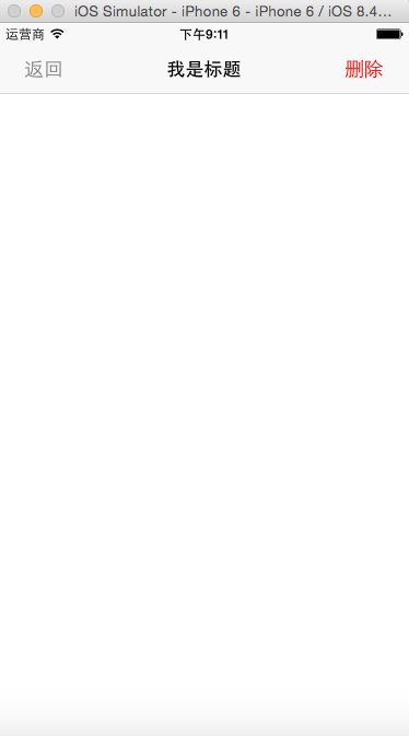
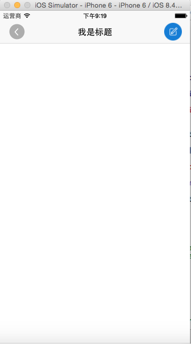
图片: 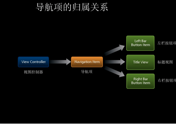
工具栏的使用
显示工具栏
简述:控制器下边的可以切换的选项称为工具栏
代码
[self.navigationController.toolbar setBackgroundImage:[UIImage imageNamed:@"toolBar"] forToolbarPosition:UIBarPositionAny barMetrics:UIBarMetricsDefault];

    UIBarButtonItem *item1 = [[UIBarButtonItem alloc] initWithBarButtonSystemItem:UIBarButtonSystemItemBookmarks target:self action:@selector(itemClick:)];

    UIBarButtonItem *item2 = [[UIBarButtonItem alloc] initWithBarButtonSystemItem:UIBarButtonSystemItemFastForward target:self action:@selector(itemClick:)];

    UIBarButtonItem *item3 = [[UIBarButtonItem alloc] initWithBarButtonSystemItem:UIBarButtonSystemItemPlay target:self action:@selector(itemClick:)];
    self.toolbarItems = @[item1, item2,item3];
代码说明 使用系统自带的工具栏功能进行创建,也可以进行自定义创建。
工具栏添加按钮
简述:导航控制器下边的称为工具栏。
代码
[self.navigationController.toolbar setBackgroundImage:[UIImage imageNamed:@"toolBar"] forToolbarPosition:UIBarPositionAny barMetrics:UIBarMetricsDefault];//设置工具栏设置背景图

    //创建工具栏选项
    UIBarButtonItem *item1 = [[UIBarButtonItem alloc] initWithBarButtonSystemItem:UIBarButtonSystemItemBookmarks target:self action:@selector(itemClick:)];

    UIBarButtonItem *item2 = [[UIBarButtonItem alloc] initWithBarButtonSystemItem:UIBarButtonSystemItemFastForward target:self action:@selector(itemClick:)];

    UIBarButtonItem *item3 = [[UIBarButtonItem alloc] initWithBarButtonSystemItem:UIBarButtonSystemItemPlay target:self action:@selector(itemClick:)];

    UIBarButtonItem *item4 = [[UIBarButtonItem alloc] initWithBarButtonSystemItem:UIBarButtonSystemItemFlexibleSpace target:nil action:nil];

    //添加到toolbar 上
    self.toolbarItems = @[item1, item4, item2, item4, item3];
    self.navigationController.toolbarHidden=NO;//显示toolbar
代码说明 工具栏默认是隐藏,需要设为YES。
如图:

设置按钮间距
简述:当TabBar选项较少时,可以设置间距
代码
 UIBarButtonItem *item4 = [[UIBarButtonItem alloc] initWithBarButtonSystemItem:UIBarButtonSystemItemFlexibleSpace target:nil action:nil];
    self.toolbarItems = @[item1, item4, item2, item4, item3];
代码说明