垂直居中问题应该是长久以来前端工程师不断奋斗的一个问题,看了好多前辈们的优秀战斗成果但是一直没有认真总结过,今天看书看累了,写一篇博客总结一下我接触到的垂直居中方法:
1、使用绝对定位垂直居中
绝对对位原理:元素在过度受限情况下,将margin设置为auto,浏览器会重算margin的值,过度受限指的是同时设置top/bottom与height或者left/right与width。
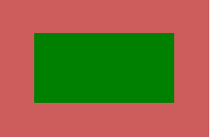
        #father{
            height: 200px;
             300px;
            background: indianred;
            position: relative;
        }
        #child{
            height: 100px;
             200px;
            background: green;
            position: absolute;
            top:0;
            bottom: 0;
            left: 0;
            right: 0;
            margin: auto;
        }
    <div id="father">
        <div id="child"></div>
    </div>
优点:支持响应式,只有这种方法在resize之后仍然垂直居中
缺点:没有显式设置overflow时,内容超过元素高度时会溢出,没有滚动条
2、负marginTop方式
这个没啥好说的了,基本上可以说是大家都知道都在用的方法:
    #father{
            height: 200px;
             300px;
            background: indianred;
            position: relative;
        }
        #child{
            height: 100px;
             200px;
            background: green;
            position: absolute;
            top: 50%;
            left: 50%;
            margin-top: -50px;
            margin-left: -100px;

        }
优点:最常见,容易理解,跳出文档流随便折腾
缺点:要事先知道元素的宽高
不过有关于元素宽高的问题已经不是问题了,CSS3中加入了transform元素,只需要加上这个元素就可以了完美实现:
    //margin-top: -50px;
    //margin-left: -100px;
    transform: translate(-50%,-50%);
相当好用,谁用谁知道。
3.弹性盒式布局
再次夸奖一句强大的CSS3,利用弹性盒式布局,将字元素的主轴、侧轴的排列方式都设置为居中对齐:
        #father{
            height: 200px;
             300px;
            background: indianred;
            display: flex;
        }
        #child{
            height: 100px;
             200px;
            background: green;
            margin: auto;
        }
优点:真正的垂直居中布局
缺点:较新版本的开始支持弹性布局,老版本要考虑兼容性问题
就先说这么多吧,说的都是盒模型,文字设置行高这种对齐就不说了。