【目录】
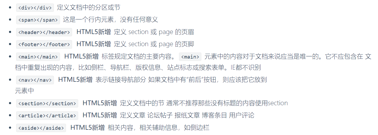
一、布局相关的标签
二、盒子模型
三、浮动
四、定位
(有个即刻偷师学艺的方法——
在浏览器里,打开一个设计很棒的网页,鼠标点击右键,选择“检查”,即可查看网页的HTML+CSS代码和相对应的布局位置
调试自己写的网页时,也可以使用“检查”直接修改代码)
一、布局相关的标签
二、盒子模型
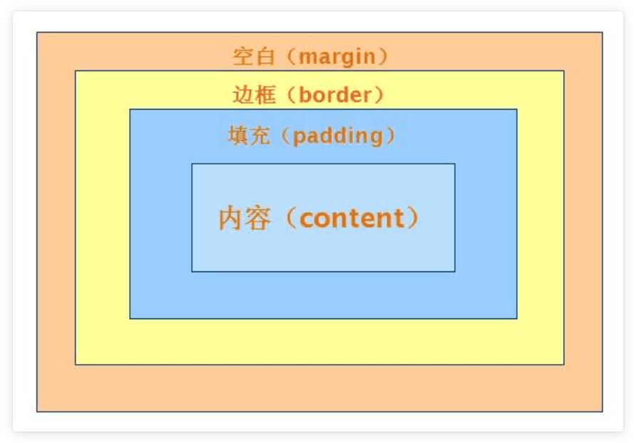
1、什么是盒子模型
# 就以快递盒为例
快递盒与快递盒之间的距离(标签与标签之间的距离 margin外边距)
盒子的厚度(标签的边框 border)
盒子里面的物体到盒子的距离(内容到边框的距离 padding内边距)
物体的大小(内容 content)
# 如果你想要调整标签与标签之间的距离 你就可以调整margin
# 浏览器会自带8px的margin,一般情况下我们在写页面的时候,上来就会先将body的margin去除


<!DOCTYPE html>
<html lang="en">
<head>
    <meta charset="UTF-8">
    <title>Title</title>
    <meta name="viewport" content="width=device-width, initial-scale=1">
    <style>
        body {
            margin: 0;  /*上下左右全是0
            /*margin: 10px 20px;  !* 第一个上下 第二个左右*!*/
            /*margin: 10px 20px 30px;  !*第一个上  第二个左右  第三个下*!*/
            /*margin: 10px 20px 30px 40px;  !*上 右 下 左*!*/
        }
        /*p {*/
        /*    margin-left: 0;*/
        /*    margin-top: 0;*/
        /*    margin-right: 0;*/
        /*    margin-bottom: 0;*/
        /*}*/

        #d1 {
            margin-bottom: 50px;
        }


        #d2 {
            margin-top: 20px;  /*不叠加 只取大的*/
        }

        #dd {
            margin: 0 auto;  /*只能做到标签的水平居中*/
        }
        p {
            border: 3px solid red;
            /*padding-left: 10px;*/
            /*padding-top: 20px;*/
            /*padding-right: 20px;*/
            /*padding-bottom: 50px;*/

            /*padding: 10px;*/
            /*padding: 10px 20px;*/
            /*padding: 10px 20px 30px;*/
            /*padding: 10px 20px 30px 40px;*/  /*规律和margin一模一样*/
        }
    </style>
</head>
<body>
<!--    <p style="border: 1px solid red;" id="d1">ppp</p>-->
<!--    <p style="border: 1px solid orange;" id="d2">ppp</p>-->
<!--<div style="border: 3px solid red;height: 400px; 400px">-->
<!--    <div id='dd' style="border: 1px solid orange;height: 50px; 50px;background-color: blue;"></div>-->
<!--</div>-->

<p>ppp</p>


</body>
</html>
2、盒子模型相关的CSS属性
(1)布局属性
display 显示
| 值           | 描述                                                 |
| ------------ | ---------------------------------------------------- |
| none         | 此元素不会被显示。                                   |
| block        | 此元素将显示为块级元素,此元素前后会带有换行符。     |
| inline       | 默认。此元素会被显示为内联元素,元素前后没有换行符。 |
| inline-block | 行内块元素。(CSS2.1 新增的值)                      |
float 浮动
| 值      | 描述                                                 |
| ------- | ---------------------------------------------------- |
| left    | 元素向左浮动。                                       |
| right   | 元素向右浮动。                                       |
| none    | 默认值。元素不浮动,并会显示在其在文本中出现的位置。 |
| inherit | 规定应该从父元素继承 float 属性的值。                |
clear 清除
| 值      | 描述                                  |
| ------- | ------------------------------------- |
| left    | 在左侧不允许浮动元素。                |
| right   | 在右侧不允许浮动元素。                |
| both    | 在左右两侧均不允许浮动元素。          |
| none    | 默认值。允许浮动元素出现在两侧。      |
| inherit | 规定应该从父元素继承 clear 属性的值。 |
visibility 可见
| 值       | 描述                                                         |
| -------- | ------------------------------------------------------------ |
| visible  | 默认值。元素是可见的。                                       |
| hidden   | 元素是不可见的。                                             |
| collapse | 当在表格元素中使用时,此值可删除一行或一列,但是它不会影响表格的布局。被行或列占据的空间会留给其他内容使用。
        如果此值被用在其他的元素上,会呈现为 "hidden"。 |
| inherit  | 规定应该从父元素继承 visibility 属性的值。                   |
overflow 溢出
| 值      | 描述                                                     |
| ------- | -------------------------------------------------------- |
| visible | 默认值。内容不会被修剪,会呈现在元素框之外。             |
| hidden  | 内容会被修剪,并且其余内容是不可见的。                   |
| scroll  | 内容会被修剪,但是浏览器会显示滚动条以便查看其余的内容。 |
| auto    | 如果内容被修剪,则浏览器会显示滚动条以便查看其余的内容。 |
| inherit | 规定应该从父元素继承 overflow 属性的值。                 |
overflow-x
overflow-y
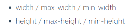
(2)尺寸
(3)内补白
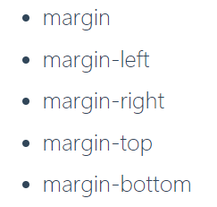
(4)外边距
三、浮动——float
1、什么是浮动

2、设置浮动
    <style>
        body {
            margin: 0;
        }
        #d1 {
            height: 200px;
            width: 200px;
            background-color: red;
            float: left;  /*浮动  浮到空中往左飘*/
        }
        #d2 {
            height: 200px;
            width: 200px;
            background-color: greenyellow;
            float: right;   /*浮动 浮到空中往右飘*/
        }
    </style>
3、清除浮动
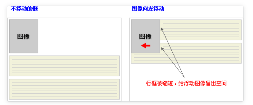
清除浮动的目的:
阻止行框围绕浮动框,一般使用行框的clear 属性(属性值 : left 、right、both、none ,表示框的哪一边不该挨着浮动框)
clear: both
clear: left
clear: right
<!DOCTYPE html>
<html lang="en">
<head>
    <meta charset="UTF-8">
    <title>Title</title>
    <meta name="viewport" content="width=device-width, initial-scale=1">
    <style>
        body {
            margin: 0;
        }
        #d1 {
            border: 3px solid black;
        }
        #d2 {
            height: 100px;
            width: 100px;
            background-color: red;
            float: left;
        }
        #d3 {
            height: 100px;
            width: 100px;
            background-color: greenyellow;
            float: left;
        }
        #d4 {
            /*height: 100px;*/
            clear: left;  /*该标签的左边(地面和空中)不能有浮动的元素*/
        }

        /* 万金油——前端框架必备CSS */
        .clearfix:after {
            content: '';
            display: block;
            clear:both;
        }
    </style>
</head>
<body>
<div id="d1" class="clearfix">
    <div id="d2"></div>
    <div id="d3"></div>
<!--    <div id="d4"></div>-->
</div>
</body>
</html>
清除方法二:
 /* 万金油——前端框架必备CSS ——清除浮动*/
        .clearfix:after {
            content: '';
            display: block;
            clear:both;
四、定位——position (标签默认的状态是静态的(static))
# 不脱离文档流
1.相对定位
# 脱离文档流
1.浮动
2.绝对定位
3.固定定位
1、相对定位—relative

.box {
    position: relative;
    top: 10px;
    left: 20px;
}
2、绝对定位— absolute

.box {
    position: absolute;
    top: 10px;
    left: 20px
}
3、固定定位— fixed
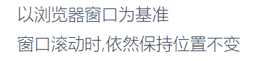
.box {
    position: fixed;
    top: 10px;
    left: 20px;
}
<!DOCTYPE html>
<html lang="en">
<head>
    <meta charset="UTF-8">
    <title>Title</title>
    <meta name="viewport" content="width=device-width, initial-scale=1">
    <style>
        body {
            margin: 0;
        }
        #d1 {
            height: 100px;
            width: 100px;
            background-color: red;
            left: 50px;  /*从左往右   如果是负数 方向则相反*/
            top: 50px;  /*从上往下    如果是负数 方向则相反*/
            /*position: static;  !*默认是static无法修改位置*!*/
            position: relative;
            /*相对定位
            标签由static变为relative它的性质就从原来没有定位的标签变成了已经定位过的标签
            虽然你哪怕没有动 但是你的性质也已经改变了
            */
        }

        #d2 {
            height: 100px;
            width: 200px;
            background-color: red;
            position: relative;  /*已经定位过了*/
        }
        #d3 {
            height: 200px;
            width: 400px;
            background-color: yellowgreen;
            position: absolute;
            left: 200px;
            top: 100px;
        }

        #d4 {
            position: fixed;  /*写了fixed之后 定位就是依据浏览器窗口*/
            bottom: 10px;
            right: 20px;

            height: 50px;
            width: 100px;
            background-color: white;
            border: 3px solid black;
        }
    </style>
</head>
<body>
<!--    <div id="d1"></div>-->

<!--<div id="d2">-->
<!--    <div id="d3"></div>-->
<!--</div>-->

<div style="height: 500px;background-color: red"></div>
<div style="height: 500px;background-color: greenyellow"></div>
<div style="height: 500px;background-color: blue"></div>
<div id="d4">回到顶部</div>

</body>
</html>
4、空间位置 —属性 z-index

eg:百度登陆页面 其实是三层结构
1.最底部是正常内容(z=0) 最远的
2.黑色的透明区(z=99) 中间层
3.白色的注册区域(z=100) 离用户最近
<!DOCTYPE html>
<html lang="en">
<head>
    <meta charset="UTF-8">
    <title>Title</title>
    <meta name="viewport" content="width=device-width, initial-scale=1">
    <style>
        body {
            margin: 0;
        }
        .cover {
            position: fixed;
            left: 0;
            top: 0;
            right: 0;
            bottom: 0;
            background-color: rgba(0,0,0,0.5);
            z-index: 99;
        }
        .modal {
            background-color: white;
            height: 200px;
            width: 400px;
            position: fixed;
            left: 50%;
            top: 50%;
            z-index: 100;
            margin-left: -200px;
            margin-top: -100px;

        }
    </style>
</head>
<body>
<div>这是最底层的页面内容</div>
<div class="cover"></div>
<div class="modal">
    <h1>登陆页面</h1>
    <p>username:<input type="text"></p>
    <p>password:<input type="text"></p>
    <button>点我点我~</button>
</div>
</body>
</html>
(PS: 浏览器的显示其实是建立在一个立体模型上的,屏幕的上方为 x轴,左边为y轴,z 轴 则是与用户的视线相对的,即像 垂直插在屏幕上的一根棍子,z 的值,代表着离用户视觉的距离,值越大,离用户越近。显示的效果就是 最先看到的内容,是z 值最大的标签部件。)
5、透明度
/* 它不单单可以修改颜色的透明度还同时修改字体的透明度
rgba只能影响颜色 (a的值用于设置透明度)
而opacity可以修改颜色和字体 */

opacity: 0.5;
参考阅读:
https://www.cnblogs.com/xiaoyuanqujing/articles/11670018.html