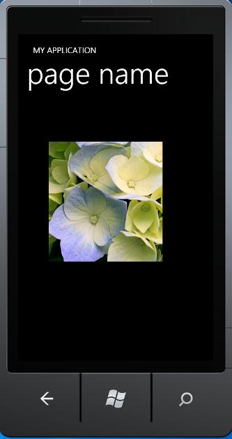
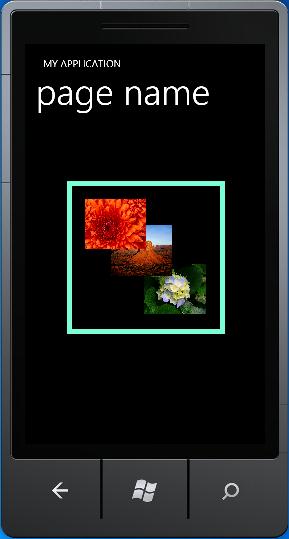
一.Grid控件:主要用于界面的布局,这个和web page里的很相似,可以通过网格布置规划界面,也可以嵌套使用。
<Grid x:Name="ContentGrid" Grid.Row="1">
<Grid.ColumnDefinitions>
<ColumnDefinition Width="159*" />
<ColumnDefinition Width="141*" />
<ColumnDefinition Width="180*" />
</Grid.ColumnDefinitions>
<Grid.RowDefinitions>
<RowDefinition Height="134*" />
<RowDefinition Height="133*" />
<RowDefinition Height="220*" />
<RowDefinition Height="162*" />
</Grid.RowDefinitions>
<Image Height="110" HorizontalAlignment="Left" Margin="20,16,0,0" Name="image1" Stretch="Fill" VerticalAlignment="Top" Width="131" Source="/MyPhoneTest;component/Images/Chrysanthemum.jpg" />
<Image Grid.Column="1" Grid.Row="1" Height="105" HorizontalAlignment="Left" Margin="13,12,0,0" Name="image2" Stretch="Fill" VerticalAlignment="Top" Width="115" Source="/MyPhoneTest;component/Images/Desert.jpg" />
<Image Grid.Column="2" Grid.Row="2" Height="150" HorizontalAlignment="Left" Margin="14,51,0,0" Name="image3" Stretch="Fill" VerticalAlignment="Top" Width="154" Source="/MyPhoneTest;component/Images/Hydrangeas.jpg" />
</Grid>
</Grid>
二.Canvas控件: 容器、布局控件,主要是用绝对坐标来定位子控件。对于游戏开发来说用处很大。
<Canvas x:Name="C1" Grid.Row="2">
<CheckBox x:Name="CheckBox3" Content="CheckBox3" Canvas.Top="50" Canvas.Left="100" Canvas.ZIndex="1" />
</Canvas>
也可以用代码来控制:
Canvas.SetLeft();
Canvas.SetTop();
Canvas.SetZIndex();//控制子控件在Z轴上的顺序。
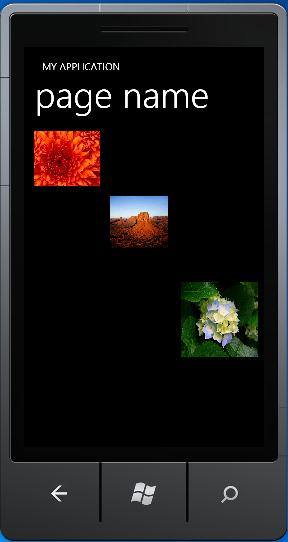
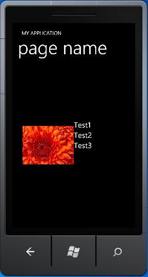
三.StackPanel控件:容器、布局控件,主要用来多个子控件的纵向、横向的布局控制。
<StackPanel Orientation="Horizontal" Width="400" Height="200">
<Image Source="Chrysanthemum.jpg" Height="200" Width="200" />
<StackPanel Orientation="Vertical" Width="200">
<TextBlock Text="Test1" FontSize="30"/>
<TextBlock Text="Test2" FontSize="30"/>
<TextBlock Text="Test3" FontSize="30"/>
</StackPanel>
</StackPanel>
四.Border控件: 用于包容一个控件并为其绘制边框,并且通过参数设置可以产生多种不同的边框效果。(不太应该算为容器控件,但是又觉得放在别的类里又不是很合适。)
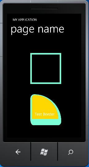
<Border x:Name="b2" Width="200" Height="200" BorderBrush="Aquamarine" BorderThickness="10" Margin="150,103,130,346" />
<Border x:Name="b1" Width="200" Height="200" Background="Gold" BorderBrush="Aquamarine" BorderThickness="10, 5, 20, 40" Margin="150,369,130,80" CornerRadius="25, 200, 10, 15" >
<TextBox Height="67" Name="textBox1" Text="Test Border" Background="Gold" Foreground="White" BorderBrush="Gold" Width="170" VerticalAlignment="Bottom"/>
</Border>
BorderThickness:边框宽度,设置不同的值使四个边产生不同的宽度。
CornerRadius:边角半径,设置不同的值四个边角产生不同的弧度。
如果要在一个边框控件里放多个控件的话,就需要先将多个控件放到一个容器类控件里,然后再把容器控件放到边框控件里。
<Border x:Name="b2" BorderBrush="Aquamarine" BorderThickness="10" Margin="84,123,80,220">
<Canvas Height="279" Name="canvas1" Width="289">
<Image Canvas.Left="140" Canvas.Top="151" Height="101" Name="image3" Stretch="Fill" Width="123" Source="/MyPhoneTest;component/Images/Hydrangeas.jpg" />
<Image Canvas.Left="73" Canvas.Top="74" Height="101" Name="image2" Stretch="Fill" Width="123" Source="/MyPhoneTest;component/Images/Desert.jpg" />
<Image Canvas.Left="21" Canvas.Top="21" Height="101" Name="image1" Stretch="Fill" Width="123" Source="/MyPhoneTest;component/Images/Chrysanthemum.jpg" />
</Canvas>
</Border>
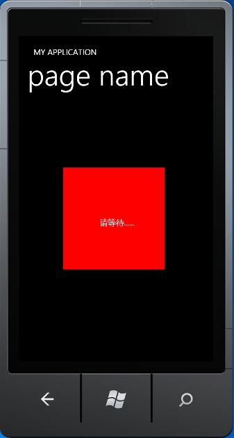
五.PopUp控件:严格来讲这个不应该算作容器控件,但是它可以把包含在其中的控件显示在当前页的最前面。可以用来制作自定义的MessageBox、WaitingBox等。
<Popup Grid.Row="1" HorizontalAlignment="Left" Margin="109,172,0,0" Name="popup1" VerticalAlignment="Top" Height="250" Width="250" IsOpen="True" Opened="popup1_Opened">
<Canvas Width="250" Height="250" Background="Red" VerticalAlignment="Center" HorizontalAlignment="Center">
<TextBlock Margin="90,120,0,0" Text="请等待......"/>
</Canvas>
</Popup>
六.ScrollView: 滚动查看器控件,也算是一个容器控件,它可以用来拖动显示其所包含的控件的内容。
<ScrollViewer Grid.Row="1" Height="293" HorizontalAlignment="Left" Margin="75,112,0,0" Name="scrollViewer1" VerticalAlignment="Top" Width="279" HorizontalScrollBarVisibility="Auto" VerticalScrollBarVisibility="Auto" >
<Image Source="Images/Hydrangeas.jpg" Height="779" Width="1036" />
</ScrollViewer>
HorizontalScrollBarVisibility/ VerticalScrollBarVisibility:水平/垂直滚动条状态。