目录:
1、pandas官方画图链接
2、标记图中数据点
3、画图显示中文
4、画股票K线图
5、matplotlib基本用法
6、format输出
6、format输出例子
eps_range=[0.1,0.2,0.3]
#plt.legend(['eps =%0.1f' % eps for eps in eps_range],loc='lower right')
plt.legend(['eps ={:.1f}'.format(eps) for eps in eps_range],loc='lower right')
5、matplotlib基本用法
结论:python脚本文件中,matplotlib默认是阻塞模式,plt.plot(x) 或plt.imshow(x)是直接出图像,需要plt.show()后才能显示图像。不用ion()和ioff(),麻烦 !!!
plt.cla() #清除原有图像
1、pandas官方画图链接
http://pandas.pydata.org/pandas-docs/stable/visualization.html
http://pandas.pydata.org/pandas-docs/stable/generated/pandas.DataFrame.plot.html?highlight=plot
http://pandas.pydata.org/pandas-docs/stable/generated/pandas.Series.plot.html?highlight=series
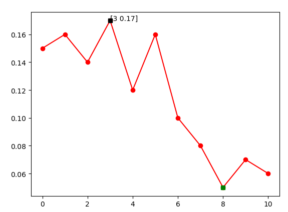
2、标记图中数据点
import matplotlib.pyplot as plt
import numpy as np

def demo_test():
    a=np.array([0.15,0.16,0.14,0.17,0.12,0.16,0.1,0.08,0.05,0.07,0.06])
  #Series也有argmax属性,直接Series.argmax()得到,新版本(0.20.0)中argmax属性修改为idxmax,argmin同。
    max_indx=np.argmax(a)#max value index
    min_indx=np.argmin(a)#min value index
    plt.plot(a,'r-o')
    plt.plot(max_indx,a[max_indx],'ks')
    show_max='['+str(max_indx)+' '+str(a[max_indx])+']'
    plt.annotate(show_max,xytext=(max_indx,a[max_indx]),xy=(max_indx,a[max_indx]))
    plt.plot(min_indx,a[min_indx],'gs')
    plt.show()
demo_test()
3、画图显示中文
import matplotlib
#指定默认字体
matplotlib.rcParams['font.sans-serif'] = ['SimHei']
matplotlib.rcParams['font.family']='sans-serif'
#解决负号'-'显示为方块的问题
matplotlib.rcParams['axes.unicode_minus'] = False
4、画股票K线图
#数据源:http://pan.baidu.com/s/1hs5Wn0w

  #要求:Matlibplot简单应用
  #1.根据数据绘制出2017年6月~8月日线级别的价格走势K线。
  #2.将MA5、MA10、MA20叠加至图中
import pandas as pd
import numpy as np
import matplotlib.pyplot as plt
import matplotlib.finance as mpf
import datetime
from matplotlib.pylab import date2num

plt.rcParams['font.sans-serif'] = ['SimHei']
plt.rcParams['axes.unicode_minus'] = False

#读取数据并去掉多余数据
data=pd.read_csv('000001.SZ.csv',encoding='gbk',index_col=0).iloc[:-2,:4]
#将索引调整为datetime格式
data.index=pd.to_datetime(data.index)
#将分钟数据聚合为日数据
data_open=data.loc[:,'开盘价(元)'].resample('D').first().dropna()
data_high=data.loc[:,'最高价(元)'].resample('D').max().dropna()
data_low=data.loc[:,'最低价(元)'].resample('D').min().dropna()
data_close=data.loc[:,'收盘价(元)'].resample('D').last().dropna()
#将开盘、收盘、最高、最低数据合并,注意数据顺序,与candlestick_ochl一致
new_data=pd.concat([data_open,data_close,data_high,data_low],axis=1)
#new_data=new_data.ix['2017-06':'2017-08'];print(new_data)
#将日期索引调整到列
new_data=new_data.reset_index()
#将日期转换为num格式
new_data['日期']=[int(date2num(new_data.ix[i,['日期']])) for i in range(len(new_data))]
quotes=np.array(new_data)
fig,ax=plt.subplots(figsize=(8,5))
mpf.candlestick_ochl(ax,quotes,width=1,colorup='g',colordown='r')
#分别画出5日、10日、20日均线图
new_data.index=new_data['日期']
new_data['收盘价(元)'].rolling(window=5).mean().plot()
new_data['收盘价(元)'].rolling(window=10).mean().plot()
new_data['收盘价(元)'].rolling(window=20).mean().plot()
#将x轴设置为日期,调整x轴日期范围
ax.xaxis_date()
ax.set_xlim(datetime.datetime(2017,6,1),datetime.datetime(2017,8,31)) plt.show()