以下是学习笔记:
参考:https://www.bilibili.com/video/BV1HC4y1b76v?from=search&seid=16211864127488032003
参考:https://www.bilibili.com/video/BV16U4y1b7ZP?p=33
一,命名空间
xaml命名空间
xmlns:[前缀名]="命名空间描述"
自定义类或程序集映射语法
xmlns:[必选前缀]="clr-namespace:[命名空间];assembly=[程序集名称]"
二,WPF应用程序组成
App.config:配置文件 连接字符串 配置信息
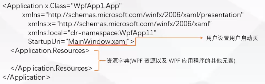
App.xaml:设置应用程序起始文件,系统级资源
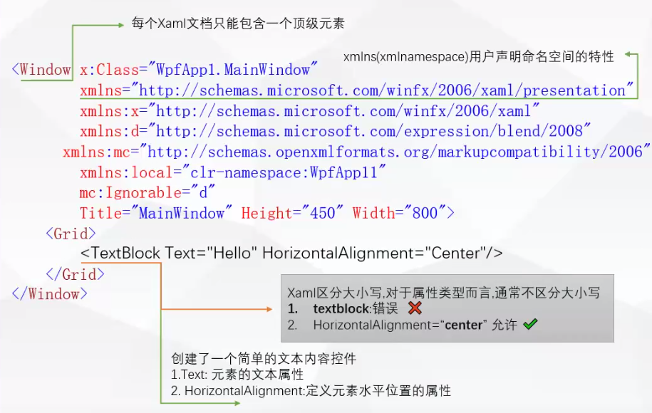
一个xaml文件至少要有两个命名空间:1,默认命名空间 。2,带x前缀
        xmlns="http://schemas.microsoft.com/winfx/2006/xaml/presentation"
        xmlns:x="http://schemas.microsoft.com/winfx/2006/xaml"
StartupUri="View/MainWindow.xaml">:起始文件(开始的窗体)
<Application.Resources>:定义整个WPF应用程序的相关资源
App.xaml.cs:App.xaml文件的后台类文件
MainWindow.xaml:Window-WPF应用程序界面与Xaml设计文件
MainWindow.xaml.cs:xaml窗口文件的后台代码文件
三,Window介绍
System.Window.Window
Window--ContentControl:内容控件 只能承载一个Content--Grid
1,常用属性
【1】ShowInTaskbar:窗口是否具有任务栏按钮
【2】WindowStartupLocation:窗口首次显示的位置
【3】WindowState:窗口最大化,最小化,正常尺寸显示
【4】Topmost:窗口显示在最上层
【5】Icon:图标,任何图片格式都可以
无边框设计:
ResizeMode="NoResize":设置窗口不能放大
WindowStartupLocation="CenterScreen":启动位置,屏幕中心
WindowStyle="None":边框样式:无边框
AllowsTransparency="True":工作区支持透明
Background="{x:Null}":取消背景
2,事件
【1】Loaded:加载
【2】Closing
【3】MouseDoubleClick
四,控件
WPF允许控件没有Name属性
1,Label 文本标签 ContentControl
2,TextBox 文本框 编辑与显示 特殊内容控件
TextWrapping="Wrap" :自动换行
LineHeight="22" :行距设置
3,PasswordBox 密码框 PasswordChar
【1】获取密码:string pwd = txt_UserPwd.Password.Trim();
4,Button 按钮 ContentControl【内容控件】
【1】Content:文本
【2】Background:背景颜色
【3】BorderBrush:边框颜色
【4】BorderThickness:边框的宽度
【5】Foreground:前景色,文本颜色
【6】IsDefault:键盘Enter激活
【7】IsCancel:键盘Esc激活
5,RadioButton 单选按钮 【内容控件】
同一组单选按钮,它们是互斥关系
GroupName:设置一个组名,不用组名的单选按钮,它们不具有互斥的关系
IsChecked:是否选中
Checked:选中时候的事件
6,CheckBox 复选框【内容控件】
允许选中多个
Content
Name:
IsChecked:是否选中(true,false,null) 。如果需要设置3种状态,要设置IsThreeState
6.1:获取窗口中所有勾选的CheckBox的Content内容
        private void Btn_Get_Chk_Click(object sender, RoutedEventArgs e)
        {
            //获取窗口中所有勾选的CheckBox的Content内容
            string strContent = "";
            foreach (UIElement ele in grid1.Children)
            {
                if (ele is CheckBox)
                {
                    CheckBox chk=ele  as CheckBox;
                    if (chk.IsChecked == true)
                    {
                        if (strContent != "")
                        {
                            strContent += ",";
                        }
                        strContent += chk.Content.ToString();
                    }
                }
            }
            MessageBox.Show(strContent);
        }
6.2:代码动态添加checkbox
        //代码动态添加checkbox
        private void Btn_Add_Chek_Click(object sender, RoutedEventArgs e)
        {
            string[] names = {"体育2", "唱歌2", "跳舞2"};
            for (int i = 0; i < names.Length; i++)
            {
                CheckBox chk = new CheckBox();
                chk.Content = names[i];
                chk.HorizontalAlignment = HorizontalAlignment.Left;//水平对齐
                chk.VerticalAlignment = VerticalAlignment.Top;
                chk.Margin=new Thickness(btn_Add_Chek.Margin.Left+i*80,btn_Add_Chek.Margin.Top+40,0,0);
                grid1.Children.Add(chk);
            }
        }

7,Image控件:显示图片【特殊内容控件】
属性:
Stretch:填充
None=0(实际大小)。
Fill=1(填充目标尺寸,不保留纵横比)。
Uniform=2(保留纵横比,适合目标尺寸,可能图片显示不全),默认是这个。
UniformToFill=3(保留纵横比,填充目标尺寸,对图片进行裁剪)
StretchDirection:填充
UpOnly=0(内容小于父级时扩展,如果内容较大,不执行缩放)
DownOnly=1(内容大于父级缩放,如果内容较小,不扩展)
Both=2(拉伸以适应父级),默认是这个。
Source:图片来源
        //代码导入图片
        private void Btn_AddIamge_Click(object sender, RoutedEventArgs e)
        {
            //【1】相对路径的图片导入
            //imgPic.Source = new BitmapImage(new Uri("/imgs/boy.png", UriKind.Relative));//参数2:指明相对路径

            //WPF:支持两种授权:  applicaiton:/// 和 siteoforigin://
            //applicaiton
            //siteoforigin:图片文件-属性-生成操作-内容
            //pcak URI 方案 pack://授权//路径
            //【2】绝对路径的图片导入
            //imgPic.Source = new BitmapImage(new Uri("pack://application:,,,/imgs/boy.png", UriKind.Absolute));//参数2:指明绝对路径

            //【3】bin目录下的文件的图片导入,要设置下面2项
            //图片文件-属性-生成操作-内容
            //图片文件-属性-复制到输出目录-始终内容
            imgPic.Source = new BitmapImage(new Uri(AppDomain.CurrentDomain.BaseDirectory + "/imgs/boy.png", UriKind.Absolute));//参数2:指明绝对路径

            //【4】完整路径图片的导入
            //imgPic.Source = new BitmapImage(new Uri("E://VS workspace//image//设计用图片//背景图02.png", UriKind.Absolute));//参数2:指明绝对路径
        }
事件:
圆形图片:

圆形图片代码:
<Border Width="80" Height="80" Background="White" VerticalAlignment="Center" HorizontalAlignment="Center"
                        CornerRadius="50" Margin="0,0,0,20">
                    <!--添加阴影-->
                    <Border.Effect>
                        <DropShadowEffect Color="Red" ShadowDepth="0" BlurRadius="5" Opacity="0.3" Direction="0"></DropShadowEffect>
                    </Border.Effect>
                    <Border Width="80" Height="80" HorizontalAlignment="Center">
                        <Border.Background>
                            <ImageBrush ImageSource="../Assets/Images/boy.png" Stretch="Uniform"></ImageBrush>
                        </Border.Background>
                    </Border>
                </Border>
7,Border控件:显示边框【不是布局面板,只能有一个元素作为它的子元素】
【作用:围绕在其他元素周围 ,设置背景,布局面板一起使用】
【要显示多个元素怎么办:布局面板作为它的一个子元素,布局面板可以存放多个子元素】
属性:
BorderBrush:边框颜色
BorderThickness:边框线条粗细
CornerRadius:圆角
Background:背景
Padding:Border与嵌套里面元素的距离
【例子】红色的阴影小边框效果:
【例子代码】红色的阴影小边框效果:
    <Border Margin="5" Background="White" CornerRadius="10">
        <Border.Effect>//阴影边框
            <DropShadowEffect Color="Red" ShadowDepth="0" BlurRadius="5" Opacity="0.3" Direction="0"></DropShadowEffect>
        </Border.Effect>
    </Border>
8,ComboBox:下拉框【条目控件:ItemsControl】
属性:
IsEditable:是否可编辑
IsDropDownOpen:下拉框是否展开
绑定数据方式
1,ItemSource
2,Items.Add
3,DataContext=List 需要添加:ItemsSource="{Binding}"
        private void Btn_Add_cmbItems_Click(object sender, RoutedEventArgs e)
        {

            cmb_Change.Items.Clear();//先清除

            cmb_Change.SelectedValuePath = "ClassId";//指定项的值对应的属性名
            cmb_Change.DisplayMemberPath = "ClassName";//项的显示文本对应的属性名

            //【数据绑定方法1】
            //cmb_Change.ItemsSource = GetClassInfo();//指定数据源【注意:绑定了数据源,不能直接移除,也不能添加】

            //注意:绑定了数据源,不能直接移除,也不能添加
            //如果想动态添加移除,就用add方式,一项一项的添加
            //【数据绑定方法2】
            //foreach (ClassInfo item in GetClassInfo())
            //{
            //    cmb_Change.Items.Add(item);
            //}
            ////移除
            //cmb_Change.Items.RemoveAt(0);

            //【数据绑定方法3】
            cmb_Change.DataContext = GetClassInfo();
        }

        //模拟从数据库获取的数据
        private List<ClassInfo> GetClassInfo()
        {
            List<ClassInfo> list = new List<ClassInfo>();
            list.AddRange(new ClassInfo[]
            {
                new ClassInfo()
                {
                    ClassId = 0,
                    ClassName = "计算机一班"
                },
                new ClassInfo()
                {
                    ClassId = 1,
                    ClassName = "计算机二班"
                },
                new ClassInfo()
                {
                    ClassId = 3,
                    ClassName = "计算机三班"
                },
            });
            return list;
        }
事件:
选择项改变事件:SelectionChanged
9,ListBox:列表框【条目控件:ItemsControl】
手动添加项:
绑定数据源:
        private void Btn_ListBox_Click(object sender, RoutedEventArgs e)
        {
            lst_class.Items.Clear();//先清除手动添加的

            //【1】绑定数据源的方式1
            //lst_class.ItemsSource = GetClassInfo();
            //lst_class.DisplayMemberPath = "ClassName";
            //lst_class.SelectedValuePath = "ClassId";
            //lst_class.SelectedIndex = 0;

            //如果要冬天添加,移除项,跟ComboBox一样的,不能添加移除
            //lst_class.Items.Add(11);
            //lst_class.Items.Add("string");
            //lst_class.Items.Add(11.22);

            //【2】绑定数据源的方式2
            lst_class.DataContext = GetClassInfo();
            lst_class.DisplayMemberPath = "ClassName";
            lst_class.SelectedValuePath = "ClassId";
            lst_class.SelectedIndex = 0;
        }
属性:
SelectionMode:选一个或多个
事件:
        //ListBox选择项发生改变的时候
        private void Lst_class_SelectionChanged(object sender, SelectionChangedEventArgs e)
        {
            //选择项类型  由绑定或添加数据的类型决定的
            MessageBox.Show(lst_class.SelectedItem.ToString());//字符串,int
            //如果类型是实体类
            ClassInfo selItem=lst_class.SelectedItem as ClassInfo;
            MessageBox.Show(selItem.ClassName);
        }
10,DatePicker:日期控件
属性:
DisplayDate:默认显示的日期,并不会显示到文本框
DisplayDateStart:选择范围的开始日期
DisplayDateEnd:选择范围的结束日期
Style:样式
SelectedDateFormat:选择的日期的格式 long:2021年2月21日 short:2021/2/21
FirstDayOfWeek:设置每周的第一天
IsTodayHighlighted:高亮显示,默认True
SelectedDate:文本框显示的日期
自定义格式:
SelectedDate:代码修改的方式-行不通
自定义Style,改变template模板来实现自定义
事件:
11,Calendar:日期控件
可视化的日历控件
属性:
DisplayMode:显示模式按年显示还是按月显示
DisplayDateStart:选择范围的开始日期
DisplayDateEnd:选择范围的结束日期
SelectionMode:选择的范围模式
12,Slider:滑块控件:移动来选择一个范围的值
常用用途:改变其他属性的值
属性:
Maximum="100":最大值
Minimum="0":最下值
Value="50":当前的值
Orientation="Horizontal":方向水平还是垂直
TickPlacement="Both" :刻度的位置。Both两边都有刻度
TickFrequency="5":刻度的间隔
IsSnapToTickEnabled:True->Value值是Int。False->Value值是浮点型
SelectionStart="20"
SelectionEnd="50"
IsSelectionRangeEnabled="True":选择的范围高亮显示
IsDirectionReversed="True":增加值的方向
13,ProgressBar:进度条:显示操作过程
四,布局控件
1,Grid: 网格面板(最复杂,强大,灵活的一个控件,布局整个页面布局)
类似于Winform中的TableLayoutPanel ,行和列的方式布局页面或页面中某一块区域
单元格:可以放一个元素或多个元素,一个单元格其实也是一个容器:可以放多个控件 StarkPanel/WrapPanel/Grid等
可以使边框可见,方便布局可视。
网格结构:定义行和列
指定元位置:
行:Row
列:Column
ShowGirdLines:可以设置行列的变距线的显示
Grid.RowDefinitions:可以创建任意行,进行固定高度与百分比或自适应高度设置。
Grid.ColumnDefinitions:可以创建任意列,进行固定高度与百分比或自适应高度设置。
跨列:Grid.ColumnSpan="2"代表跨2列
跨行:
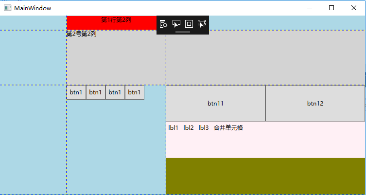
<Window x:Class="_005_Grid_网格面板.MainWindow"
        xmlns="http://schemas.microsoft.com/winfx/2006/xaml/presentation"
        xmlns:x="http://schemas.microsoft.com/winfx/2006/xaml"
        xmlns:d="http://schemas.microsoft.com/expression/blend/2008"
        xmlns:mc="http://schemas.openxmlformats.org/markup-compatibility/2006"
        xmlns:local="clr-namespace:_005_Grid_网格面板"
        mc:Ignorable="d"
        Title="MainWindow" Height="450" Width="800">
    <Grid ShowGridLines="True" Background="LightBlue">
        <!--定义的Grid的行和列-->
        <!--没有设置Height和Width 就平均分配-->
        <Grid.RowDefinitions>
            <!--尺寸的三种方式:1,固定尺寸-->
            <RowDefinition Height="30"></RowDefinition>
            <!--尺寸的三种方式:2,按比例-->
            <RowDefinition Height="*"></RowDefinition>
            <!--2* 是 * 的2倍-->
            <RowDefinition Height="2*"></RowDefinition>
            <!--尺寸的三种方式:3,自动调整,按内容-->
            <RowDefinition Height="Auto"></RowDefinition>
        </Grid.RowDefinitions>
        <Grid.ColumnDefinitions>
            <ColumnDefinition Width="*"></ColumnDefinition>
            <ColumnDefinition Width="1.5*"></ColumnDefinition>
            <ColumnDefinition Width="3*"></ColumnDefinition>
        </Grid.ColumnDefinitions>
        <!--元素位置的指定,指定该元素所在的行索引和列索引,索引从0开始,如果没有指定
        ,默认就是第一个,跨行或跨列 RowSpan ColSpan-->
        <!--在第1行第2列放一个TextBox控件-->
        <TextBox Grid.Column="1" TextAlignment="Center" Background="Red">第1行第2列</TextBox>
        <!--第2行第2列,跨2列。 Grid.ColumnSpan="2"代表跨2列-->
        <TextBlock Grid.Row="1" Grid.Column="1" Grid.ColumnSpan="2" Background="LightGray">第2号第2列</TextBlock>
        <!--第3行第2列放多个控件-->
        <WrapPanel Grid.Column="1" Grid.Row="2" ItemHeight="30" ItemWidth="40">
            <Button Content="btn1" ></Button>
            <Button Content="btn1" ></Button>
            <Button Content="btn1" ></Button>
            <Button Content="btn1" ></Button>
        </WrapPanel>
        <!--网格控件嵌套网格控件-->
        <Grid Grid.Column="2" Grid.Row="2" Background="Olive">
            <Grid.RowDefinitions>
                <RowDefinition ></RowDefinition>
                <RowDefinition ></RowDefinition>
                <RowDefinition ></RowDefinition>
            </Grid.RowDefinitions>
            <Grid.ColumnDefinitions>
                <ColumnDefinition ></ColumnDefinition>
                <ColumnDefinition ></ColumnDefinition>
            </Grid.ColumnDefinitions>
            <Button Content="btn11"></Button>
            <Button Content="btn12" Grid.Column="1"></Button>
            <!--合并单元格的效果 ,第二行的第1列和第2列合并-->
            <StackPanel Grid.Column="0" Grid.Row="1" Grid.ColumnSpan="2" Background="LavenderBlush" Orientation="Horizontal">
                <Label Content="lbl1"></Label>
                <Label Content="lbl2"></Label>
                <Label Content="lbl3"></Label>
                <Label Content="合并单元格
                       "></Label>
            </StackPanel>
        </Grid>
    </Grid>
</Window>
2,StackPanel:布局控件:子元素排列成一排或一列,水平摆放或垂直摆放
经常嵌套在其他布局控件里,与其他布局控件结合使用
子元素超出的部分,会被隐藏
Orientation="Vertical":垂直对齐,HorizontalAlignment="Center" 、Left 、Right、Stretch
Orientation="Horizontal":水平对齐,HorizontalAlignment="Center" 、Top、Bottom、Stretch
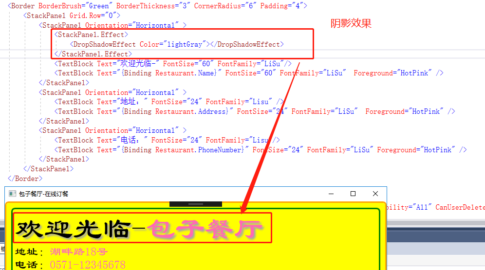
例:阴影效果展示
3,WrapPanel:布局控件:子元素按顺序排列(与StachPanel区别,可以自动换行)
弥补了StackPanel的不足
如果按水平方向:从左到右,超出部分,自动换行
如果按垂直方向:从上到下,超出部分,自动换列
调整面板的尺寸,内部的元素的布局--自动调整
属性:
Orientation="Horizontal":方向
ItemHeight="30":子元素高度
ItemWidth="60":子元素宽度
【1】设计代码:
    <Grid>
        <Border BorderBrush="Red" BorderThickness="3" CornerRadius="5"  Margin="20"  >
            <WrapPanel Name="wp_Panel" Orientation="Horizontal" ItemHeight="30" ItemWidth="60">

            </WrapPanel>
        </Border>
    </Grid>
【2】窗体代码:
        private void MainWindow_OnLoaded(object sender, RoutedEventArgs e)
        {
            for (int i = 0; i < 100; i++)
            {
                Button btn=new Button();
                btn.Content = "btn" + i.ToString("00") + "号";
                btn.Background=new SolidColorBrush(Colors.Gray);
                btn.Name = "btn" + i;
                btn.Margin=new Thickness(10,5,0,0);
                wp_Panel.Children.Add(btn);//添加到面板中

            }
        }
【3】效果

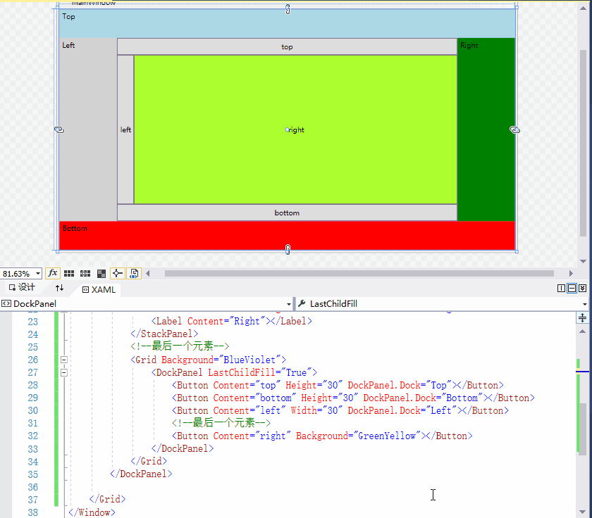
4,DockPanel:停靠面板(自适应效果)
停靠面板:顶部,左边,右边,下边,中间
DockPanel.Dock:Top Left Right Botton
Winfrom Dock:Top Left Right Botton
特点:先添加的子元素,优先占用边角(优先占有权),所有子元素区域不会重叠
与其他布局控件结合使用
LastChildFill :默认为true 最后的元素完全填充剩余的部分
如果在一侧,依靠了多个元素,它们按顺序依次排列
5,UniformGrid:均分空间,自动排布
与Grid不同的是:该容器具备Columns/Rows属性,通过该属性,UniformGird则具备相应的行和列,但是设置的Columns/Rows不允许单独的进行容器大小的设置。
位于UniformGrid中的子元素,按输入顺序排列至容器中,直至充填容器的所有空间。
未显示指定的Columns/Rows,UniformGrid则为子元素动态分配Columns/Rows,换行与换列的基准主要基于UniformGrid的容器大小(宽度与高度)

17,Canvas:画布面板
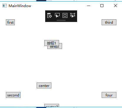
    <Grid >
        <Canvas ClipToBounds="False">
            <Button Content="first" Width="30" Height="20" Canvas.Left="20" Canvas.Top="30" Canvas.Right="30"></Button>
            <Button Content="second" Width="50" Height="20" Canvas.Left="20" Canvas.Bottom="30"></Button>
            <Button Content="third" Width="50" Height="20" Canvas.Right="20" Canvas.Top="30"></Button>
            <Button Content="four" Width="50" Height="20" Canvas.Right="20" Canvas.Bottom="30"></Button>
            <Button Content="center" Width="50" Height="20" Canvas.Left="124" Canvas.Bottom="150" Canvas.Top="243"></Button>
            <Button Content="center2" Width="50" Height="20" Canvas.Left="150" Canvas.Bottom="-10"></Button>
            <!--重叠效果 优先显示 后添加的元素显示在上面。如果要改变优先级:Panel.ZIndex="1"-->
            <!--优先显示顺序,Panel.ZIndex的值越大,就显示在最上面。如果Panel.ZIndex相同,后添加的显示在上面-->
            <Button Content="按钮1" Width="50" Height="20" Canvas.Left="150" Canvas.Top="100" Panel.ZIndex="2"></Button>
            <Button Content="按钮2" Width="50" Height="20" Canvas.Left="160" Canvas.Top="110" Panel.ZIndex="1"></Button>
        </Canvas>
    </Grid>
画布面板(坐标面板):定义区域,子元素的显示位置,指定相对于面板的坐标,来定位子元素显示的位置
附加属性:Canvas.Left Canvas.Right Canva.Top Canvs.Bottom
坐标(left,top)(left,bottom)(rigth,top)(rigth,bottom)
不能为子元素指定两个以上的附加属性,如果指定了,忽略后者。
例如:Canvas.Left="20" Canvas.Top="30" Canvas.Right="30" 会把Canvas.Right="30"忽略。
当窗口大小变化,Canvas的尺寸就随之变动,子元素的位置也随之变化,子元素的坐标相对Canvas的位置没有变
ClipToBounds:默认false 如果有溢出,就显示外边。如果为true ,如果有溢出,就裁剪了。
<!--重叠效果 优先显示 后添加的元素显示在上面。如果要改变优先级:Panel.ZIndex="1"-->
<!--优先显示顺序,Panel.ZIndex的值越大,就显示在最上面。如果Panel.ZIndex相同,后添加的显示在上面-->
应用:图画,精确定位,最简单的布局。
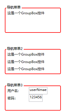
19,GroupBox
Winform Groupbox:分组容器控件
Wpf GroupBox:分组,带标题 HeaderedContentControl 带标题的内容控件
只能有一个子元素作为它的内容 Content Header
结合布局控件(容器)就可以放多个控件了
代码:
<Window x:Class="_006_GroupBox_带标题的内容控件.MainWindow"
        xmlns="http://schemas.microsoft.com/winfx/2006/xaml/presentation"
        xmlns:x="http://schemas.microsoft.com/winfx/2006/xaml"
        xmlns:d="http://schemas.microsoft.com/expression/blend/2008"
        xmlns:mc="http://schemas.openxmlformats.org/markup-compatibility/2006"
        xmlns:local="clr-namespace:_006_GroupBox_带标题的内容控件"
        mc:Ignorable="d"
        Title="MainWindow" Height="450" Width="800" Loaded="MainWindow_OnLoaded">
    <Grid>
        <!--分组控件 内容控件-->
        <GroupBox Header="导航菜单" Width="200" Height="100" BorderThickness="2" BorderBrush="Red" Margin="33,27,0,0" HorizontalAlignment="Left" VerticalAlignment="Top"  >
            <Label Content="这是一个GroupBox控件"></Label>
        </GroupBox>
        <!--分组控件 内容控件 放多个控件的办法-->
        <GroupBox Header="导航菜单2" Width="200" Height="100" BorderThickness="2" BorderBrush="Red" Margin="33,172,0,0" HorizontalAlignment="Left" VerticalAlignment="Top"  >
            <StackPanel>
                <Label Content="这是一个GroupBox控件"></Label>
                <Label Content="这是一个GroupBox控件"></Label>
                <Label Content="这是一个GroupBox控件"></Label>
            </StackPanel>
        </GroupBox>
        <!--分组控件 内容控件 放多个控件的办法-->
        <GroupBox Header="导航菜单3" Width="200" Height="100" BorderThickness="2" BorderBrush="Red" Margin="33,300,0,0" HorizontalAlignment="Left" VerticalAlignment="Top"
                  Name="gb_Info">
            <StackPanel Orientation="Vertical" Name="sp_First">
                <StackPanel Orientation="Horizontal" Name="sp_userName">
                    <Label Content="用户名:" Width="80"></Label>
                    <TextBox Name="txt_userName" Text="userNmae"></TextBox>
                </StackPanel>
                <StackPanel Orientation="Horizontal">
                    <Label Content="密码:" Width="80"></Label>
                    <TextBox Text="123456"></TextBox>
                </StackPanel>
            </StackPanel>
        </GroupBox>
    </Grid>
</Window>
20,Expander(可折叠控件)
带标题 HeaderedContentControl 带标题的内容控件
折叠展开的特点:IsExpander
展开方向:ExpandDirection="Down" Up/Left/Right
是否隐藏:IsExpanded="False" 默认False
事件:Expanded Collapsed
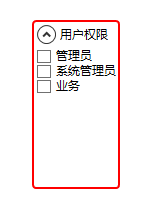
代码:
    <Grid>
        <Expander Header="用户权限" HorizontalAlignment="Left" Height="169" Margin="85,73,0,0" VerticalAlignment="Top" Width="auto"
                  Padding="2" ExpandDirection="Down" IsExpanded="False" BorderThickness="2" BorderBrush="Red">
           <StackPanel>
               <CheckBox Content="管理员"></CheckBox>
               <CheckBox Content="系统管理员"></CheckBox>
               <CheckBox Content="业务"></CheckBox>
           </StackPanel>
        </Expander>

    </Grid>
常用的布局属性:
HorizontalAlignment:水平对齐
VerticalAlignment:垂直对齐
HorizontalContentAlignment:文本水平对齐方式
VerticalContentAlignment:文本垂直对齐方式
Margin:元素与容器的变距
Height:高度
Width:宽度
MinHeight/MinWidth:元素的最小高度和宽度
MaxHeight/MaxWidth:元素的最大高度和宽度
Padding:元素的内部边距
FlowDirection="RightToLeft":子元素的流动方向