转自:https://www.cnblogs.com/mihoutaoguniang/p/6124299.html
小果今天要实现这样的效果:单纯css样式,实现body下子集的水平垂直居中。
body内容:
|
1
2
3
4
5
|
<body> <div class="div1"> <div class="div2"></div> </div></body> |
效果:
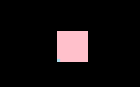
通过一系列的尝试,实现了四种方法,惊奇的发现,其中三个是用position:absolute实现的:(div大小确定)
1.原理:position: absolute;top: 50%;left: 50%;margin-top: -50px;margin-left: -50px;
|
1
2
3
4
5
6
7
8
9
10
11
12
13
14
15
16
17
18
19
20
21
22
23
|
<style type="text/css"> html,body{ height:100%; width:100%; background: black; } .div1{ height: 100px; width: 100px; position: absolute; top: 50%; left: 50%; margin-top: -50px; margin-left: -50px; background: pink; } .div2{ height: 10px; width: 10px; margin-top: 90px; background: lightblue; }</style> |
2.原理:margin: auto;position: absolute;top: 0;right:0;bottom: 0;left: 0;
|
1
2
3
4
5
6
7
8
9
10
11
12
13
14
15
16
17
18
19
20
21
22
23
24
|
<style type="text/css"> html,body{ height:100%; width:100%; background: black; } .div1{ height: 100px; width: 100px; margin: auto; position: absolute; top: 0; right:0; bottom: 0; left: 0; background: pink; } .div2{ height: 10px; width: 10px; margin-top: 90px; background: lightblue; }</style> |
3.原理:transform:translate(-100px,-100px);position: absolute;top: 50%;left: 50%;
|
1
2
3
4
5
6
7
8
9
10
11
12
13
14
15
16
17
18
19
20
21
22
23
24
|
<style type="text/css"> html,body{ height:100%; width:100%; background: black; } .div1{ height: 100px; width: 100px; margin: auto; position: absolute; top: 50%; left: 50%; background: pink; -webkit-transform:translate(-100px,-100px); transform:translate(-100px,-100px); } .div2{ height: 10px; width: 10px; margin-top: 90%; background: lightblue; }</style> |
4.原理:display:flex;justify-content:center;align-items:center;
body是这样子的:
|
1
2
3
4
|
<body> <div class="div1"></div> <div class="div2"></div></body> |
css:
|
1
2
3
4
5
6
7
8
9
10
11
12
13
14
15
16
17
18
19
20
21
22
23
24
25
|
<style type="text/css"> html,body{ height:100%; width:100%; background: black; display: flex; justify-content: center; align-items: center; } .div1{ height: 100px; width: 100px; background: pink; } .div2{ height: 10px; width: 10px; position: absolute; left: 50%; top: 50%; margin-top: 40px; margin-left: -50px; background: lightblue; }</style> |
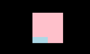
以上是div1的大小确定的居中方法,那如果大小不知道呢?小果使用了paddingO(∩_∩)O
代码君:(display: table-cell必不可少啊)
body内容:
|
1
2
3
4
5
|
<body> <div class="div1"> <div class="div2"></div> </div></body> |
css内容:
|
1
2
3
4
5
6
7
8
9
10
11
12
13
14
15
16
17
18
19
20
21
22
23
24
|
<style type="text/css"> html,body{ height:100%; width:100%; background: black; } .div1{ padding: 50px; display: table-cell; position: absolute; top: 50%; right:50%; bottom: 50%; left: 50%; background: pink; margin: auto; } .div2{ padding: 10px; margin-top: 30px; margin-left: -50px; background: lightblue; }</style> |
然而,效果是这样的:
好了,整理完毕。如果果果大军们有什么意见,或者更好的方法,欢迎交流,随之奉陪哈,谢谢!