background-origin(背景原点)
设置元素背景图片的原始起始位置。必须保证背景是background-repeat为no-repeat属性才能生效。
background-origin:border-box|padding-box|content-box;
border-box
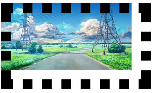
这是用border-box时图片位于边框左上角
<!DOCTYPE html>
<html>
    <head>
        <meta charset="UTF-8">
        <title></title>
        <style>
        .img{
                border: 30px dotted black;
                width: 400px;
                height: 204px;
                background: url(36686900_p0.jpg) no-repeat;
                background-origin: border-box;
        </style>
    </head>
    <body>
        <div class="img"></div>
    </body>
</html>
padding-box
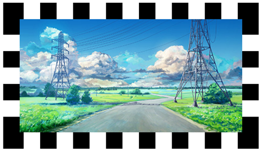
它看上去和下面的content-box没什么不同,但仔细用浏览器的开发者工具(F12)来看一下图片的位置的话padding-box位于内边距以内含内边距、内容这两个里面。
<!DOCTYPE html>
<html>
    <head>
        <meta charset="UTF-8">
        <title></title>
        <style>
        .img{
                border: 30px dotted black;
                width: 400px;
                height: 204px;
                background: url(36686900_p0.jpg) no-repeat;
                background-origin: padding-box;
        </style>
    </head>
    <body>
        <div class="img"></div>
    </body>
</html>
content-box
content-box位于内容部分padding-box位于内边距以内包括内边距,两者需要区分好。

<!DOCTYPE html>
<html>
    <head>
        <meta charset="utf-8" />
        <title></title>
        <style type="text/css">
            .img{
                border: 30px dotted black;
                width: 400px;
                height: 204px;
                background: url(36686900_p0.jpg) no-repeat;
                background-origin: content-box;
        </style>
    </head>
    <body>
        <div class="img"></div>
    </body>
</html>
背景显示区域
设定背景区域裁剪的区域
语法:
background-clip:border-box|padding-box|content-box|text
将图片的溢出部分裁剪。
裁剪部分理解和背景原点意思理解可以为一样
三个以不同位置裁剪的图片。
背景大小
background-size
以长度或者百分比显示,还可以通过cover和contain对图片进行伸缩。
div{
    background:url(img.jpg);
    background-size:80px 30px;
    background-repeat:no-repeat;
}
背景样式缩写
规格background:背景色 背景图 背景平铺方式 背景定位
缩写
div{background:#ccc url(img.png) no-repeat left top;}
多重背景
语法:background: [background-color] | [background-image]| [background-position][/background-size] | [background-repeat] | [background-attachment] | [background-clip] | [background-origin],...
也可以拆开写
background-repeat : repeat1,repeat2,...,repeatN;
backround-position : position1,position2,...,positionN;
background-size : size1,size2,...,sizeN;
background-attachment : attachment1,attachment2,...,attachmentN;
background-clip : clip1,clip2,...,clipN;
background-origin : origin1,origin2,...,originN;
background-color : color;
注意用缩写时记得用 , 号间隔
如果有size值,需要紧跟position用 / 隔开
如果有多个背景图,如果其它属性只有一个,表明所有图片都应用到。
background-color只能设置一个。
列表样式
1.项目符号
list-style-type:符号样式;
ul{

    list-style-type:符号样式;

}
符号样式有很多
disc:
实心圆(CSS1)
circle:
空心圆(CSS1)
square:
实心方块(CSS1)
decimal:
阿拉伯数字(CSS1)
lower-roman:
小写罗马数字(CSS1)
upper-roman:
大写罗马数字(CSS1)
lower-alpha:
小写英文字母(CSS1)
upper-alpha:
大写英文字母(CSS1)
none:
不使用项目符号(CSS1)
armenian:
传统的亚美尼亚数字(CSS2)
cjk-ideographic:
浅白的表意数字(CSS2)
georgian:
传统的乔治数字(CSS2)
lower-greek:
基本的希腊小写字母(CSS2)
hebrew:
传统的希伯莱数字(CSS2)
hiragana:
日文平假名字符(CSS2)
hiragana-iroha:
日文平假名序号(CSS2)
katakana:
日文片假名字符(CSS2)
katakana-iroha:
日文片假名序号(CSS2)
lower-latin:
小写拉丁字母(CSS2)
upper-latin:
大写拉丁字母(CSS2)
自定义项目符号
用图片插入
list-style-image:none|url
ul{
    list-style-image:url(img.png);
}
变形样式
改变元素大小,透明,旋转角度,扭曲等
语法:transorm:none |<transform-function>+
translate(): 指定对象的2D translation(2D平移)。第一个参数对应X轴,第二个参数对应Y轴。如果第二个参数未提供,则默认值为0
transform-origin:任何一个元素都有一个中心点,默认情况之下,其中心点是居于元素X轴和Y轴的50%处。
translateX(): 指定对象X轴(水平方向)的平移
translateY(): 指定对象Y轴(垂直方向)的平移
rotate(): 指定对象的2D rotation(2D旋转),需先有 <' transform-origin '> 属性的定义
scale(): 指定对象的2D scale(2D缩放)。第一个参数对应X轴,第二个参数对应Y轴。如果第二个参数未提供,则默认取第一个参数的值
skew(): 指定对象skew transformation(斜切扭曲)。第一个参数对应X轴,第二个参数对应Y轴。如果第二个参数未提供,则默认值为0
translate3d(): 指定对象的3D位移。第1个参数对应X轴,第2个参数对应Y轴,第3个参数对应Z轴,参数不允许省略
过渡动画
<' transition-property '>:
检索或设置对象中的参与过渡的属性
<' transition-duration '>:
检索或设置对象过渡的持续时间
<' transition-timing-function '>:
检索或设置对象中过渡的动画类型
<' transition-delay '>:
检索或设置对象延迟过渡的时间
利用上面过渡动画和变形样式做出
<!DOCTYPE html>
<html>
    <head>
        <meta charset="UTF-8">
        <title></title>
        <style type="text/css">
            .img{
                width: 100px;
                height: 100px;
                border-radius: 10px;
                background-color: #808080;
                /*移动X,Y*/
                /*transform: translate(30% 30%);*/
                /*移动X*/
                /*transform: translateX(200%);*/
                /*移动y*/
            /*    transform: translateY(200%);*/
                transition: all 1s;
            }
            .img:hover{
                -webkit-transform: translateY(200%);

            }
            .img:active{
                -webkit-transform: translate(200% 200%);
            }
        </style>
    </head>
    <body>
        <div class="img"></div>
    </body>
</html>
还有
<!DOCTYPE html>
<html>
    <head>
        <meta charset="UTF-8">
        <title></title>
        <style type="text/css">
            .img2{
                width: 100px;
                height: 100px;
                border-radius: 10px;
                background-color: black;
                transform-origin:0 0;
                /*transform: rotate(15deg);*/
                transition: all 1s;
            }
            .img2:hover{
                -webkit-transform: rotate(15deg);
            }
            .img2:active{

                -webkit-transform:translateY(200%) ;
            }
        </style>
    </head>
    <body>
        <div class="img2"></div>
    </body>
</html>