最近扒了一个有弹性效果上下翻转demo
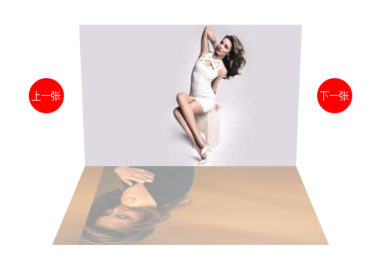
上图:
上代码:
<!DOCTYPE html>
<html lang="en">
<head>
    <meta charset="UTF-8">
    <title>Document</title>
    <style>
    @-webkit-keyframes show
    {
        0%   {
                transform:rotateX(180deg);
                opacity:0;
             }
        50%   {
                transform:rotateX(-25deg);
                opacity:1;
             }
        60%   {
                transform:rotateX(18deg);
                opacity:1;
             }
        70%   {
                transform:rotateX(-13deg);
                opacity:1;
             }
        80%   {
                transform:rotateX(8deg);
                opacity:1;
             }
        90%   {
                transform:rotateX(-6deg);
                opacity:1;
             }
        100% {
                transform:rotateX(0deg);
                opacity:1;
             }
    }
    @-webkit-keyframes hide
    {
        0%   {
                transform:rotateX(0deg);
                opacity:1;
             }

        100% {
                transform:rotateX(-180deg);
                opacity:0;
             }
    }
    *{ margin:0; padding:0;}
    li{ list-style: none;}
    .box{ position:relative;  width:300px; height:200px; margin:100px auto; }
    .box-ul,.box li{width:300px; height:200px;}
    .box-ul{transform-style:preserve-3d;perspective:800px;}
    .box li{ position:absolute;  background-size:cover; background-position:-50% -50%;transform:rotateX(180deg);transform-origin:bottom ; opacity:0;}
    .box li.show{-webkit-transform:rotateX(0deg);-webkit-animation: show .6s; opacity:1;}
    .box li.hide{-webkit-transform:rotateX(180deg); -webkit-animation: hide .6s;opacity:0;}
    .box a{ position:absolute; top:50%;transform: translateY(-50%) ; width:50px; height:50px; line-height: 50px; font-size: 14px; text-decoration: none; color:#fff; text-align:center; border-radius:50%; background-color:red;}
    .box a:nth-of-type(1){left:-80px;}
    .box a:nth-of-type(2){right:-80px;}


    </style>
    <script>
    window.onload = function(){

        var aA = document.getElementsByTagName('a'),
            aLi = document.getElementsByTagName('li');
        var len = aLi.length-1,
            n = 0;

        aA[0].onclick = function(){
            aLi[n].className = "hide";
            n--;
            n = n < 0 ? len : n;
            aLi[n].className = "show";
        }
        aA[1].onclick = function(){
            aLi[n].className = "hide";
            n++;
            n = n > len ? 0 : n;
            aLi[n].className = "show";
        }

    }
    </script>
</head>
<body>
    <div class="box">
        <ul class="box-ul">
            <li class="show" style=" background-image:url(1.jpg)"></li>
            <li style=" background-image:url(2.jpg)"></li>
            <li style=" background-image:url(3.jpg)"></li>
            <li style=" background-image:url(4.jpg)"></li>
            <li style=" background-image:url(5.jpg)"></li>
        </ul>
        <a href="javascript:;">上一张</a>
        <a href="javascript:;">下一张</a>
    </div>
</body>
</html>
演示:demo
扒代码心得:
初次看到这个效果感觉主要是JS做的
因为翻转上来有弹性运动,直接想的是JS弹性运动 不知道CSS3也可是设置 当时仅仅知道 transition 过去 也知道 animation 仅仅理解成 从 A点到B点
用 ul 用css3 转成 3D (transform-style:preserve-3d)同时加上景深 perspective:800px; (张鑫旭大神对景深的解释:http://www.zhangxinxu.com/wordpress/2012/09/css3-3d-transform-perspective-animate-transition/ )我个人简单粗暴的理解就是:给了一个三维的视角 ,
rotateX,rotateY,rotateZ 就能 X轴、Y轴、Z轴 设置3D了,换句话说不加其实还是2D平面。

li 初始X轴旋转 transform:rotateX(180deg) 在设置旋转的基点 根据li的底边旋转 (transform-origin:bottom);
然后 分别 有两个 class 分别 show(翻转上来)、hide(翻转下去);同时也写两个 animation 对应 keyframes show,keyframes hide
.show:虽然有keyframes show 运动 但是最后还要设置它的运动的最终点 transform:rotateX(0deg);
.hide:同理
keyframes show 是从 180deg 到 0deg 然后 弹性运动 其实就是 在 50% 的时候 运动 -25deg 10%的频率 来回的设置 deg 达到 弹性的运动,最开始一直这只不好,仔细看别人的代码发现是有规律逐次减少deg,
keyframes hide 仅仅是从 transform:rotateX(0deg); 到 transform:rotateX(-180deg); 同时还有透明度;

剩下的就是 JS 切换给class