1、首先看一下画出一个下三角形完整的代码及效果图
#trangle1-up{
    width:0;
    height:0;
    border-left:50px solid transparent;
    border-right:50px solid transparent;
    border-bottom:100px solid blue;
    }
<div id="trangle1-up">
        </div>
chrome截图

2、接下来看一下原理
首先我们知道:
#test{
width: 100px;
height: 100px;
border:2px solid blue;
}
上面这段代码会产生如下的效果:

这个应该没什么疑问。
如果我们继续增大边框的宽度并且使边框各个边的颜色不一致:
#test{
width: 100px;
height: 100px;
border:20px solid;
border-color:blue black red yellow;
}
那么会产生如下效果:

那么,试想一下,如果我们把边框的宽度设置成50px呢?会产生什么效果?试验一下
#test{
width: 100px;
height: 100px;
border:50px solid;
border-color:blue black red yellow;
}

有人会问了为什么中间还有一块空白的区域呢?边框不是应该完全填充矩形区域了吗?
其实不然,这个设计到W3C的标准盒子模型的概念,可以参考一下http://www.jb51.net/css/12199.html
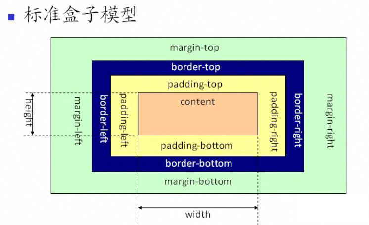
请仔细看图中,什么叫height?什么叫width?height和width包含边框border吗?当你明白了这些,我们再继续往下看。
。。。。。。。。。
现在我们把width和height设置为0:
#test{
width: 0px;
height: 0px;
border:50px solid;
border-color:blue black red yellow;
}

酱紫,中间就不再有空白的区域了,即content区域为0了;吃完饭回来再写。。。。
好了,到了这里,那么怎么画一个三角形呢?
#test{
width: 0px;
height: 0px;
border-left:50px solid transparent;
border-right:50px solid transparent;
border-bottom:100px solid blue;
}

酱紫咯,这不就是个三角形了吗?哈哈哈
其中,上边界是0px,所以下边界会向上延升100px,左右各50px。这是上三角,下三角也很好做:
#test{
width: 0px;
height: 0px;
border-left:50px solid transparent;
border-right:50px solid transparent;
border-top:100px solid blue;
}

左右三角就自己搞咯。。。。
最后来个合体的:
#test{
    width:100px;
    height:100px;
    margin-left:100px;
    position:absolute;
    background:#F63;}
#test-up{
width: 0px;
height: 0px;
margin-left:100px;
border-left:50px solid transparent;
border-right:50px solid transparent;
border-bottom:100px solid blue;
}
#test-right{
width: 0px;
height: 0px;
position:absolute;
margin-left:200px;
border-left:100px solid blue;
border-bottom:50px solid transparent;
border-top:50px solid transparent;
}
#test-bottom{
width: 0px;
height: 0px;
position:absolute;
margin-left:100px;
margin-top:100px;
border-left:50px solid transparent;
border-right:50px solid transparent;
border-top:100px solid blue;
}
#test-left{
width: 0px;
height: 0px;
border-bottom:50px solid transparent;
border-right:100px solid blue;
border-top:50px solid transparent;
}
<div id="test-up">
        </div>
        <div id="test">
        </div>

        <div id="test-right">
        </div>

        <div id="test-bottom">
        </div>

        <div id="test-left">
        </div>

接下来再上一个图形及其CSS代码:
图形长这样:

怎么实现?答案是需要借助伪类,使用方法是在一个黑色的右三角形上叠加一个全白的稍小一点的右三角形,叠加的顺序就得通过after和before伪类来控制,
注意代码中的after和before伪类中的颜色不可弄错,否则右三角形会是全黑的,代码如下:
#demo {
 width: 100px;
 height: 100px;
 border: 2px #000 solid;
 background-color: #fff;
 position: relative;
}

#demo:before {
 content: "";    /*这一行必须有,否则这个特效不会显示*/
 border-top: 12px transparent solid;
 border-bottom: 12px transparent solid;
 border-left: 12px #000 solid;    /*纯黑色*/
 position: absolute;
 /*right: -12px;*/
 margin-left:102px;
 margin-top: 18px;
}

#demo:after {
 content: "";
 border-top: 12px transparent solid;
 border-bottom: 12px transparent solid;
 border-left: 12px #fff solid;    /*纯白色*/
 position: absolute;
 /*right: -10px;*/
 margin-left:100px;
 margin-top:18px;
/* top: 20px;*/
}
<div id="demo">
        </div>