这里用到的svg的知识点:
1.stroke-dasharray
一组用逗号分割的数字组成的数列
为一个参数时:表示虚线长度和每段虚线之间的间距
两个参数时:一个表示长度,一个表示间距
多个参数时:数字会循环两次,形成一个偶数的虚线模式(奇数个循环两次变偶数个)
2.stroke-dashoffset
偏移的位置
偏移负数,虚线整体右移动
偏移正数,虚线整体左移

以上2个参数一起用可以设置动画
1.设置stroke-dasharray虚线长度等于当前svg的宽度,间隔大于或者等于svg宽度 可视区域内只能看到一段虚线 此时偏移量为0
2.设置stroke左移svg的宽度 会刚好隐藏了虚线
因此 如果反过来---设置偏移为从【svg的宽度】到【0】 就会慢慢显现出来虚线
3.animate
动画
:from
:to
:dur
用来配合stroke-dashoffset使用
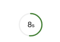
这次实现的思路是
1 设置两个circle
  一个用来当背景圈
  一个用来走圈动画
 2.走圈动画的circle里面套一个animate 用来保证动画的流畅性
   圈动画主要就是一个stroke-dashoffset的从circle的周长过渡为0的过程(圆逐渐出现


下面是代码实现:
<template>
    <svg class="ring-container" :style="` ${size}; height: ${size}`">
        <circle :cx="cx" :cy="cx" :r="r"
                :stroke="backgroundColor"
                :stroke-width="width"
                stroke-linecap="round"
                fill="none"></circle>
        <circle :cx="cx" :cy="cx" :r="r"
                class="ring"
                :stroke-width="width"
                :stroke="color"
                :stroke-dasharray="`${circum}`"
                stroke-linecap="round"
                fill="none">
            <animate attributeName="stroke-dashoffset"
                     :from="circum"
                     :to="endCircum"
                     :dur="originCountDown"/>
        </circle>
        <text :x="cx+5" :y="cx+10" text-anchor="end"
              :font-size="fontSize + 5"
              :fill="fontColor">
            {{ countDown }}
        </text>
        <text :x="cx+5" :y="cx+10" text-anchor="start"
              :font-size="fontSize - 5"
              :fill="fontColor">
           s
        </text>
    </svg>
</template>

<script>
    export default {
        name: "CircleLoad",
        data(){
            return{
                endCircum:0,
                countDown:this.originCountDown,
            }
        },
        computed: {
            cx() { // 中心点位置
                return this.size / 2
            },
            r() { // 半径
                return this.size / 2 - this.width
            },
            circum() {
                return parseInt(this.r * Math.PI * 2)
            }
        },
        props: {
            fontSize: {
                type: Number,
                default: 26
            },
            size: {
                type: Number,
                default: 100
            },
             {
                type: Number,
                default: 5
            },
            backgroundColor: {
                type: String,
                default: '#f0f0f0'
            },
            color: {
                type: String,
                default: '#448732'
            },
            fontColor:{
                type: String,
                default: '#333'
            },
            originCountDown:{
                type: Number,
                default: 15
            }
        },
        mounted(){
            this.interval = setInterval(() => {
                let diff = '1';
                this.countDown -= diff;
                if (this.countDown <= 0) {
                    clearInterval(this.interval)
                }
            }, 1000)
        }
    }
</script>

<style lang="scss">
    .ring-container {
        .ring {
            transform: rotate(-90deg);
            transform-origin: 50% 50%;
        }
    }
</style>
效果示意图:
小TIPS:
 1.circle默认会从3点钟方向开始走 因此要在css里rotate一下
 2. 在css里写不行 因为animate涉及到数据的设置