献上效果图:
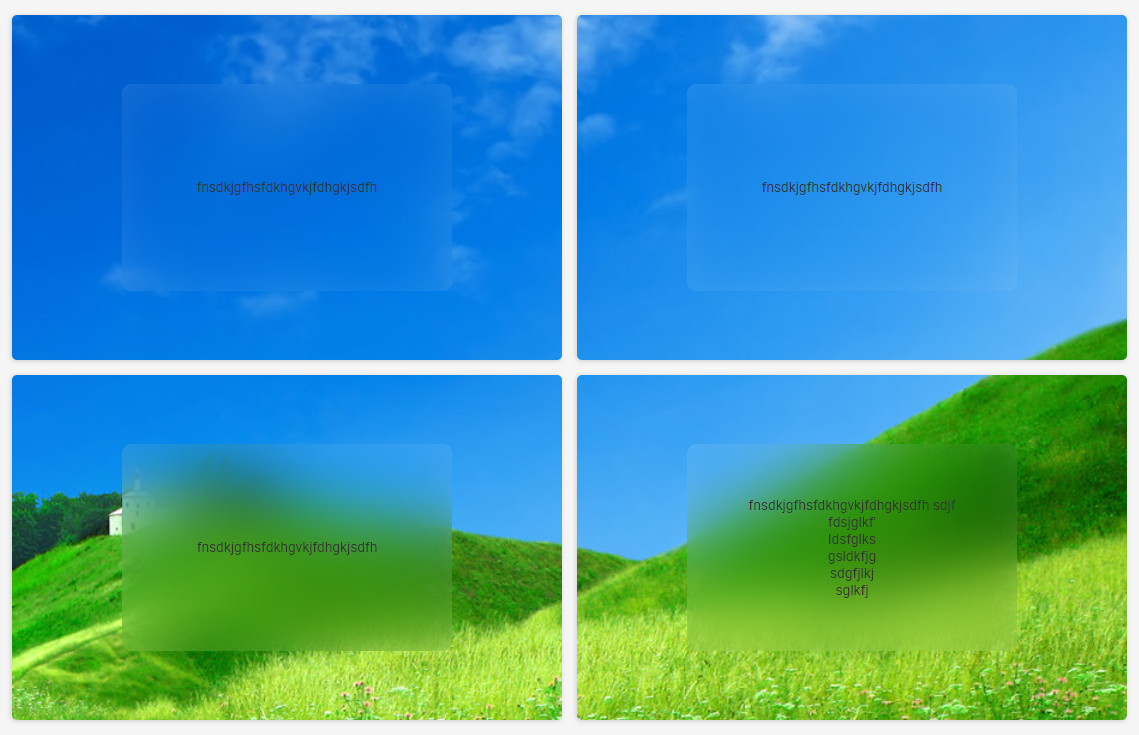
实现关键代码:
<body>
    <div class='divContener' colSpan={4} rowSpan={24}>
        <div class='itemContener'>
            fnsdkjgfhsfdkhgvkjfdhgkjsdfh
        </div>
    </div>
</body>

<style>
    .cellContener, .itemContener::before{
    background: url("http://www.86ps.com/sc/bj/232/02.jpg") 0 / cover fixed;
    }

    .itemContener{
        height: 60%;
        width: 60%;
        position: relative;
        right:-20%;
        top:20%;
        // color: red;
        background: hsla(0,0%,100%,0.2);
        // background: rgb(233, 233, 233);
        overflow: hidden;
        border-radius: 10px;
        text-align: center;
        z-index: 2;
        // filter: blur(5px);

        display: flex;
        justify-content: center;
        align-items: center;
    }

    .itemContener:before{
        content: '';
        position: absolute;
        top:0;right:0;bottom:0;left:0;
        filter: blur(30px);//高斯模糊
        margin:-20px;
        z-index: -1;//下移一层,让内容清晰
    }
</style>