前些天我们一直致力于爬虫技术的研究,并取得了一些小的成果,成功爬取了网易云音乐,时光电影网,豆瓣读书,智联招聘等网站的数据,数据也已经导出到Excel,有需要的同学们可以到这个地址下载:http://git.oschina.net/AuSiang/myBug/attach_files 。那么,我们拿到了这些数据肯定是为我们所用,有的同学可能是抱着好玩的心态去爬取一些数据下来,诚然,爬的时候很兴奋,爬下来的以后这些数据对我们来讲用途还是非常大的,特别是做市场调研或者数据分析的时候往往数据能够更直观更准确的指引我们的方向。当然,我们现在爬下来的数据还很乱,混杂在一起,那么,这就需要我们在对这些数据进行整理和统计,也就是今天我们要实现的功能:以图标形式分析和统计数据。
一、
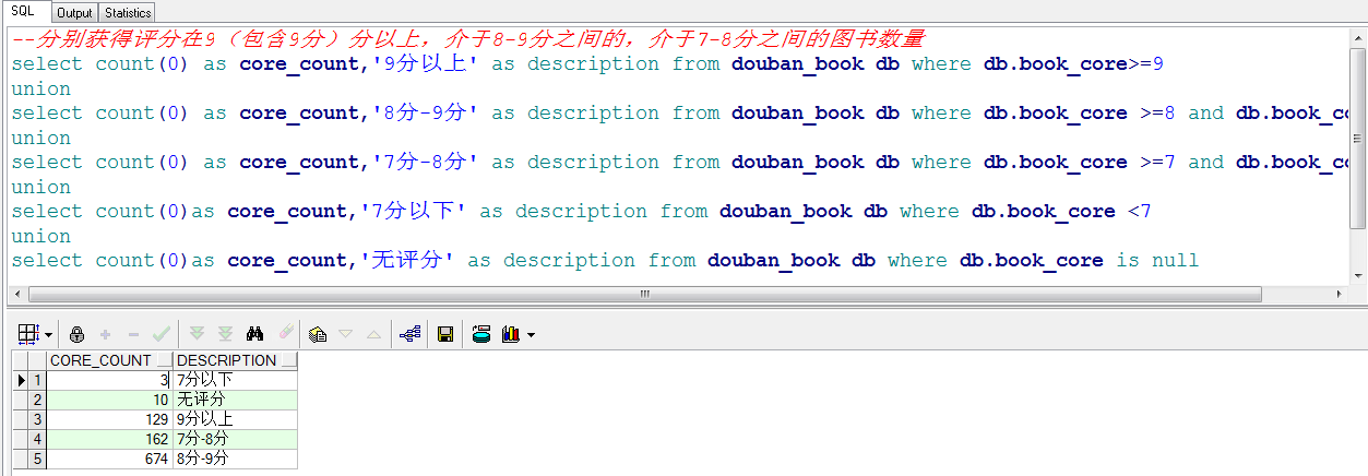
我们选取豆瓣图书的数据,统计一下评分在9分以上,8分-9分,7分-8分,7分以下和无评分的图书数量。我们先在oracle中新建一张表,对应Excel的各列,然后导入Excel的数据进来,如下图:

然后我们直接写SQL语句进行分类统计拿到结果数据。
我们现在已经拿到了数据,下面开始实现图表展现。
二、
1、我们先用JfreeChart展示一下3D饼状图,关于JfreeChart的使用就不再赘述了,学习资料已上传至http://git.oschina.net/AuSiang/myBug/attach_files ,我们直接看代码:
/**
 *
 */
package com.ax.chart;

import java.awt.Color;
import java.awt.Font;
import java.text.DecimalFormat;
import java.text.NumberFormat;

import org.jfree.chart.ChartFactory;
import org.jfree.chart.ChartFrame;
import org.jfree.chart.JFreeChart;
import org.jfree.chart.labels.StandardPieSectionLabelGenerator;
import org.jfree.chart.plot.PiePlot;
import org.jfree.chart.title.LegendTitle;
import org.jfree.chart.title.TextTitle;
import org.jfree.data.general.DefaultPieDataset;

/**
 * @description:对爬取的豆瓣图书的评分生成饼状图
 * @author AoXiang
 * @date 2017年3月23日
 * @version 1.0
 */
public class pieChart {

    /**
     * 设置数据集
     * 2017年3月23日
     */
    private static DefaultPieDataset getDataSet(){
        DefaultPieDataset dfp = new DefaultPieDataset();
        dfp.setValue("9分以上",129);
        dfp.setValue("8分-9分",674);
        dfp.setValue("7分-8分",162);
        dfp.setValue("7分以下",3);
        dfp.setValue("无评分",10);
        return dfp;
    }

    /**
     * 生成饼状图
     * 2017年3月23日
     */
    public static void makePieChart3D(){
        // 标题
        String title ="豆瓣图书(小说篇)评分统计和分析";
        // 获得数据集
        DefaultPieDataset dataset = getDataSet();
        // 利用chart工厂创建一个Jfreechart实例
        JFreeChart chart = ChartFactory.createPieChart3D(
                title,         // 图表标题
                dataset,    // 图标数据集
                true,        // 是否显示图例
                false,        //是否生成工具(提示)
                false);        //是否生成url链接
        // 设置pieChart的标题与字体
        Font font = new Font("宋体",Font.BOLD,25);
        TextTitle textTitle = new TextTitle(title);
        textTitle.setFont(font);
        chart.setTitle(textTitle);
        chart.setAntiAlias(false); // 是否启用反锯齿功能
        // 设置背景色
        chart.setBackgroundPaint(new Color(255,255,255));
        // 设置图例字体
        LegendTitle  legend = chart.getLegend(0);
        legend.setItemFont(new Font("宋体",1,15));
        // 设置标签字体
        PiePlot plot = (PiePlot) chart.getPlot();
        plot.setLabelFont(new Font("宋体", Font.TRUETYPE_FONT, 12));
        // 指定图片的透明度(0.0-1.0)
        plot.setForegroundAlpha(0.95f);
        // 图片中显示百分比:自定义方式,{0} 表示选项, {1} 表示数值, {2} 表示所占比例 ,小数点后两位
        plot.setLabelGenerator(new StandardPieSectionLabelGenerator(
                "{0}={1}({2})", NumberFormat.getNumberInstance(),
                new DecimalFormat("0.00%")));
        // 图例显示百分比:自定义方式, {0} 表示选项, {1} 表示数值, {2} 表示所占比例
        plot.setLegendLabelGenerator(new StandardPieSectionLabelGenerator("{0} ({2})"));
        // 设置第一个饼块截面开始的位置,默认是12点钟方向
        plot.setStartAngle(90);

        ChartFrame frame = new ChartFrame(title, chart,true);
        frame.pack();
        frame.setVisible(true);
    }

    public static void main(String[] args) {
        makePieChart3D();
    }

}
运行一下,看下效果:

接下来我们再来实现一下用柱状图的方式展现数据:
/**
 *
 */
package com.ax.chart;

import java.awt.Color;
import java.awt.Font;

import org.jfree.chart.ChartFactory;
import org.jfree.chart.ChartFrame;
import org.jfree.chart.JFreeChart;
import org.jfree.chart.axis.CategoryAxis;
import org.jfree.chart.axis.NumberAxis;
import org.jfree.chart.plot.CategoryPlot;
import org.jfree.chart.plot.PlotOrientation;
import org.jfree.chart.title.LegendTitle;
import org.jfree.chart.title.TextTitle;
import org.jfree.data.category.CategoryDataset;
import org.jfree.data.general.DatasetUtilities;

/**
 * @description:对爬取的豆瓣图书的评分生成柱状图
 * @author AoXiang
 * @date 2017年3月23日
 * @version 1.0
 */
public class barChart {
    private static CategoryDataset getDataset() {
        double[][] data = new double[][] { { 129, 674, 162, 3, 10 }};
        String[] rowKeys = {"数量"};
        String[] columnKeys = { "9分以上", "8分-9分", "7分-8分", "7分以下", "无评分" };
        CategoryDataset dataset = DatasetUtilities.createCategoryDataset(
                rowKeys,columnKeys, data);
        return dataset;
    }
    /**
     * 生成柱状图。
     */
    public static void makeBarChart3D() {
        String title = "豆瓣图书(小说篇)评分统计和分析";
        // 获得数据集
        CategoryDataset dataset = getDataset();
        JFreeChart chart = ChartFactory.createBarChart3D(
            title, // 图表标题
            "评分",                      // 目录轴的显示标签
            "数量",                      // 数值轴的显示标签
            dataset,                     // 数据集
            PlotOrientation.VERTICAL,    // 图表方向:水平、垂直
            true,                        // 是否显示图例
            true,                        // 是否生成工具(提示)
            true                         // 是否生成URL链接
        );
        // 设置标题字体
        Font font = new Font("宋体", Font.BOLD, 18);
        TextTitle textTitle = new TextTitle(title);
        textTitle.setFont(font);
        chart.setTitle(textTitle);
        chart.setTextAntiAlias(false);
        // 设置背景色
        chart.setBackgroundPaint(new Color(255, 255, 255));
        // 设置图例字体
        LegendTitle legend = chart.getLegend(0);
        legend.setItemFont(new Font("宋体", Font.TRUETYPE_FONT, 14));
        // 获得柱状图的Plot对象
        CategoryPlot plot = chart.getCategoryPlot();
        // 取得横轴
        CategoryAxis categoryAxis = plot.getDomainAxis();
        // 设置横轴显示标签的字体
        categoryAxis.setLabelFont(new Font("宋体", Font.BOLD, 16));
        // 设置横轴标记的字体
        categoryAxis.setTickLabelFont(new Font("宋休", Font.TRUETYPE_FONT, 16));
        // 取得纵轴
        NumberAxis numberAxis = (NumberAxis) plot.getRangeAxis();
        // 设置纵轴显示标签的字体
        numberAxis.setLabelFont(new Font("宋体", Font.BOLD, 16));

        ChartFrame frame = new ChartFrame(title, chart, true);
        frame.pack();
        frame.setVisible(true);
    }

    public static void main(String[] args) {
        // 3D柱状图
        makeBarChart3D();
    }
}
运行效果如下图:

接下来我们在使用Google Chart 的Jquery插件的形式展现一下数据:
<!DOCTYPE html PUBLIC "-//W3C//DTD XHTML 1.0 Transitional//EN" "http://www.w3.org/TR/xhtml1/DTD/xhtml1-transitional.dtd">
<html xmlns="http://www.w3.org/1999/xhtml">
<head>
<meta http-equiv="Content-Type" content="text/html; charset=utf-8" />
<title>豆瓣图书(小说篇)评分统计和分析</title>

<script src="http://www.jq22.com/jquery/jquery-1.10.2.js"></script>
<script type="text/javascript" src="js/jsapi.js"></script>
<script type="text/javascript" src="js/corechart.js"></script>
<script type="text/javascript" src="js/jquery.gvChart-1.0.1.min.js"></script>
<script type="text/javascript" src="js/jquery.ba-resize.min.js"></script>

<script type="text/javascript">
gvChartInit();
$(document).ready(function(){
    $('#myTable5').gvChart({
        chartType: 'PieChart',
        gvSettings: {
            vAxis: {title: 'No of players'},
            hAxis: {title: 'Month'},
             1200,
            height: 600
        }
    });
});
</script>

<script type="text/javascript">
gvChartInit();
$(document).ready(function(){
        $('#myTable1').gvChart({
            chartType: 'PieChart',
            gvSettings: {
            vAxis: {title: 'No of players'},
            hAxis: {title: 'Month'},
             1000,
            height: 500
        }
    });
});
</script>

</head>


<body>

    <div style="1000px;margin:0 auto;">

       <table id='myTable5'>
            <caption>豆瓣图书(小说篇)评分统计和分析</caption>
            <thead>
                <tr>
                    <th></th>
                    <th>9分以上</th>
                    <th>8分-9分</th>
                    <th>7分-8分</th>
                    <th>7分以下</th>
                    <th>无评分</th>

                </tr>
            </thead>
            <tbody>
                <tr>
                    <th>1200</th>
                    <td>129</td>
                    <td>674</td>
                    <td>162</td>
                    <td>3</td>
                    <td>10</td>
                </tr>
            </tbody>
        </table>

    </div>


</body>
</html>
运行结果如下图所示:

是不是感觉比之前的要美观一些呢。
好了,今天就到这里了,主要是使用JfreeChart以及Jquery插件的形式对我们爬虫爬取的数据进行统计和分析,从而更直观的解读数据给我们传递的信息。
源码就不上传了,有兴趣的同学可以参考一下上传的资料。
如果您对代码有什么异议欢迎您的留言,我们一起交流!