           .flex{
                display: flex;
                display: -webkit-flex;/*Webkit内核的浏览器,必须加上-webkit前缀。*/
                /*注意,设为Flex布局以后,子元素的float、clear和vertical-align属性将失效。*/
                flex-direction: row;/*决定主轴的方向,即子项目(子元素)横向排列还是纵向排列*/
                /*row(默认值):主轴为水平方向,起点在左端。
                row-reverse:主轴为水平方向,起点在右端。
                column:主轴为垂直方向,起点在上沿。
                column-reverse:主轴为垂直方向,起点在下沿。*/
                flex-wrap:nowrap;/*定义如果一条轴线排不下,如何换行*/
                /*nowrap(默认):不换行。
                wrap:换行,第一行在上方。
                wrap-reverse:换行,第一行在下方。*/
                justify-content: flex-start;/*定义了项目在主轴上的对齐方式。*/
                /*flex-start(默认值):左对齐
                flex-end:右对齐
                center: 居中
                space-between:两端对齐,项目之间的间隔都相等。
                space-around:每个项目两侧的间隔相等。所以,项目之间的间隔比项目与边框的间隔大一倍。*/
                align-items: flex-start;/*定义项目在交叉轴上如何对齐。*/
                /*flex-start:交叉轴的起点对齐。
                flex-end:交叉轴的终点对齐。
                center:交叉轴的中点对齐。
                baseline: 项目的第一行文字的基线对齐。
                stretch(默认值):如果项目未设置高度或设为auto,将占满整个容器的高度。*/
            }
            /*项目,容器里的子元素默认成为项目,并拥有项目的默认属性*/
            .flex-item{
                order:0;/*定义项目的排列顺序。数值越小,排列越靠前,默认为0。*/
                flex-grow:0;/*定义项目的放大比例,默认为0,即如果存在剩余空间,也不放大。*/
                /*如果所有项目的flex-grow属性都为1,则它们将等分剩余空间(如果有的话)。如果一个项目的flex-grow属性为2,其他项目都为1,则前者占据的剩余空间将比其他项多一倍。*/
                flex-shrink:1;/*定义了项目的缩小比例,默认为1,即如果空间不足,该项目将缩小。*/
                flex-basis:auto;/*定义了在分配多余空间之前,项目占据的主轴空间(main size)。浏览器根据这个属性,计算主轴是否有多余空间。它的默认值为auto,即项目的本来大小。*/
                flex:0 1 auto;/*flex属性是flex-grow, flex-shrink 和 flex-basis的简写,默认值为0 1 auto。后两个属性可选。*/
                align-self:auto;/*允许单个项目有与其他项目不一样的对齐方式,可覆盖align-items属性*/
            }
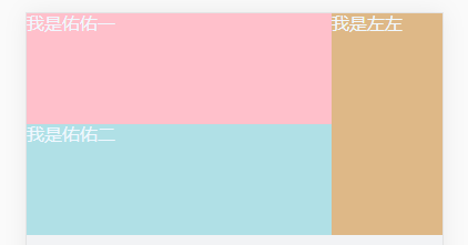
常用的布局:
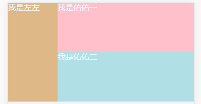
<template>
  <div class="home">
    <div class="left-box">我是左左</div>
    <div class="right-box">
      <div class="right-top">我是佑佑一</div>
      <div class="right-bottom">我是佑佑二</div>
    </div>
  </div>
</template>
<style lang="scss" scoped>
.home{
   100%;
  height: 2rem;
  background: burlywood;
  display: flex;
  color: aliceblue;
  .left-box{
    flex: 0 1 1rem;
    //order:1;}
  .right-box{
  //order:0;
    flex: 1 1 auto;
    display: flex;
    flex-direction: column;
    .right-top{
      flex: 0 1 1rem;
      background: pink;
    }
    .right-bottom{
      flex: 1 1 auto;
      background: powderblue;
    }
  }
}
</style>
加order改变排列顺序
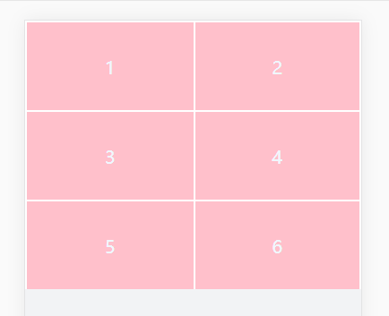
宫格布局
<template>
  <div class="home">
    <div class="item">1</div>
    <div class="item">2</div>
    <div class="item">3</div>
    <div class="item">4</div>
    <div class="item">5</div>
    <div class="item">6</div>
  </div>
</template>
<script>
</script>
<style lang="scss" scoped>
.home{
   100%;
  height: 3rem;
  background: burlywood;
  display: flex;
  color: aliceblue;
  flex-wrap: wrap;
  font-size: 20px;
  text-align: center;
  .item{
    background: pink;
    flex: 0 1 50%;
    border: 0.02rem solid white;
    height: 1rem;
    box-sizing: border-box;
    line-height: 1rem;
  }
  .item:nth-child(odd){
    border-right: 0rem;
  }
  .item {
    border-bottom: 0rem;
  }
}

</style>